.NET MAUI Button - Custom Button Control
- Easily customize a button as an outline, flat, circle, or icon button.
- Display an image as the background for the control.
- Display custom content in the button control.
Trusted by the world’s leading companies

Overview
The .NET MAUI custom Button is a UI lets users set icons, background images, and corner edge radii and customize its appearance for different visual states using the visual state manager.
.NET MAUI Button code example
Easily get started with the .NET MAUI Button using a few simple lines of XAML and C# code, as demonstrated below. Also, explore our .NET MAUI Button example, which shows you how to render and configure the .NET MAUI Button.
<button:SfButton Text="SfButton" TextColor="White"/>SfButton button = new SfButton();
button.Text = "SfButton";
button.TextColor = Colors.White;Image support
Set images in the .NET MAUI Button control to provide an elegant view that matches the application.


Custom view
In the .NET MAUI Button, you can customize the appearance and behavior of a button by creating a custom view or by using styles.
Font customization
Customize the font size with standard options: small, medium, and large. The font family and text color can also be easily customized.

Appearance
The appearance of the .NET MAUI Button is highly customizable. Customize the border color, border thickness, corner radius, and more.

Border color
The border color of the button can be customized to any desired color.
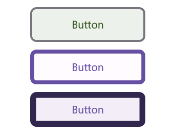
Border thickness
The border of the buttons can be customized to the desired thickness. Users can also remove the border if it is not required.

Corner radius
The .NET MAUI Button control’s corner radii can easily be customized to create rounded edges.
Customization
Users can customize the appearance of a button to be an outline, flat, circle, or icon button.

Primary buttons
A primary button is the default button with an accent color as the background.

Normal buttons
A button with a traditional look and appearance.

Flat buttons
A .NET MAUI Button without a border or background color.

Outline buttons
A .NET MAUI Button with a border and without a background color.
Icon buttons
A .NET MAUI Button with an icon and caption.

Circular buttons
A .NET MAUI Button with rounded edges and a font icon.
 95+ UI controls
200+ interactive .NET MAUI demos
3.2M+ downloads
95+ UI controls
200+ interactive .NET MAUI demos
3.2M+ downloads
Not sure how to create your first .NET MAUI Button? Our tutorial videos and documentation can help.
I’d love to watch it now I’d love to read it now.NET MAUI DataViz & UI Controls
Standalone UI SDKs
Integrate the DataGrid, Chart, Scheduler, and Rich Text Editor UI components into applications to enable rich interaction and visualization, delivering a seamless user experience.
Document Solutions
Integrate the PDF Viewer, DOCX Editor, Spreadsheet Editor, and document-processing libraries into the .NET MAUI applications to enable a smooth user experience.
Frequently Asked Questions
Why should you choose the Syncfusion® .NET MAUI Button?
The Syncfusion® .NET MAUI Button control supports the following features:
- Easily customize a button as an outline, flat, circle, or icon button.
- Display an image as the background for the control.
- Display custom content with a template.
- Customize the appearance of the corners, text, and borders.
Simple configuration and APIs.
- Mobile-friendly UI.
Extensive demos, documentation, and videos to let you get started quickly with the .NET MAUI Button.
Where can I find the Syncfusion® .NET MAUI Button demo?
You can find our .NET MAUI Button demo here. It demonstrates how to render and configure the Button.
Can I download and utilize the Syncfusion® .NET MAUI Button for free?
No, this is a commercial product and requires a paid license. However, a free community license is also available for companies and individuals whose organizations have less than $1 million USD in annual gross revenue, 5 or fewer developers, and 10 or fewer total employees.
How do I get started with the Syncfusion® .NET MAUI Button?
A good place to start would be our comprehensive getting started documentation.
Our Customers Love Us


See Real Success Stories
Developers around the world trust Syncfusion’s Essential Studio to simplify complex projects and speed up delivery. With a vast library of UI controls, powerful SDKs, and reliable support, Essential Studio helps teams build enterprise-ready applications with confidence.
Read Our Customer StoriesIndustry
Software development
75% Cost reduction
50% Faster development
Industry
Utilities (oil and gas)
450+ hours saved
Streamlined processes and hours of development effort saved.
Advanced, flexible features
Empowered users through robust and versatile functionality.
Industry
Software and technology
1000+ of hours saved
Accelerated development with enterprise-ready UI components.
Efficient file management
Streamlined workflows with document libraries without building them from scratch.
Industry
Software and technology
2 Years of delay avoided
Two years of delays prevented with proactive planning.
On-time delivery
Projects delivered on schedule using trusted controls.
Industry
IT services and IT consulting
Improved performance
Large datasets handled with easy customization and quick debugging.
Highly customizable
Plug-and-play controls with quick template integration.
Industry
Professional services
Instant access
Quick availability of features and resources.
Reduced dependencies
Fewer dependencies for faster development.
Rated by users across the globe


Awards
Greatness—it’s one thing to say you have it, but it means more when others recognize it. Syncfusion® is proud to hold the following industry awards.

