
 Satheeskumar S
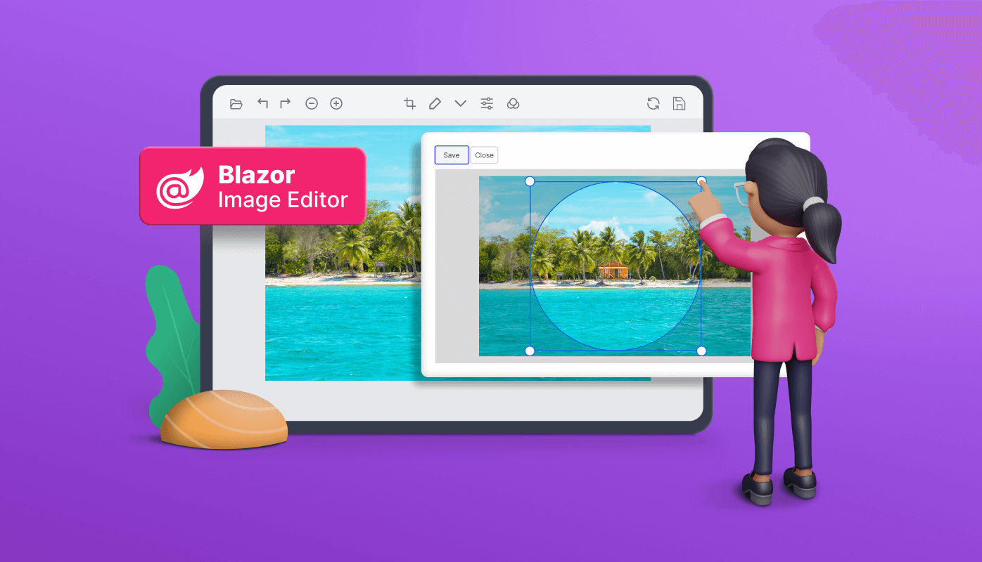
We are happy to introduce the new Blazor Image Editor component in the 2023 Volume 2 release. It has convenient, built-in tools for rotating, flipping, zooming, and cropping images with user-selected areas. You can insert annotations such as text, freehand drawings, and various shapes like rectangles, ellipses, lines, paths, and arrows over the images. This component also includes filters and finetuning options to enhance the images. It supports keyboard interactions and events and provides a user-friendly interface optimized for touch interactions.
Let’s explore the features of the new Blazor Image Editor component and its UI design.
Use cases
The Blazor Image Editor component is a versatile tool for image transformation and cropping, making it suitable for various applications. Here are some specific use case scenarios where this component excels:
- Profile pictures: Crop images to create profile pictures. User-friendly APIs make it easy to customize the editor to fit specific use cases. Users can customize the toolbar or external buttons to enhance the editing experience and tailor it to their needs.
- Photo editor: Comprehensive, built-in support for all essential editing features, conveniently accessible through a toolbar. This makes it a perfect fit for integrating into web or mobile apps that require robust image editing capabilities. Whether adjusting color, applying filters, or adding annotations, the Image Editor component provides a seamless solution for editing images within an app.
Key features
The key features of the Blazor Image Editor are as follows:
- Loading image
- Selection and cropping
- Transforming images
- Image annotations
- Zooming
- Filters and finetunes
- Undo and redo
- Toolbar
- Quick access toolbar
- Exporting
- Adaptive and touch-friendly UI
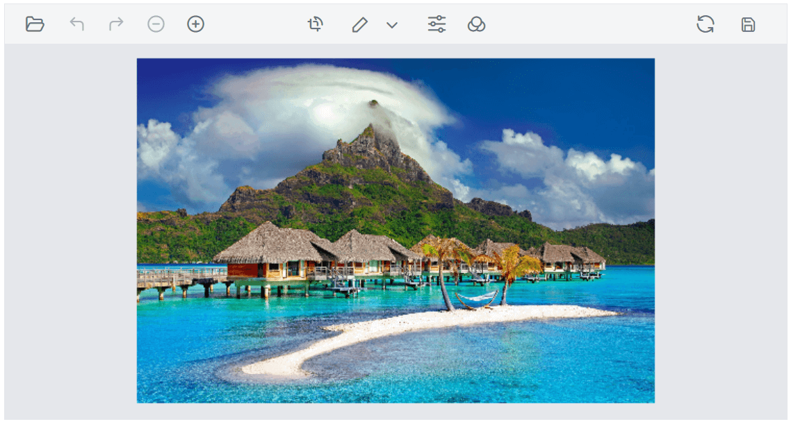
Loading an image
The Blazor Image Editor offers multiple options for opening images for editing. You can open images by directly providing the encoded data (base64 image data).
Alternatively, you can open images using a URL by specifying it. The component also offers a user-friendly open button in the toolbar, allowing users to select and open image files from their local file system. The supported file types are PNG, JPEG, SVG, and base64.
Note: Place the image within the app’s wwwroot folder to load it in the Image Editor.
In the following code example, the OpenAsync method is used to load the hosted image.
@using Syncfusion.Blazor.ImageEditor
@using Syncfusion.Blazor.Buttons

<div style="padding-bottom: 15px">
    <SfButton OnClick="OpenAsync">Open Image</SfButton>
</div>

<SfImageEditor @ref="ImageEditor" Toolbar="customToolbarItem" Height="400">
</SfImageEditor>

@code {
    SfImageEditor ImageEditor;
    private List<ImageEditorToolbarItemModel> customToolbarItem = new List<ImageEditorToolbarItemModel>() { };

    private async void OpenAsync ()
    {
        await ImageEditor.OpenAsync("nature.png");
    }
}
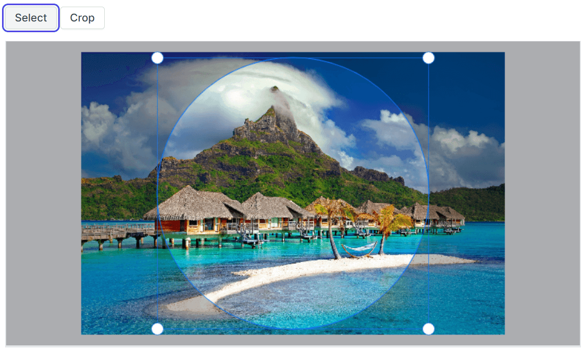
Selection and cropping
The Blazor Image Editor offers a range of selection options to cater to different cropping needs. The selection region can be easily adjusted by dragging and resizing it according to the desired cropping area.
Selection
We can select an image using either the toolbar or the SelectAsync method. While using the SelectAsync method, we need to specify the selection type. The available selection types include custom, square, circle, and the aspect ratios 3:2, 4:3, 5:4, 7:5, and 16:9. This enables users to precisely define the shape and proportions of the selection region for cropping images.
Users can enable the selection functionality in the toolbar by clicking on the Crop and Transform button. This action reveals a dropdown menu and users can easily choose their desired option from the Crop Selection dropdown button.
Cropping
The Blazor Image Editor allows you to crop images based on the selected region. This can be accomplished through either the toolbar or the CropAsync method.
In the toolbar, users can perform cropping by clicking the enabled OK button, which becomes available only after selection. This ensures that a valid region for cropping is defined before applying the operation.
In the following code example, the SelectAsync and CropAsync methods are used to perform circle selection and cropping of an image.
@using Syncfusion.Blazor.ImageEditor
@using Syncfusion.Blazor.Buttons

<div style="padding-bottom: 15px">
    <SfButton OnClick="SelectAsync">Select</SfButton>
    <SfButton OnClick="CropAsync">Crop</SfButton>
</div>

<SfImageEditor @ref="ImageEditor" Toolbar="customToolbarItem" Height="400">
    <ImageEditorEvents Created="CreatedAsync"></ImageEditorEvents>
</SfImageEditor>

@code {
    SfImageEditor ImageEditor;
    private List<ImageEditorToolbarItemModel> customToolbarItem = new List<ImageEditorToolbarItemModel>() { };

    private async void CreatedAsync ()
    {
        await ImageEditor.OpenAsync("nature.png");
    }

    private async void SelectAsync ()
    {
        await ImageEditor.SelectAsync("Circle");
    }

    private async void CropAsync ()
    {
        await ImageEditor.CropAsync();
    }
}

Transforming an image
The toolbar in the Blazor Image Editor offers straightforward and user-friendly support for rotate and flip transformations. Users can access the transform options by clicking the Crop and Transform button and choosing Rotate Left, Rotate Right, Horizontal Flip, or Vertical Flip. This enables the easy rotation and flipping of images without the need for complex programming.
Additionally, developers can programmatically utilize the RotateAsync and FlipAsync methods to apply the rotation and flip transformations, respectively.
Refer to the following code example.
@using Syncfusion.Blazor.ImageEditor
@using Syncfusion.Blazor.Buttons
 <div style="padding-bottom: 15px">
    <SfButton OnClick="RotateAsync">Rotate</SfButton>
    <SfButton OnClick="FlipAsync">Flip</SfButton>
</div>

<SfImageEditor @ref="ImageEditor" Toolbar="customToolbarItem" Height="400">
    <ImageEditorEvents Created="CreatedAsync"></ImageEditorEvents>
</SfImageEditor>

@code {
    SfImageEditor ImageEditor;
    private List<ImageEditorToolbarItemModel> customToolbarItem = new List<ImageEditorToolbarItemModel>() { };

    private async void CreatedAsync()
    {
        await ImageEditor.OpenAsync("nature.png");
    }

    private async void RotateAsync()
    {
        await ImageEditor.RotateAsync(90);
    }

    private async void FlipAsync()
    {
        await ImageEditor.FlipAsync(ImageEditorDirection.Horizontal);
    }
}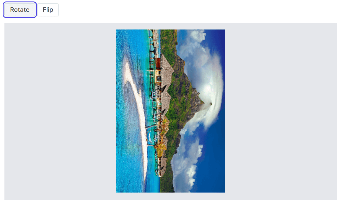
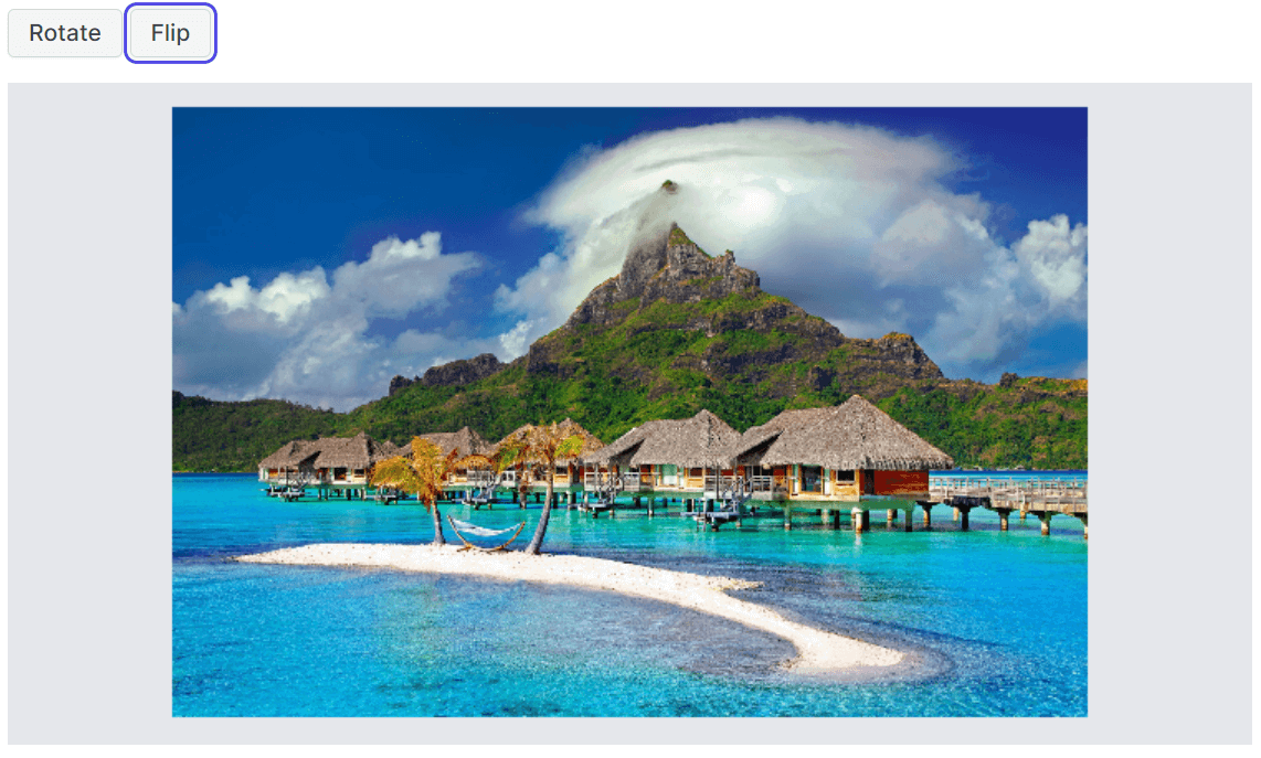
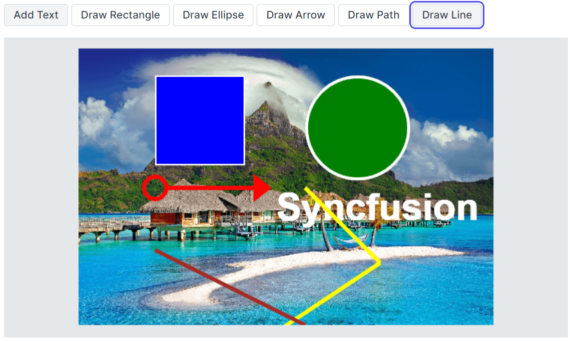
Image annotations
Users can add annotations such as text, freehand drawings, and multiple shapes, including rectangles, ellipses, lines, arrows, and paths, over the images. These annotation features provide versatile ways to mark, highlight, or add graphical elements to images. Whether adding descriptive text, drawing freehand sketches, or incorporating geometric shapes, the Image Editor empowers users to annotate images with precision and creativity.
Text annotations
The Blazor Image Editor provides comprehensive support for text annotations. We can add text annotations to images using either the toolbar or the DrawTextAsync method.
With the DrawTextAsync method, users can specify the text content, font family, font size, and font styles to insert a text annotation programmatically.
Users can add text annotations using the toolbar by clicking the Annotation dropdown button and selecting the Add Text option from the pop-up menu. Once the text is added, a contextual toolbar (to customize the text) will automatically be enabled.
Shapes annotations
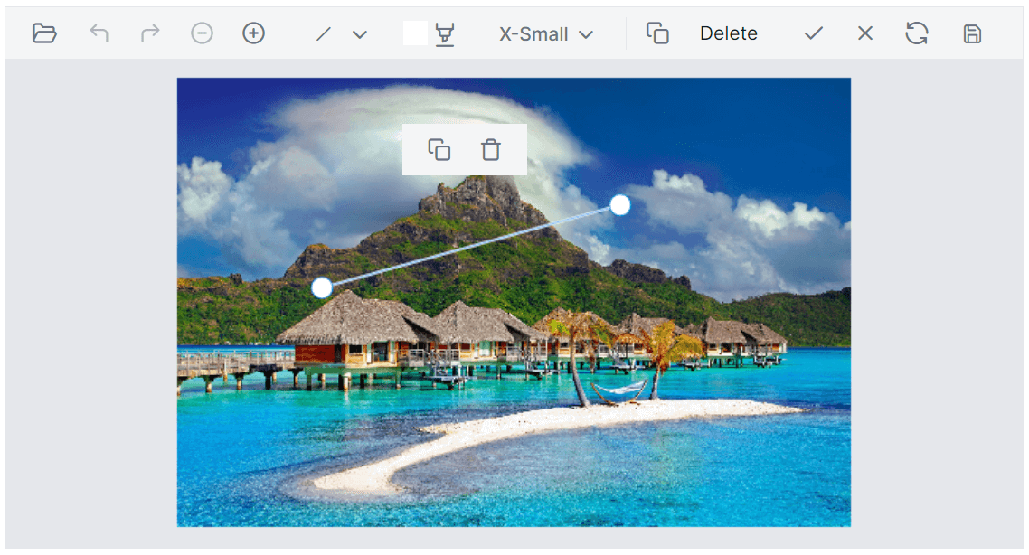
The Image Editor supports a variety of shape annotations, including rectangles, ellipses, lines, arrows, and paths. You can insert and customize them by adjusting their stroke color, fill color, and width. You can add shape annotations using the toolbar or specific methods such as DrawRectangleAsync, DrawEllipseAsync, DrawLineAsync, DrawArrowAsync, and DrawPathAsync.
In the toolbar, click the Annotation dropdown button and select an option from the pop-up menu. This enables users to activate the freehand mode to draw the shapes. Once enabled, a contextual toolbar becomes available, allowing users to customize the stroke color, fill color, and stroke width of the shape annotation.
After the shape annotation is completed, the Image Editor enables a quick access toolbar to clone or delete the shapes. The clone option duplicates the current shape and the delete option removes the shape annotation. This provides a convenient way to adjust or undo the annotation if it is unsatisfactory or no longer required.
In the following code example, the DrawTextAsync method is used to insert text, and the DrawRectangleAsync, DrawEllipseAsync, DrawLineAsync, DrawArrowAsync, and DrawPathAsync methods are used to insert shapes.
@using Syncfusion.Blazor.ImageEditor
@using Syncfusion.Blazor.Buttons

<div style="padding-bottom: 15px">
    <SfButton OnClick="TextAsync">Add Text</SfButton>
    <SfButton OnClick="RectangleAsync">Draw Rectangle</SfButton>
    <SfButton OnClick="EllipseAsync">Draw Ellipse</SfButton>
    <SfButton OnClick="ArrowAsync">Draw Arrow</SfButton>
    <SfButton OnClick="PathAsync">Draw Path</SfButton>
    <SfButton OnClick="LineAsync">Draw Line</SfButton>
</div>

<SfImageEditor @ref="ImageEditor" Toolbar="customToolbarItem" Height="400">
    <ImageEditorEvents Created="CreatedAsync"></ImageEditorEvents>
</SfImageEditor>

@code {
    SfImageEditor ImageEditor;
    private List<ImageEditorToolbarItemModel> customToolbarItem = new List<ImageEditorToolbarItemModel>() { };
    private ImageEditorPoint[] points = new ImageEditorPoint[] { new ImageEditorPoint { X = 400, Y = 200 }, new ImageEditorPoint { X = 500, Y = 300 }, new ImageEditorPoint { X = 350, Y = 400 } };

    private async void CreatedAsync()
    {
        await ImageEditor.OpenAsync("nature.png");
    }

    private async void TextAsync()
    {
        await ImageEditor.DrawTextAsync(450, 200, "Syncfusion", "Arial", 50, true, true, "#000");
    }

    private async void RectangleAsync()
    {
        await ImageEditor.DrawRectangleAsync(200, 50, 120, 120, 4, "#fff", "blue");
    }

    private async void EllipseAsync()
    {
        await ImageEditor.DrawEllipseAsync(400, 50, 70, 70, 4, "#fff", "green");
    }

    private async void ArrowAsync()
    {
        await ImageEditor.DrawArrowAsync(200, 200, 400, 200, 5, "red", ImageEditorArrowHeadType.Circle);
    }

    private async void PathAsync()
    {
        await ImageEditor.DrawPathAsync(points, 5, "yellow");
    }
    private async void LineAsync()
    {
        await ImageEditor.DrawLineAsync(200, 300, 400, 400, 5, "brown");
    }
}
Freehand drawing
You can also insert and customize freehand drawing annotations. You can adjust the stroke color and width to personalize the annotations. This can be achieved using either the toolbar or the EnableFreehandDrawAsync method.
In the toolbar, click the Annotation dropdown button and select the Freehand Draw option from the pop-up menu. This enables users to activate the freehand drawing mode. Once enabled, a contextual toolbar becomes available, allowing users to customize the stroke color and width for their freehand annotations.
After completing the freehand drawing annotation, the Image Editor enables a quick access toolbar that provides an option to delete the drawing.
In the following code example, the EnableFreehandDrawAsync, and DisableFreehandDrawAsync methods are used to toggle the freehand drawing mode.
@using Syncfusion.Blazor.ImageEditor
@using Syncfusion.Blazor.Buttons

<div style="padding-bottom: 15px">
    <SfButton OnClick="EnableAsync">Enable Freehand Draw</SfButton>
    <SfButton OnClick="DisableAsync">Disable Freehand Draw</SfButton>
</div>

<SfImageEditor @ref="ImageEditor" Toolbar="customToolbarItem" Height="400">
    <ImageEditorEvents Created="CreatedAsync"></ImageEditorEvents>
</SfImageEditor>

@code {
    SfImageEditor ImageEditor;
    private List<ImageEditorToolbarItemModel> customToolbarItem = new List<ImageEditorToolbarItemModel>() { };

    private async void CreatedAsync()
    {
        await ImageEditor.OpenAsync("nature.png");
    }

    private async void EnableAsync()
    {
        await ImageEditor.EnableFreehandDrawAsync();
    }

    private async void DisableAsync()
    {
        await ImageEditor.DisableFreehandDrawAsync();
    }
}
Zooming an image
The Blazor Image Editor control provides zoom functionality to magnify or reduce the image size. Users can zoom in or out and pan the image to view specific areas of interest. This can be achieved through either the toolbar or the ZoomAsync method.
Users can easily zoom in or out in the toolbar by clicking the dedicated Zoom In and Zoom Out buttons. This provides a convenient way to adjust the zoom level of the images without additional programming.
Alternatively, developers can utilize the ZoomAsync method to control the zoom functionality programmatically based on specific requirements or user interactions outside the toolbar.
Refer to the following code example.
@using Syncfusion.Blazor.ImageEditor
@using Syncfusion.Blazor.Buttons

<div style="padding-bottom: 15px">
    <SfButton OnClick="ZoomInAsync">Zoom In </SfButton>
    <SfButton OnClick="ZoomOutAsync">Zoom Out </SfButton>
</div>

<SfImageEditor @ref="ImageEditor" Toolbar="customToolbarItem" Height="400">
    <ImageEditorEvents Created="CreatedAsync"></ImageEditorEvents>
</SfImageEditor>

@code {
    SfImageEditor ImageEditor;
    private List<ImageEditorToolbarItemModel> customToolbarItem = new List<ImageEditorToolbarItemModel>() { };
    ImageEditorPoint point = new ImageEditorPoint { X = 300, Y = 300 };
    private async void CreatedAsync()
    {
        ImageEditor.OpenAsync("nature.png");
    }

    private async void ZoomInAsync()
    {
        ImageEditor.ZoomAsync(2, point);
    }

    private void ZoomOutAsync()
    {
        ImageEditor.ZoomAsync(1, point);
    }
}
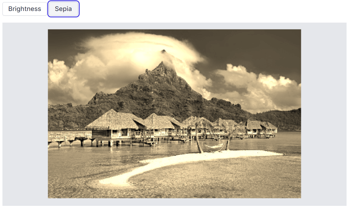
Filters and finetuning
You can apply filters to alter the appearance of an image. Image filters are predefined effects that can be applied to an image to add visual interest or enhance certain features. The available filters are cold, warm, chrome, sepia, grayscale, and invert. We can apply filters by using either the toolbar or the ApplyImageFilterAsync method.
You can finetune the image filters to alter the appearance of an image. Adjust the settings of an image filter to achieve the desired effect. The available finetuning options are brightness, contrast, exposure, hue, saturation, opacity, and blur. You can use them through either the toolbar or the FinetuneImageAsync method.
In the following code example, the ApplyImageFilterAsync and FinetuneImageAsync methods are used to perform filter and finetuning actions.
@using Syncfusion.Blazor.ImageEditor
@using Syncfusion.Blazor.Buttons

<div style="padding-bottom: 15px">
    <SfButton OnClick="BrightnessAsync">Brightness</SfButton>
    <SfButton OnClick="SepiaAsync">Sepia</SfButton>
</div>

<SfImageEditor @ref="ImageEditor" Toolbar="customToolbarItem" Height="400">
    <ImageEditorEvents Created="CreatedAsync"></ImageEditorEvents>
</SfImageEditor>

@code {
    SfImageEditor ImageEditor;
    private List<ImageEditorToolbarItemModel> customToolbarItem = new List<ImageEditorToolbarItemModel>() { };

    private async void CreatedAsync()
    {
        ImageEditor.OpenAsync("nature.png");
    }

    private async void BrightnessAsync()
    {
        ImageEditor.FinetuneImageAsync(ImageFinetuneOption.Brightness, 75);
    }

    private void SepiaAsync()
    {
        ImageEditor.ApplyImageFilterAsync(ImageFilterOption.Sepia);
    }
}
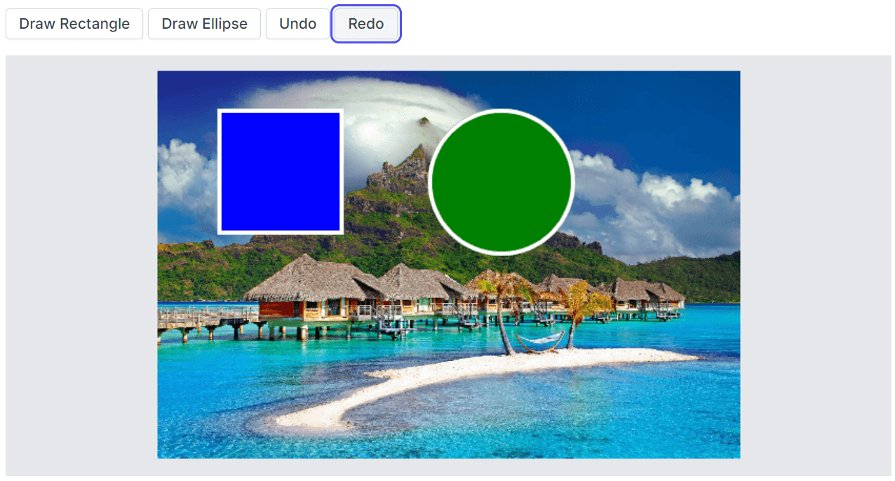
Undo and redo actions
The undo functionality is used to reverse the most recent modification to an image. By invoking the UndoAsync or Undo button, the Image Editor reverts the most recently applied action, effectively restoring the image to its previous state.
On the other hand, the redo functionality is used to reapply an action that was previously undone. After using the undo operation, users can use the RedoAsync method or Redo button to reapply the action and return the undone changes.
These features enhance the editing experience by allowing users to experiment, revert changes, and selectively apply or reapply modifications to achieve the desired result.
In the following code example, the UndoAsync and RedoAsync methods are used to undo and redo the actions performed in the Blazor Image Editor component.
@using Syncfusion.Blazor.ImageEditor
@using Syncfusion.Blazor.Buttons
 <div style="padding-bottom: 15px">
    <SfButton OnClick="RectangleAsync">Draw Rectangle</SfButton>
    <SfButton OnClick="EllipseAsync">Draw Ellipse</SfButton>
    <SfButton OnClick="UndoAsync">Undo</SfButton>
    <SfButton OnClick="RedoAsync">Redo</SfButton>
</div>

<SfImageEditor @ref="ImageEditor" Toolbar="customToolbarItem" Height="400">
    <ImageEditorEvents Created="CreatedAsync"></ImageEditorEvents>
</SfImageEditor>

@code {
    SfImageEditor ImageEditor;
    private List<ImageEditorToolbarItemModel> customToolbarItem = new List<ImageEditorToolbarItemModel>() { };

    private async void CreatedAsync()
    {
        await ImageEditor.OpenAsync("nature.png");
    }

    private async void RectangleAsync()
    {
        await ImageEditor.DrawRectangleAsync(200, 50, 120, 120, 4, "#fff", "blue");
    }

    private async void EllipseAsync()
    {
        await ImageEditor.DrawEllipseAsync(400, 50, 70, 70, 4, "#fff", "green");
    }

    private async void UndoAsync()
    {
        await ImageEditor.UndoAsync();
    }

    private async void RedoAsync()
    {
        await ImageEditor.RedoAsync();
    }
}
Toolbar
The Blazor Image Editor provides options to customize both the built-in and contextual toolbars.
The built-in toolbar can be customized by utilizing the Toolbar property. This allows developers to specify which toolbar items should be enabled and displayed in the Image Editor toolbar.
The ToolbarUpdating event can be utilized to add, remove, or modify toolbar items dynamically, ensuring the contextual toolbar offers relevant and desired customization options during annotation.
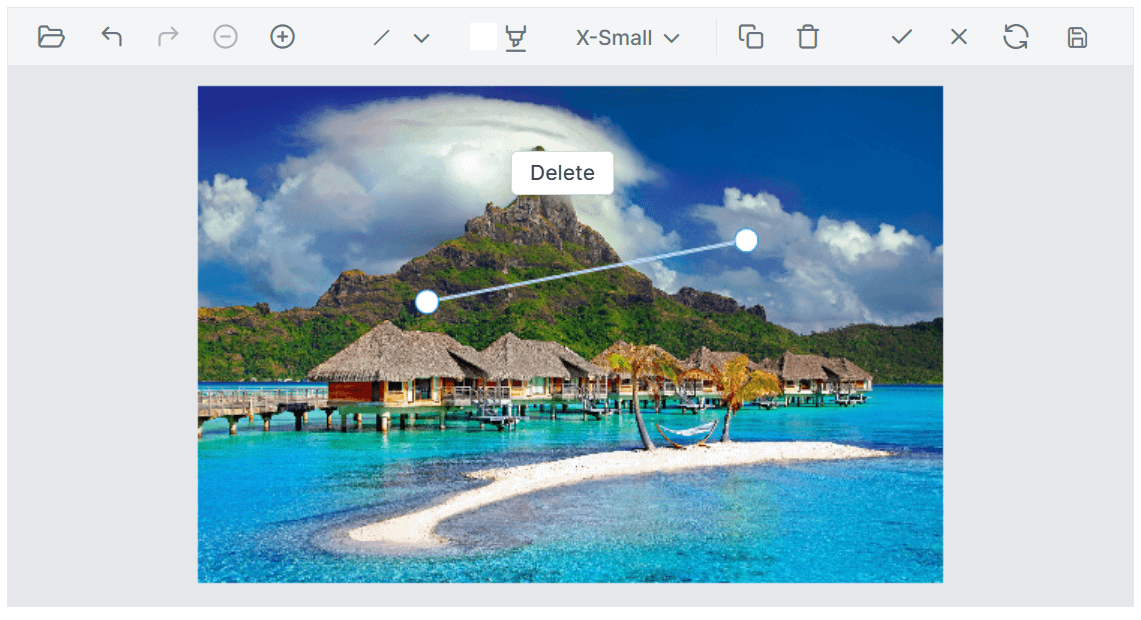
In the following code example, the contextual toolbar for the line is rendered by hiding the default delete button and adding a custom delete button using the ToolbarUpdating event.
To retrieve the inserted shapes, we’ve used the GetShapesAsync method, which provides a collection of shapes represented by ShapeSettings. This method allows you to access and work with the shapes inserted into the image.
@using Syncfusion.Blazor.ImageEditor
@using Syncfusion.Blazor.Navigations

<SfImageEditor @ref="ImageEditor" Height="400">
    <ImageEditorEvents Created="CreatedAsync" ToolbarUpdating="ToolbarUpdate" ToolbarItemClicked="ToolbarItemClickedAsync">
    </ImageEditorEvents>
</SfImageEditor>

@code {
    SfImageEditor ImageEditor;
    private async void CreatedAsync()
    {
        await ImageEditor.OpenAsync("nature.png");
    }

    private void ToolbarUpdate(ToolbarEventArgs args)
    {
        if (args.ToolbarType == ShapeType.Line)
        {
            var toolbarItemToRemove = args.ToolbarItems.FirstOrDefault(item => item.Name == "Remove");
           if (toolbarItemToRemove != null)
           {
                  toolbarItemToRemove.Visible = false;
           }
           args.ToolbarItems.Add(new ImageEditorToolbarItemModel { Text = "Delete", TooltipText = "Delete", Align = ItemAlign.Center });
        }
    }

    private async void ToolbarItemClickedAsync(ClickEventArgs args)
    {
        ShapeSettings[] shapeSetting = await ImageEditor.GetShapesAsync();
        if (args.Item.Text == "Delete" && shapeSetting.Length > 0)
        {
             await ImageEditor.DeleteShapeAsync(shapeSetting[0].ID);
         }
    }
}
Toolbar template
The Image Editor component allows users to replace its default toolbar with a custom, user-specific UI. This can be achieved by utilizing the ToolbarTemplate property. With this property, developers can design and implement a toolbar that includes their desired features, layout, and interactions.
In the following code example, the toolbar of the Image Editor is replaced with the user-specific UI using the ToolbarTemplate property.
@using Syncfusion.Blazor.ImageEditor
@using Syncfusion.Blazor.Buttons

<SfImageEditor @ref="ImageEditor" Height="400px">
    <ImageEditorEvents Created="CreatedAsync"></ImageEditorEvents>
    <ImageEditorTemplates>
        <ToolbarTemplate>
            <SfButton OnClick="ClickAsync">Enable FreehandDraw</SfButton>
        </ToolbarTemplate>
    </ImageEditorTemplates>
</SfImageEditor>

@code {
    SfImageEditor ImageEditor;
    private async void CreatedAsync()
    {
        await ImageEditor.OpenAsync("nature.png");
    }

    private async void ClickAsync()
    {
        await ImageEditor.EnableFreehandDrawAsync(true);
    }
}
Quick access toolbar
The quick access toolbar becomes active when we select annotations. The default items on the toolbar may differ depending on the annotation. The options to clone and delete annotations will appear by default. Additionally, users can personalize the toolbar items by utilizing the QuickAccessToolbarOpening event.
Quick access toolbar template
The Image Editor provides the flexibility to replace its default quick access toolbar with a custom, user-specific UI. This can be achieved by utilizing the QuickAccessToolbarTemplate property. This empowers users to create a personalized editing experience that perfectly suits their app’s needs and enhances the user interface.
Refer to the following code example.
@using Syncfusion.Blazor.ImageEditor
@using Syncfusion.Blazor.Buttons

<SfImageEditor @ref="ImageEditor" Height="400px">
    <ImageEditorEvents Created="CreatedAsync"></ImageEditorEvents>
    <ImageEditorTemplates>
        <QuickAccessToolbarTemplate>
            <SfButton OnClick="ClickAsync">Delete</SfButton>
        </QuickAccessToolbarTemplate>
    </ImageEditorTemplates>
</SfImageEditor>

@code {
    SfImageEditor ImageEditor;
    private async void CreatedAsync()
    {
        await ImageEditor.OpenAsync("nature.png");
    }

    private async void ClickAsync()
    {
        ShapeSettings[] shapeSetting = await ImageEditor.GetShapesAsync();
        if (args.Item.Text == "Delete" && shapeSetting.Length > 0)
        {
             await ImageEditor.DeleteShapeAsync(shapeSetting[0].ID);
         }
    }
}
Exporting an image
Users can save the edited images in the file formats PNG, JPEG, and SVG. This can be achieved by utilizing the ExportAsync method, where users can specify the desired file type and provide a file name for the saved image.
Adaptive and touch-friendly UI
The Blazor Image Editor is designed to be responsive and adapt to various screen sizes, making it suitable for all mobile devices by default. It provides a touch-friendly interface, allowing users to interact with the control using their fingers, stylus pens, or a mouse on the desktop and mobile devices.
Note: For more details, refer to the Blazor Image Editor live demos and documentation.
Upcoming features
The Blazor Image Editor component is now available in preview mode, and we’ve plans to include the following features in our future releases:
- Image annotation: To insert an image as an annotation.
- Resizing: To resize the images.
- IPTC standard: To add a meta tag to support IPTC standards.
- Frame support: To add a frame to the image.
Conclusion
Thanks for reading! In this blog, we’ve explored the features of the new Blazor Image Editor component in our latest 2023 Volume 2 release. To see the other updates of this release, we recommend visiting our Release Notes and What’s New pages. Stay informed about the latest enhancements and share your feedback in the comments section.
If you’re not a Syncfusion customer, you can download a free trial of Essential Studio® for Blazor to start exploring its controls immediately.
For questions, you can contact us through our support forums, support portal, or feedback portal. Our team is always ready to assist you!


 No spam, just valuable updates.