
 Manivannan Elangovan
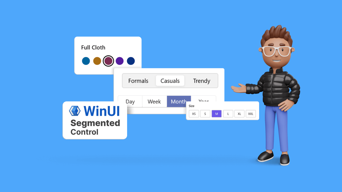
The Syncfusion WinUI Segmented Control is a user interface element that provides a simple way to choose from a linear set of two or more segments, each of which functions as a mutually exclusive option.
In this article, we’ll explore the practical benefits of using the WinUI Segmented Control to facilitate streamlined filtering and navigational capabilities in different apps.
Note: Before proceeding, refer to the getting started with WinUI Segmented Control documentation.
Navigation
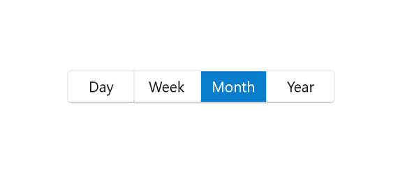
The WinUI Segmented Control allows users to switch between different sections or views within a user interface. For example, in a calendar app, you could use it to switch between “Day,” “Week,” “Month,” and “Year” views.
To demonstrate this concept, the following code examples showcase two distinct designs for the WinUI Segmented Control that categorize days, weeks, months, and years.
Basic Segmented Control design
Refer to the following code example. In it, the WinUI Segmented Control is created with a user-defined data source and a DataTemplate to present each category.
<syncfusion:SfSegmentedControl Margin="100" HorizontalAlignment="Center" VerticalAlignment="Center" SelectedIndex="2" ItemsSource="{Binding Days}">
  <syncfusion:SfSegmentedControl.ItemTemplate>
   <DataTemplate>
    <Grid>
     <TextBlock Text="{Binding Name}" VerticalAlignment="Center" HorizontalAlignment="Center"/>
    </Grid>
   </DataTemplate>
  </syncfusion:SfSegmentedControl.ItemTemplate>
</syncfusion:SfSegmentedControl>
After executing the previous code example, we’ll have a visually appealing Segmented Control that allows users to switch between different periods.
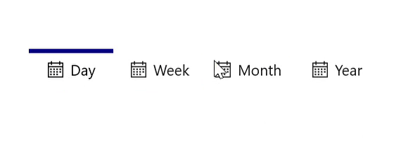
Customized Segmented Control design
We can also customize the appearance of the WinUI Segmented Control items. This can be done by modifying various properties, such as border styles, background colors, and icon rendering.
Refer to the following code example. In it, we’ll create a custom look for the Segmented Control.
<Grid HorizontalAlignment="Center" VerticalAlignment="Center">
 <Grid.Resources>
  <ResourceDictionary>
   <SolidColorBrush x:Key="SyncfusionSegmentedItemHoverBackground" Color="#7995f2"/>
   <SolidColorBrush x:Key="SyncfusionSegmentedItemPressedBackground" Color="#7995e6"/>
   <SolidColorBrush x:Key="SyncfusionSegmentedItemHoverForeground" Color="White"/>
   <SolidColorBrush x:Key="SyncfusionSegmentedItemSelectedHoverBackground" Color="#7995f2"/>
   <SolidColorBrush x:Key="SyncfusionSegmentedItemSelectedHoverForeground" Color="White"/>
   <SolidColorBrush x:Key="SyncfusionSegmentedItemSelectedForeground" Color="Black"/>
  </ResourceDictionary>
 </Grid.Resources>
 <syncfusion:SfSegmentedControl Margin="100" HorizontalAlignment="Center"
                                VerticalAlignment="Center" SelectedIndex="2"
                                BorderThickness="0" ItemBorderThickness="0,4,0,0"
                                CornerRadius="0" Background="Transparent"
                                SelectedSegmentStyle="{StaticResource topBorderStyle}"
                                ItemsSource="{Binding Days}">
  <syncfusion:SfSegmentedControl.ItemContainerStyle>
   <Style TargetType="syncfusion:SfSegmentedItem">
    <Setter Property="BorderBrush" Value="Transparent" />
    <Setter Property="Padding" Value="8" />
    <Setter Property="Margin" Value="2,0,2,0"/>
   </Style>
  </syncfusion:SfSegmentedControl.ItemContainerStyle>
  <syncfusion:SfSegmentedControl.ItemTemplate>
   <DataTemplate>
    <StackPanel Orientation="Horizontal">
     <Path Data="{Binding Icon}" Stretch="Uniform" Fill="{Binding RelativeSource={RelativeSource Mode=TemplatedParent}, Path=Foreground}" Width="16" Height="16" RenderTransformOrigin="0.5,0.5">
      <Path.RenderTransform>
       <TransformGroup>
        <TransformGroup.Children>
         <RotateTransform Angle="0" />
         <ScaleTransform ScaleX="1" ScaleY="1" />
        </TransformGroup.Children>
       </TransformGroup>
      </Path.RenderTransform>
     </Path>
     <TextBlock Text="{Binding Name}" Margin="6,0,0,0"
                VerticalAlignment="Center" HorizontalAlignment="Center"/>
    </StackPanel>
   </DataTemplate>
  </syncfusion:SfSegmentedControl.ItemTemplate>
 </syncfusion:SfSegmentedControl>
</Grid>
After executing the previous code example, we’ll have a customized Segmented Control design with distinct visual elements, enhancing user interaction and experience.
Filtering
We can also use the Segmented Control to filter data in a user interface. For example, in an e-commerce app, you can filter products based on different criteria, such as “Category,” “Size,” and “Color.”
One of the notable advantages of our WinUI Segmented Control is its support for customizing segment items’ shapes into circles, rectangles, or rounded rectangles to match the aesthetics of your app. This flexibility allows developers to create an interface that aligns with their branding and design choices.
Let’s see how to implement category, size, and color filtering scenarios in an e-commerce app using the WinUI Segmented Control.
Refer to the following code example to design the Segmented Control for choosing a category.
<syncfusion:SfSegmentedControl Height="36" Margin="0,20,0,0" HorizontalAlignment="Center" VerticalAlignment="Center" SelectedItem="{Binding SelectedItem, Mode=TwoWay}" CornerRadius="4" BorderThickness="1" ItemBorderThickness="0" SelectedSegmentStyle="{StaticResource shirtModelStyle}" ItemsSource="{Binding Shirts}" >
 <syncfusion:SfSegmentedControl.Resources>
  <ResourceDictionary>
   <SolidColorBrush x:Key="SyncfusionSegmentedControlBackground" Color="#F2F2F2"/>
   <SolidColorBrush x:Key="SyncfusionSegmentedItemBackground" Color="#F2F2F2"/>
   <SolidColorBrush x:Key="SyncfusionSegmentedItemSelectedBackground" Color="White"/>
   <SolidColorBrush x:Key="SyncfusionSegmentedItemHoverBackground" Color="#E4E4E4"/>
   <SolidColorBrush x:Key="SyncfusionSegmentedItemPressedBackground" Color="#E4E4E4"/>
   <SolidColorBrush x:Key="SyncfusionSegmentedItemSelectedHoverBackground" Color="#E4E4E4"/>
   <SolidColorBrush x:Key="SyncfusionSegmentedItemForeground" Color="Black"/>
   <SolidColorBrush x:Key="SyncfusionSegmentedItemHoverForeground" Color="Black"/>
   <SolidColorBrush x:Key="SyncfusionSegmentedItemPressedForeground" Color="Black"/>
   <SolidColorBrush x:Key="SyncfusionSegmentedItemSelectedHoverForeground" Color="Black"/>
   <SolidColorBrush x:Key="SyncfusionSegmentedItemSelectedForeground" Color="Black"/>
   <SolidColorBrush x:Key="SyncfusionSegmentedControlBorderBrush" Color="#D9D9D9"/>
  </ResourceDictionary>
 </syncfusion:SfSegmentedControl.Resources>
 <syncfusion:SfSegmentedControl.ItemContainerStyle>
  <Style TargetType="syncfusion:SfSegmentedItem">
   <Setter Property="Margin" Value="4" />
   <Setter Property="CornerRadius" Value="4" />
  </Style>
 </syncfusion:SfSegmentedControl.ItemContainerStyle>
 <syncfusion:SfSegmentedControl.ItemTemplate>
  <DataTemplate>
   <Grid>
    <TextBlock Text="{Binding Name}"
               VerticalAlignment="Center" HorizontalAlignment="Center"/>
   </Grid>
  </DataTemplate>
 </syncfusion:SfSegmentedControl.ItemTemplate>
</syncfusion:SfSegmentedControl>
Refer to the following image.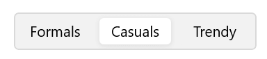
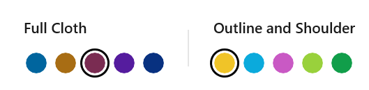
Now let’s design the Segmented Control for choosing a color.
. . .
<Style TargetType="Syncfusion:SelectedSegmentBorder" x:Key="circleStyle">
 <Setter Property="BorderThickness" Value="2" />
 <Setter Property="BorderBrush" Value="{ThemeResource SystemBaseHighColor}"/>
 <Setter Property="Width" Value="28"/>
 <Setter Property="Margin" Value="-4,0,0,0"/>
 <Setter Property=”CornerRadius” Value=”14” />
 <Setter Property="Background" Value="Transparent"/>
 <Setter Property="Canvas.Zindex" Value="2"/>
</Style>

. . .

<Syncfusion:SfSegmentedControl Margin="-2,35,0,0" HorizontalAlignment="Left" VerticalAlignment="Center" MinHeight="28" BorderThickness="0" Background="Transparent" SelectedItem="{Binding SelectedBackground, Mode=TwoWay}" ItemBorderThickness="0" SelectionAnimationType="None" SelectedSegmentStyle="{StaticResource circleStyle}" ItemsSource="{Binding Colors}">
  <Syncfusion:SfSegmentedControl.ItemContainerStyle>
   <Style TargetType="Syncfusion:SfSegmentedItem">
    <Setter Property="Width" Value="20" />
    <Setter Property="Height" Value="20" />
    <Setter Property="CornerRadius" Value="10" />
    <Setter Property="Padding" Value="0" />
    <Setter Property="Margin" Value="4,0,4,0"/>
   </Style>
  </Syncfusion:SfSegmentedControl.ItemContainerStyle>
  <Syncfusion:SfSegmentedControl.ItemTemplate>
   <DataTemplate>
    <Border Background="{Binding Background}" Width="20" Height="20" CornerRadius="10"/>
   </DataTemplate>
  </Syncfusion:SfSegmentedControl.ItemTemplate>
</Syncfusion:SfSegmentedControl>
Refer to the following image to see the code’s output.
 Finally, let’s design the Segmented Control for choosing a size.
. . .
<Style TargetType="Syncfusion:SelectedSegmentBorder" x:Key="shirtSizeStyle">
 <Setter Property="CornerRadius" Value="2"/>
 <Setter Property="Background" Value="{ThemeResource SelectedBackground}"/>
</Style>

. . .
<Syncfusion:SfSegmentedControl Margin="-3,35,0,20" VerticalAlignment="Center" HorizontalAlignment="Left" SelectedIndex="2" BorderThickness="0" SelectionAnimationType="None" ItemBorderThickness="1" Background="Transparent" SelectedSegmentStyle="{StaticResource shirtSizeStyle}" ItemsSource="{Binding Sizes}" >
 <Syncfusion:SfSegmentedControl.Resources>
   <ResourceDictionary>
    <SolidColorBrush x:Key="SyncfusionSegmentedItemSelectedBackground" Color="#6C58EA"/>
    <SolidColorBrush x:Key="SyncfusionSegmentedItemHoverBackground" Color="#E8E4FF"/>
    <SolidColorBrush x:Key="SyncfusionSegmentedItemPressedBackground" Color="#6C58CA"/>
    <SolidColorBrush x:Key="SyncfusionSegmentedItemSelectedHoverBackground" Color="#6C58EA"/>
    <SolidColorBrush x:Key="SyncfusionSegmentedItemForeground" Color="Black"/>
    <SolidColorBrush x:Key="SyncfusionSegmentedItemHoverForeground" Color="Black"/>
    <SolidColorBrush x:Key="SyncfusionSegmentedItemSelectedHoverForeground" Color="White"/>
    <SolidColorBrush x:Key="SyncfusionSegmentedItemSelectedForeground" Color="White"/>
   </ResourceDictionary>
  </Syncfusion:SfSegmentedControl.Resources>
  <Syncfusion:SfSegmentedControl.ItemContainerStyle>
    <Style TargetType="Syncfusion:SfSegmentedItem">
     <Setter Property="Margin" Value="3" />
     <Setter Property="Height" Value="33"/>
     <Setter Property="Width" Value="45"/>
     <Setter Property="CornerRadius" Value="2"/>
     <Setter Property="BorderBrush" Value="#C6C6C6"/>
    </Style>
  </Syncfusion:SfSegmentedControl.ItemContainerStyle>
  <Syncfusion:SfSegmentedControl.ItemTemplate>
    <DataTemplate>
     <Grid>
      <TextBlock Text="{Binding Name}" VerticalAlignment="Center" HorizontalAlignment="Center"/>
     </Grid>
    </DataTemplate>
  </Syncfusion:SfSegmentedControl.ItemTemplate>
</Syncfusion:SfSegmentedControl>
The following image shows the customized control.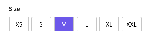
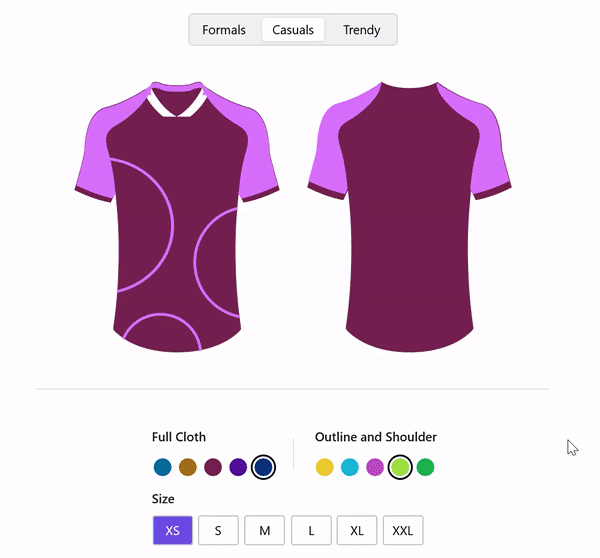
The output UI combining the category, color and size selectors is shown in the following image.
GitHub reference
For more details, refer to the WinUI Segmented Control demo on GitHub.
Conclusion
Thanks for reading! I hope you found the information about our WinUI Segmented Control and its features interesting. This control is a powerful and versatile tool that can improve the user experience in apps by simplifying navigation and streamlining data filtering.
Our WinUI demo app is available for download in the Microsoft Store. After trying it out, please share your thoughts in the comment section below.
The latest version of our WinUI controls can be found on the License and Downloads page for current customers. If you’re not a Syncfusion customer, take advantage of our 30-day free trial to explore the newest features.
Don’t hesitate to contact us through our support forums, support portal, or feedback portal. We’re always here to help!
Related blogs
- Chart of the Week: Creating a WinUI 100% Stacked Column Chart for Global Distribution of Cloud Provider Data Centers
- Personalize your WinUI DataGrid: Quick and Simple Customization Techniques
- Introducing the New WinUI AvatarView Control
- How to Synchronize Outlook Calendar Events with Syncfusion WinUI Scheduler
 No spam, just valuable updates.