

Welcome to our Chart of the Week blog series!
Today, we will construct a stacked column chart that displays the volume of smartphone shipments worldwide for each quarter of 2022. But that is not all! We will also generate a line chart that represents the market share of smartphones for 2022.
We will utilize the Syncfusion .NET MAUI Cartesian Charts control to accomplish this. This versatile control is compatible with desktop platforms (Windows and Mac) and mobile platforms (Android and iOS), making it a powerful tool for data visualization.
The Stacked Column Chart we are creating is a type of chart with columns stacked on top of one another. This allows for an easy comparison of the total volumes and the relative contribution of each subcategory. In our case, the columns will represent the quarterly smartphone shipments for 2022.
Simultaneously, the Line Chart will provide a clear illustration of the market share of smartphones in 2022, offering a comprehensive view of the smartphone industry landscape throughout the year.
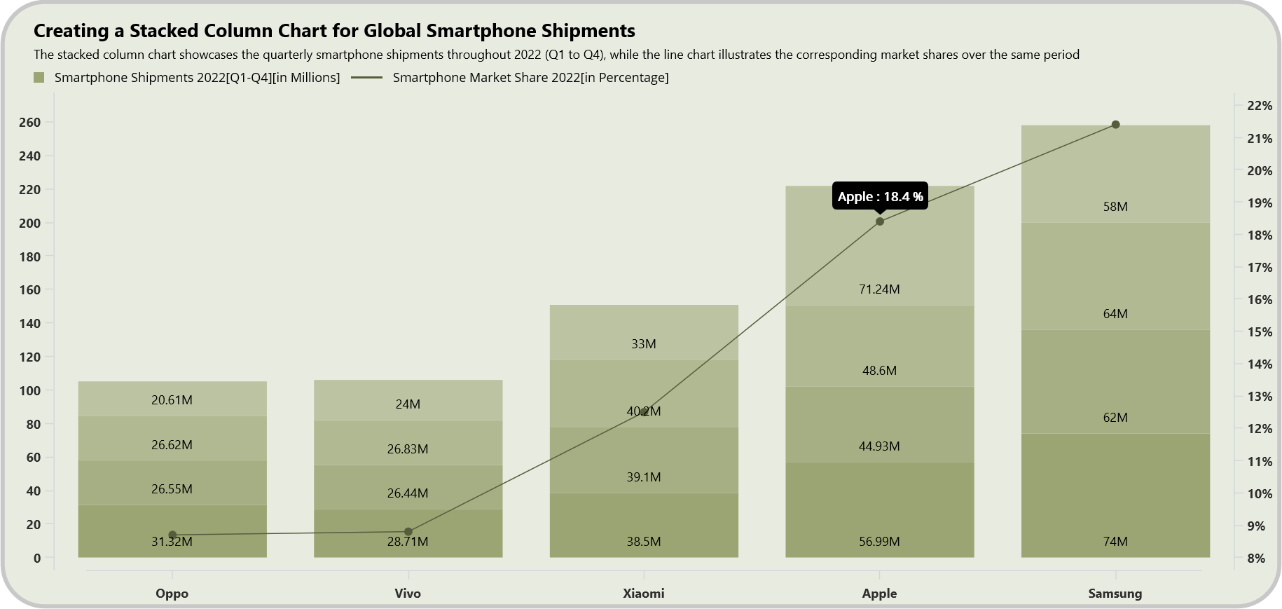
Refer to the following image.
Let’s get started!
Step 1: Collecting data on smartphone shipments
First, gather data on the global smartphone shipments for each quarter of 2022 and collect the market share data for smartphones in 2022.
Step 2: Preparing data for the chart
Create a Model class that includes properties for storing information about quarterly smartphone shipments and the market share of smartphones.
Refer to the following code example.
public class Model
{
      public string BrandName { get; set; }
      public double Quarter1 { get; set; }
      public double Quarter2 { get; set; }
      public double Quarter3 { get; set; }
      public double Quarter4 { get; set; }
      public double MarketShare { get; set; }

      public Model(string brandName,double q1, double q2, double q3, double q4, double marketShare)
      {
          BrandName = brandName;
          Quarter1 = q1;
          Quarter2 = q2;
          Quarter3 = q3;
          Quarter4 = q4;
          MarketShare = marketShare;
      }
}
Next, configure the ViewModel class to create a collection of data on smartphone shipments per quarter and their market share and store it in an observable collection using the ShipmentsData property.
Refer to the following code example.
public class ViewModel
{
     public ObservableCollection<Model> ShipmentsData { get; set; }

     public ViewModel()
     {
         ShipmentsData = new ObservableCollection<Model>()
         {
              new Model ("Oppo", 31.32, 26.55, 26.62, 20.61, 8.7),
              new Model ("Vivo",28.71, 26.44, 26.83, 24, 8.8),
              new Model ("Xiaomi", 38.5, 39.1, 40.2, 33, 12.5),
              new Model ("Apple", 56.99,  44.93,  48.6, 71.24,  18.4),
              new Model ("Samsung", 74, 62, 64, 58 , 21.4)

         };

     }
}
Step 3: Defining the layout
Define a layout using a Border element. Inside the border, utilize a Grid to place the elements.
Refer to the following code example.
<Border Background="#e8ebe0"
        StrokeThickness="4"
        StrokeShape="RoundRectangle 40"
        Margin="30">

 <Grid RowDefinitions="1*,7*" Margin="10" RowSpacing="0">
  <! --Align Header-->
  <Grid Grid.Row="0" RowDefinitions="*,*,*">
            …
  </Grid>
       …
 </Grid>
</Border>
Step 4: Configuring the Syncfusion .NET MAUI Cartesian Charts
Now, configure the Syncfusion .NET MAUI Cartesian Charts control using this documentation.
Refer to the following code example.
<chart:SfCartesianChart Grid.Row="1">

 <chart:SfCartesianChart.XAxes>
  <chart:CategoryAxis />
 </chart:SfCartesianChart.XAxes>

 <chart:SfCartesianChart.YAxes>
  <chart:NumericalAxis />
 </chart:SfCartesianChart.YAxes>
</chart:SfCartesianChart>
Step 5: Binding data to the chart
To bring the global smartphone shipments to life, we’ll employ Syncfusion’s StackingColumnSeries.
Initially, establish a connection between the ViewModel and the page’s binding context. This connection will grant access to the properties of the ViewModel. Following this, bind the properties of the ViewModel to the x- and y-axes of the chart using the XbindingPath and YbindingPath properties. To finish, set the ItemsSource to gain access to the collection.
Refer to the following code example.
<ContentPage.BindingContext>
 <model:ViewModel></model:ViewModel>
</ContentPage.BindingContext>


<chart:SfCartesianChart Grid.Row="1" >

 <chart:StackingColumnSeries ItemsSource="{Binding ShipmentsData}"
                             XbindingPath="BrandName"
                             YbindingPath="Quarter1"/>


 <chart:StackingColumnSeries ItemsSource="{Binding ShipmentsData}"
                             XbindingPath="BrandName"
                             YbindingPath="Quarter2"/>

 <chart:StackingColumnSeries ItemsSource="{Binding ShipmentsData}"
                             XbindingPath="BrandName"
                             YbindingPath="Quarter3"/>

 <chart:StackingColumnSeries ItemsSource="{Binding ShipmentsData}"
                             XbindingPath="BrandName"
                             YbindingPath="Quarter4"/>

</chart:SfCartesianChart>
Next, utilize Syncfusion’s LineSeries instances to represent the global smartphone market share. Bind the BrandName and MarketShare properties to the x- and y-axes using XBindingPath and YBindingPath properties. Set the ItemsSource to access the collection.
<chart:SfCartesianChart Grid.Row="1" >
 …
 <chart:LineSeries XBindingPath="BrandName"
                   YBindingPath="MarketShare"
                   ItemsSource="{Binding ShipmentsData}"/>
</chart:SfCartesianChart>
Step 6: Setting multiple y-axes to the chart
In this step, we’ll create a distinct y-axis for the line chart. This process begins with generating a y-axis and assigning a unique name. This name is subsequently bound to the line series, establishing a connection between them.
The versatility of the Cartesian Charts enables us to create multiple series, each having its own dedicated x- and y-axes. To improve the chart’s readability, modify the CrossesAt property, which will position the y-axis at the end of the chart (values are in percentages).
<chart:SfCartesianChart>
 <chart:SfCartesianChart.YAxes>
  <chart:NumericalAxis ShowMajorGridLines="False"/>
  <chart:NumericalAxis Name="YAxis"
                       CrossesAt="{Static x:Double.MaxValue}"
                       ShowMajorGridLines="False"/>
 </chart:SfCartesianChart.YAxes>

 <chart:LineSeries XBindingPath="BrandName"
                   YBindingPath="MarketShare"
                   ItemsSource="{Binding ShipmentsData}"
                   YAxisName="YAxis"/>
</chart:SfCartesianChart>
Step 7: Customizing the chart appearance
Let’s enhance the visual appeal of the Stacked Column Chart and its elements.
Set the title
Refer to the following code example to set the chart title.
<!--Customize Header-->
<Grid Grid.Row="0" RowDefinitions="*,*,*">

 <Label Text="Creating a Stacked Column Chart for Global Smartphone Shipments"
        TextColor="Black"
        FontSize="18"
        FontFamily="TimeSpan"
        FontAttributes="Bold"
        Grid.Row="0"
        Margin="18,0,0,0"/>

 <Label Text="The stacked column chart showcases the quarterly smartphone shipments throughout 2022 (Q1 to Q4), while the line chart illustrates the corresponding market shares over the same period"
        TextColor="Black"
        FontSize="12"
        FontFamily="TimeSpan"
        Grid.Row="1"
        Margin="18,3,0,0"/>
 <StackLayout Orientation="Horizontal" Grid.Row="2" Spacing="10" Margin="18,0,0,0">
  <BoxView BackgroundColor="#9aa573"
           HeightRequest="10"
           WidthRequest="10"
           HorizontalOptions="Start"
           VerticalOptions="Start"
           Margin="0,4,0,0" />

  <Label Text="Smartphone Shipments 2022[Q1-Q4][in Millions]"
         TextColor="Black"
         FontSize="12"/>

  <BoxView BackgroundColor="#555d3c"
           HeightRequest="2"
           WidthRequest="30"
           HorizontalOptions="Start"
           VerticalOptions="Start"
           Margin="0,8,0,0"/>

  <Label Text="Smartphone Market Share 2022[in Percentage]"
         TextColor="Black"
         FontSize="12"/>
 </StackLayout>
</Grid>
Customizing the axes
Then, we will customize the x- and y-axes using the MajorGrideLines, Title, Text, and Interval properties.
<!--X-Axis-->
 <chart:SfCartesianChart.XAxes>
  <chart:CategoryAxis IsVisible="True"
                      ShowMajorGridLines="False"
                      AxisLineOffset="30">
   <chart:CategoryAxis.LabelStyle>
    <chart:ChartAxisLabelStyle FontAttributes="Bold" />
   </chart:CategoryAxis.LabelStyle>
  </chart:CategoryAxis>
 </chart:SfCartesianChart.XAxes>

<!--Y-Axis-->
 <chart:SfCartesianChart.YAxes>
  <chart:NumericalAxis ShowMajorGridLines="False"
                       Maximum="270"
                       Interval="20"
                       EdgeLabelsDrawingMode="Fit">
   <chart:NumericalAxis.LabelStyle>
    <chart:ChartAxisLabelStyle FontAttributes="Bold"/>
   </chart:NumericalAxis.LabelStyle>
  </chart:NumericalAxis>
  <chart:NumericalAxis  Name="YAxis"
                        CrossesAt="{Static x:Double.MaxValue}"
                        ShowMajorGridLines="False"
                        EdgeLabelsDrawingMode="Fit">
   <chart:NumericalAxis.LabelStyle>
    <chart:ChartAxisLabelStyle LabelFormat="0'%"
                               FontAttributes="Bold"/>
   </chart:NumericalAxis.LabelStyle>
  </chart:NumericalAxis>
</chart:SfCartesianChart.YAxes>
Customizing the series and data label appearance
Next, customize the StackingColumn and Line series using the Fill properties and the series data labels using the DataLabelSetting and LabelStyle properties.
<!--Quater 1 Smartphone shipments -->
<chart:StackingColumnSeries ShowDataLabels="True"
                            ItemsSource="{Binding ShipmentsData}"
                            XBindingPath="BrandName"
                            YBindingPath="Quarter1"
                            Fill="#9aa573">
 <chart:StackingColumnSeries.DataLabelSettings>
  <chart:CartesianDataLabelSettings LabelPlacement="Inner" UseSeriesPalette="False" BarAlignment="Bottom">
   <chart:CartesianDataLabelSettings.LabelStyle>
    <chart:ChartDataLabelStyle LabelFormat="0.##'M"
                               TextColor="Black"/>
   </chart:CartesianDataLabelSettings.LabelStyle>
  </chart:CartesianDataLabelSettings>
 </chart:StackingColumnSeries.DataLabelSettings>
</chart:StackingColumnSeries>


<chart:StackingColumnSeries ShowDataLabels="True"
                            ItemsSource="{Binding ShipmentsData}"
                            XBindingPath="BrandName"
                            YBindingPath="Quarter2"
                            StrokeWidth="7"
                            Fill="#a5af83">
 <chart:StackingColumnSeries.DataLabelSettings>
  <chart:CartesianDataLabelSettings LabelPlacement="Inner"
                                    UseSeriesPalette="False"
                                    BarAlignment="Bottom">
   <chart:CartesianDataLabelSettings.LabelStyle>
    <chart:ChartDataLabelStyle LabelFormat="0.##'M"
                               TextColor="Black"/>
   </chart:CartesianDataLabelSettings.LabelStyle>
  </chart:CartesianDataLabelSettings>
 </chart:StackingColumnSeries.DataLabelSettings>
</chart:StackingColumnSeries>

<chart:StackingColumnSeries ShowDataLabels="True"
                            ItemsSource="{Binding ShipmentsData}"
                            XBindingPath="BrandName"
                            YBindingPath="Quarter3"
                            Fill="#b0b992">
 <chart:StackingColumnSeries.DataLabelSettings>
  <chart:CartesianDataLabelSettings LabelPlacement="Inner"
                                    UseSeriesPalette="False"
                                    BarAlignment="Bottom">
   <chart:CartesianDataLabelSettings.LabelStyle>
    <chart:ChartDataLabelStyle LabelFormat="0.##'M"
                               TextColor="Black"/>
   </chart:CartesianDataLabelSettings.LabelStyle>
  </chart:CartesianDataLabelSettings>
 </chart:StackingColumnSeries.DataLabelSettings>
</chart:StackingColumnSeries>

<chart:StackingColumnSeries ShowDataLabels="True"
                            ItemsSource="{Binding ShipmentsData}"
                            XBindingPath="BrandName"
                            YBindingPath="Quarter4"
                            Fill="#bbc3a2">
 <chart:StackingColumnSeries.DataLabelSettings>
  <chart:CartesianDataLabelSettings LabelPlacement="Inner"
                                    UseSeriesPalette="False"
                                    BarAlignment="Bottom">
   <chart:CartesianDataLabelSettings.LabelStyle>
    <chart:ChartDataLabelStyle TextColor="Black"
                               LabelFormat="0.##'M"/>
   </chart:CartesianDataLabelSettings.LabelStyle>
  </chart:CartesianDataLabelSettings>

 </chart:StackingColumnSeries.DataLabelSettings>
</chart:StackingColumnSeries>

<chart:LineSeries XBindingPath="BrandName"
                  YBindingPath="MarketShare"
                  ItemsSource="{Binding ShipmentsData}"
                  YAxisName="YAxis"
                  ShowMarkers="True"
                  EnableTooltip="True"
                  TooltipTemplate="{StaticResource tooltipTemplate}"
                  Fill="#555d3c">
 <chart:LineSeries.MarkerSettings>
  <chart:ChartMarkerSettings Type="Circle"
                             Height="8"
                             Width="8"/>
 </chart:LineSeries.MarkerSettings>
</chart:LineSeries>
Customizing the tooltip using a template
We can also customize the tooltip using a tooltip template. First, create a date template using the brand name and market share, and then bind this template to the tooltip using the Tooltip template property.
<chart:SfCartesianChart.Resources>
 <DataTemplate x:Key="tooltipTemplate">
  <StackLayout Orientation="Horizontal">
   <Label Text="{Binding Item.BrandName}"
          TextColor="White"
          FontAttributes="Bold"
          FontSize="12"
          HorizontalOptions="Center"
          VerticalOptions="Center"/>
   <Label Text=" : "
          TextColor="White"
          FontAttributes="Bold"
          FontSize="12"
          HorizontalOptions="Center"
          VerticalOptions="Center"/>
   <Label Text="{Binding Item.MarketShare,StringFormat='{0:F1} %'}"
          TextColor="White"
          FontAttributes="Bold"
          FontSize="12"
          Margin="3,0,0,0"
          HorizontalOptions="Center"
          VerticalOptions="Center"/>
  </StackLayout>
 </DataTemplate>
</chart:SfCartesianChart.Resources>
…
<chart:LineSeries XBindingPath="BrandName"
                  YBindingPath="MarketShare"
                  ItemsSource="{Binding ShipmentsData}"
                  YAxisName="YAxis"
                  ShowMarkers="True"
                  EnableTooltip="True"
                  TooltipTemplate="{StaticResource tooltipTemplate}"
                  Fill="#555d3c"/>
After executing the previous code examples, our output will look like the following image.
GitHub reference
For more details, refer to the project on Github.

Conclusion
Thanks for reading! This blog showed us how to create a stacked column chart using the Syncfusion .NET MAUI Cartesian Charts control to visualize global smartphone shipments and their market share in 2022. We encourage you to follow these steps and share your thoughts in the comment section below.
If you require assistance, please don’t hesitate to contact us via our support forum, support portal, or feedback portal. We are always happy to help you!
Related blogs
- Chart of the Week: Creating a .NET MAUI Scatter Chart to Visualize CO2 Emissions vs. Fossil Fuel Consumption
- Introducing the New .NET MAUI PullToRefresh Control
- Chart of the Week: Create a .NET MAUI Stacked Area Chart to Visualize US School Revenue as a Share of GDP by Funding Sources
- Introducing the .NET MAUI Navigation Drawer Control
 No spam, just valuable updates.