
Welcome to our Chart of the Week blog series!
Today, we’ll visualize the relationship between CO2 emissions and fossil fuel consumption per capita in 2022 using the Syncfusion .NET MAUI Scatter Chart.
In many developing countries, most of the population relies on coal, oil, and gas for their daily energy needs. Numerous industries also contribute to global carbon dioxide emissions through the consumption of these fossil fuels.
The combustion of fossil fuels causes an increase in greenhouse gas concentrations in the atmosphere. The accumulation of these gases leads to the retention of heat in the Earth’s atmosphere, resulting in a gradual escalation in global temperatures.
Let’s examine the quantity of carbon dioxide emitted in tons versus fossil fuel burned in thousands of kilowatt-hours for coal, oil, and gas in 2022.
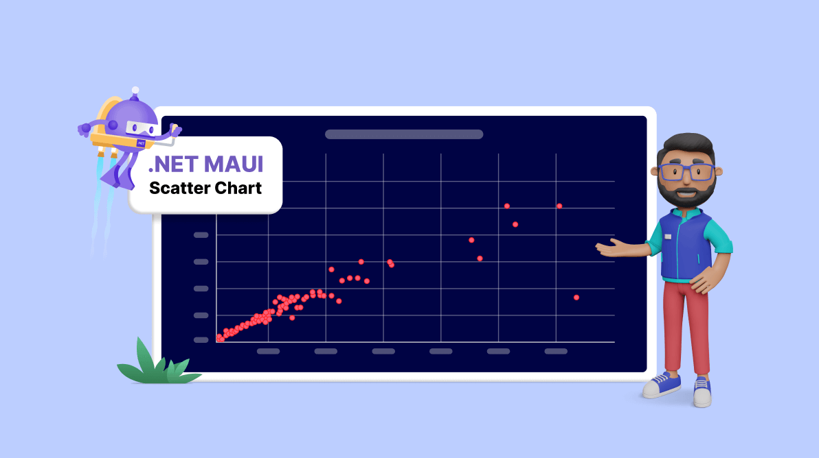
The following image shows the chart we’re going to build.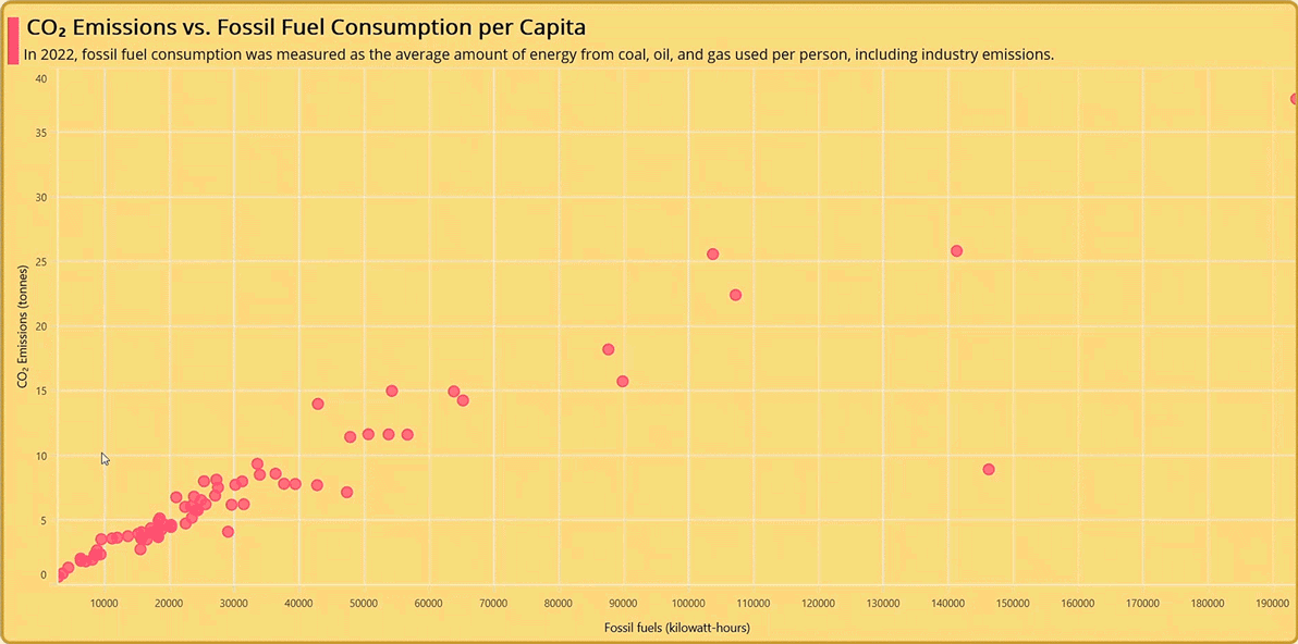
Step 1: Gathering CO2 emission and fossil fuel consumption data
First, let’s gather the data on CO2 emissions and fossil fuel consumption from Our World in Data in 2022.
Step 2: Preparing the data for the chart
Create the Model class with the help of the Fossil_fuel, CO2_Emissions, and Countries properties.
public class Model
{
    public double CO2_Emissions { get; set; }
    public double Fossil_fuel { get; set; }
    public string Countries { get; set; }

    public Model(string countries, double CO2_emission, double fuel)
    {
        Countries = countries;
        CO2_Emissions = CO2_emission;
        Fossil_fuel = fuel;
    }
}
Then, generate the CO2 emissions and average fossil fuel consumption data collection using the ViewModel class and its CO2_Emission_Fuel_Consumption property. Assign the CSV data to the Co2 emissions and fuel consumption data collection using the ReadCSV method and store it in the CO2_Emission_Fuel_Consumption property.
Refer to the following code example.
public class ViewModel
{
    private List<Model>? co2_Emission_Fuel_Consumption;
    public List<Model>? CO2_Emission_Fuel_Consumption
    {
        get { return co2_Emission_Fuel_Consumption; }
        set
        {
            co2_Emission_Fuel_Consumption = value;
        }
    }

    /// <summary>
    ///
    /// </summary>
    public ViewModel()
    {
        CO2_Emission_Fuel_Consumption = new List<Model>(ReadCSV());
    }

    public IEnumerable<Model> ReadCSV()
    {
        Assembly executingAssembly = typeof(App).GetTypeInfo().Assembly;
        Stream? inputStream = executingAssembly.GetManifestResourceStream("ScatterChartMAUI.Resources.Raw.fuel_co2_emission.csv");

        string? line;
        List<string> lines = new List<string>();

        using StreamReader reader = new StreamReader(inputStream);
        while ((line = reader.ReadLine()) != null)
        {
            lines.Add(line);
        }
        lines.RemoveAt(0);
        return lines.Select(line =>
        {
            string[] data = line.Split(',');

            return new Model(data[0].ToString(), Convert.ToDouble(data[1]), Convert.ToDouble(data[2]));
        });
    }
}
Step 3: Configuring the Syncfusion .NET MAUI Cartesian Charts
Configure the Syncfusion .NET MAUI Cartesian Charts control using this documentation.
Refer to the following code example.
<chart:SfCartesianChart>

 <chart:SfCartesianChart.XAxes>
  <chart:NumericalAxis>
  </chart:NumericalAxis>
 </chart:SfCartesianChart.XAxes>

 <chart:SfCartesianChart.YAxes>
  <chart:NumericalAxis>
  </chart:NumericalAxis>
 </chart:SfCartesianChart.YAxes>

</chart:SfCartesianChart>
Step 4: Initialize the BindingContext for the chart
Configure the Model class on the ViewModel class of your XAML page to bind its properties to the BindingContext of the SfCartesianChart.
Refer to the following code example.
<chart:SfCartesianChart.BindingContext>
 <model:ViewModel/>
</chart:SfCartesianChart.BindingContext>
Step 5: Bind the CO2 emission data to the Scatter Chart
To visualize the relationship between CO2 emissions and fossil fuel consumption in 2022, we’ll use the Syncfusion ScatterSeries instance.
Refer to the following code example.
<chart:ScatterSeries ItemsSource="{Binding CO2_Emission_Fuel_Consumption}" XBindingPath="Fossil_fuel" YBindingPath="CO2_Emissions">
</chart:ScatterSeries>
In the previous code example, we bound the ItemSource with the CO2_Emission_Fuel_Consumption property. We specified the XBindingPath with the Fossil_fuel property and the YBindingPath with the CO2_Emissions property.
Step 6: Customizing the chart appearance
We can customize the Scatter Chart’s appearance by changing the axis elements’ appearance, customizing the scatter points, setting a chart background, and adding a title, among other customizations.
Customizing the chart title
Refer to the following code example to customize the Scatter Chart title using the Title property.
<chart:SfCartesianChart.Title>
 <Grid HorizontalOptions="Start" Margin="5" VerticalOptions="Center">
  <Grid.ColumnDefinitions>
   <ColumnDefinition Width="13"/>
   <ColumnDefinition Width="*"/>
  </Grid.ColumnDefinitions>
  <StackLayout Orientation="Vertical" Background="#fc3a75" Margin="0,10,0,0"  Grid.RowSpan="2"/>
  <VerticalStackLayout Margin="5,0,0,0" HorizontalOptions="Start" Grid.Column="1">
   <Label  Margin="3" Text="CO₂ Emissions vs. Fossil Fuel Consumption per Capita"
           LineBreakMode="WordWrap" HorizontalOptions="StartAndExpand"
           VerticalOptions="CenterAndExpand" FontAttributes="Bold"
           TextColor="Black" FontSize="25" />
   <Label HorizontalOptions="StartAndExpand" VerticalOptions="CenterAndExpand"
          LineBreakMode="WordWrap" TextColor="Black"  FontSize="17"
          Text=" In 2022, fossil fuel consumption was measured as the average amount of energy from coal, oil, and gas used per person, including industry emissions." />
  </VerticalStackLayout>
 </Grid>
</chart:SfCartesianChart.Title>
Customize the chart axes
Let’s customize the axes titles, text color, font size, and axis line styles using the ChartAxisTitle property.
<chart:SfCartesianChart.XAxes>
 <chart:NumericalAxis>
  <chart:NumericalAxis.Title>
   <chart:ChartAxisTitle Text="Fossil fuels (kilowatt-hours)"
                         FontSize="14" TextColor="#020308" />
  </chart:NumericalAxis.Title>
 </chart:NumericalAxis>
</chart:SfCartesianChart.XAxes>
<chart:SfCartesianChart.YAxes>
 <chart:NumericalAxis>
  <chart:NumericalAxis.Title>
   <chart:ChartAxisTitle Text="CO₂ Emissions (tonnes)"
                         FontSize="14" TextColor="#020308" />
  </chart:NumericalAxis.Title>
 </chart:NumericalAxis>
</chart:SfCartesianChart.YAxes>
Next, we customize the axis label color using the TextColor property in the LabelStyle and customize the axis line using the StrokeWidth and Stroke properties in the AxisLineStyle of the axis.
<chart:SfCartesianChart.XAxes>
 <chart:NumericalAxis>
  <chart:NumericalAxis.LabelStyle>
   <chart:ChartAxisLabelStyle TextColor="#C4020308" />
  </chart:NumericalAxis.LabelStyle>

  <chart:NumericalAxis.AxisLineStyle>
   <chart:ChartLineStyle StrokeWidth ="1" Stroke="White"/>
  </chart:NumericalAxis.AxisLineStyle>

 </chart:NumericalAxis>
</chart:SfCartesianChart.XAxes>
<chart:SfCartesianChart.YAxes>
 <chart:NumericalAxis>
  <chart:NumericalAxis.LabelStyle>
   <chart:ChartAxisLabelStyle TextColor="#C4020308" />
  </chart:NumericalAxis.LabelStyle>

  <chart:NumericalAxis.AxisLineStyle>
   <chart:ChartLineStyle StrokeWidth ="1" Stroke="White"/>
  </chart:NumericalAxis.AxisLineStyle>

 </chart:NumericalAxis>
</chart:SfCartesianChart.YAxes>
Customize the scatter plot appearance
We can customize the scatter point height and width using the PointHeight and PointWidth properties. Then, we customize the scatter color and border using the Fill and Stroke properties, respectively.
Enabling tooltips
We can display additional information about CO2 emissions and fossil fuel consumption per capita by enabling the tooltip using the EnableTooltip property. We will customize its appearance using the TooltipTemplate property.
<chart:ScatterSeries EnableTooltip="True" ItemsSource="{Binding CO2_Emission_Fuel_Consumption}" Fill="#C2fc3a75" Label="United States" Stroke="#fc3a75" PointHeight="12" PointWidth="12" TooltipTemplate="{StaticResource toolTip1}" StrokeWidth="2" XbindingPath="Fossil_fuel" YbindingPath="CO2_Emissions">
</chart:ScatterSeries>
Step 7: Enabling zooming
Using the selection zooming feature, we can focus on a specific area of the chart and zoom in based on our viewing perspective. This can be done by enabling the EnableSelectionZooming property in the ZoomPanBehavior using the ChartZoomPanBehavior instance.
<chart:SfCartesianChart.ZoomPanBehavior>
 <chart:ChartZoomPanBehavior EnableSelectionZooming="True"/>
</chart:SfCartesianChart.ZoomPanBehavior>
To perform selection zooming on a desktop, hold the left mouse button, double-click, and drag. On a mobile device, hold your finger, double-tap, and drag to create a selection rectangle.
After executing the previous code example, we’ll get output like in the following GIF image.

GitHub reference
For more details, refer to the GitHub demo.
Conclusion
Thanks for reading! In this blog, we’ve seen how to visualize the relationship between CO2 emissions and fossil fuel consumption per capita using the Syncfusion .NET MAUI Scatter Chart. We encourage you to try the steps discussed and share your thoughts in the comments below.
If you require assistance, please don’t hesitate to contact us via our support forum, support portal, or feedback portal. We are always eager to help you!


Related blogs
- Introducing the New .NET MAUI PullToRefresh Control
- Chart of the Week: Create a .NET MAUI Stacked Area Chart to Visualize US School Revenue as a Share of GDP by Funding Sources
- Introducing the .NET MAUI Navigation Drawer Control
- Chart of the Week: Creating a .NET MAUI Dynamic Bar Race Chart for the Top 10 Populations in the World
 No spam, just valuable updates.
Comments (2)
Why don’t you do a chart on E.V. benefits VS. the waste of manufacturing and maintaining E.V. vehicles, and the massive Earth destruction caused by strip mining?
Hi Mike Lopez,
Thank you for your suggestion, we can consider the provided topics and write blog in upcoming chart of week section.
Best regards,
Nanthini M.