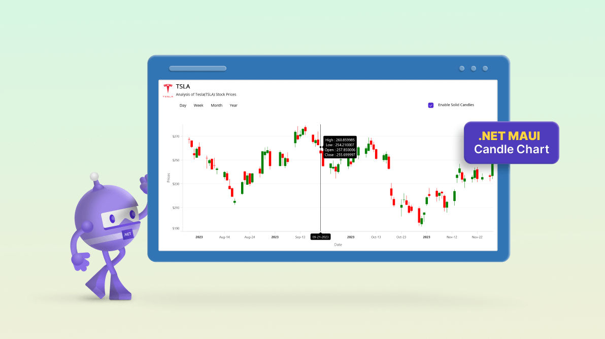
Welcome to our Chart of the Week blog series!
Today, we’ll analyze Tesla’s (TSLA) stock prices through the lens of candlestick chart analysis using the Syncfusion .NET MAUI Candle Chart.
In the fast-paced realm of finance, candle charts help analysts understand the intricacies of stock movements. A candle chart, also called a candlestick chart, is a powerful visual tool that can unveil patterns, trends, and potential turning points in the market. Join us as we dissect the historical performance of TSLA, uncovering the stories hidden within the data.
Whether you’re a seasoned investor or a newcomer to the stock market, this analysis aims to show you how candle charts can provide actionable insights to enhance your decision-making.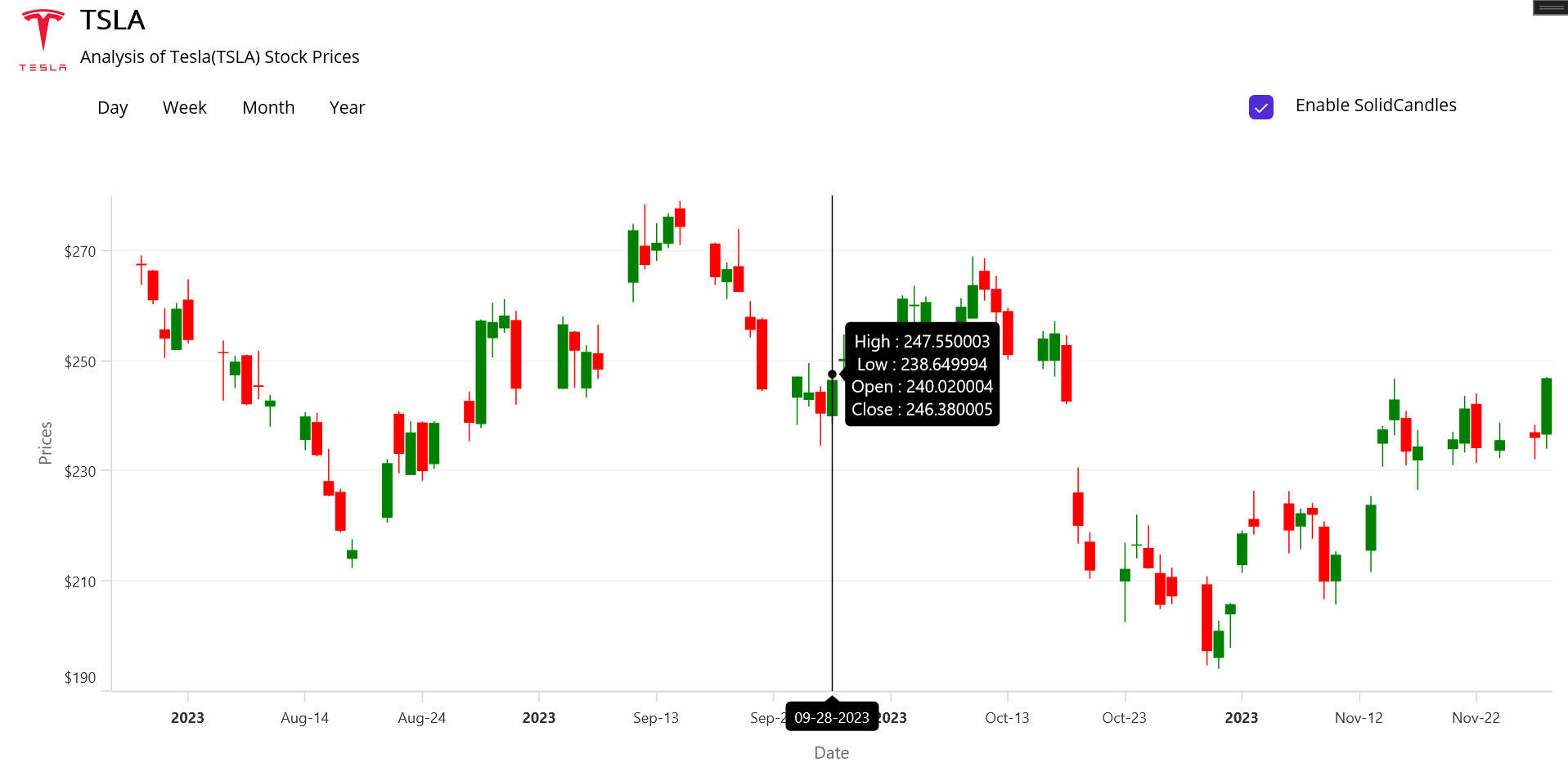
Step 1: Gather data for the stock prices of Tesla
Before creating the chart, we need to gather the historical data of Tesla’s stock prices. For this demo, we are getting data from Nov. 2022 to Nov. 2023.
Step 2: Prepare the data for the chart
Create the StockPriceModel class for holding stock price data with the help of the Date, Open, High, Low, and Close properties.
Refer to the following code example.
public StockPriceModel(DateTime date,double open,double high,double low,double close)
 {
     Date = date;
     Open = open;
     High = high;
     Low = low;
     Close = close;
 }
Generate the data collection with the help of the StockPriceViewModel class and StockDataCollection property.
Then, convert the CSV data to a collection of stock data using the ReadCSV method and store it in the StockData collection property.
public class StockPriceViewModel : INotifyPropertyChanged
 {
     private ObservableCollection<StockPriceModel> _stockPrices;

     public ObservableCollection<StockPriceModel> StockPrices
     {
         get
         {
             return _stockPrices;
         }
         set
         {
             _stockPrices = value;
             PropertyChanged?.Invoke(this, new PropertyChangedEventArgs("StockPrices"));
         }
     }
     public StockPriceViewModel()
     {
         StockPrices = new ObservableCollection<StockPriceModel>(ReadCSV("CandlestickSample.Resources.Raw.tesla.csv"));
     }

     private IEnumerable<StockPriceModel> ReadCSV(string resourceStream)
     {
         Assembly executingAssembly = typeof(App).GetTypeInfo().Assembly;
         Stream inputStream = executingAssembly.GetManifestResourceStream(resourceStream);

         string? line;
         List<string> lines = new List<string>();
         using StreamReader reader = new StreamReader(inputStream);
         while ((line = reader.ReadLine()) != null)
         {
             lines.Add(line);
         }

         return lines.Select(line =>
         {
             string[] data = line.Split(',');
             DateTime date = DateTime.ParseExact(data[0], "yyyy-MM-dd", CultureInfo.InvariantCulture);
             return new StockPriceModel((date), Convert.ToDouble(data[1]), Convert.ToDouble(data[2]), Convert.ToDouble(data[3]), Convert.ToDouble(data[4]));
         });
     }

     public event PropertyChangedEventHandler? PropertyChanged;
 }
Step 3: Configure Syncfusion .NET MAUI Cartesian Charts
Next, configure the Syncfusion .NET MAUI Cartesian Charts control using this documentation.
Refer to the following code example.
<chart:SfCartesianChart>
 <chart:SfCartesianChart.XAxes>
  <chart:DateTimeAxis/>
 </chart:SfCartesianChart.XAxes>

 <chart:SfCartesianChart.YAxes>
  <chart:NumericalAxis/>
 </chart:SfCartesianChart.YAxes>
</chart:SfCartesianChart>
Step 4: Bind data to the Candle Chart
To visualize Tesla’s stock price data, use the Syncfusion CandleSeries and bind the data to it.
Refer to the following code example.
<chart:CandleSeries ItemsSource="{Binding StockPrices}"
                    XBindingPath="Date"
                    Open="Open"
                    High="High"
                    Low="Low"
                    Close="Close"/>
Step 5: Customize the chart appearance
We can enhance the appearance of the charts by changing the axis elements’ appearance and adding titles to the charts.
Refer to the following code example to customize the chart title with interactive information.
<Grid.RowDefinitions>
 <RowDefinition Height="2*"></RowDefinition>
 <RowDefinition Height="8*"></RowDefinition>
</Grid.RowDefinitions>
<HorizontalStackLayout>
 <Image Source="tesla.png" WidthRequest="60" HeightRequest="60" Margin="{OnPlatform Android='5,-20,0,0',Default='5,-80,0,0'}" Grid.Row="0" Grid.Column="0"></Image>
 <VerticalStackLayout Grid.Row="0" Grid.Column="1">
  <Label Text="{OnPlatform Android='Tesla,Inc.(TSLA)',Default='TSLA'}" FontSize="Medium" FontAttributes="Bold"></Label>
  <Label Text="Analysis of Tesla(TSLA) Stock Prices" FontSize="Default" Margin="{OnPlatform Android='0,15,0,0',Default='0,5,0,0'}"></Label>
</HorizontalStackLayout>
Configure the axis and modify the axis elements, as shown in the following code example.
<chart:SfCartesianChart.XAxes>
 <chart:DateTimeAxis>
  <chart:DateTimeAxis.Title>
   <chart:ChartAxisTitle Text="Date"></chart:ChartAxisTitle>
  </chart:DateTimeAxis.Title>
 </chart:DateTimeAxis>
</chart:SfCartesianChart.XAxes>
<chart:SfCartesianChart.YAxes>
 <chart:NumericalAxis>
  <chart:NumericalAxis.Title>
   <chart:ChartAxisTitle Text="Prices"></chart:ChartAxisTitle>
  </chart:NumericalAxis.Title>
 </chart:NumericalAxis>
</chart:SfCartesianChart.YAxes>
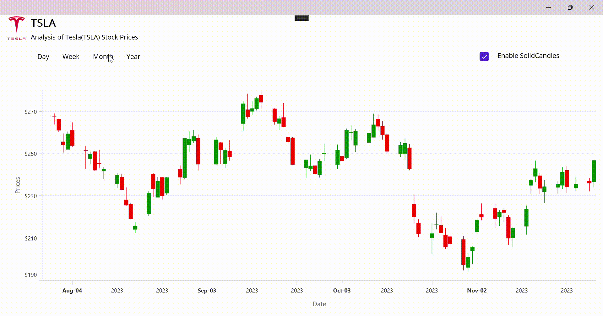
Step 6: Add buttons to customize ranges
Add the range buttons Day, Week, Month, and Year. This will allow us to visualize Tesla’s stock price data based on the range.
XAML
<HorizontalStackLayout Margin="{OnPlatform Android='0',Default='0,10,0,0'}">
 <Button x:Name="Label1" Text="Day" Background="Transparent" TextColor="Black" Clicked="DayRange_Changed"></Button>
 <Button x:Name="Label2" Text="Week" Background="Transparent" TextColor="Black" Clicked="WeekRange_Changed"></Button>
 <Button x:Name="Label3" Text="Month" Background="Transparent" TextColor="Black" Clicked="MonthRange_Changed"></Button>
 <Button x:Name="Label4" Text="Year" Background="Transparent" TextColor="Black" Clicked="YearRange_Changed"></Button>
 <CheckBox HorizontalOptions="End" Margin="{OnPlatform Android='300,0,0,0',Default='700,0,0,0'}" x:Name="CheckBox" IsChecked="True"></CheckBox>
 <Label Text="Enable SolidCandles" Margin="0,10,0,0" HorizontalOptions="End"></Label>
</HorizontalStackLayout>
C#
private void DayRange_Changed(object sender, EventArgs e)
{
    Label1.Background = Colors.LightSkyBlue;
    xAxis.AutoScrollingDeltaType = DateTimeIntervalType.Days;
    xAxis.AutoScrollingDelta = 7;
}

private void WeekRange_Changed(object sender, EventArgs e)
{
    Label2.Background = Colors.LightSkyBlue;
    xAxis.AutoScrollingDeltaType = DateTimeIntervalType.Days;
    xAxis.AutoScrollingDelta = 15;
}

private void MonthRange_Changed(object sender, EventArgs e)
{
    Label3.Background = Colors.LightSkyBlue;
    xAxis.AutoScrollingMode = Syncfusion.Maui.Charts.ChartAutoScrollingMode.End;
    xAxis.AutoScrollingDeltaType = DateTimeIntervalType.Months;
    xAxis.AutoScrollingDelta = 2;
}

private void YearRange_Changed(object sender, EventArgs e)
{
    Label4.Background = Colors.LightSkyBlue;
    yAxis.Minimum = 90;
    yAxis.Maximum = 320;
    xAxis.AutoScrollingDeltaType = DateTimeIntervalType.Years;
    xAxis.AutoScrollingDelta = 1;
}
Step 7: Add interactivity features to the chart
To enhance the chart with additional information, we can leverage interactive features like a trackball, auto-scrolling delta, and panning. The trackball feature is particularly useful as it provides more information about the chart while tracking a specific segment.
Refer to the following code example.
<chart:CandleSeries ItemsSource="{Binding StockPrices}"
                    XBindingPath="Date"
                    Open="Open"
                    High="High"
                    Low="Low"
                    Close="Close"
                    ShowTrackballLabel="True"/>
<chart:SfCartesianChart.TrackballBehavior>
 <chart:ChartTrackballBehavior></chart:ChartTrackballBehavior>
</chart:SfCartesianChart.TrackballBehavior>
Next, set the AutoScrollingDelta property with a value of 4 and the AutoScrollingDeltaType with Months in the x-axis. This configuration will display the data for the last four months on the axis.
<chart:DateTimeAxis x:Name="xAxis"
                    ShowTrackballLabel="True"
                    AutoScrollingDelta="4"
                    AutoScrollingDeltaType="Months"
                    ShowMajorGridLines="False"/>
Additionally, add the ZoomPanBehavior property to the chart to enable panning.
<chart:SfCartesianChart.ZoomPanBehavior>
 <chart:ChartZoomPanBehavior EnablePanning="True" ZoomMode="X" EnableDoubleTap="False"/>
</chart:SfCartesianChart.ZoomPanBehavior>
After executing the previous code examples, the output will look like the following image.
GitHub reference
For more details, refer to the project on the GitHub repository.

Conclusion
Thanks for reading! In this blog, we’ve seen how to analyze Tesla’s stock prices using the Syncfusion .NET MAUI Candle Chart. We encourage you to follow the steps outlined in this blog and share your feedback in the comments section below.
If you require any assistance, please don’t hesitate to contact us via our support forum, support portal, or feedback portal. We are always eager to help you!
Related blogs
- Chart of the Week: Creating a .NET MAUI Column Chart to Visualize Top Insurance Companies
- Revolutionize Your User Experience with a Custom Dropdown Calendar in .NET MAUI
- Announcing .NET 8 Support for Syncfusion .NET MAUI Controls!
- Chart of the Week: Creating a .NET MAUI Bubble Chart to Visualize Healthcare Spending and Life Expectancy Data