

Welcome to the Chart of the week blog series!
Today, we’ll visualize the most traded goods between the U.S. and China in 2017 using the Syncfusion .NET MAUI Bar Chart control.
Before we dive in, let’s imagine you’re a financial or trade analysts, you need to communicate trade data and trends effectively for imported and exported goods. Visualization tools such as bar charts are useful for getting this information across to an audience of mixed specialties.
A bar chart uses rectangular bars to represent data values. In the context of analyzing the U.S.’s import and export trends with China, a bar chart can effectively illustrate key trends in trade flows.
In our example, we’re going to create a custom bar chart by integrating images and descriptions into the relevant data source. Images can enhance the visual appeal and comprehension of the chart beyond mere text.
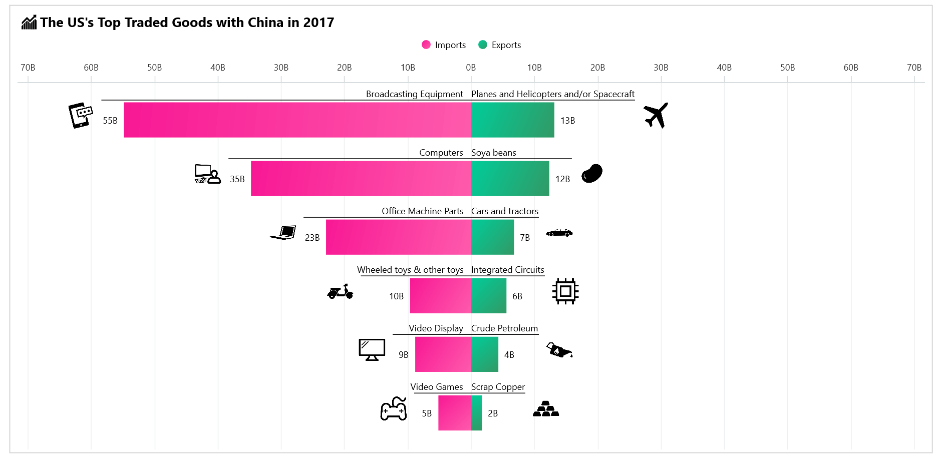
The following image shows the bar chart we’re going to create.
Step 1: Gathering import and export goods data
Before creating the bar chart, we need to gather data on the goods the U.S. imports from and exports to China.
Step 2: Preparing the data for the chart
Create a TradeModel class that includes the properties for storing the goods’ name, value, category (import and export), and description.
In this bar chart use case, the values will be plotted on both quadrants (positive and negative) of the x-axis. We’ll plot the import value details of goods in the negative quadrant, meaning that these values will appear below the x-axis. To achieve this, we need the original values to be represented in their negative form. So, we’ll adjust the sine of the value accordingly.
Refer to the following code example.
Public class TradeModel
{
    public string? GoodsName { get; set; }
    public string Category { get; set; }

    public double Value { get; set; }
    public string Description { get; set; }
    public Iimage? Image { get; set; }
    public TradeModel(string name, double value, string category, string description)
    {
        GoodsName = name;
        Category = category;

        if (Category == "import")
        {
            Value = - value;
        }
        else
        {
            Value = value;
        }
        Description = description;
    }
}
Next, generate the data collection using the TradeGoodsData class, specify the ImportDataCollection and ExportDataCollection properties to store the collection of import and export data.
Refer to the following code example.
public class TradeGoodsData
{

        public ObservableCollection<TradeModel> ImportDataCollection { get; set;}

        public ObservableCollection<TradeModel> ExportDataCollection { get; set;}

        public Dictionary<string, Stream>? Stream { get; set; } = new Dictionary<string, Stream>();


        public TradeGoodsData()
        {
            ImportDataCollection = new ObservableCollection<TradeModel>();
            ExportDataCollection = new ObservableCollection<TradeModel>();

            Assembly executingAssembly = typeof(App).GetTypeInfo().Assembly;
            Stream? ExportStream = executingAssembly.GetManifestResourceStream("CustomBarSample.Resources.Raw.Export_Data.csv");
            Stream? ImportStream = executingAssembly.GetManifestResourceStream("CustomBarSample.Resources.Raw.Import_Data.csv");

            ReadCSV(ImportDataCollection, ImportStream);
            ReadCSV(ExportDataCollection, ExportStream);
        }
}
Then, convert the CSV data to a collection of trade data using the ReadCSV method with specific fields.
private void ReadCSV(ObservableCollection<TradeModel> dataCollection, Stream? datestream)
{
    string line;
    List<string> lines = new();
    if(datestream != null)
    {
        using StreamReader reader = new(datestream);
        while ((line = reader.ReadLine()) != null)
        {
            lines.Add(line);
        }

        lines.RemoveAt(0);
        foreach (var datapoint in lines)
        {
            string[] data = datapoint.Split(',');
            var model = new TradeModel(data[9], Convert.ToDouble(data[8]), data[10], data[5]);
            // add the relevant image to the itemsource
            SetStream(model);
            dataCollection.Add(model);
        }
    }
}
Refer to the following code example to add the image source to the relevant model. Here, we use images in PNG format that are available in Syncfusion Metro Studio.
private void SetStream(TradeModel data)
{
    Assembly assembly = typeof(MainPage).GetTypeInfo().Assembly;
    string imageName = $"{data.GoodsName}.png";
    Stream? stream = assembly.GetManifestResourceStream($"CustomBarSample.Resources.Images.{imageName}");
    if (stream != null && data.GoodsName is not null)
    {
        var image = PlatformImage.FromStream(stream);
        data.Image = image;
    }
}
Step 3: Configure the Syncfusion .NET MAUI Cartesian Charts control
Then, configure the Syncfusion .NET MAUI Cartesian Charts control using this documentation.
Configure the SfCartesianChart and then switch the chart’s x- and y-axes by setting the IsTransposed property to true. Then, create a column chart by creating an instance of ColumnSeries and add it to the Series collection property of SfCartesianChart.
Refer to the following code example.
<chart:SfCartesianChart IsTransposed="True">
    <chart:SfCartesianChart.XAxes>
        <chart:CategoryAxis></chart:CategoryAxis>
    </chart:SfCartesianChart.XAxes>
    <chart:SfCartesianChart.YAxes>
        <chart:NumericalAxis></chart:NumericalAxis>
    </chart:SfCartesianChart.YAxes>
</chart:SfCartesianChart>
Step 4: Create a customized bar chart
Create the ColumnSeriesExt class inherited from the ColumnSeries to customize the bar chart segment drawing method for series. While rendering the segments (bars) for data, it will be displayed along with the relevant image and description about the segment based on the itemsource data.
Refer to the following code example.
public class ColumnSeriesExt : ColumnSeries
{
    int index = 0;
    protected override ChartSegment CreateSegment()
    {
        var segment = new ColumnSegmentExt();
        segment.Item = GetItemSource(index); // do get the segment model
        index++;
        return segment;
    }
}
Creating a custom ColumnSegment involves defining a segment type that displays the relevant images and descriptions about the segment’s data source.
Refer to the following code example.
public class ColumnSegmentExt : ColumnSegment
{
    internal TradeModel? Item { get; set; }
    protected override void OnLayout()
    {
        base.OnLayout();
        if (Series is ColumnSeriesExt series && Item != null)
        {
            var style = series.LabelStyle;
            style.Parent = series.ActualYAxis!.Parent;
            var size = Item.Description.Measure(style);
            CalculatePositions(size); // calculate the image and description positions.
        }
    }
    protected override void Draw(ICanvas canvas)
    {
        if (Series is ColumnSeriesExt series)
        {
            var style = series.LabelStyle;
            if (Item != null)
            {
                canvas.DrawText(Item.Description, TextX, TextY, style);
                canvas.StrokeColor = Colors.Black;
                canvas.DrawLine(LineX1, LineY, LineX2, LineY);
                canvas.DrawImage(Item.Image, ImageX, ImageY, imageWidth, imageWidth);
            }
        }

        base.Draw(canvas);
    }
}
Next, initialize the custom bar series in the SfCartesianChart.
<chart:SfCartesianChart>
    . . .
        <local:ColumnSeriesExt x:Name="Imports" />
        <local:ColumnSeriesExt x:Name="Exports" />

    . . .
</chart:SfCartesianChart>
Step 5: Initialize the legend
Enable the legend in the bar chart to provide a visual guide to the data series.
C#
chart.Legend = new ChartLegend();
XAML
. . .
<chart:SfCartesianChart.Series>
  <local:ColumnSeriesExt Label="Imports" />
  <local:ColumnSeriesExt Label="Exports" />
</chart:SfCartesianChart.Series>
Step 6: Binding the data to the bar chart
Configure the TradeGoodsData class to bind its properties to the chart’s BindingContext.
Bind the ExportDataCollection from the TradeGoodsData class to the ItemsSource property for one series and ImportDataCollection as the ItemsSource for another. The XBindingPath and YBindingPath properties are bound with the GoodsName and Value details, respectively. Set the EnableSidebySideSeriesPlacement property to false to prevent the series from being arranged side by side.
Refer to the following code example.
<chart:SfCartesianChart IsTransposed="True"
                        EnableSideBySideSeriesPlacement="False">
    <chart:SfCartesianChart.BindingContext>
        <local:TradeGoodsData/>
    </chart:SfCartesianChart.BindingContext>
    <chart:SfCartesianChart.Series>
    <local:ColumnSeriesExt ItemsSource="{Binding ImportDataCollection}"
                           XBindingPath="GoodsName"
                           YBindingPath="Value">

    </local:ColumnSeriesExt>
    <local:ColumnSeriesExt ItemsSource="{Binding ExportDataCollection}"
                           XBindingPath="GoodsName"
                           YBindingPath="Value">

    </local:ColumnSeriesExt>
   </chart:SfCartesianChart.Series>
</chart:SfCartesianChart>
Step 7: Customize the chart appearance
Let’s customize the .NET MAUI bar chart by configuring its properties and styles.
Customize the chart title
You can customize the chart title to make the chart more visually appealing and informative.
<chart:SfCartesianChart>
<chart:SfCartesianChart.Title>

    <HorizontalStackLayout>
        <Image Source="finance.png"
               Margin="5,0,5,0"
               HeightRequest="{OnPlatform Android=16, WinUI=20, iOS= 16, MacCatalyst= 20}"
               WidthRequest="{OnPlatform Android=16, WinUI=20, iOS= 16, MacCatalyst= 20}"/>
        <VerticalStackLayout>
            <Label Text="The US's Top Traded Goods with China in 2017"
            TextColor="Black"
            FontSize="{OnPlatform Android=12, WinUI=18, iOS=12, MacCatalyst=18}"
            FontFamily="TimeSpan"
            FontAttributes="Bold"
            Margin="0,2,0,0" />
        </VerticalStackLayout>
    </HorizontalStackLayout>

</chart:SfCartesianChart.Title>
</chart:SfCartesianChart>
Customize the chart axes
You can customize the chart axes to enhance the look and readability of the chart, as shown in the following code example.
<chart:SfCartesianChart.XAxes>
      <chart:CategoryAxis LabelPlacement="BetweenTicks"
                          PlotOffsetStart="10"
                          IsVisible="False"
                          IsInversed="True"
                          ShowMajorGridLines="False" />
  </chart:SfCartesianChart.XAxes>
  <chart:SfCartesianChart.YAxes>
      <chart:NumericalAxis EdgeLabelsDrawingMode="Fit"
                           Maximum="70"
                           Minimum="-70" />
      <chart:NumericalAxis.LabelStyle>
          <chart:ChartAxisLabelStyle LabelFormat="0'B';#.##'B" />
      </chart:NumericalAxis.LabelStyle>
</chart:SfCartesianChart.YAxes>
Customize the chart series appearance
Next, customize the series appearance by utilizing the PaletteBrush property by binding gradients from the LinearGradiantBrush collection.
Refer to the following code example.
<chart:SfCartesianChart PaletteBrushes="{Binding CustomBrushes}">
    <chart:SfCartesianChart.Series>
        <local:ColumnSeriesExt Width="0.6"
                               ShowDataLabels="True" />
        <local:ColumnSeriesExt Width="0.6"
                               ShowDataLabels="True" />
    </chart:SfCartesianChart.Series>
</chart:SfCartesianChart>
Customize the data label appearance
Data labels provide additional information about the data points on the chart. We can customize their appearance using the CartesianDataLabelSettings class.
Refer to the following code example.
<chart:SfCartesianChart.Series>
     <local:ColumnSeriesExt x:Name="Import">
         <local:ColumnSeriesExt.DataLabelSettings>
             <chart:CartesianDataLabelSettings LabelPlacement="Outer"
                                               UseSeriesPalette="False">
               <chart:CartesianDataLabelSettings.LabelStyle>
                      <chart:ChartDataLabelStyle LabelFormat="0;#'B" />
               </chart:CartesianDataLabelSettings.LabelStyle>
             </chart:CartesianDataLabelSettings>
         </local:ColumnSeriesExt.DataLabelSettings>
     </local:ColumnSeriesExt>
      <local:ColumnSeriesExt x:Name="Export">
    <local:ColumnSeriesExt.DataLabelSettings>
        <chart:CartesianDataLabelSettings LabelPlacement="Outer"
                                          UseSeriesPalette="False">
        </chart:CartesianDataLabelSettings>
           <chart:CartesianDataLabelSettings.LabelStyle>
                  <chart:ChartDataLabelStyle LabelFormat="0'B" />
           </chart:CartesianDataLabelSettings.LabelStyle>
    </local:ColumnSeriesExt.DataLabelSettings>
</local:ColumnSeriesExt>
</chart:SfCartesianChart.Series>
After executing the previous code examples, the output will look like the following image.
GitHub reference
For more details, refer to the complete project on GitHub.
Conclusion
Thanks for reading! In this blog, we explored how to visualize the U.S.’s most traded goods with China using the Syncfusion .NET MAUI Bar Chart. We strongly encourage you to follow the steps outlined in this blog and share your thoughts in the comments below.
You can also contact us through our support forums, support portal, or feedback portal. We are always happy to assist you!
 No spam, just valuable updates.