In this article, we will enhance your XAML skills by replicating a waiting list UI inspired by this Dribble design.
Start by knowing the structure
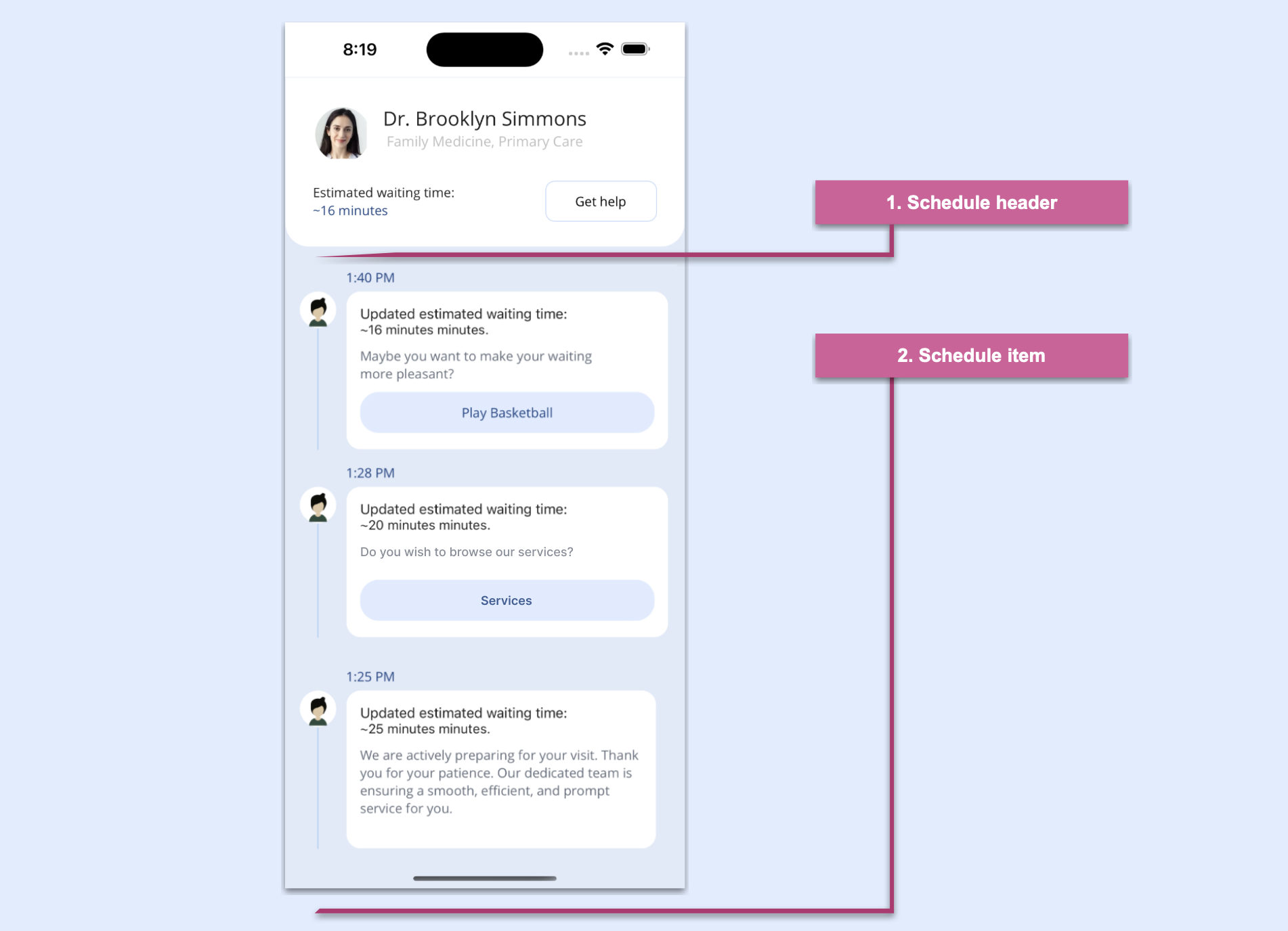
Let’s start by grasping the fundamental structure of the waiting list UI. To facilitate this, we’ve divided the article into clear steps, each representing a cluster of visual elements essential for replicating the UI.
Refer to the following image.
The Waiting List UI We Will Replicate
What specific skills will you be learning in XAML?
In addition to strengthening your XAML skills, you will learn to use:
First, we’ll generate a page named MainPage.xaml, which serves as the container for the main layout that organizes the blocks outlined in the previous image. The chosen layout is VerticalStackLayout, to optimize the utilization of screen space.
Refer to the following code example.
<!-- Main layout --><VerticalStackLayoutBackgroundColor="#e1eaf8"Margin="0,0,0,-65"><!-- Step 1: Add all the elements contained in the schedule header --><!-- Step 2: Add all the elements contained in the schedule item --></VerticalStackLayout>
We have finished implementing the main layout, so let’s design the schedule header in XAML.
Designing the schedule header
The schedule header encompasses an avatar, name, role, description, minutes, and a Get Help button. Notably, the design incorporates rounded bottom edges, achieved using the Border control.
Refer to the following code example.
<!-- 1. Schedule header --><BorderStrokeShape="RoundRectangle 0,0,25,25"StrokeThickness="0"BackgroundColor="White"><GridRowDefinitions="Auto,Auto,Auto,Auto,Auto"ColumnDefinitions="Auto,*"Padding="30"><!-- Add the Avatar element --><!-- Add name & role elements --><!-- Add description & minutes elements --><!-- Add the Get Help button element --></Grid></Border>
To display the user image, we will use thre Syncfusion .NET MAUI Avatar View:
To add the .NET MAUI Avatar Viewto your project, open the NuGet package manager in Visual Studio, search for Syncfusion.Maui.Core, and then install it.
To register the handler for Syncfusion core, go to your MauiProgram.cs file. Add the Syncfusion.Maui.Core.Hosting namespace. Then, add the following line of code just after the line .UseMauiApp<App>() in the CreateMauiApp method.
.ConfigureSyncfusionCore();
Then, add the namespace for .NET MAUI Avatar View.
To enhance the user experience, let’s enhance specific UI elements within the schedule header.
Designing name and role elements
Refer to the following code example to design the name and role elements.
<!-- Name & role --><LabelGrid.Column="0"Grid.Row="0"Grid.ColumnSpan="2"HorizontalTextAlignment="Center"Text="Dr. Brooklyn Simmons"FontSize="21"/><LabelGrid.Column="0"Grid.Row="1"Grid.ColumnSpan="2"HorizontalTextAlignment="Center"Text="Family Medicine, Primary Care"FontSize="15"TextColor="Silver"Margin="0,0,0,35"/>
Designing description and minutes
Refer to the following code example to design the description and minutes elements to ensure transparency about the estimated waiting time.
Refer to the following code example to design the Get help button.
<!-- Get help button --><ButtonGrid.Column="1"Grid.Row="2"Grid.RowSpan="3"WidthRequest="120"HorizontalOptions="End"Text="Get help"BackgroundColor="Transparent"TextColor="Black"CornerRadius="10"BorderWidth="1"VerticalOptions="Center"BorderColor="#cddefa"Margin="10,0,0,0"/>
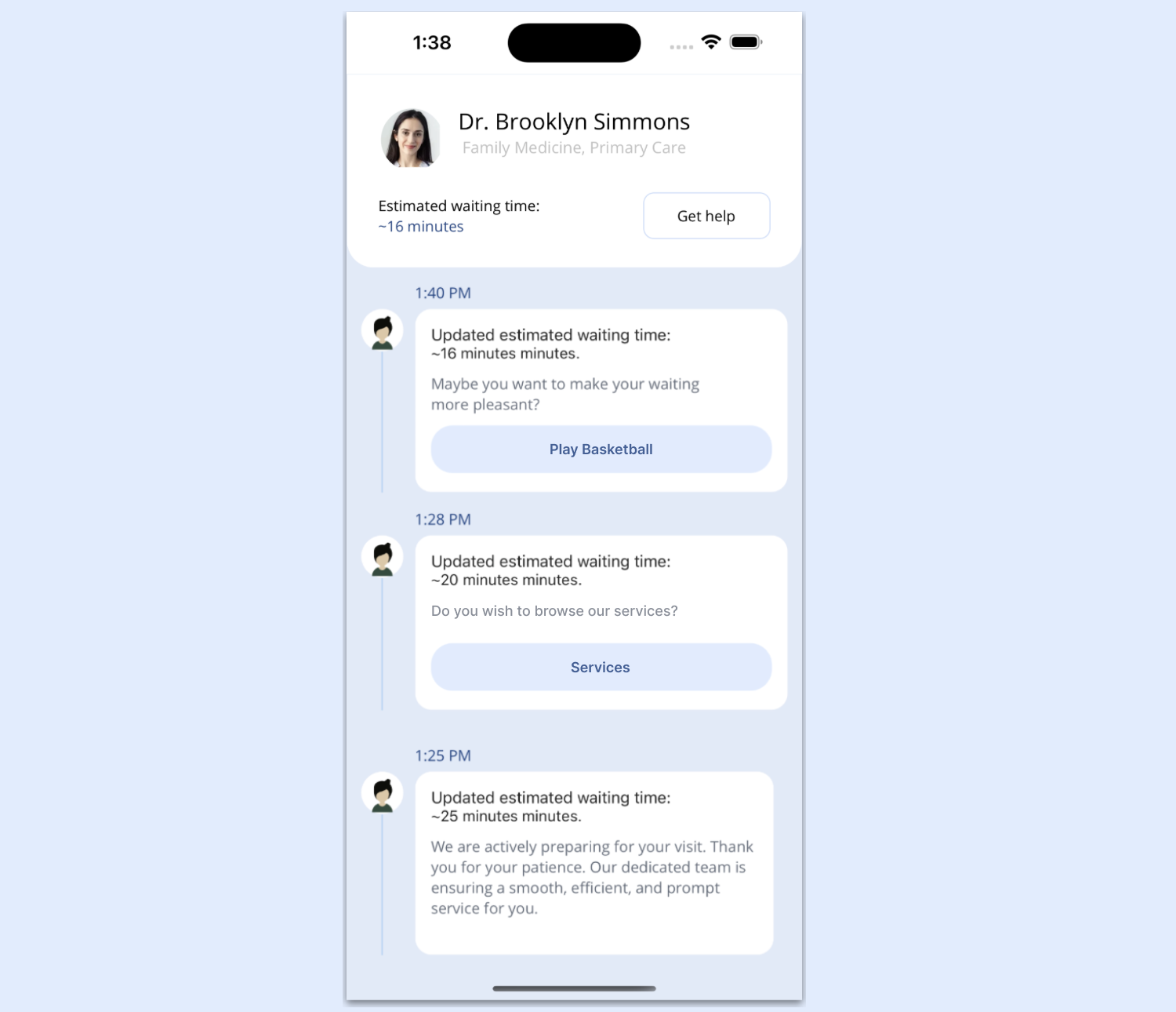
Let’s create a list of cards for the schedule, like in the following image.
Building the schedule items in .NET MAUI
This section includes the following elements:
Populating the cards list.
Designing the individual elements in a card.
Populating the cards list
We’ll add some mock data to visualize the final list result by following these steps. Feel free to use any data you prefer.
1. Create a Model folder
Set up a Model folder and add the Schedule.cs class to it. Define the necessary attributes that we’ll be utilizing.
Refer to the following code example.
publicclassSchedule
{
privatestring picture;
privatestring minutes;
privatestring description;
privatestring time;
privatebool playBasket;
privatebool readArticle;
publicstring Picture
{
get { return picture; }
set { picture = value; }
}
publicstring Minutes
{
get { return minutes; }
set { minutes = value; }
}
publicstring Description
{
get { return description; }
set { description = value; }
}
publicstring Time
{
get { return time; }
set { time = value; }
}
publicbool PlayBasket
{
get { return playBasket; }
set { playBasket = value; }
}
publicbool ReadArticle
{
get { return readArticle; }
set { readArticle = value; }
}
}
2. Develop a ViewModel with mock data
Let’s set up a ViewModel populated with mock data. First, create a folder named ViewModel. Then, create a file called ScheduleViewModel.cs in it.
publicclassScheduleViewModel
{
private ObservableCollection<Schedule> scheduleCollection;
public ObservableCollection<Schedule> Schedule
{
get { return scheduleCollection; }
set { scheduleCollection = value; }
}
internalvoidGenerateInfo()
{
scheduleCollection = new ObservableCollection<Schedule>();
scheduleCollection.Add(new Schedule { Time = "1:40 PM", Picture = "", Minutes = "16 minutes", Description = "Maybe you want to make your waiting more pleasant?", PlayBasket = true, ReadArticle = false });
scheduleCollection.Add(new Schedule { Time = "1:25 PM", Picture = "", Minutes = "25 minutes", Description = "We are actively preparing for your visit. Thank you for your patience. Our dedicated team is ensuring a smooth, efficient, and prompt service for you.", PlayBasket = false, ReadArticle = true });
scheduleCollection.Add(new Schedule { Time = "1:28 PM", Picture = "", Minutes = "20 minutes", Description = "Maybe you want to make your waiting more pleasant?", PlayBasket = true, ReadArticle = false });
}
publicScheduleViewModel()
{
GenerateInfo();
}
}
Then, populate this ViewModel with mock data to simulate the appearance of the schedule list. Lastly, ensure that your XAML includes references to this ViewModel.
publicMainPage()
{
InitializeComponent();
BindingContext = new ViewModels.ScheduleViewModel();
}
3. Adding the ListView
Once we have the mock data ready to display in the UI list, let’s add a list view. This will enable us to visualize the previously added mock data. For this, we will use the Syncfusion .NET MAUI ListView control.
Go to the MauiProgram.cs file and register the handler for the Syncfusion .NET MAUI ListView. To do so, navigate to the CreateMauiApp method and then, just before the line return builder.Build();, add the builder.ConfigureSyncfusionListView(); method.
Now, add Syncfusion.Maui.ListView namespace in the XAML page.
Finally, initialize the ListView control using the following code example in your XAML page.
<listView:SfListViewItemsSource="{Binding Schedule}"ItemSize="215"ScrollBarVisibility="Never"><listView:SfListView.ItemTemplate><DataTemplate><GridColumnDefinitions="Auto,*"RowDefinitions="Auto,Auto,*,Auto,Auto,Auto"Padding="15,20,20,0"><!-- Add the time, avatar, and line elements. --><!-- Add the border: minutes, and description elements. --></Grid></DataTemplate></listView:SfListView.ItemTemplate></listView:SfListView>
Let’s design the individual elements within each schedule card.
Time, avatar, and line
We will display the time description using a simple Label. For the avatar, we will use the Syncfusion AvatarView again (since it’s already implemented, you won’t need to implement it again).
We’ll use a BoxView to create the line. Note that it’s also possible to create this line using a .NET MAUI line shape. However, for this exercise, we’ll use the BoxView.
Refer to the following code example.
<!-- Time --><LabelGrid.Row="0"Grid.Column="1"Text="{Binding Time}"TextColor="#1b4485"Margin="10,0,0,5"/><!-- Avatar --><sfControl:SfAvatarViewGrid.Column="0"Grid.Row="1"ContentType="Default"VerticalOptions="Start"Stroke="Transparent"BackgroundColor="White"HorizontalOptions="Start"WidthRequest="40"HeightRequest="40"CornerRadius="20"/><!-- Line --><BoxViewGrid.Column="0"Grid.Row="2"Grid.RowSpan="2"Opacity="0.3"HorizontalOptions="FillAndExpand"WidthRequest="1"Color="#1690F4"/>
Border: minutes and description
We’ve reached the final section of code to complete our UI! Here, we’ll add a Border control to achieve the card’s rounded effect and include necessary information like the duration in minutes and description.
Thanks for reading! In this blog, we enhanced your XAML knowledge by teaching you how to replicate a waiting list UI using Syncfusion .NET MAUI controls. Try out the steps outlined in the post and leave your thoughts in the comments section below.
Syncfusion’s .NET MAUI controls were created from the ground up using .NET MAUI, which makes them feel like native framework controls. These controls are optimized to manage large amounts of data, making them ideal for building top-notch, cross-platform mobile and desktop apps.
If you have any questions or need assistance, don’t hesitate to reach out to us through our support forum, support portal, or feedback portal. We are always available to help you!
I’m Leomaris Reyes, Microsoft MVP, Master Coach at Platzi, Software Engineer from the Dominican Republic, with more than 6 years of experience in Software Development. Xamarin Certified Mobile Developer. Founder of Stemelle.
 Leomaris Reyes