
 Leomaris Reyes
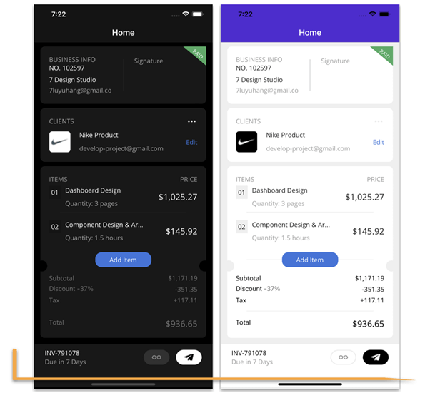
Howdy! This blog explains how to replicate an invoice page UI based on this Dribbble design.
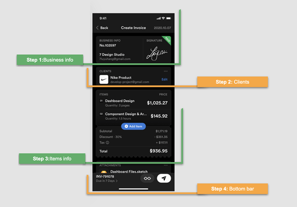
Let’s break down the creation of the UI into four steps, as illustrated by the following screenshot.
Before starting to develop the UI, let me highlight some important points. In this article, we will learn to:
- Use XAML components in different ways.
- Use the Syncfusion .NET MAUI SignaturePad and ListView controls in your app.
- Manage properties with independent values for light and dark modes.
Let’s code!

Main layout
The initial structure should be prepared for the content we will add in all the development steps. It should be noted that step four is designing a bottom bar that is fixed and does not move regardless of the content of the remaining blocks.
To add both the bottom bar and the remaining content, we will create the following pieces:
- Main layout: The main layout includes a grid with a single row. This is because both the bottom bar and the remaining content will be in the same grid row. Only the bottom bar will be in a fixed orientation at the bottom of the screen.
- ScrollView: We are going to design the top content with a ScrollView to make the content scrollable in case the amount of information grows. Inside this ScrollView, we will add a DataGrid, which is the layout in charge of organizing the elements contained in this upper part.
- Bottom bar: Finally, you will see a comment that says <!– Add your Bottom Bar here–>, and for the moment, we will leave it that way. Keep in mind, though, that when you get to step number four, you must add that code in this part.
Therefore, implementing all these pieces will look like the following code.
<!-- Main layout-->
<Grid RowDefinitions="*">
 <!-- Allows top information to be scrolled-->
   <ScrollView Grid.Row="0" Margin="15,10">
    <!--Layout top information-->
    <Grid RowDefinitions="Auto,Auto,Auto,Auto,Auto" RowSpacing="10">
      <!-- Add here the information needed in the top -->
    </Grid>
   </ScrollView>
  <!-- Add your bottom bar here-->
 </Grid>
</Grid>
General settings
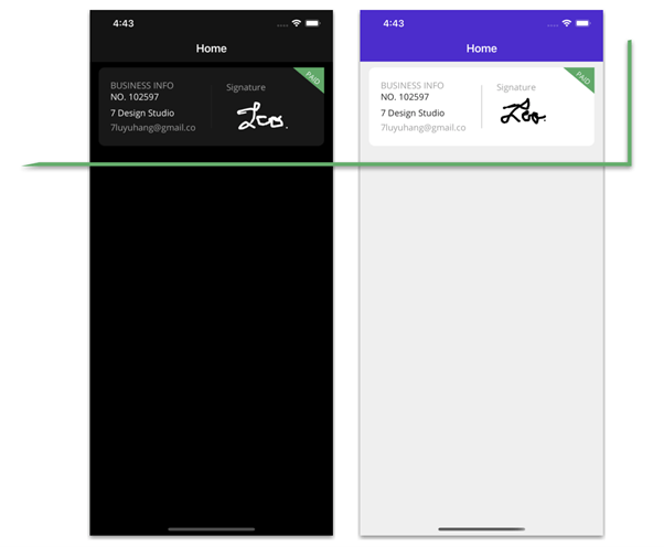
This application will be developed to support both light and dark modes. For that, we have to keep in mind the visual values that we will assign to each property. To do so, we will be using the Markup Extension AppThemeBinding.
We need to provide a background color to the content page by adding the following code to the content page’s header.
BackgroundColor="{AppThemeBinding Light=#efefef,Dark=Black}"The .NET MAUI framework already has predefined global styles for each visual element. So, we need to modify only some properties of the default style. To locate it, navigate to Resources ➡ Styles ➡ Styles.xaml. We are going to modify the styles for the frames and box views. Refer to the following code examples.
Frame
<Style TargetType="Frame">
 <Setter Property="HasShadow" Value="False" />
 <Setter Property="BackgroundColor" Value="{AppThemeBinding Light=White, Dark=#181818}" />
 <Setter Property="CornerRadius" Value="10" />
</Style>
BoxView
<Style TargetType="BoxView">
 <Setter Property="Color" Value="{AppThemeBinding Dark=#252525,Light=Silver}" />
 <Setter Property="HorizontalOptions" Value="FillAndExpand" />
 <Setter Property="Margin" Value="25,10" />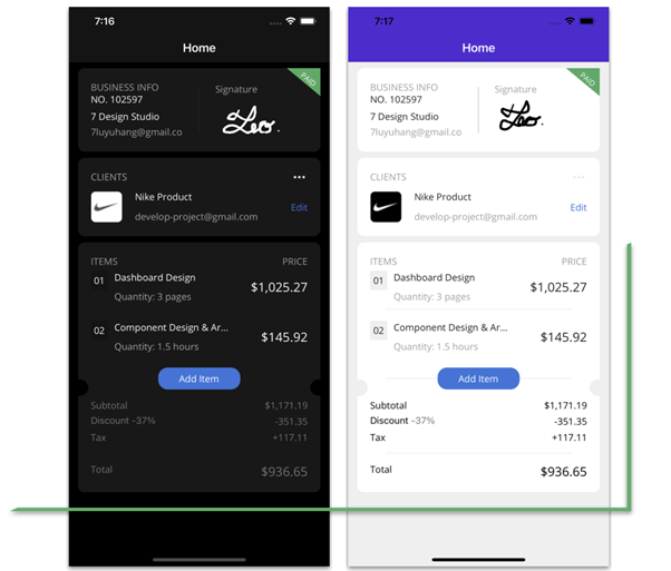
</Style>Step 1: Business info
Now that we have configured the initial setup, let’s get started with the UI design!
Adding a business frame
Let’s add business information inside a frame. Don’t worry about its properties for light and dark modes. Remember that we have already defined this in the styles section of the general settings.
<!-- Business info-->
 <Frame Grid.Row="0">
  <Grid RowDefinitions="*,*,*,*" ColumnDefinitions="*,Auto,*">
   <!-- Add all the information corresponding to block 1 here -- >
  </Grid>
 </Frame>
<!-- Add all the information corresponding to block 2 here -- >
<!-- Add all the information corresponding to block 3 here -- >
Business information details
This block contains the following information:
- Title
- Identification
- Name
- Separator
- Signature board
- Payment badge
First, let’s start with the code to implement the title, identification, name, email, and a separator.
<!-- Business description-->
<!-- Title-->
 <Label Grid.Column="0" Grid.Row="0" Text="BUSINESS INFO" TextColor="#a0a0a0"/>
<!-- Identification-->
 <Label Grid.Column="0" Grid.Row="1" Text="NO. 102597" FontAttributes="Bold" Padding="0,0,0,11"/>
<!-- Name-->
 <Label Grid.Column="0" Grid.Row="2" Text="7 Design Studio"  FontAttributes="Bold"/>
<!-- Email-->
 <Label Grid.Column="0" Grid.Row="3" Text="[email protected]" TextColor="#a0a0a0"/>
<!-- Separator-->
<BoxView Grid.Row="0" Grid.RowSpan="4" Grid.Column="1" WidthRequest="1"/>
Signature board
To design the signature board, we are going to use the Syncfusion .NET MAUI SignaturePad control. To do so, follow these steps:
Note: Refer to the .NET MAUI SignaturePad control’s getting started documentation for more information.
- First, install the Syncfusion.Maui.SignaturePad NuGet package.

- Second, register the handler for the Syncfusion core in the MauiProgram.cs file. Go to the CreateMauiApp method, and just below the line .UseMauiApp<App>(), add the .ConfigureSyncfusionSignaturePad() method.
- Third, add the Syncfusion.Maui.SignaturePad namespace in your XAML page.
xmlns:signaturePad="clr-namespace:Syncfusion.Maui.SignaturePad;assembly=Syncfusion.Maui.SignaturePad"
- Finally, add the following code to your XAML page.
<!--Signature -->
<!-- Title-->
 <Label Grid.Column="2" Grid.Row="0" Text="Signature" TextColor="#a0a0a0" VerticalTextAlignment="End"/>
<!-- Syncfusion Signature Pad-->
<signaturePad:SfSignaturePad Grid.Column="2" Grid.Row="1" Grid.RowSpan="3" MinimumStrokeThickness="1" MaximumStrokeThickness="4" StrokeColor="{AppThemeBinding Light=Black, Dark=White}" />
Payment badge
To design the paid badge located in the upper-right corner of the screen, we will use a label. Let’s use the following three properties of the label to obtain this UI design:
- Padding: Indicates the space that the label will have.
- BackgroundColor: Assigns a color to the visible space in the background.
- Rotation: Helps rotate the elements, in this case, to put the label diagonal.
<!-- Paid badge-->
<Label Grid.Column="2" Grid.RowSpan="4" BackgroundColor="#46aa62" Text="PAID" TextColor="White" Padding="0,50,20,0" Rotation="40" VerticalOptions="Start" FontSize="11" HorizontalTextAlignment="End" TranslationX="60" TranslationY="-80"/>
Step 2: Clients
 The clients’ details will also be contained in the frame. Inside it, I have added a DataGrid to organize the information. Refer to the following code example.
<Frame Grid.Row="1">
 <Grid RowDefinitions="*,*,*" RowSpacing="10" ColumnDefinitions="Auto,*,Auto">
   <!-- Add all the information corresponding to block 2 here -- >
 </Grid>
</Frame>
Let’s design the following elements in this block:
- Title and logo
- Name and email address
- Icon and edit label
Title and logo
The title of this content is a label. To design the logo, we use the border support available in the .NET MAUI framework and color the background according to the appearance mode that you have configured in the device (dark or light mode).
Finally, we add an image inside it with a transparent background (the logo) so that it can be reflected in the previously added background.
<!-- Title-->
 <Label Grid.Column="0" Grid.Row="0" Text="CLIENTS" TextColor="#a0a0a0"/>
<!-- Logo-->
 <Border Grid.Row="1" Grid.RowSpan="2" Grid.Column="0"
         Margin="0,0,20,0"
         Stroke="Transparent"
         BackgroundColor="{AppThemeBinding Light=Black, Dark=White}"
         StrokeThickness="4"
         WidthRequest="50"
         HeightRequest="50"
         StrokeShape="RoundRectangle 7">
  <Image Aspect="AspectFill" Source="{AppThemeBinding Dark=niken, Light=nike}" />
 </Border>

 <!-- Add here all the information explained in the next code block -- >
Name and email address
Design the name and email address details, referring to the following code example.
<!-- Name-->
 <Label Grid.Column="1" Grid.Row="1" Text="Nike Product" FontAttributes="Bold"/>
<!-- Email-->
 <Label Grid.Column="1" Grid.Row="2" Text="[email protected]" TextColor="#a0a0a0"/>
<!-- Add here all the information explained in the next code block -- >
Icon and edit label
Design the icon and edit label, referring to the following code example.
<!-- Icon-->
 <Image Grid.Column="2" Grid.Row="0" Source="points"/>
<!-- Edit Label-->
 <Label Grid.Column="2" Grid.Row="1" Grid.RowSpan="2" TextColor="#3373dc" VerticalTextAlignment="Center" Text="Edit"/>
Step 3: Items info
 Continuing with the third block, Items Info, we modified this a bit from the original design. Here, you will learn to use:
- Syncfusion’s ListView control
- Shapes in the .NET MAUI framework
Now, we are going to design the frame and the layout to display the items’ information.
<!-- Items-->
 <Frame Grid.Row="2">
  <Grid RowDefinitions="Auto,*,Auto,Auto,Auto,Auto,Auto,Auto,Auto" ColumnDefinitions="*,Auto" RowSpacing="5">
   <!-- Add all the information corresponding to block 3 here -- >
  </Grid>
 </Frame>
Items and price titles
Refer to the following code example to add the titles for the items before adding them to the list.
<!--Item and prices title-->
 <Label Grid.Row="0" Grid.Column="0" Text="ITEMS" HorizontalTextAlignment="Start" TextColor="#9a9a9a"/>
 <Label Grid.Row="0" Grid.Column="1" Text="PRICE" HorizontalTextAlignment="End" TextColor="#9a9a9a"/>
Items list
To design the items list, we are going to use the Syncfusion .NET MAUI ListView control. Please follow these steps:
Note: Refer to the .NET MAUI ListView control getting started documentation
- First, add Syncfusion.Maui.ListView NuGet package.
- Second, go to your MauiProgram.cs file and register the handler for the Syncfusion .NET MAUI ListView. Go to the CreateMauiApp method, just before the line return builder.Build();, and add the builder.ConfigureSyncfusionListView(); method.
- Third, add Syncfusion.Maui.ListView namespace in your XAML
page.xmlns:syncfusion="clr-namespace:Syncfusion.Maui.ListView;assembly=Syncfusion.Maui.ListView"
- Then, add the following code to your XAML page.
<!-- Item List: Syncfusion ListView Control-->
 <syncfusion:SfListView Grid.Row="1" Grid.Column="0" Grid.ColumnSpan="2"
                        ItemsSource="{Binding ItemInfo}"
                        ItemSize="80"
                        ScrollBarVisibility="Never"
                        HeightRequest="140"
                        HorizontalOptions="FillAndExpand"
                        Orientation="Vertical">
  <syncfusion:SfListView.ItemTemplate>
   <DataTemplate>
    <Grid RowDefinitions="Auto,Auto,Auto" ColumnDefinitions="Auto,Auto,*">
     <Label Grid.Row="0" Grid.Column="0" Text="{Binding Order}" Padding="5" BackgroundColor="{AppThemeBinding Dark=#141414, Light=#efefef}" Margin="0,0,10,0"/>
     <Label Grid.Row="0" Grid.Column="1" Text="{Binding Title}"/>
     <Label Grid.Row="1" Grid.Column="1" Text="{Binding Description}" TextColor="#a3a3a3"/>
     <Label Grid.Row="0" Grid.Column="2" Grid.RowSpan="2" Text="{Binding Price}" FontSize="18" HorizontalOptions="End" VerticalTextAlignment="Center"/>
     <BoxView Grid.Row="2" Grid.Column="0" Grid.ColumnSpan="3" HeightRequest="0.5"/>
    </Grid>
   </DataTemplate>
 </syncfusion:SfListView.ItemTemplate>
</syncfusion:SfListView>

<!-- Add here all the information explained in the next code block -- >
Separator and center button
Now, we are going to use a box view to add a line as a separator and locate a button in the center of the frame.
<!-- Separator-->
 <BoxView Grid.Row="2" Grid.Column="0" Grid.ColumnSpan="2" HeightRequest="0.5"/>
<!-- Middle Button-->
 <Button Grid.Row="2" Grid.Column="0" Grid.ColumnSpan="2" Text="Add Item" CornerRadius="15" WidthRequest="130" HeightRequest="35" BackgroundColor="#3775dc" HorizontalOptions="Center" TextColor="White" Margin="0,10"/>
<!-- Add here all the information explained in the next code block -- >
Side cutouts in circles of the frame
Did you see the frame with two circular holes at each end? To replicate it, we’ll use the shapes and position them on each side, as in the following code example.
<!-- Cutouts in circles -->
 <Ellipse Grid.Row="2" Grid.Column="0" HorizontalOptions="Start" Margin="-30,-30,0,0" Fill="{AppThemeBinding Light=#efefef,Dark=Black}" VerticalOptions="End" HeightRequest="26" WidthRequest="26" StrokeThickness="0"/>
 <Ellipse Grid.Row="2" Grid.Column="1" HorizontalOptions="End"  Margin="0,-30,-30,0" Fill="{AppThemeBinding Light=#efefef,Dark=Black}" VerticalOptions="End" HeightRequest="26" WidthRequest="26" StrokeThickness="0"/>
Total information
This last sub-block is made up of the following elements:
- Subtotal information
- Discount information
- Tax information
- Separator
- Total
Refer to the following code to design them in the UI.
<!--Total information-->

<!-- Subtotal information-->
 <Label Grid.Row="3" Grid.Column="0" Text="Subtotal" TextColor="{AppThemeBinding Light=Black, Dark=#727272}"/>
 <Label Grid.Row="3" Grid.Column="1" Text="$1,171.19" TextColor="{AppThemeBinding Light=Black, Dark=#727272}" HorizontalTextAlignment="End"/>
<!-- Discount-->
 <Label Grid.Row="4" Grid.Column="0">
  <Label.FormattedText>
   <FormattedString>
    <Span Text="Discount" TextColor="{AppThemeBinding Light=Black, Dark=#727272}"  />
    <Span Text=" -37%" TextColor="#727272"/>
   </FormattedString>
  </Label.FormattedText>
 </Label>
 <Label Grid.Row="4" Grid.Column="1" Text="-351.35" TextColor="{AppThemeBinding Light=Black, Dark=#727272}" HorizontalTextAlignment="End"/>
<!-- Tax-->
 <Label Grid.Row="5" Grid.Column="0" Text="Tax" TextColor="{AppThemeBinding Light=Black, Dark=#727272}"/>
 <Label Grid.Row="5" Grid.Column="1" Text="+117.11" TextColor="{AppThemeBinding Light=Black, Dark=#727272}" HorizontalTextAlignment="End"/>
<!-- Separator-->
 <BoxView Grid.Row="6" Grid.Column="0" Grid.ColumnSpan="2"  HeightRequest="0.5"/>
<!-- Total-->
  <Label Grid.Row="7" Grid.Column="0" Text="Total" TextColor="{AppThemeBinding Light=Black, Dark=#727272}"/>
  <Label Grid.Row="7" Grid.Column="1" Text="$936.65" TextColor="{AppThemeBinding Light=Black, Dark=#727272}" FontSize="18" HorizontalTextAlignment="End"/>
Step 4: Bottom bar
 Let’s design the last block. We are going to add the following elements to the bottom bar:
- Invoice number
- Period of days
- Call to action buttons
Refer to the following code example.
<!-- Button Bar-->
 <Grid Grid.Row="0" RowDefinitions="Auto,Auto" ColumnDefinitions="*,Auto,Auto" HeightRequest="100" Margin="0,0,0,-30" Padding="25,10" VerticalOptions="End" BackgroundColor="{AppThemeBinding Light=White, Dark=#181818}">
<!--Invoice number-->
  <Label Grid.Row="0" Grid.Column="0" Text="INV-791078" TextColor="{AppThemeBinding Dark=White, Light=Black}" FontAttributes="Bold"/>
<!--Period of days-->
  <Label Grid.Row="1" Grid.Column="0" Text="Due in 7 Days " TextColor="#9d9d9d"/>
<!--Call to action buttons-->
   <Button Grid.Row="0" Grid.RowSpan="2" Grid.Column="1" BackgroundColor="{AppThemeBinding Dark=#313131, Light=White}" CornerRadius="18" WidthRequest="60" HeightRequest="35" ImageSource="{AppThemeBinding Light=glasses, Dark=glassesn}" BorderWidth="2" BorderColor="{AppThemeBinding Light=#ededed ,Dark=Transparent}" Margin="0,0,15,0"/>
   <Button Grid.Row="0" Grid.RowSpan="2" Grid.Column="2" BackgroundColor="{AppThemeBinding Dark=White, Light=Black}" CornerRadius="18" WidthRequest="60" HeightRequest="35" ImageSource="{AppThemeBinding Light=telegram, Dark=telegramn}"/>
 </Grid>
And our UI is done!
GitHub reference
For more details, refer to our Invoice Page UI in .NET MAUI demo on GitHub.
Conclusion
Thanks for reading! In this blog, we saw how to replicate an invoice page UI using Syncfusion .NET MAUI controls. Try out the steps in this blog post and leave your feedback in the comments section below!
Syncfusion .NET MAUI controls were built from scratch using .NET MAUI, so they feel like framework controls. They are fine-tuned to work with a huge volume of data. Use them to build your cross-platform mobile and desktop apps!
For current customers, the new Essential Studio® version is available for download from the License and Downloads page. If you are not a Syncfusion customer, you can always download our free evaluation to see all our controls.
For questions, you can contact us through our support forum, support portal, or feedback portal. We are always happy to assist you!
See you next time!


 No spam, just valuable updates.
Comments (2)
It’s amazing what can be done with .net Maui!
Hello, running on a MacBook Pro, I’ve got the following runtime error:
————————————-
Translated Report (Full Report Below)
————————————-
Incident Identifier: 38C5C04A-FFFA-437B-BEC3-C663E9BE7E07
CrashReporter Key: D0A4C093-CA48-54C9-2F1A-E36D5EA9608D
Hardware Model: MacBookPro16,1
Process: InvoiceConceptUI [7877]
Path: /Users/USER/Library/Developer/CoreSimulator/Devices/494F7B3C-5558-4642-934F-6679DA4BB5AE/data/Containers/Bundle/Application/9DBF44ED-C1B7-47AF-8C39-CB5275F6610C/InvoiceConceptUI.app/InvoiceConceptUI
Identifier: com.companyname.invoiceconceptui
Version: 1.0 (1)
Code Type: X86-64 (Native)
Role: Foreground
Parent Process: launchd_sim [7721]
Coalition: com.apple.CoreSimulator.SimDevice.494F7B3C-5558-4642-934F-6679DA4BB5AE [3413]
Responsible Process: SimulatorTrampoline [802]
Date/Time: 2022-12-11 00:12:00.8793 -0500
Launch Time: 2022-12-11 00:12:00.8634 -0500
OS Version: macOS 13.0.1 (22A400)
Release Type: User
Report Version: 104
Exception Type: EXC_BAD_ACCESS (SIGKILL (Code Signature Invalid))
Exception Subtype: UNKNOWN_0x32 at 0x000000010c6f0000
Exception Codes: 0x0000000000000032, 0x000000010c6f0000
VM Region Info: 0x10c6f0000 is in 0x10c6f0000-0x10c7d4000; bytes after start: 0 bytes before end: 933887
REGION TYPE START – END [ VSIZE] PRT/MAX SHRMOD REGION DETAIL
mapped file 10c5fd000-10c6f0000 [ 972K] r–/rwx SM=COW …t_id=54733309
—> mapped file 10c6f0000-10c7d4000 [ 912K] r-x/rwx SM=COW …t_id=54733309
VM_ALLOCATE (reserved) 10c7d4000-10c7e4000 [ 64K] rw-/rwx SM=NUL …(unallocated)
Termination Reason: CODESIGNING 2 Invalid Page
Triggered by Thread: 0