Time Picker is a new component introduced to Syncfusion’s Xamarin.Forms components in Essential Studio® 2019 Volume 4. Time Picker is a fully customizable component used in scheduling, to-do, and reminder applications. It that provides provides a common UI for all platforms in a simple, yet attractive UI to give your application a smooth, touch-friendly experience.
In this article, I will walk you through the features available in the new Time Picker component.
Formatting the picker
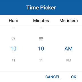
The Xamarin.Forms Time Picker shows the selectable time values in four predefined time formats. The Time Picker also provides support for formatting the text of the column and the header. The following code example and screenshot illustrate the “hh_mm_tt” time format.
<ContentPage xmlns="http://xamarin.com/schemas/2014/forms"
             xmlns:x="http://schemas.microsoft.com/winfx/2009/xaml"
             xmlns:local="clr-namespace:TimePickerSample"
             xmlns:timepicker="clr-namespace:Syncfusion.XForms.Pickers;assembly=Syncfusion.SfPicker.XForms"
             x:Class="TimePickerSample.MainPage">
    <ContentPage.Content>
        <Grid>
            <timepicker:SfTimePicker PickerMode="Dialog"
                                     Format="hh_mm_tt"
                                     ShowFooter="True"/>
        </Grid>
    </ContentPage.Content>
</ContentPage>
Dialog and standalone
A compact view of elements on the screen is one of the most important aspects of an application. Time Picker comes with standalone and dialog modes that make the app look more impressive in the UI.
<ContentPage xmlns="http://xamarin.com/schemas/2014/forms"
             xmlns:x="http://schemas.microsoft.com/winfx/2009/xaml"
             xmlns:local="clr-namespace:TimePickerSample"
             xmlns:timepicker ="clr-namespace:Syncfusion.XForms.Pickers;assembly=Syncfusion.SfPicker.XForms"
             x:Class="TimePickerSample.MainPage">
    <Grid>
        <timepicker:SfTimePicker x:Name="timePicker"
                                 PickerMode="Dialog" .../>
        <Button Clicked="PickerButton_Clicked" .../>
    </Grid>
</ContentPage >
public partial class MainPage
{
    public MainPage()
    {
        InitializeComponent();
    }
    private void PickerButton_Clicked(object sender,
                                       System.EventArgs e)
    {
        timePicker.IsOpen = true;
    }
}

Time values with intervals
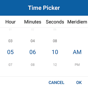
Time values can be populated with intervals in Time Picker for minutes, hours, and seconds, individually.
<timepicker:SfTimePicker PickerMode="Dialog"
                         HourInterval="2"
                         MinuteInterval="2"
                         SecondInterval="2" .../>
Customization
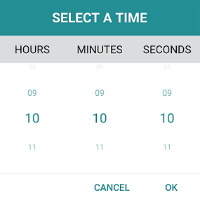
You can customize the colors and fonts of the headers, column headers, footer, and time values. The following code example shows how the selected and unselected values are customized along with fonts.
<timepicker:SfTimePicker PickerMode="Dialog"
                         HeaderText="SELECT A TIME"
                         HeaderBackgroundColor="#238F94"
                         HeaderTextColor="#FFFFFF"
                         OKButtonTextColor="#238F94"
                         CancelButtonTextColor="#238F94"
                         UnselectedItemTextColor="#238F94"
                      ColumnHeaderBackgroundColor="#DADDDE"
                         SelectedItemTextColor="#238F94"
                         ShowFooter="True"/>
Creating a Xamarin.Forms application containing the Time Picker
This section explains the step-by-step procedure for implementing the Time Picker control in a Xamarin.Forms application using Visual Studio:
- Create a blank Xamarin.Forms application.
- In the application, reference the Xamarin.SfPicker NuGet package from nuget.org. To learn more about SfTimePicker, refer to the Adding SfTimePicker reference documentation.
- When deploying the application in UWP and iOS, follow the steps provided in the Launching the application on each platform with Time Picker documentation.
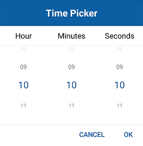
- Import the Time Picker namespace in your page and initialize SfTimePicker as demonstrated in the following code sample.
<?xml version="1.0" encoding="utf-8" ?>
<ContentPage xmlns="http://xamarin.com/schemas/2014/forms"
             xmlns:x="http://schemas.microsoft.com/winfx/2009/xaml"
             xmlns:local="clr-namespace:TimePickerSample"
             xmlns:timepicker="clr-namespace:Syncfusion.XForms.Pickers;assembly=Syncfusion.SfPicker.XForms"
             x:Class="TimePickerSample.MainPage">
    <ContentPage.Content>
        <Grid>
            <timepicker:SfTimePicker x:Name="timePicker"
                                 PickerMode="Dialog"
                                 PickerWidth="300"
                                 ShowFooter="True"/>
            <Button Text="Open time Picker"
                    x:Name="pickerButton"
                    Clicked="PickerButton_Clicked"
                    HorizontalOptions="Center"
                    VerticalOptions="Center"
                    HeightRequest="50"
                    WidthRequest="200"/>
        </Grid>
    </ContentPage.Content>
</ContentPage>
using Xamarin.Forms;

namespace TimePickerSample
{
    public partial class MainPage : ContentPage
    {
        public MainPage()
        {
            InitializeComponent();
        }

        private void PickerButton_Clicked(object sender, System.EventArgs e)
        {
            timePicker.IsOpen = true;
        }
    }
}
You can download a basic sample from the Getting Started section of our Time Picker control documentation.
Conclusion
In this blog post, we walked through our new Xamarin.Forms Time Picker component and its features. Try this control with our 2019 Volume 4 release. To learn more about this component, refer to our UG documentation. You can drop your comments below if you need any clarifications about this component.
Try our Time Picker component with this sample project available on GitHub.
If you need support for specific features in this component or have any questions, contact us through our support forum, Direct-Trac, or feedback portal. We are waiting to hear your feedback about this new component!

Comments (1)
VERY useful