
 Jegan Raj M
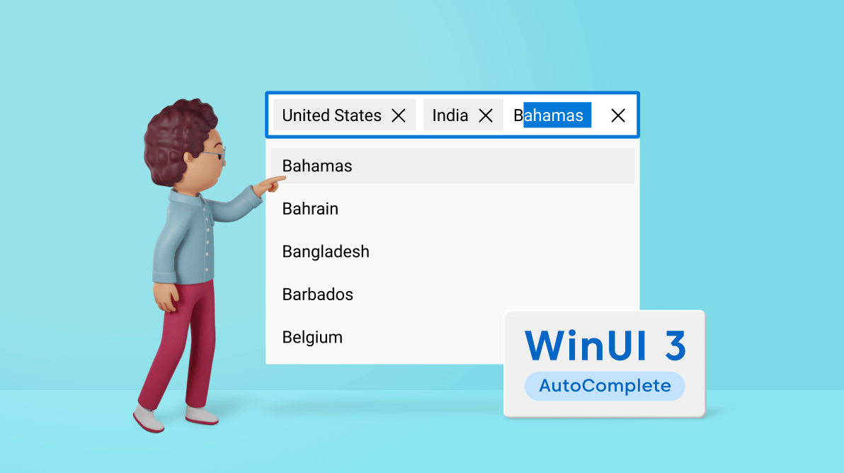
We are glad to announce our new WinUI 3 AutoComplete control in the 2021 Volume 4 release. It is a text box control that shows a suggestion list based on user input.
The key features of the AutoComplete control are:
- Multiple selection
- Filtering
- Custom filtering
- Grouping
- Asynchronous item loading
- Item customization
- Theming
Let’s look at these features and learn how to integrate the new WinUI 3 AutoComplete control into your application.
Multiple selection
The AutoComplete control provides support for both single and multiple selection modes.
In single selection mode, we can select a single item from the suggestion list based on the entered text.
In multiple selection mode, we can choose more than one item from the suggestion list. The selected items are displayed as tokens or chips in the selection area. Each item has a close button to easily remove it.
Note: For more details, refer to the multiple selection mode in WinUI AutoComplete documentation.
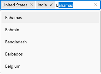
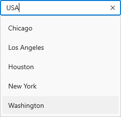
Filtering
The built-in filtering feature filters items based on the user input in the text box. It filters the items by matching the input text with the starting text or any specific text in the items.
Refer to the following GIF images.
Note: For more details, refer to the filtering modes in WinUI AutoComplete documentation.
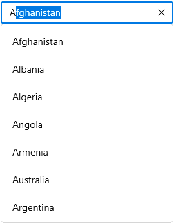
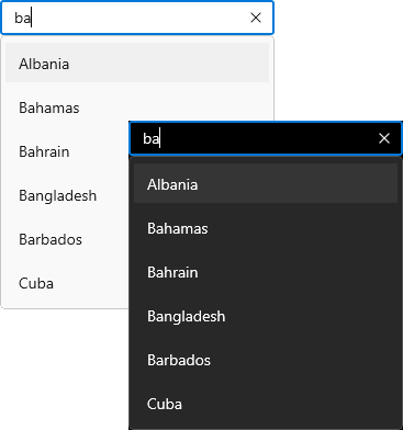
Custom filtering
Besides the built-in filtering support, users can use their own filtering logic to show suggestions. These suggestions can be loaded instantly from a huge volume of data.
Refer to the following image. Here, the AutoComplete filters cities based on the country name.
Note: For more details, refer to the custom filtering in WinUI AutoComplete documentation.
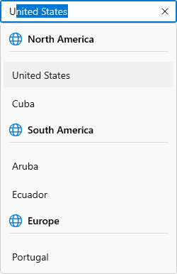
Grouping
You can display the suggestions by grouping them using the CollectionViewSource property. Each group will have a header. Also, we can customize the group headers with images and templates.
Refer to the following image.
Note: For more details, refer to the grouping in WinUI AutoComplete documentation.
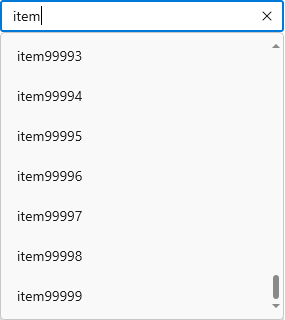
Asynchronous item loading
This feature dynamically loads a huge volume of data at runtime based on user input.
Refer to the following image where 100,00 items have been loaded based on the user input.
Note: For more details, refer to the asynchronous loading in WinUI AutoComplete documentation.
Item customization
Customize the suggestion list items to create an impressive UI with an image or any custom control. This helps users to easily choose the items they need from the list.

Note: For more details, refer to the WinUI AutoComplete dropdown item customization.
Themes
You can enjoy both light and dark themes in AutoComplete control.
Note: Refer to the themes for Syncfusion WinUI Controls documentation.
Getting started with the WinUI AutoComplete
We have explored the features of the WinUI AutoComplete control, so now let’s see how to add it to your app and use its basic features.
Step 1: Create a WinUI application.
First, create a simple project using the instructions provided in the Create a WinUI 3 app with Windows App SDK documentation.
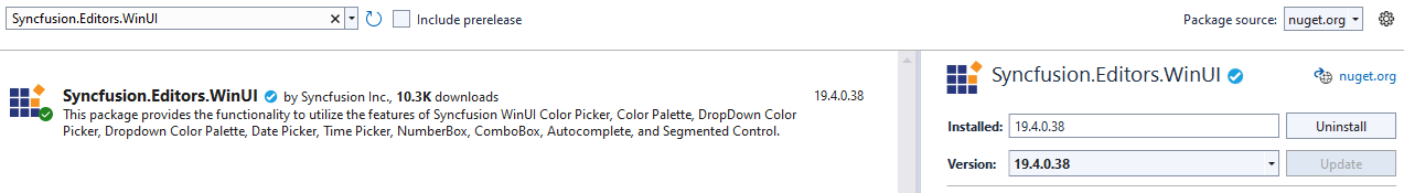
Step 2: Add the Syncfusion.Editor.WinUI NuGet package.
Install the latest Syncfusion.Editor.WinUI NuGet package in your app from nuget.org or from the installed location, C:\Program Files (x86)\Syncfusion\Essential Studio®\WinUI\xx.x.x.xx\NuGetPackages.
Note: In the installed location, xx.x.x.xx denotes the version of the Syncfusion WinUI Editor package.
Refer to the following image.
Step 3: Add the namespace.
Include the editors namespace in your XAML file with the following code.
xmlns:editors="using:Syncfusion.UI.Xaml.Editors"
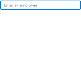
Step 4: Initialize the AutoComplete control.
Finally, initialize the AutoComplete control. Refer to the following code example.
<editors:SfAutoComplete  TextMemberPath="Name"
                         DisplayMemberPath="Name"
                         ItemsSource="{Binding Employees}" />
Here, the DisplayMemberPath property is used to specify the name or path of the property displayed for each data item in the dropdown list. The TextMemberPath property gets the value to display in the selection box portion when an item is selected.
Conclusion
Thanks for reading! I hope you enjoyed learning about the new Syncfusion WinUI 3 AutoComplete control and its features. This control is available in our 2021 Volume 4 release. Check out our Release Notes and What’s New pages to see all the new updates in this release. Try them out and leave your feedback in the comments section below!
Also, you can check our WinUI control demos on GitHub and in the Microsoft Store.
For existing customers, the new version is available for download from the License and Downloads page. If you are not yet a Syncfusion customer, you can try our 30-day free trial to check out our newest features.
You can also contact us through our support forums, support tickets, or feedback portal. We are always happy to assist you!
 No spam, just valuable updates.