
When it comes to data analysis and presentation, nothing beats a good chart. Charts visualize complex data in an easily understandable way. The Syncfusion WinUI Charts control provides over 20 popular and widely used chart types, like line, column, area, and circular. Its rich feature set includes data binding, multiple axes, legends, animations, data labels, tooltip, gradient, zooming, and so on.
First, let’s do a quick overview of our WinUI circular charts.
WinUI circular charts
The WinUI circular charts are user-friendly chart types that provide better UI visualization of data. These charts are classified into two types: pie charts and doughnut charts (also spelled donut).
Pie chart
The WinUI pie chart displays the proportions and percentages of different categories.
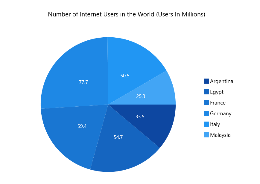
To render a pie chart, create an instance of the PieSeries and add it to the series collection property of the SfCircularChart.
Refer to the following XAML code.
<chart:SfCircularChart>
      <chart:SfCircularChart.Series>
          <chart:PieSeries ItemsSource="{Binding Data}" XBindingPath="Category"
                           YBindingPath="Value"/>
      </chart:SfCircularChart.Series>
</chart:SfCircularChart>
Doughnut chart
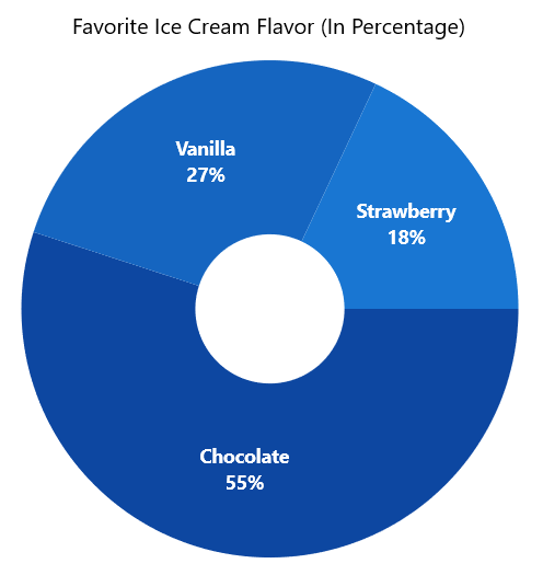
The WinUI doughnut chart is similar to the pie chart, but with an open space at the center. It is intended for comparing the contribution of each data point to the whole.
To render a doughnut chart, create an instance of the DoughnutSeries and add it to the Series collection property of the SfCircularChart. Refer to the following XAML code.
<chart:SfCircularChart>
    <chart:SfCircularChart.Series>
        <chart:DoughnutSeries ItemsSource="{Binding Data}"
                              XBindingPath="Product"
                              YBindingPath="SalesRate" />
    </chart:SfCircularChart.Series>
</chart:SfCircularChart>Spend less time building data visualization features from scratch. Syncfusion WinUI Charts includes ready-to-use support for multiple chart types, data binding, interactive tooltips, legends, zooming, selection, and responsive layouts.
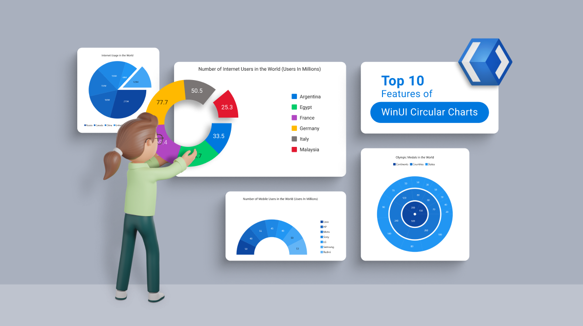
Start Building TodayNow, let’s explore the top 10 features of these WinUI circular charts:
- Legend
- Multilevel chart
- Semicircular chart
- Exploded segments
- Grouping small data points into others category
- Smart data label
- Tooltip
- Selection
- Animation
- UI styling
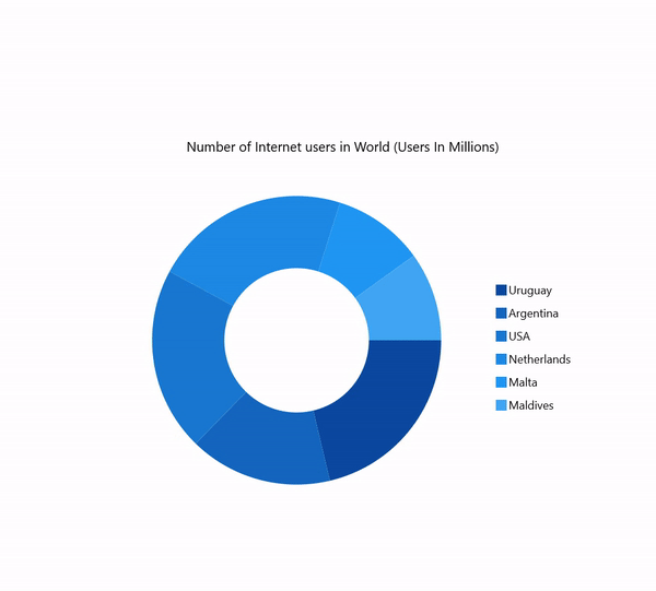
1. Legend
A legend provides additional information that helps us to identify the individual slices in a circular chart.
It supports the following options:
- Placement of legend on top, left, right, bottom, and inside the chart area.
- Vertical or horizontal orientation.
- Auto-creation of legend UI and binding to the underlying data model.
- APIs to customize the default UI appearance.
- Templating of legend items.
You can define legends in your WinUI Charts using the following code example.
<chart:SfCircularChart>
   <chart:SfCircularChart.Legend>
       <chart:ChartLegend />
   </chart:SfCircularChart.Legend>
</chart:SfChart>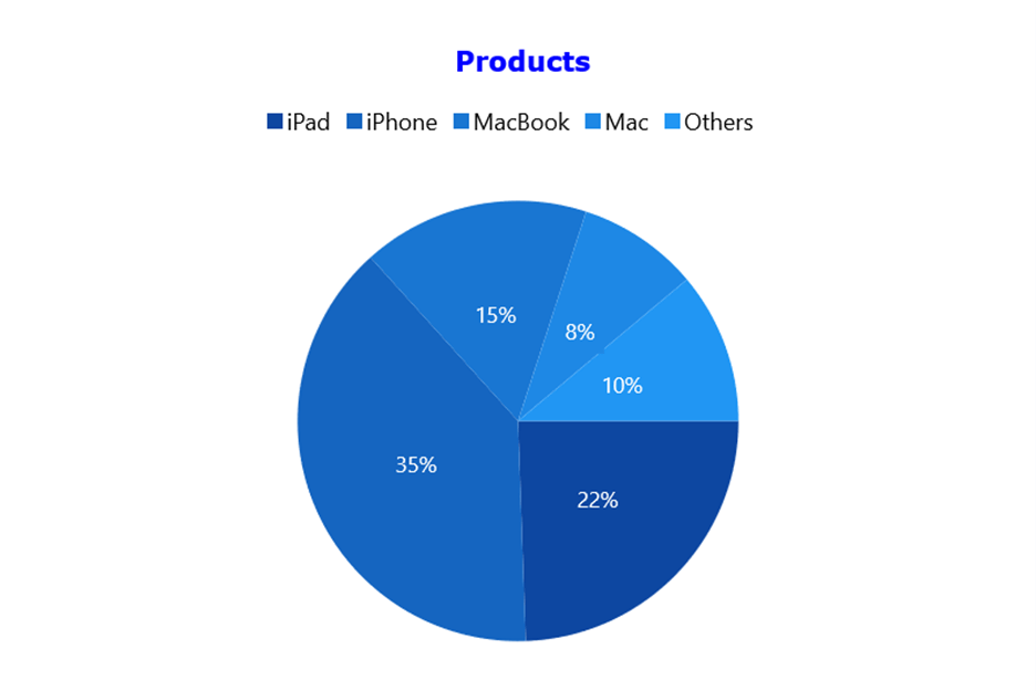
2. Multilevel circular chart
A multilevel circular chart allows users to add multiple series in a single chart. Usually, the donut chart has different categories of data slices. A multilevel donut chart is used to compare the distribution of category values.
Refer to the following XAML code example.
<chart:SfCircularChart>
      <chart:SfCircularChart.Series>
          <chart:DoughnutSeries ItemsSource="{Binding Data}" XBindingPath="Category"
                                YBindingPath="Value1"/>
          <chart:DoughnutSeries ItemsSource="{Binding Data}" XBindingPath="Category"
                                YBindingPath="Value2"/>
          <chart:DoughnutSeries ItemsSource="{Binding Data}" XBindingPath="Category"
                                YBindingPath="Value2"/>
      </chart:SfCircularChart.Series>
</chart:SfCircularChart >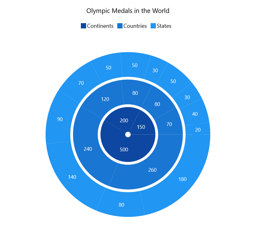
3. Semicircular chart
The main advantage of the semicircle chart is that it takes up half the space of a regular circular chart for the same amount of data displayed. The semi-doughnut chart is also known as a half doughnut chart.
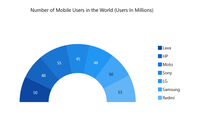
Note: For more details, refer to the WinUI Semi-Pie Chart and Semi-Doughnut Chart documentation.
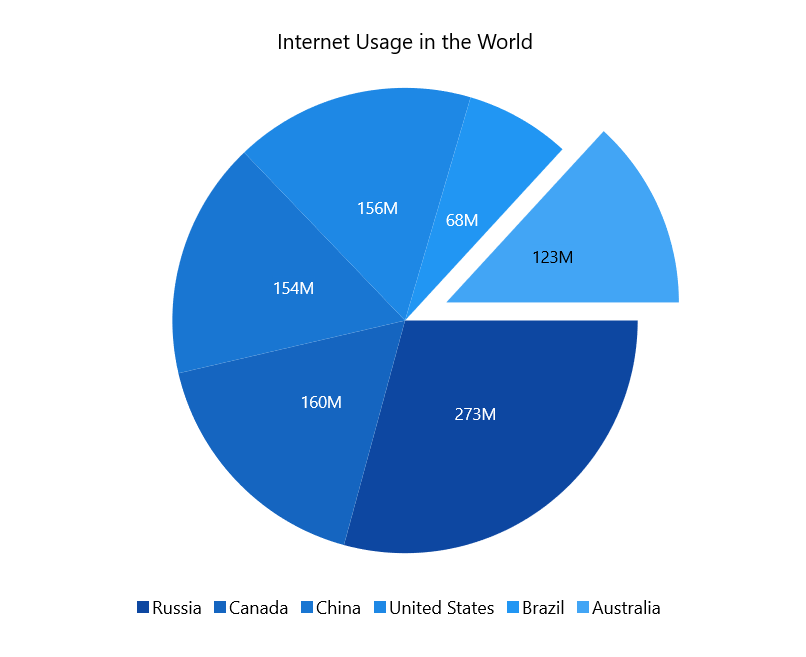
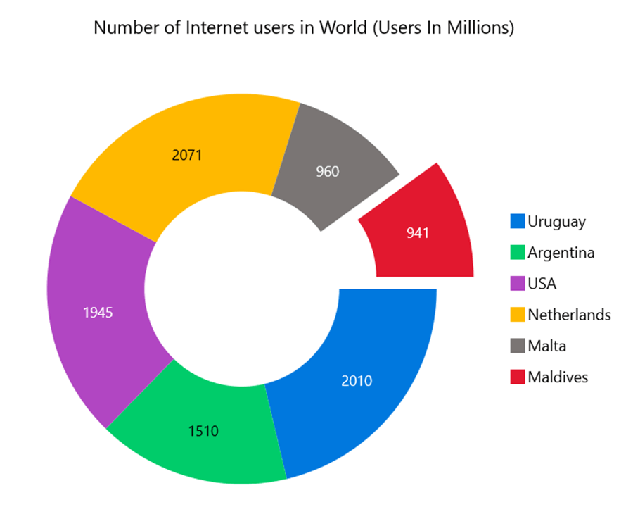
4. Exploded segments
An exploded segment in a circular chart is used to pull attention to a specific slice of the chart. You can change the explosion setting for all slices or specific slices. This can be done either programmatically or through user interaction.
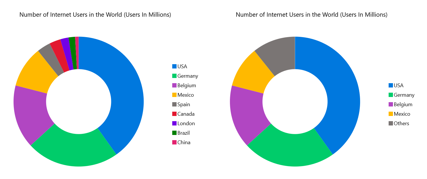
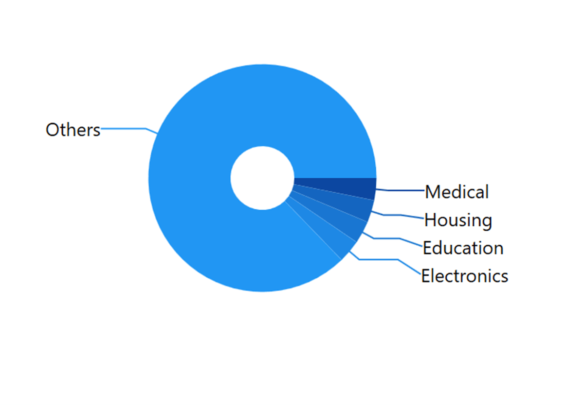
5. Grouping small data points into others category
A chart with a large number of segments can be challenging to decipher. Also, it is difficult to see the smaller segments and apply appropriate colors to distinguish all the segments.
In this scenario, you can group smaller segments into a single other segment. We can easily achieve this using the GroupTo and GroupMode properties.
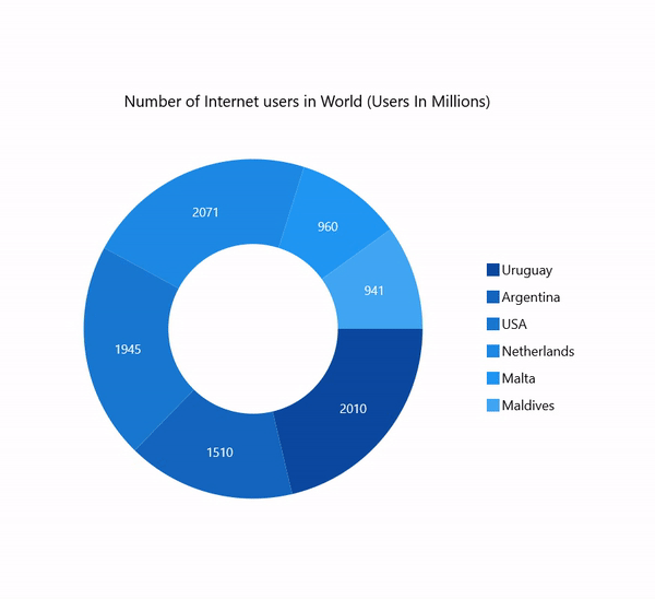
6. Smart data labels
In our WinUI circular charts, you can smartly arrange data labels to avoid overlapping when the data points fall close together.
7. Tooltip
The tooltip displays a pop-up with additional information when the mouse hovers over a data point.
8. Selection
This feature allows the users to interactively select and highlight a data point. This is widely used to navigate to another page of information about a selected data point or update other components on the same page based on the selected data point.
9. Animation
An animated chart, such as the one following, will attract the audience’s attention and direct it to specific points on the graph.

10. UI Styling customization
Customization is one of the significant features of any data visualization control. You can customize the look and feel of the WinUI circular charts using the built-in APIs.
References
For more details about the WinUI circular charts, refer to the following links:
Conclusion
Thanks for reading! In this blog post, we have seen the top 10 features of the Syncfusion WinUI circular charts. These chart types support other features, too. Use these vivid features to elegantly design and visualize the data points in your WinUI charts!
If you aren’t a customer yet, you can try our 30-day free trial to check out these features.
If you wish to send us feedback or would like to submit any questions, please feel free to post them in the comments section of this blog post. You can also contact us through our support forum, feedback portal, or support portal. We are always happy to assist you!
Related blogs
- WinUI 3 Date Picker Control-A Perfect Tool for Date Selection
- WinUI Scheduler: A Smart Tool to Handle Appointments in a Hospital
- Pick Colors Like a Boss Using Syncfusion Color Controls in WinUI
- How to Develop a Sleep Tracker in WinUI and Exploring 2021 Volume 3 Updates for WinUI, MAUI, & WPF [Webinar Show Notes]
 No spam, just valuable updates.