
 Satheeskumar S
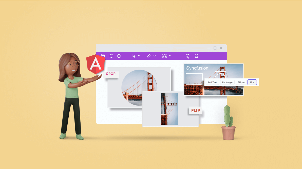
We are happy to introduce the new Angular Image Editor component with our latest release, 2022 Volume 3!
Let’s explore its features and UI design!
Image Editor overview
The Angular Image Editor is a graphical user interface for editing images. It provides built-in support to rotate, flip, zoom, and crop images. Users can insert annotations including text, freehand drawings, and shapes such as rectangles, ellipses, and lines. Also, the control supports keyboard interactions, events, and an optimized UI for touch gestures.
The following GIF image shows some of its features in action.
Use cases
The Angular Image Editor is a great fit for the following applications:
- Profile pictures: Crop any image and use it as your profile picture through the component’s user-friendly APIs. You can customize the Image Editor’s capabilities for this use by changing its toolbar or using external buttons.
- Photo editor: Use all the common image editing features built into the component’s toolbar. You can easily integrate the Image Editor into web or mobile applications to provide image editing capabilities.
Key features
The following are the key features available in the Angular Image Editor component:
- Load and save an image.
- Select and crop an image.
- Transform an image.
- Annotate an image.
- Zoom and pan an image.
- Customize the toolbar.
- Responsive, touch-friendly UI.
Let’s see how these features work with code examples.
Load and save an image
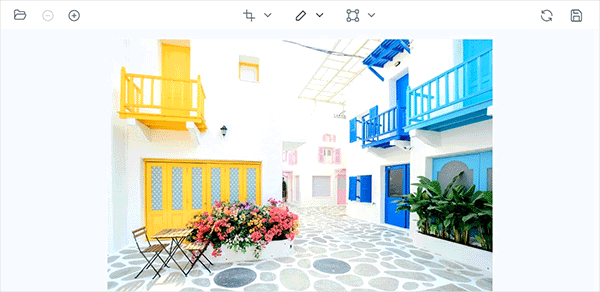
The Image Editor component can open base64, image data, or hosted and online URL images using the open method. You can also open an image by clicking the Open button in the toolbar. The supported file types are PNG, JPEG, and SVG.
Users can also edit images and save them as ImageData using the getImageData method. To save images in PNG, JPEG, and SVG formats, users can use the export method, which accepts file type and file name as parameters.
In the following code example, the open method is used to open a hosted image.
<div id="wrapperDiv" style="width:550px; height:350px;">
<ejs-imageeditor (created)="created()" #ImageEditor [toolbar]='toolbarItems'></ejs-imageeditor>
</div>
export class AppComponent {
@ViewChild('ImageEditor')
public ImageEditorInstance!: ImageEditorComponent;
public toolbarItems: string[] = [];
public created = (): void => {
this.ImageEditorInstance.open("http://localhost:6969/image/bridge.png");
}
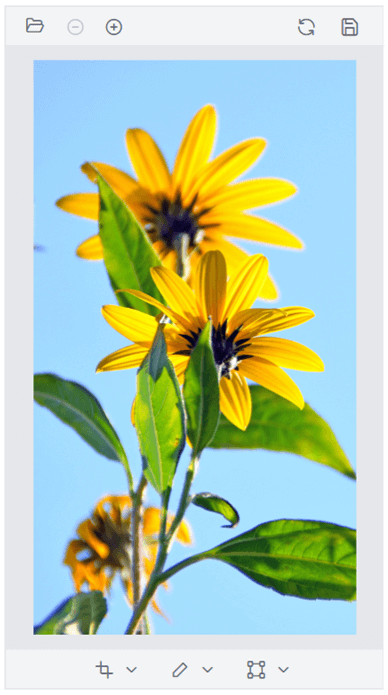
}The output of this code example is shown in the following image.

Note: To view hosted images, you need to enable the Directory Browsing option in IIS, which creates a web.config file inside the hosted folder. Add the following code in the web.config file to resolve the CORS issue.
<?xml version="1.0" encoding="UTF-8"?>
<configuration>
 <system.webServer>
 <directoryBrowse enabled="true" />
  <httpProtocol>
   <customHeaders>
    <clear />
    <add name="Access-Control-Allow-Origin" value="*" />
   </customHeaders>
  </httpProtocol>
 </system.webServer>
</configuration>
Selection and cropping
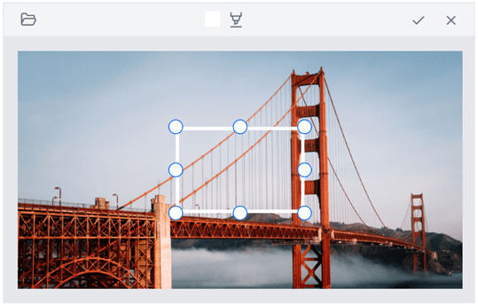
The Image Editor component supports multiple selection options including square, circle, and custom shapes. It can also handle various aspect ratios. You can crop an image by dragging and resizing the selection region. You can perform selection by either using the toolbar or the select method.
In the select method, we have to specify the selection type (custom, square, or circle) and aspect ratios (3:2, 4:3, 5:4, 7:5, or 16:9).
In the toolbar, we can perform selection by just clicking the Crop dropdown button and picking a selection shape (custom, square, or circle) and aspect ratio.
Cropping
The Angular Image Editor can crop any image based on a user-defined selection. The cropping can be made by either using the toolbar or the crop method.
In the toolbar, we can perform cropping by clicking the OK button that is enabled after the user selects a part of the image.
In the following code example, we have used the select and crop methods to perform circular selection and crop the image.
<div>
 <div style="padding-bottom: 10px;">
  <button class="e-btn" (click)="select()">Select</button>
  <button class="e-btn" (click)="crop()">Crop</button>
 </div>
 <div id="wrapperDiv" style="width:550px; height:350px;">
  <ejs-imageeditor (created)="created()" #ImageEditor [toolbar]='toolbarItems'></ejs-imageeditor>
 </div>
</div>
export class AppComponent {
 @ViewChild('ImageEditor')
 public ImageEditorInstance!: ImageEditorComponent;
 public toolbarItems: string[] = [];
 public created = (): void => {
  this.ImageEditorInstance.open("http://localhost:6969/image/bridge.png");
 }
 public select = (): void => {
  this.ImageEditorInstance.select('circle');
 }
 public crop = (): void => {
  this.ImageEditorInstance.crop();
 }
}
Transform an image
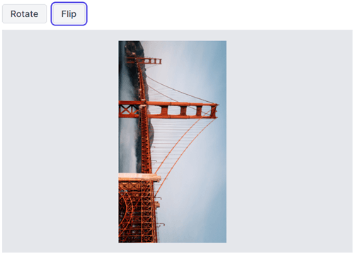
The Angular Image Editor component has rotate and flip transformation support. The rotation transformation allows users to rotate an image clockwise or counterclockwise 90, 180, 270, or 360 degrees. The flip transformation supports horizontal and vertical orientations. We can perform both transformations by either using the toolbar or the rotate and flip methods.
In the toolbar, we can perform rotate and flip actions by clicking the Transform dropdown button and selecting one of the Rotate Left, Rotate Right, Horizontal Flip, or Vertical Flip options.
In the following code example, the rotate and flip methods are used to perform rotation and flip actions.
<div>
 <div style="padding-bottom: 10px;">
  <button class="e-btn" (click)="rotate()">Rotate</button>
  <button class="e-btn" (click)="flip()">Flip</button>
 </div>
 <div id="wrapperDiv" style="width:550px; height:350px;">
  <ejs-imageeditor (created)="created()" #ImageEditor [toolbar]='toolbarItems'></ejs-imageeditor>
 </div>
</div>


export class AppComponent {
 @ViewChild('ImageEditor')
 public ImageEditorInstance!: ImageEditorComponent;
 public toolbarItems: string[] = [];
 public created = (): void => {
  this.ImageEditorInstance.open("http://localhost:6969/image/bridge.png");
 }
 public rotate = (): void => {
  this.ImageEditorInstance.rotate(90);
 }
 public flip = (): void => {
  this.ImageEditorInstance.flip("Vertical");
 }
}
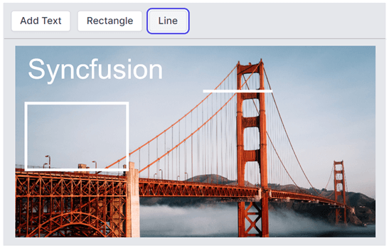
Annotations
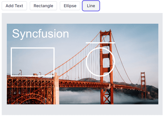
The Angular Image Editor component supports multiple types of annotations, including text, freehand drawings, and shapes such as rectangles, ellipses, and lines.
Text
You can insert a text annotation and customize it by changing its color, font family, font size, and font styles, such as bold and italic. You can add a text annotation by either using the toolbar or the drawText method.
In the drawText method, you can insert a text annotation by specifying the text, font family, font size, and font styles.
In the toolbar, we can insert a text annotation by just clicking the Annotation dropdown button and picking the Add Text option. Once the text is inserted, the contextual toolbar will be enabled to customize the annotation’s color, font family, font size, and font styles, such as bold and italic.
Shapes
You can insert and customize the shape annotations such as rectangles, ellipses, and lines by changing their stroke color, fill color, and stroke width. Shape annotations can be made by either using the toolbar or the drawRectangle, drawEllipse, and drawLine methods.
In the toolbar, we can insert the shape annotations by clicking the Annotation dropdown button and picking either the Rectangle, Ellipse, or Line options. Once the shape is inserted, the contextual toolbar will be enabled to customize the annotation’s stroke color, fill color, and stroke width.
In the following code example, the drawText method is used to insert text, and the drawRectangle, drawEllipse, and drawLine methods are used to insert the respective annotation shapes.
<div>
 <div style="padding-bottom: 10px;">
  <button class="e-btn" (click)="text()">Add Text</button>
  <button class="e-btn" (click)="rectangle()">Rectangle</button>
  <button class="e-btn" (click)="ellipse()">Ellipse</button>
  <button class="e-btn" (click)="line()">Line</button>
 </div>
 <div id="wrapperDiv" style="width:550px; height:350px;">
  <ejs-imageeditor (created)="created()" #ImageEditor [toolbar]='toolbarItems'></ejs-imageeditor>
 </div>
</div>

export class AppComponent {
 @ViewChild('ImageEditor')
 public ImageEditorInstance!: ImageEditorComponent;
 public toolbarItems: string[] = [];
 public created = (): void => {
  this.ImageEditorInstance.open("http://localhost:6969/image/bridge.png");
 }
 public text = (): void => {
  this.ImageEditorInstance.drawText(50, 50, 'Syncfusion');
 }
 public rectangle = (): void => {
  this.ImageEditorInstance.drawRectangle(50, 300);
 }
 public ellipse = (): void => {
  this.ImageEditorInstance.drawEllipse(1000, 300);
 }
 public line = (): void => {
  this.ImageEditorInstance.drawLine(1000, 150);
 }
}
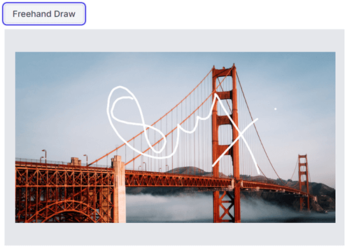
Freehand drawing
You can easily insert a freehand drawing annotation and customize it by changing its stroke color and stroke width. The freehand drawing annotation can be made by either using the toolbar or the freehandDraw method.
In the toolbar, you can insert the freehand draw annotation by clicking the Annotation dropdown button and picking the Freehand Draw option. Once the freehand draw option is enabled, the contextual toolbar will be enabled to customize the stroke color and width.
In the following code example, the freehandDraw method is used to toggle the freehand drawings.
<div>
 <div style=”padding-bottom: 10px;”>
  <button class=”e-btn” (click)=”freehanddraw()”>Freehand Draw</button>
 </div>
 <div id=”wrapperDiv” style=”width:550px; height:350px;”>
  <ejs-imageeditor (created)=”created()” #ImageEditor [toolbar]=’toolbarItems’></ejs-imageeditor>
 </div>
</div>

export class AppComponent {
 @ViewChild(‘ImageEditor’)
 public ImageEditorInstance!: ImageEditorComponent;
 public toolbarItems: string[] = [];
 public created = (): void => {
  this.ImageEditorInstance.open(“http://localhost:6969/image/bridge.png”);
 }
 public freehanddraw = (): void => {
  this.ImageEditorInstance.freeHandDraw(true);
 }
}
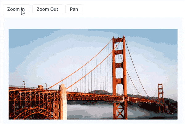
Zooming and panning an image
The Angular Image Editor allows users to zoom and pan an image. You can perform zooming and panning by either using the toolbar or the zoom and pan method.
In the toolbar, we can perform zooming by clicking the Zoom In and Zoom Out buttons, which enable the Pan option in the toolbar.
In the following code example, the zoomIn, zoomOut, and pan methods are used to perform zooming in, zooming out, and panning the image, respectively.
<div>
 <div style="padding-bottom: 10px;">
  <button class="e-btn" (click)="zoomIn()">Zoom In</button>
  <button class="e-btn" (click)="zoomOut()">Zoom Out</button>
  <button class="e-btn" (click)="pan()">Pan</button>
 </div>
 <div id="wrapperDiv" style="width:550px; height:350px;">
  <ejs-imageeditor (created)="created()" #ImageEditor [toolbar]='toolbarItems'></ejs-imageeditor>
 </div>
</div>

export class AppComponent {
 @ViewChild('ImageEditor')
 public ImageEditorInstance!: ImageEditorComponent;
 public toolbarItems: string[] = [];
 public created = (): void => {
  this.ImageEditorInstance.open("http://localhost:6969/image/bridge.png");
 }
 public zoomIn = (): void => {
  this.ImageEditorInstance.zoom(0.1);
 }
 public zoomOut = (): void => {
  this.ImageEditorInstance.zoom(-0.1);
 }
 public pan = (): void => {
  this.ImageEditorInstance.pan(true);
 }
}
Toolbar customization
You can customize the built-in toolbar using the toolbar property. A contextual toolbar is enabled while inserting annotations. You can also customize the toolbar by using the toolbarUpdating event.
In the following code example, the annotate option is only enabled with text, rectangle, and ellipse options using the toolbar property, and the contextual toolbar for the rectangle annotation is rendered with only stroke color by excluding fill color and stroke width using the toolbarUpdating event.
<div>
 <div id=”wrapperDiv” style=”width:550px; height:350px;”>
  <ejs-imageeditor (toolbarUpdating)=”toolbarUpdating($event)” (created)=”created()” #ImageEditor [toolbar]=’toolbarItems’></ejs-imageeditor>
 </div>
</div>

export class AppComponent {
 @ViewChild(‘ImageEditor’)
 public ImageEditorInstance!: ImageEditorComponent;
 public toolbarItems: string[] = [‘Annotate’, ‘Text’, ‘Rectangle’, ‘Ellipse’];
 public created = (): void => {
  this.ImageEditorInstance.open(“http://localhost:6969/image/bridge.png”);
 }
 public toolbarUpdating = (args: ToolbarEventArgs): void => {
  if (args.toolbarType === ‘shapes’) {
   args.toolbarItems = [‘strokeColor’];
  }
 }
}
Toolbar template
Also, users can replace the toolbar of the Image Editor with the user-specific UI using the toolbarTemplate property.
Refer to the following code example.
<div>
 <div id="wrapperDiv" style="width: 550px; height: 350px;">
  <ejs-imageeditor (created)="created()" #ImageEditor>
   <ng-template #toolbarTemplate let-data>
    <div style="padding: 10px; border-bottom: 1px solid darkgray;">
     <button class="e-btn" (click)="text()">Add Text</button>
     <button class="e-btn" (click)="rectangle()">Rectangle</button>
     <button class="e-btn" (click)="line()">Line</button>
    </div>
   </ng-template>
  </ejs-imageeditor>
 </div>
</div>

export class AppComponent {
 @ViewChild('ImageEditor')
 public ImageEditorInstance!: ImageEditorComponent;
 public toolbarItems: string[] = ['Annotate', 'Text', 'Rectangle', 'Ellipse'];
 public created = (): void => {
  this.ImageEditorInstance.open("http://localhost:6969/image/bridge.png");
 }
 public text = (): void => {
  this.ImageEditorInstance.drawText(50, 50, 'Syncfusion');
 }
 public rectangle = (): void => {
  this.ImageEditorInstance.drawRectangle(50, 300);
 }
 public line = (): void => {
  this.ImageEditorInstance.drawLine(1000, 150);
 }
}
Adaptive and touch-friendly UI
By default, the Angular Image Editor adapts to all mobile devices based on the screen size. It is a touch-friendly component, so users can use their finger, a pen, or a mouse device on desktop and mobile devices to edit the image.
How to use it
We have a set of resources for you, including our Angular Image Editor live demos and documentation that explains our customization features.

Conclusion
Thanks for reading! We hope you enjoyed this quick introduction to the design and features of our new Angular Image Editor component. If you would like to give it a try, please download the latest available version of Essential Studio®, 2022 Volume 3 . Experience wonderful image editing with this component and provide your valuable feedback in the comments section below.
You can also contact us through our support forums, support portal, or feedback portal. We are always happy to assist you!
 No spam, just valuable updates.