Typically, user scenarios with transactions, sales, employees, warehouse details, etc., are maintained as flat data in a table. These entries will have lot of raw data and it will be very difficult to analyze them. Taking this into consideration, our pivot grid widget has been developed to automatically summarize raw data and group it. It also allows the user to manipulate the data in different ways (sorting, filtering, calculated fields, etc.) and get the reports changed dynamically at runtime.
With the introduction of Essential JS 2 pivot grid, users will be able to append a HTML5 multidimensional data visualization component into their web-based application. Pivot grid is an interactive widget that works on top of the relational data source, presenting a rich UI and high-performance pivot engine to aggregate and analyze the raw data in a meaningful and grouped manner. To add the pivot grid to your app easily, you can refer to our documentation.
In this blog, we are going to walk you through the most important details of the pivot grid. We will be looking at the following sections one by one:
- Possible UI settings to create and alter reports dynamically at runtime.
- Creating new fields based on existing measures and simple arithmetic formulas.
- Key features of pivot grid.
- What’s coming next in Essential Studio® v16.4.
User interaction
The main motive of the UI interface is to provide a good user experience. Users anticipate the interface will be easy to access, be easy to understand, fulfill their needs, and have a pleasant aesthetic appearance. Our pivot grid will satisfy these through the pivot field list and grouping bar features.
Field list
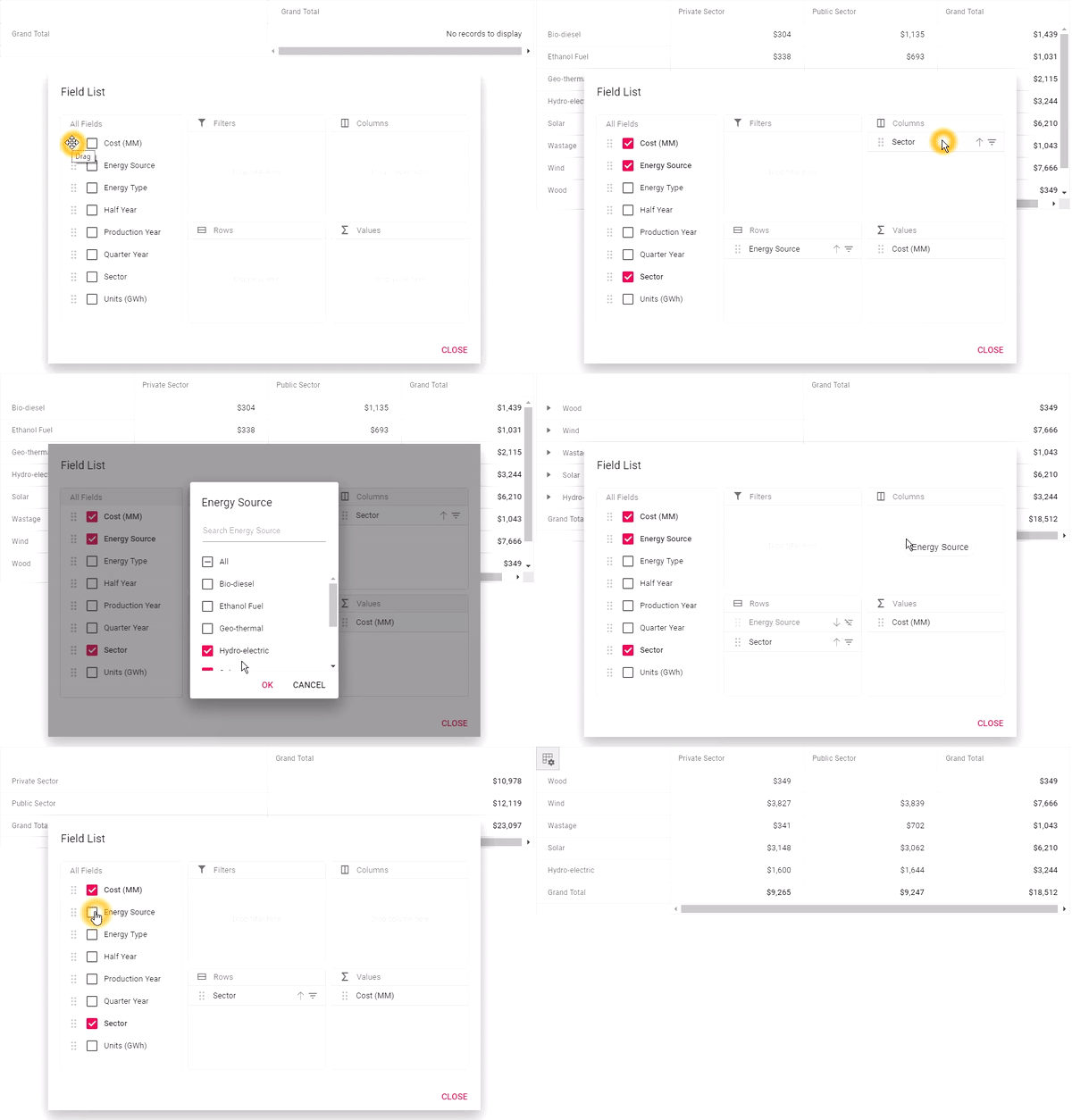
Field list is similar to a schema designer for your raw data from the data source. It allows you to manage and customize the pivot reports at runtime. The following report manipulations can be performed through the field list UI.
Create: Users can create reports by simply dragging an unbound field from a field list across the four axes and get the view instantly in pivot grid.
Customize: Users can customize an existing report by simply dragging the field (either unbound or bound) across the four axes. Also, users can rearrange the order of the bound fields within the same axis.
Deletion: Fields can be removed either by dragging the field outside the axes or by unchecking the bound item from the field list.
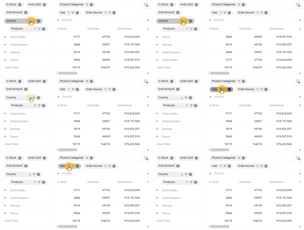
Filtering and sorting: Filter and sort icons are placed inside the pivot button. They allow users to remove records based on a condition and order them. On performing any such operation, the icon also changes, indicating its current state.
To learn more about field list, refer to our documentation.
Grouping bar
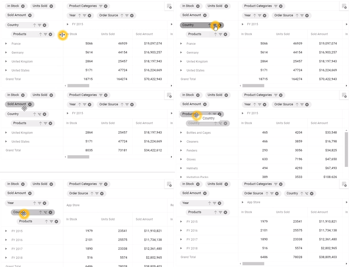
Grouping bar gets displayed at the top of the pivot grid as a panel and its main scope is to customize the report with the bound fields alone. No new report can be created using grouping bar. It allows you to drag fields between different axes, such as columns, rows, values, and filters, and change pivot views at runtime. The below report manipulations could be performed.
Customize: Allows the user to customize an existing report by dragging a bound field across the four axes. Also, the user can rearrange the order of the bound fields within the same axis.
Deletion: Fields can be removed by dragging them outside the axes.
Filtering and sorting: Filter and sort icons are placed inside the pivot button. They allow users to remove records based on conditions and order them. On performing any such operation, the icon also changes, indicating its current state.
To learn more about grouping bar, refer to our documentation.
Calculated field list
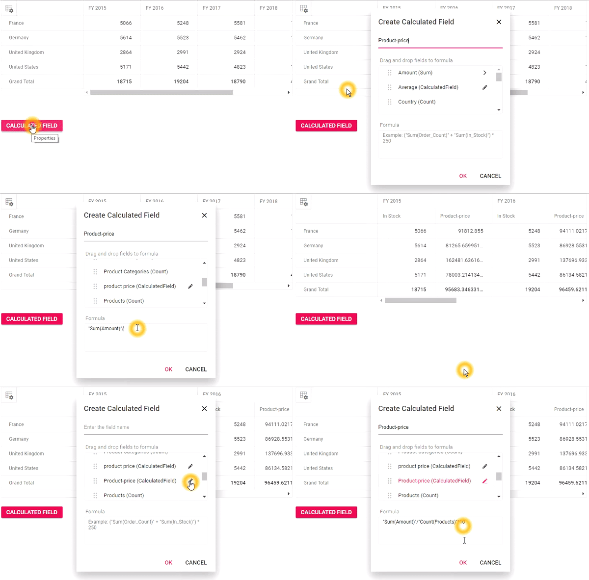
A user-defined value field can be created and added based on a simple mathematical formula and other value fields. For example, assume that you have information on the total sales amount and discount amount of the products in a store. Now, if you want to display information about the discount percentage of each product, a new, user-defined field should be created. The actual formula to calculate a discount rate is:
| Discount amount / (Sales amount + discount amount) * 100 |
To achieve this case practically, in the calculated field UI, simply drag the fields, total sales amount and discount amount, into the formula bar, prepare an arithmetic expression, and execute as shown in the following image.
| “Sum(discount_amt)”/(“Sum(sales_amt)”+ “Sum(discount_amt)”)*100 |
To learn more about calculated fields, refer to our documentation.
Key features
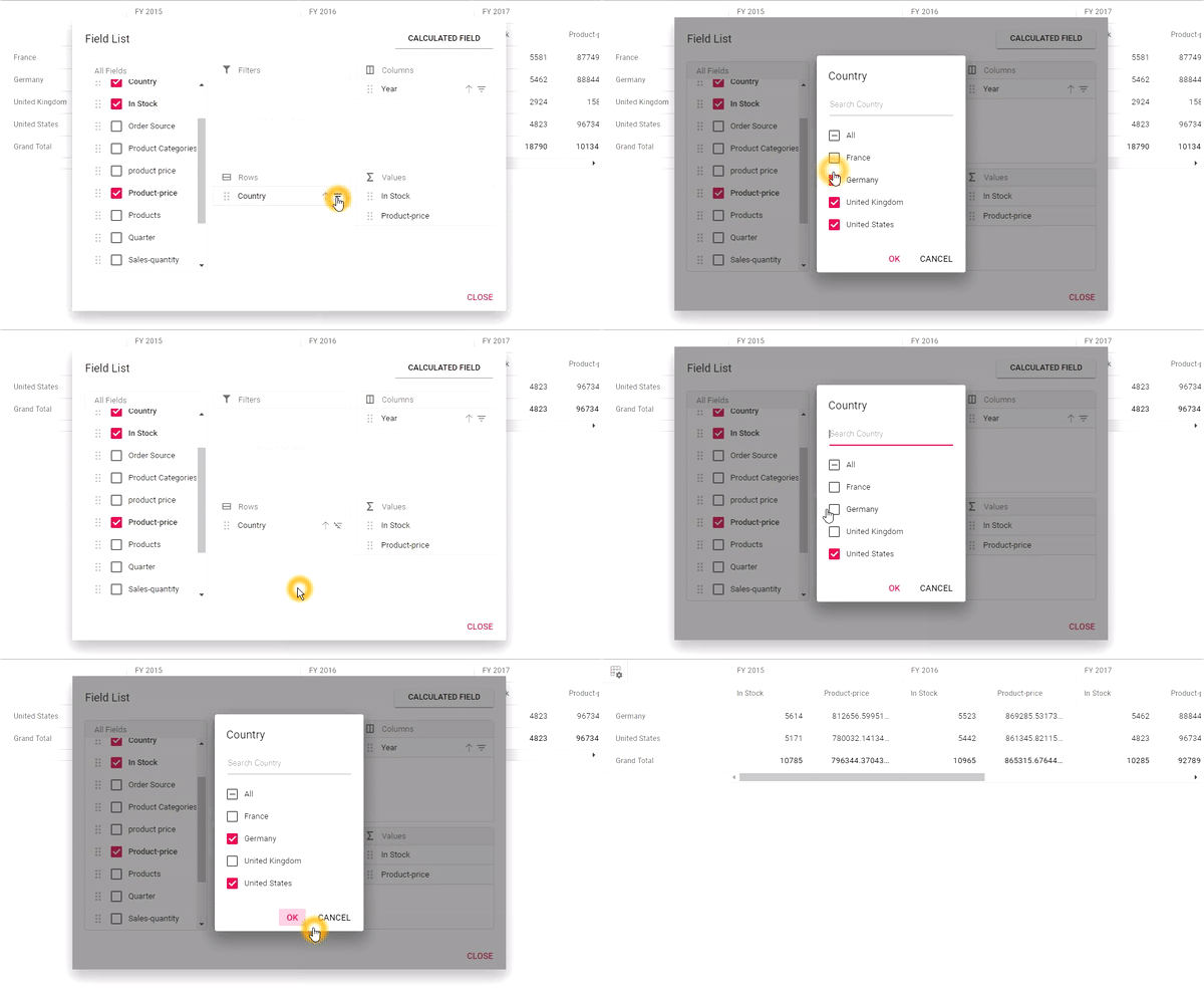
Filtering
Filtering is one of the most important features. It slices the member in order to get precise information that the user is looking for quickly. In other words, filtering allows you to view pivot grid with particular records based on filter criteria. It can be configured using the filterSettings option through code behind. Also, the field list and grouping bar UI has this functionality built in, allowing users to apply filter criteria at runtime. To learn more about filtering, refer to our documentation.
Sorting
Yet another important feature is sorting. Sorting allows users to order the field header in rows and columns, either in ascending or descending order. By default, the sorting option is enabled in pivot grid, allowing field headers to be arranged in ascending order. Users can disable sorting by setting the enableSorting property to false. Sorting can be applied either through code behind or UI options like field list and grouping bar. To learn more about sorting, refer to our documentation.
Aggregation
Sometimes users may need different aggregation types, like minimum, maximum, average, and count, instead of summing the values by default. For example, they may need the maximum selling quantity and minimum price. In such a case, calculations are performed over a group of values using the aggregation option and its resultant data is bound to the pivot grid. This option needs be defined through the report in code behind. To learn more about aggregation, refer to our documentation.
Exporting
At the end of an analysis, if the user wants the data to be saved for later use or wishes to send it to other users, exporting seems to be the best practice. The exporting option is an essential feature for any analytics tool. The pivot grid provides exporting support for Excel, PDF, and CSV file formats, along with customization options. Please check out the documentation for Excel and PDF.
What’s coming next?
We are planning to provide the following features in our Volume 3 release.
Virtual scrolling
The pivot grid will provide a great experience with the virtual scrolling option. It will load large amounts of data without any performance problem, with a smooth scrolling experience. Technically, data will be generated only for the view area alone. When a user scrolls, either vertically or horizontally, the event will trigger to get the new data and update the pivot grid view dynamically.
Excel-like labels and value filters
We are also planning to provide label and value filters, to expand the filter options, and improve the analysis results bound to the pivot grid view, inspired by Microsoft Excel. On applying a label filter, the pivot grid view excludes the display of members from that filtered-out field. With value filters, aggregated values across the bound field, meeting the criteria/range would be displayed excluding the rest.
Conclusion
If you are an existing customer, please download the new version of Essential JS 2 from the download page and try the new widget and its features for yourself. If you are a new customer, you can try our 30-day free trial to check out this new widget.
If you have any questions or require clarification, please let us know in the comments section below. You can also contact us through our support forum or Direct-Trac.
Would you like to learn more about JavaScript and other related topics?
We recommend the following free ebooks:

Comments (2)
Documentation links are broken. Every link contains …/pivotview/… which does not work, whilst changing them to …/pivot-grid/… works.
Hi Peter,
Thank you very much for catching that! We will get it updated right away. We appreciate your reaching out. Glad the blog was informative.
Warm regards,
Ginger