
 Meikanda Nayanar I
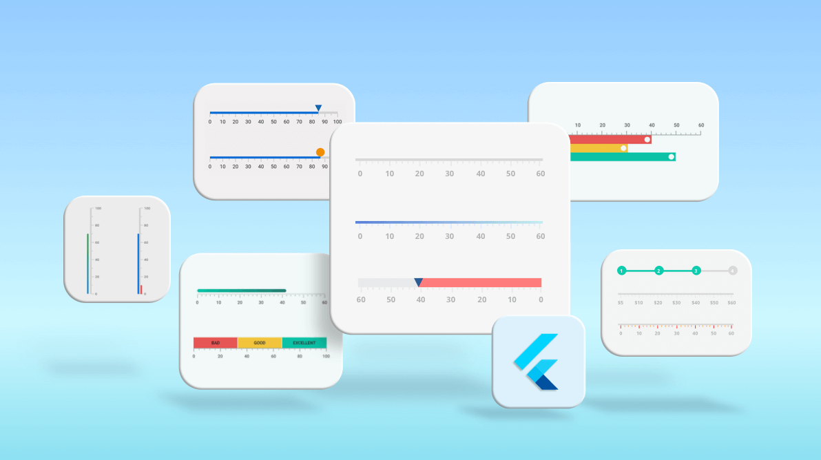
We at Syncfusion are very happy to announce the availability of the new Flutter Linear Gauge widget in the 2021 Volume 1 release. The Flutter Linear Gauge is a vivid data visualization widget that displays data on a linear scale in either horizontal or vertical orientation.
Key features
The key features of the Flutter Linear Gauge widget are:
- Set a gauge’s orientation either as vertical or horizontal.
- Easily customize all gauge elements.
- Mirror the complete widget with just a single property.
- Create most common tools like a thermometer or height calculator with minimal lines of code.
- Apply smooth animations during interactions.
- Swipe and drag gestures are possible with pointers.
Widget anatomy
The new Flutter Linear Gauge widget comes with the following easily customizable elements:
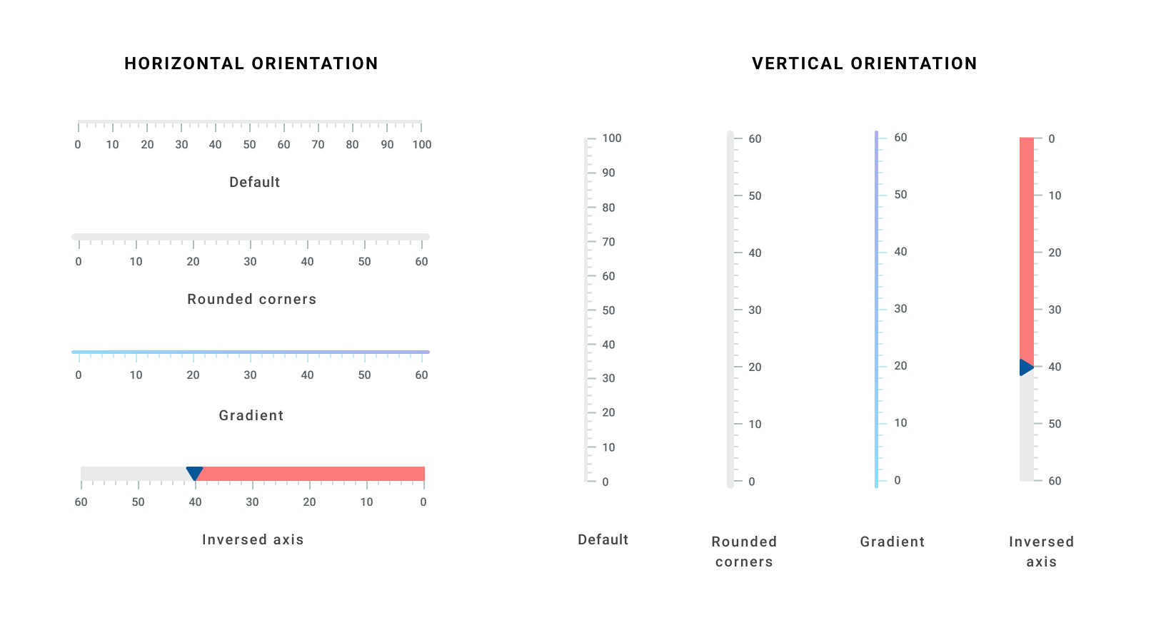
Axis track
The Linear Gauge axis is a scale where a set of values are plotted. We can customize its thickness, color, and edge styles. You can also inverse or extend the axis. Its color can be either solid or a linear gradient. The edges can be customized to have rounded corners or flat. You can also set one corner to be rounded and the others to be flat.
Ticks and labels
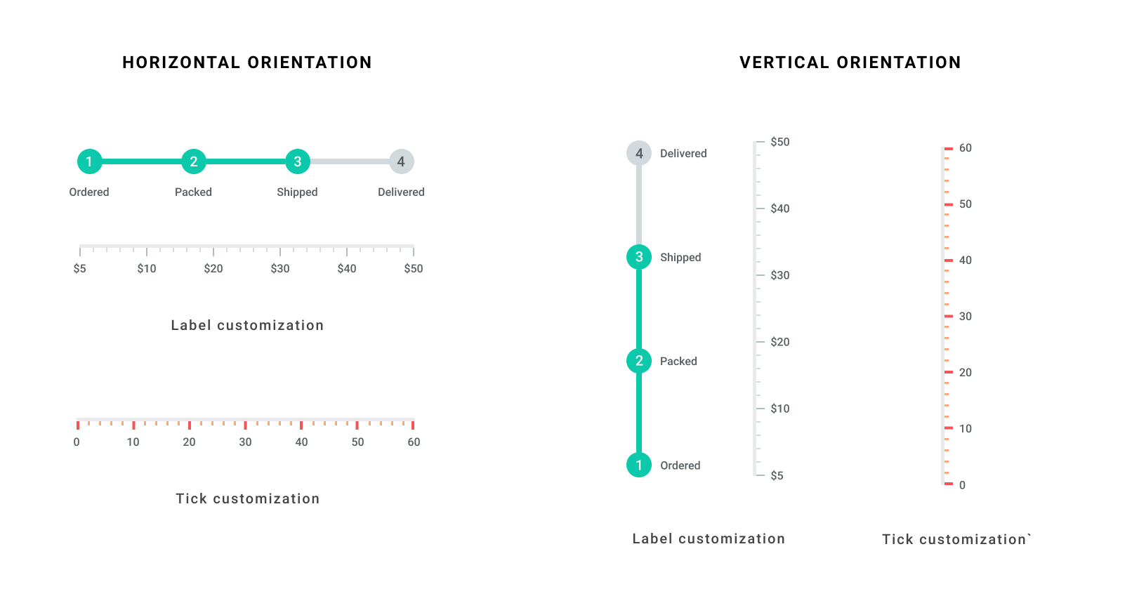
We can easily customize the Linear Gauge axis elements, such as labels and major and minor ticks, to different styles. The Linear Gauge provides multiple text customization options for its labels. You can also customize:
- Interval between the labels.
- The number of minor ticks between each pair of major ticks.
- The position of ticks and labels.
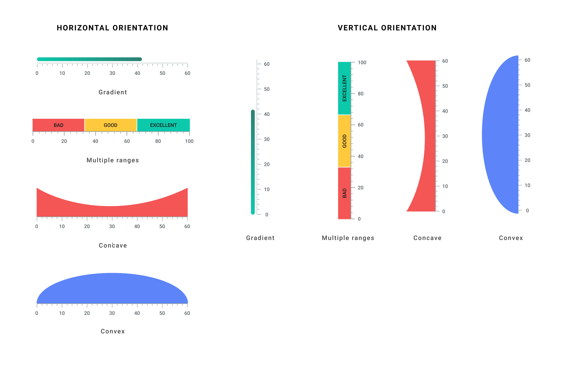
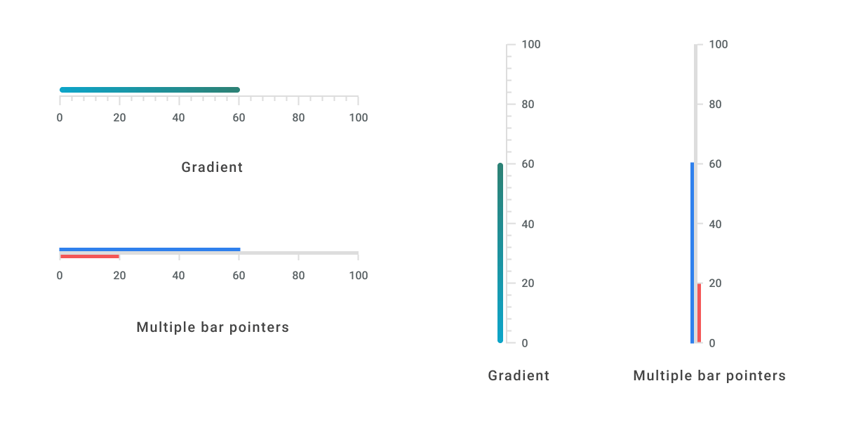
Ranges
A range is a visual element that helps you quickly visualize where the values fall on an axis track. It will denote the selected rage of values using start and end points in an axis track . We can add multiple ranges with different styles to a Linear Gauge. You can customize the representation of ranges with different shapes like concave and convex. Also, with these options you can decide whether the range should be flat or curved. You can customize the range color with shaders (linear, radial and sweep gradient).
Pointers
A pointer helps us indicate a specific value on an axis. The Linear Gauge widget supports three types of pointers:
- Shape
- Widget
- Bar
The shape and widget pointers are collectively called Marker Pointers. All the three pointer types are completely customizable. You can also add multiple pointers to a single linear gauge.
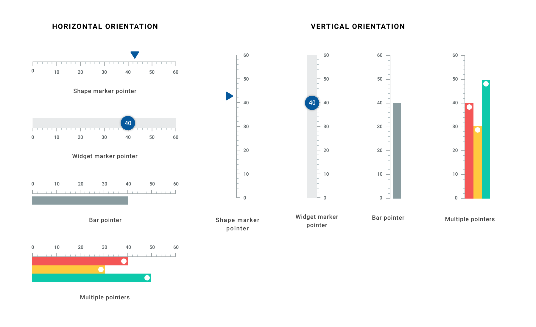
Bar pointer
A bar pointer is an accenting line or shaded background that can be placed on a linear gauge to mark the current value in the axis track. The bar pointers always start from the minimum value of the axis and end on the specified value. In Linear Gauge, we can customize the bar pointer’s thickness, color, corner styles and the position of the bar.
Marker pointer
Marker pointers are used to indicate specific values on the axis. The two types of marker pointers supported by Flutter Linear Gauge are shape and widget.
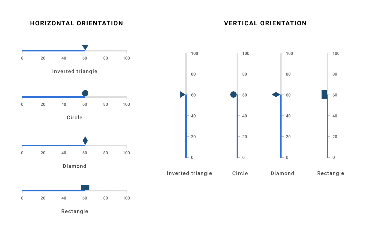
Shape marker pointer
The shape marker pointer has predefined shapes:
- Triangle
- Inverted Triangle
- Circle
- Diamond
- Rectangle
We can easily customize the size, position, and color of the shape pointer.
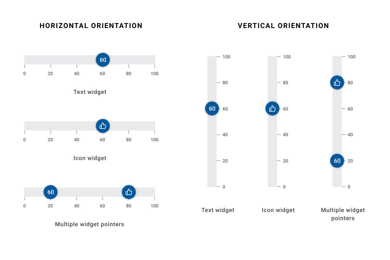
Widget marker pointer
If the predefined shapes in the shape marker don’t suite your needs, then you can use the widget marker pointer. It allows you to use any kind of Flutter widget as a marker pointer, complete with that widget’s full set of customization options.
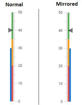
Mirror linear gauge
All the Linear Gauge elements can be mirrored by just setting the isMirrored property. The transformation will be smooth.
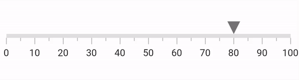
Animation
We can separately animate all Linear Gauge elements: axis, ticks, labels, ranges, bar pointers, and shape and widget marker pointers. The following are a few examples of animated pointers.
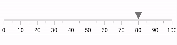
Interaction
You can move the shape and widget marker pointers in the Flutter Linear Gauge from one value to another with responsive swipe or drag gestures.
Now, we know everything about the features of new Flutter Linear Gauge widget. Let’s see how easy it is to add the widget in your application.
Add Linear Gauge to the widget tree
Refer the following code to add the Flutter Linear Gauge to your application’s widget tree.
@override
Widget build(BuildContext context) {
   return MaterialApp(
      home: Scaffold(
        body: Center(
          child: SfLinearGauge(),
        ),
      ),
   );
}
Add Linear Gauge elements
Use the following code to add a range, bar pointer and shape pointer with their default styles to the Flutter Linear Gauge widget.
@override
Widget build(BuildContext context) {
return MaterialApp(
color: Colors.white,
home: Scaffold(
body: Center(
// Add a Linear Gauge to the widget tree.
child: SfLinearGauge(
//Add a new range.
ranges: [
LinearGaugeRange(endValue:100),
],
//Add a new bar pointer.
barPointers: [
LinearBarPointer(value: 50),
],
//Add a new shape pointer.
markerPointers: [
LinearShapePointer(value: 70),
],
),
),
),
);
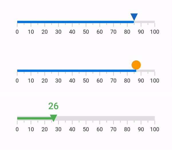
}The previous code will produce a linear gauge like this.
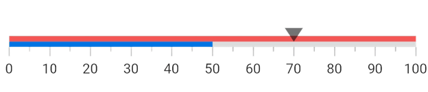
The range with values 0 to 100 is drawn in red, a bar with a value 50 is drawn in blue, and finally the shape pointer is drawn at the value 70. Now you understand the default element styles of our new Flutter Linear Gauge widget. Easy, isn’t it?
Happy coding!!
References
To know more about customization in our Flutter Linear Gauge, please check out our user documentation and live demo.
Conclusion
Thanks for reading! In this blog post, we have seen the stunning features of the new Flutter Linear Gauge widget and how to add it to your application. This widget is available in our 2021 Volume 1 release.
If you aren’t a customer yet, you can try our 30-day free trial to check out these features.
Syncfusion offers flexible Flutter widgets to create high-quality apps for Android, iOS, and the web. The number of widgets available is increasing in every release and we are making every effort to ensure their stability. Don’t miss our demo app in Google Play and the App Store and check our Flutter project demos.
If you need a new Flutter widget, you can contact us through our support forum, Direct-Trac, or feedback portal. We are always happy to assist you!


Related Blogs
If you liked this blog post, we think you’ll also like the following articles too:
 No spam, just valuable updates.