
 Mohamed Samsudeen
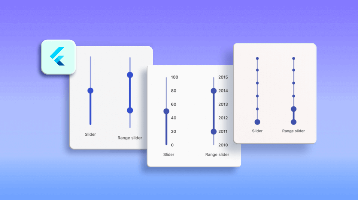
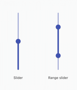
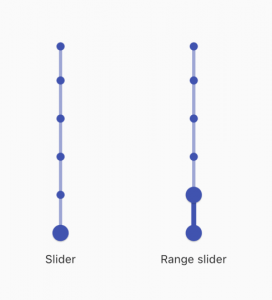
Last year, we released the Flutter Slider and Range Slider widgets with wide customization options and continued to add more features in further releases. Now, we have provided another important update to these sliders. The Flutter Slider and Range Slider now support vertical orientation with the 2021 Volume 1 release. And their existing features are available in a vertical orientation as well.
In this blog post, we will see an overview of available features and how to render these slider widgets vertically.
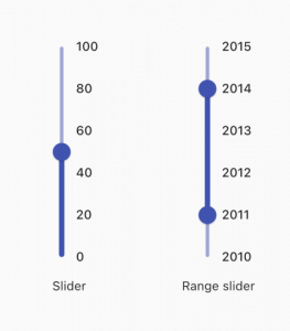
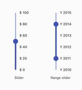
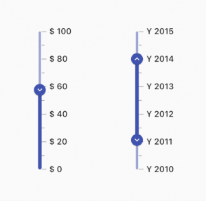
Numeric and date scale
The vertical Slider and Range Slider allow you to have numeric and date scales. For date scales, the intervals span from seconds to years.
Labels
The vertical Slider and Range Slider allow you to completely customize the labels. Built-in support for labels can be used based on chosen numeric and date types. You can customize the format, render specific intervals, and add prefixes and suffixes to the labels. You can also use text as labels, such as low, normal, and critical.
Dividers
This feature allows you to render dividers in each interval to split the scale for better readability. You can also easily customize the size, shape, and position of the dividers.
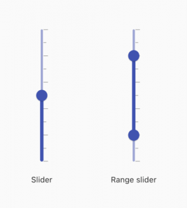
Ticks
This feature allows you to have both the major and minor ticks in the scales. You can use major ticks to show the intervals clearly in the scale and minor ticks to help the end user select a value between two intervals easily.
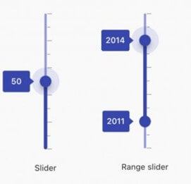
Tooltip
The tooltip feature allows you to clearly indicate the currently selected values during the interaction. You can also customize the format, text, position (left or right), and visibility of tooltips using the built-in APIs.
Thumb icons
This feature allows you to add any type of custom widget, like an icon or text, as a child.
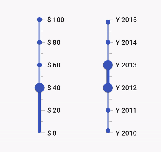
Discrete values
This feature allows you to discretely select numeric and date values in the Slider and Range Slider. By default, a value is selected continuously. However, the value selection can be restricted to discrete values as shown in the following image.
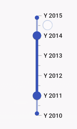
Interval selection
You can select a particular interval in the vertical Range Slider by tapping. Then, both the thumbs will move to the current interval with animation.
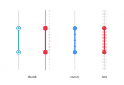
Customization
We can fully customize the vertical Slider and Range Slider using the provided APIs and override methods. In the following image, we have done a custom drawing for the thumbs, dividers, and ticks.
Getting started with the vertical Slider and Range Slider
This section explains how to add the Flutter vertical Slider and Range Slider to your application and use its basic features.
Step 1: Add the dependency
First, add the Syncfusion Flutter Sliders dependency to your pubspec.yaml file.
dependencies:
  syncfusion_flutter_sliders: ^19.1.56-beta
  //Use the latest available version in pub.dev
Step 2: Get the packages
Then, run the following command to get the required packages.
$ flutter pub get
Step 3: Import the library
Now, import the library using the following code.
import 'package:syncfusion_flutter_sliders/sliders.dart';
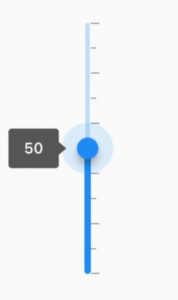
Step 4: Add Vertical Slider
Add the vertical Slider with the desired elements such as ticks, labels, and tooltips, as shown in the following code example.
double _value = 40.0;

@override
Widget build(BuildContext context) {
  return SfSlider.vertical(
       min: 0.0,
       max: 100.0,
       value: _value,
       interval: 20,
       showTicks: true,
       showLabels: true,
       showTooltip: true,
       minorTicksPerInterval: 1,
       onChanged: (dynamic value){
         setState(() {
           _value = value;
         });
       },
   );
}
Note: This example is shown with the numeric scale. You can customize it to display a date-time scale.
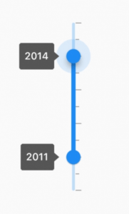
Step 5: Add Vertical Range Slider
Now, add the vertical Range Slider with the desired elements such as ticks, labels, and tooltips, as in the following code example.
SfRangeValues _currentValues = SfRangeValues(
      DateTime(2010, 01, 01), DateTime(2013, 01, 01));
@override
Widget build(BuildContext context) {
   SfRangeSlider.vertical(
      min: DateTime(2011, 01, 01),
      max: DateTime(2014, 01, 01),
      dateFormat: DateFormat.y(),
      values: _currentValues,
      interval: 1,
      dateIntervalType: DateIntervalType.years,
      showTicks: true,
      minorTicksPerInterval: 1,
      enableTooltip: true,
      onChanged: (dynamic values)
      {
         setState(()
         {
             _currentValues = values;
         });
       },
    );
}
Note: This example is shown with the date-time scale. You can customize it to display a numeric scale.
Handle value changes
During user interaction, when the values of the Slider and the Range Slider are updated, the onChanged event will be called. The Slider and the Range Slider then pass the new values to the callback, but this does not change their state until the parent widget rebuilds them with the new values. Use the setState method, as shown in the previous code example, to achieve this.
Note: If the onChanged value is null, then the Slider and Range Slider will be disabled.
Conclusion
Thanks for reading! In this blog post, we have introduced the new vertical orientation support in our Flutter Slider and Range Slider widgets, available in the 2021 Volume 1 release. For more information, refer to the complete user guides for Flutter Slider and Range Slider. You can also check out our Flutter examples for all our widgets. Additionally, check out our demo app for the different platforms Android, iOS, Web, Windows, and Linux.
If you need a new widget in the Flutter framework or new features in our existing widgets, including the Slider and Range Slider, please let us know in the comments section below.
You can also contact us through our support forum, Direct-Trac, or feedback portal. We are always happy to assist you!


 No spam, just valuable updates.