
 Joy Oyiess Rex Karunakaran
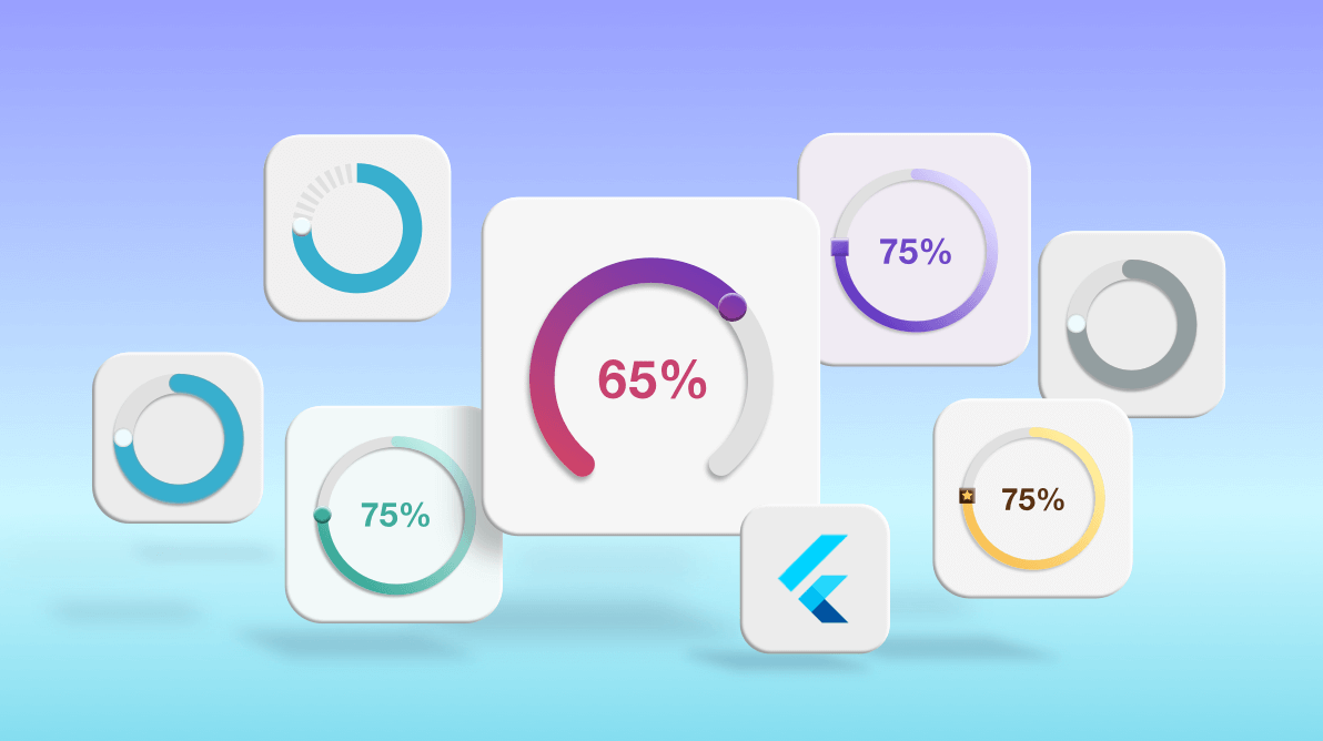
Syncfusion Flutter Radial Gauge is a data visualization widget that displays numerical values on a circular scale. It has a rich set of features that includes axes, ranges, pointers, and annotations that are fully customizable and extendable. The control can be used to create speedometers, temperature monitors, dashboards, multi-axis clocks, watches, compasses, and more.
In this blog, we’ll take a look at how to use the Syncfusion Flutter Radial Gauge to create different styles of radial sliders.
Before we can explore the features of the Syncfusion Flutter Radial Gauge to create marvelous styles of radial sliders, we have to configure an application with the Radial Gauge.
Steps to create a basic radial slider
Step #1: Create a Flutter application
Follow the instructions provided in this Get Started documentation to create a basic project in Flutter.
Step #2: Add the Radial Gauge dependency
Include the Syncfusion Flutter Radial Gauge package dependency in the pubspec.yaml file in your project.
syncfusion_flutter_gauges: ^18.2.55
Step #3: Get the package
Run the following command in the terminal window of your project to get the referenced packages.
$ flutter pub get |
Step #4: Import the package
Import the Radial Gauge package into your main.dart file as shown in the following code example.
import 'package:syncfusion_flutter_gauges/gauges.dart';
Step #5: Add the Radial Gauge widget
Once the Radial Gauge package is imported in the sample, initialize the Radial Gauge widget and add it to the widget tree as shown in the following code example.
@override
  Widget build(BuildContext context) {
    return Scaffold(
      body: Center(
        child: SfRadialGauge(),
      ),
    );
  }
Now, we have configured the Syncfusion Flutter Radial Gauge widget in the Flutter application.
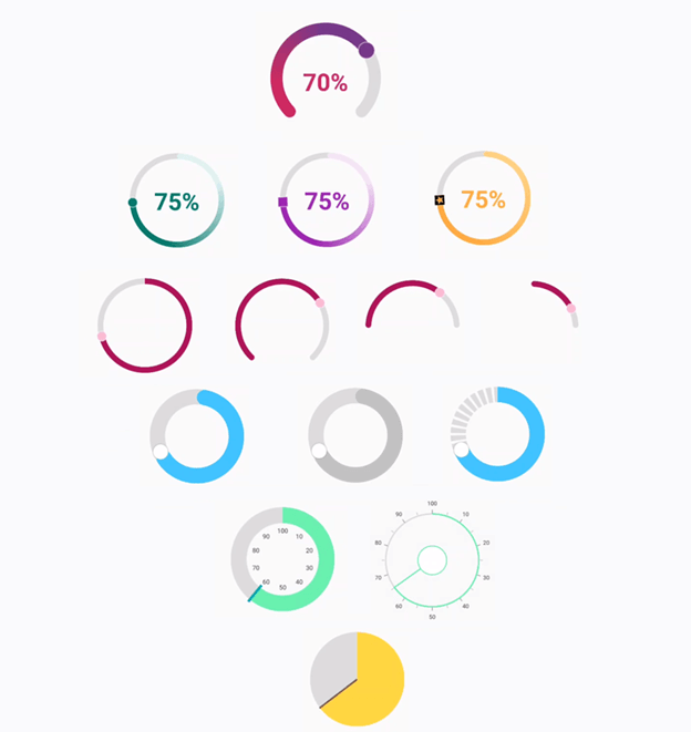
Create different styles of radial slider
The Radial Gauge is easily customized to be used as a radial slider by enabling dragging support for the pointer. Also, to enrich the appearance for the edges of the slider, we can customize the CornerStyle property of the axis line and range pointer in the Radial Gauge. Let’s see how to design the following styles in a radial slider by using the Flutter Radial Gauge:
- Varying arc length.
- Gradient tracks.
- Continuous and segmented tracks.
- Different thumbs.
- Analog appearance.
- Pie-shaped radial slider.
We will customize the radial axis, range pointer, marker pointer, and annotations in the Radial Gauge to achieve all of these styles.
Normal radial slider
To create a normal radial slider, we need to disable the labels and tick properties in the RadialAxis class and set the axis range values in the minimum and maximum properties based on our design needs.
To show 100 percent progress, we need to define the axis’s minimum value as 0 and maximum value as 100 as in the following code example.
SfRadialGauge(
    axes: <RadialAxis>[
      RadialAxis(minimum: 0,
          maximum: 100,
          showLabels: false,
          showTicks: false,
          axisLineStyle: AxisLineStyle(
              cornerStyle: CornerStyle.bothCurve,
              color: Colors.white30,
              thickness: 25),
                )
    ]
)
The range pointer will be the track and the marker pointer will be the thumb for the radial slider. You can also set a gradient for the range pointer as shown in the following code example.
SfRadialGauge(
axes: <RadialAxis>[
RadialAxis(
pointers: <GaugePointer>[
RangePointer(
value: 50,
cornerStyle: CornerStyle.bothCurve,
width: 25,
sizeUnit: GaugeSizeUnit.logicalPixel,
gradient: const SweepGradient(
colors: <Color>[
Color(0xFFCC2B5E),
Color(0xFF753A88)
],
stops: <double>[0.25, 0.75]
)),
MarkerPointer(
value: 50,
enableDragging: true,
markerHeight: 34,
markerWidth: 34,
markerType: MarkerType.circle,
color: Color(0xFF753A88),
borderWidth: 2,
borderColor: Colors.white54)
], )
]
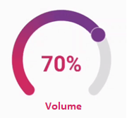
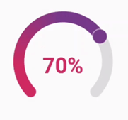
)You can add annotations to display values on the radial slider.
SfRadialGauge(
    axes: <RadialAxis>[
      RadialAxis(
          annotations: <GaugeAnnotation>[
            GaugeAnnotation(
                angle: 90,
                axisValue: 5,
                positionFactor: 0.2,
                widget: Text('50%',
                    style: TextStyle(
                        fontSize: 30,
                        fontWeight: FontWeight
                            .bold,
                        color: Color(0xFFCC2B5E)))
            ),
            GaugeAnnotation(
                angle: 90,
                axisValue: 5,
                positionFactor: 1.2,
                widget: Text('Volume',
                    style: TextStyle(
                        fontSize: 20,
                        fontWeight: FontWeight
                            .bold,
                        color: Color(0xFFCC2B5E)))
            )
          ]
      )
    ]
)
You can add a pointer event when the value changes and show the pointer value in an annotation. This can be done for the range pointer too. Refer to the following code example.
double _volumeValue = 50;

void onVolumeChanged(double value) {
  setState(() {
    _volumeValue = value;
  });
}

MarkerPointer(
                value: 50,
                enableDragging: true,
                onValueChanged: onVolumeChanged,
                markerHeight: 34,
                markerWidth: 34,
                markerType: MarkerType.circle,
                color: Color(0xFF753A88),
                borderWidth: 2,
                borderColor: Colors.white54)
          ],      )
That’s it, we have now created a simple radial slider using the Flutter Radial Gauge.
Now let’s apply different styles to it!
Radial slider with varying arc length
The slider track can be a complete circle or only a short arc. So, the start and end angle of the axis can be customized to render the slider arc in the desired size.
For instance, let’s say we are developing an app for a smart lightbulb where we need to customize how long the bulb glows at night and how brightly. In this case, a semicircular representation would be better than a complete circle as it is similar to the shape of a lightbulb.
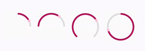
Refer to the following code example to see how the slider track is customized.
SfRadialGauge(
axes: <RadialAxis>[
RadialAxis(minimum: 0,
maximum: 100,
startAngle: 270,
endAngle: 270,
showLabels: false,
showTicks: false,
radiusFactor: 0.6,
axisLineStyle: AxisLineStyle(
cornerStyle: CornerStyle.bothFlat,
color: Colors.black12,
thickness: 12),
pointers: <GaugePointer>[
RangePointer(
value: _volumeValue,
cornerStyle: CornerStyle.bothFlat,
width: 12,
sizeUnit: GaugeSizeUnit.logicalPixel,
color: Color(0xFFAD1457),
),
MarkerPointer(
value: _volumeValue,
enableDragging: true,
onValueChanged: onVolumeChanged,
markerHeight: 20,
markerWidth: 20,
markerType: MarkerType.circle,
color: Color(0xFFF8BBD0),
borderWidth: 2,
borderColor: Colors.white54)
],
)
]
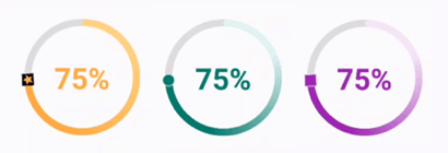
);Radial sliders with gradient tracks
Instead of choosing a flat color for the track, we can fill it with gradient colors.
Let’s say we are developing a musical app where sliders are used to control the equalization settings. We can use colors to show which genre of music best fits the current equalization setting, such as yellow for classical, purple for jazz, red for rock, cyan for pop, and so on. So, based on the type of the music that fits the current setting, the slider can be filled with the respective gradient colors.
Refer to following code example to see how a gradient track is applied.
SfRadialGauge(
    axes: <RadialAxis>[
      RadialAxis(minimum: 0,
          maximum: 100,
          showLabels: false,
          showTicks: false,
          radiusFactor: 0.7,
          axisLineStyle: AxisLineStyle(
              cornerStyle: CornerStyle.bothCurve,
              color: Colors.black12,
              thickness: 25),
          pointers: <GaugePointer>[
            RangePointer(
                value: _volumeValue,
                cornerStyle: CornerStyle.bothCurve,
                width: 25,
                sizeUnit: GaugeSizeUnit.logicalPixel,
                gradient: const SweepGradient(
                    colors: <Color>[
                      Color(0xFFCC2B5E),
                      Color(0xFF753A88)
                    ],
                    stops: <double>[0.25, 0.75]
                )),
            MarkerPointer(
                value: _volumeValue,
                enableDragging: true,
                onValueChanged: onVolumeChanged,
                markerHeight: 34,
                markerWidth: 34,
                markerType: MarkerType.circle,
                color: Color(0xFF753A88),
                borderWidth: 2,
                borderColor: Colors.white54)
          ],
          annotations: <GaugeAnnotation>[
            GaugeAnnotation(
                angle: 90,
                axisValue: 5,
                positionFactor: 0.2,
                widget: Text(_volumeValue.ceil()
                    .toString() + '%',
                    style: TextStyle(
                        fontSize: 50,
                        fontWeight: FontWeight
                            .bold,
                        color: Color(0xFFCC2B5E)))
            )
          ]
      )
    ]
)
Radial sliders with continuous and segmented tracks
The range pointer colors can be updated to show the different states of a slider, like enabled and disabled. The dashed array can be used in an axis line to show a segmented track in the slider.
For example, you can create a running tracker app where the radial sliders can be used to set the daily targeted distance. Also, the appearance of the slider can be differentiated to represent the run, stop, and walk modes.
Refer to the following code example on customizing the slider track.
SfRadialGauge(
    axes: <RadialAxis>[
      RadialAxis(minimum: 0,
          maximum: 100,
          startAngle: 270,
          endAngle: 270,
          showLabels: false,
          showTicks: false,
          radiusFactor: 0.6,
          axisLineStyle: AxisLineStyle(
              cornerStyle: CornerStyle.bothFlat,
              color: Colors.black12,
              dashArray: [10,5],
              thickness: 32),
          pointers: <GaugePointer>[
            RangePointer(
                value: _volumeValue,
                cornerStyle: CornerStyle.bothFlat,
                width: 32,
                sizeUnit: GaugeSizeUnit.logicalPixel,
                color:  Colors.lightBlueAccent,
               ),
            MarkerPointer(
                value: _volumeValue,
                enableDragging: true,
                onValueChanged: onVolumeChanged,
                markerHeight: 32,
                markerWidth: 32,
                markerType: MarkerType.circle,
                color:Colors.white,
                borderWidth: 2,
                borderColor: Colors.black12)
          ],
      )
    ]
)
Radial slider with customized thumbs
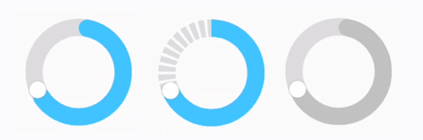
The marker pointer types can be set to depict different types of thumbs for the slider. We can use the built-in shapes like circle, rectangle, and triangle, or a custom image.
Consider a car dashboard app where we need different sliders to represent and control the volume of music and cooling level from the AC. For this, we can use different images or shapes for thumbs to represent each functionality. See the following screenshot for an example.
Refer to the following code example to see how thumbs are customized.
SfRadialGauge(
    axes: <RadialAxis>[
      RadialAxis(minimum: 0,
          maximum: 100,
          startAngle: 270,
          endAngle: 270,
          showLabels: false,
          showTicks: false,
          radiusFactor: 0.6,
          axisLineStyle: AxisLineStyle(
              cornerStyle: CornerStyle.bothFlat,
              color: Colors.black12,
              thickness: 12),
          pointers: <GaugePointer>[
            RangePointer(
                value: _volumeValue,
                cornerStyle: CornerStyle.bothFlat,
                width: 12,
                sizeUnit: GaugeSizeUnit.logicalPixel,
                color:  Colors.orangeAccent,
                gradient: const SweepGradient(
                    colors: <Color>[
                      Color(0XFFFFD180),
                      Color(0XFFFFAB40)
                    ],
                    stops: <double>[0.25, 0.75]
                )),
            MarkerPointer(
                value: _volumeValue,
                enableDragging: true,
                onValueChanged: onVolumeChanged,
                markerHeight: 20,
                markerWidth: 20,
                markerType: MarkerType.image,
                imageUrl: 'assets/images/star.png',
                color: Color(0XFFFFAB40),
                borderWidth: 2,
                borderColor: Colors.white54)
          ],
          annotations: <GaugeAnnotation>[
            GaugeAnnotation(
                angle: 90,
                axisValue: 5,
                positionFactor: 0.1,
                widget: Text(_volumeValue.ceil()
                    .toString() + '%',
                    style: TextStyle(
                        fontSize: 50,
                        fontWeight: FontWeight
                            .bold,
                        color: Color(0XFFFFAB40)))
            )
          ]
      )
    ]
)
Radial slider with analog appearance
Ticks and labels can be enabled in the axis to provide an analog appearance to a radial slider. Depending on our requirements, we can use either a marker pointer or a needle pointer.
For example, let’s say we are creating an app that deals with money. It can be a loan calculator or a SIP investment calculator. The user will always expect high accuracy, even for minor changes in the slider. So, in this scenario, the ticks and labels can be used to show the amount, interest, tenure, and so on.
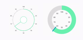
The following code example creates a radial gauge with an analog appearance.
SfRadialGauge(
    axes: <RadialAxis>[
      RadialAxis(minimum: 0,
          maximum: 100,
          startAngle: 270,
          endAngle: 270,
          showLabels: true,
          showTicks: true,
          radiusFactor: 0.6,
          labelOffset: -20,
          tickOffset: -10,
          axisLineStyle: AxisLineStyle(
              cornerStyle: CornerStyle.bothFlat,
              color: Colors.black12,
              thickness: 3),
          pointers: <GaugePointer>[
            RangePointer(
                value: _volumeValue,
                cornerStyle: CornerStyle.bothFlat,
                width: 3,
                sizeUnit: GaugeSizeUnit.logicalPixel,
                color:  Colors.greenAccent,
               ),
            NeedlePointer(
                value: _volumeValue,
                enableDragging: true,
                onValueChanged: onVolumeChanged,
                needleColor: Colors.greenAccent,
                needleStartWidth: 1.5,
                needleEndWidth: 1.5,
                needleLength: 30,
                knobStyle: KnobStyle(
                  color: Colors.white,
                  borderColor: Colors.greenAccent,
                  borderWidth: 2,
                  knobRadius: 30,
                  sizeUnit: GaugeSizeUnit.logicalPixel)
            )
          ],
      )
    ]
)
Pie-shaped radial slider
A pie chart is a data visualization component, but it can be made interactive when needed through a radial slider. A pie-shaped radial slider can be designed by increasing the thickness of the axis line and range pointer.
Consider a budget planner app in which we use a pie-shaped radial slider to set the money we intend to save or spend each month. The pie sections will represent the planned and remaining amounts.
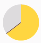
Refer to the following code example on creating a pie-shaped radial slider.
SfRadialGauge(
    axes: <RadialAxis>[
      RadialAxis(minimum: 0,
          maximum: 100,
          startAngle: 270,
          endAngle: 270,
          showLabels: false,
          showTicks: false,
          radiusFactor: 0.6,
          axisLineStyle: AxisLineStyle(
              cornerStyle: CornerStyle.bothFlat,
              color: Colors.black12,
              thickness: 100),
          pointers: <GaugePointer>[
            RangePointer(
                value: _volumeValue,
                cornerStyle: CornerStyle.bothFlat,
                width: 100,
                sizeUnit: GaugeSizeUnit.logicalPixel,
                color:  Colors.amberAccent,
               ),
            NeedlePointer(
                value: _volumeValue,
                enableDragging: true,
                onValueChanged: onVolumeChanged,
                needleStartWidth: 2,
                needleEndWidth: 2,
                needleColor: Colors.brown,
                needleLength: 50,
                knobStyle: KnobStyle(color: Colors.black12,  sizeUnit: GaugeSizeUnit.logicalPixel, knobRadius: 1)
            )
          ],
      )
    ]
)
Conclusion
In this blog, we have covered some interesting ways to create different styles for a radial slider using the Syncfusion Flutter Radial Gauge. Try out these styles, or create your own and share them in the comments section below.
Syncfusion Flutter widgets offer fast, fluid, and flexible widgets for creating high-quality apps for iOS, Android, and web. Use them to enhance your productivity!
For existing customers, the new version is available for download from the License and Downloads page. If you are not yet a Syncfusion customer, you can try our 30-day free trial to check out our available features. Also, try our samples from this GitHub location.
You can also reach us through our support forums, Direct-Trac, or feedback portal. We are always happy to assist you!


Related Blogs
If you like this article, we think you will also like the following articles:
 No spam, just valuable updates.