

This post is part of our on-going how-to series covering the Syncfusion Dashboard Platform. In this entry, we will explore working with Dashboard’s filters. You can watch the full video on our YouTube page.
Dashboard filters help you visualize different combinations of data in a single dashboard. Instead of creating a separate dashboard to visualize subsets of data, the dashboard filters allow you to analyze them within the same view. This post will explain various filtering options like adding a dashboard filter, configuring the master and listener settings, performing cross-data source filtering, and using filter profiles.
You can add filters to a dashboard by dragging the filter elements from the toolbox on the left and dropping them on the design canvas.
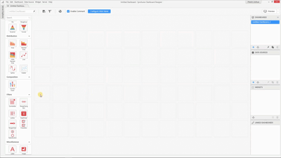
You can also use the dedicated filter panel available for configuring filter elements. For more information on filter panels, see our video on YouTube or read its accompanying blog post.
For this example, we’ll build a multi-tab dashboard to display the current statistics of the English Premier League. We’ll have the league standings in one of the tabs and the team statistics in the other, so we can filter out individual teams and analyze their performance.
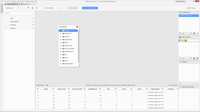
We have the latest Dashboard Designer and a data source that contains the Premier League Standing details. This is actually a web data source providing us live feeds through REST API. There are details in here like the team name, the logo of the team in the form of URLs, the total number of games played, number of points secured, total number of games won, lost, and quite a bit more. First, let’s rename this data source “Standings.”
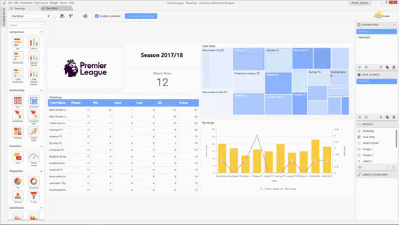
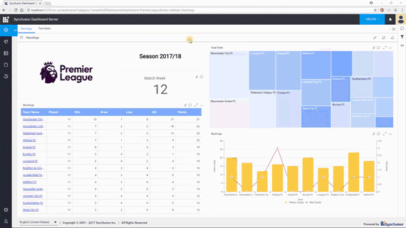
As you can see in the above GIF, the dashboard builds successfully. It has the Premier League logo, the season details, and a tree map showing the goal statistics. At the bottom are the booking details for the top 10 teams and a grid that shows the standings. We have the team name, the number of games played and won, and the number of points secured by the team. Open the grid configuration with the blue icon at the top-right of the grid card.
In the data section are the columns bound to the widget. Click the settings icon for the “Team name” column and choose Custom sort. Among the advanced sorting options in the pop-up, choose Field, based on points, and the default aggregation type Sum, in Descending order.
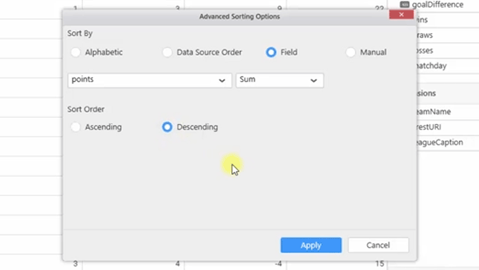
Advanced Sorting Options
Click Apply. Now the best in the league is at the top of the grid.
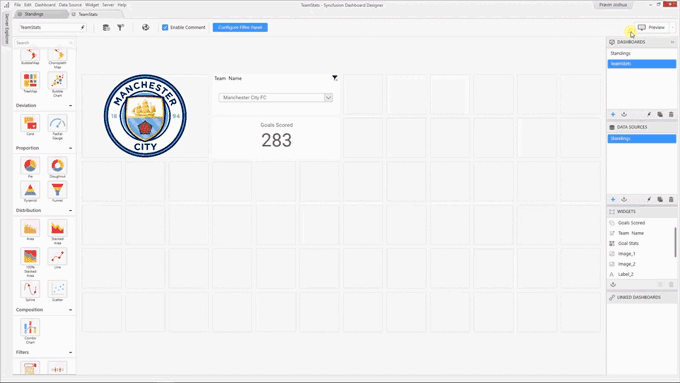
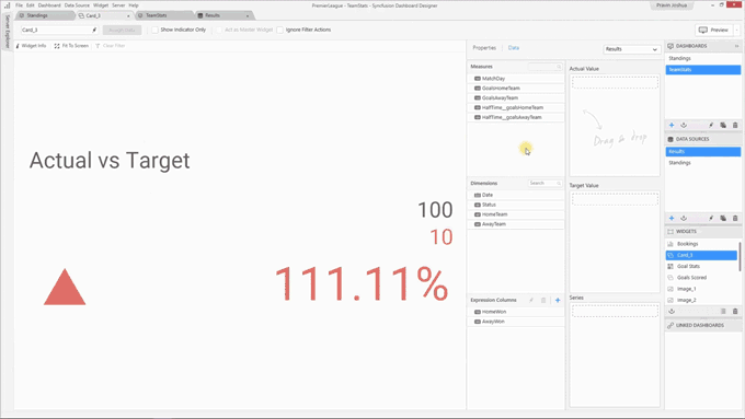
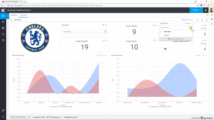
We’re going to add another dashboard to display the individual team statistics and name it accordingly. A few widgets have been added to this dashboard: at the top, a combo box to filter using team names; on the left, an image widget bound to the field containing the URL for the team logo; and on the bottom, a card widget to show the total number of goals scored by the team.
Click Preview to see how the filtering works.
By default, all the filter elements added to the dashboard will act as a master widget and all the other widgets in the dashboard will act as listener widgets. You can check this using the “Filter configuration” window available through an icon in the toolbar, or by clicking Dashboard and then Filters.
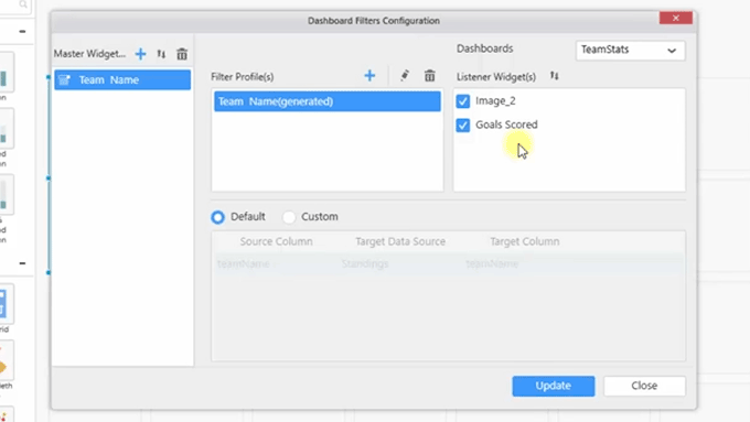
Dashboard Filters Configuration
The master widget is on the left, and is actually a combo box that we have to use to filter out the team name. On the right side are the listener widgets. By default, all the widgets in the dashboard are selected as listener widgets. You can uncheck one if you have to ignore the filter actions. Click Close.
You can also make the other nonfilter widgets into master widgets. This works for charts, maps, and grids wherever selection is applicable. So, if you select the grid we added earlier, you can select the check box at the top Act as Master Widget like in the following image.
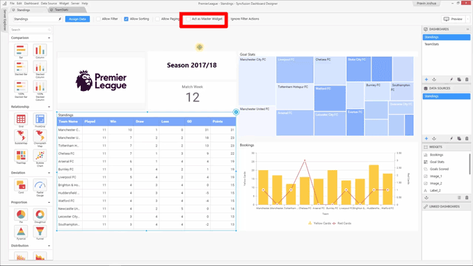
Act as Master Widget Check Box
Now, opening the Filters Configuration manager, the grid will have been added as a master widget and all the other widgets as listener widgets. Click Preview to see how the filtering works.
As you can see, whenever you select a team name, the filtering will be done and only the filtered values will be shown in the dashboard.
Now, we’re adding another data source called “Results” containing the results of individual games of the league, so we can gather team statistics like goals scored at home, away goals, and others. With the help of this data, we’re going to build individual statistics.
In the team statistics dashboard, add a card widget to show the number of goals scored by the team at home. Go back to the data source tab. Click the filter icon for the HomeTeam column and filter out the team name by unchecking (Select All).
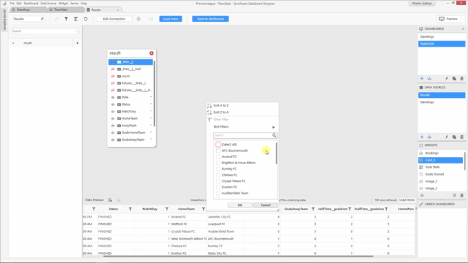
Uncheck (Select All)
Doing this, we can summarize the total number of goals scored by the team on home ground. Go back to the dashboard to configure the card widget. In the data section, drag the GoalsHomeTeam column to the Actual Value box. In the properties section, rename the widget Home Goals and center align the title.
Open the filter configuration window. You can see the new card widget in the listener widgets category. But probably, the filter actions won’t take place here because the master widget uses a different data source from the listener widget, Home Goals. You can also see at the bottom the relationship between the master and the listener widgets is not established here. To do cross-data source filtering, choose the Custom relationship. Click + and choose teamName as the source column name, Results for the target data source, and HomeTeam for the target column.
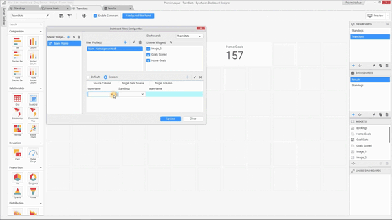
Now, the relationship between the master and the listener widgets is established. Commit this by clicking the check mark icon, and then click Update. Check the preview to see the filter action now works as expected.
If you wanted to create the same filters, but for goals made in away games, you would follow all the steps you just took until reaching the Filters Configuration window. You will still see the custom relationship for the Home Goals displayed. You cannot add another relationship to this because filtering both the columns will result in an operation and both columns will be filtered. This is where the filter profiles can be used. By default, a filter profile will be present: rename it “Home” and uncheck Away Goals in the listener widget list.
Click + to add another filter profile, and name it “Away.” For this one, check only Away Goals in the listener widget list.
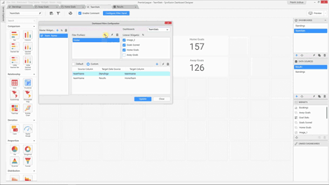
Then create a custom relationship for it like the last one and save it. In the preview, you can see both these cards works as intended.
After adding and configuring more related widgets to the dashboard using these filter profiles, the filters work as shown in the following GIF.
You can also add internal links to your dashboard for easier navigation. For more information on how to do this, please watch our Working with Multi-tabbed Dashboards video or read its accompanying blog post. You can find all the details about the filters applied to your dashboard by clicking the Filters Overview drop-down.
Filters Overview
We hope this post was helpful. Again, the link to the full video is here. If you aren’t a user of Syncfusion’s Dashboard Platform yet, give it a try with a free, 30-day trial.
If you liked this post, we think you’ll love these free e-books:
BI Solutions Using SSAS Tabular Model Succinctly
MongoDB 3 Succinctly
Hadoop Succinctly
Power BI Succinctly
R Programming Succinctly
 No spam, just valuable updates.