
 Niranjan Kumar Gopalan
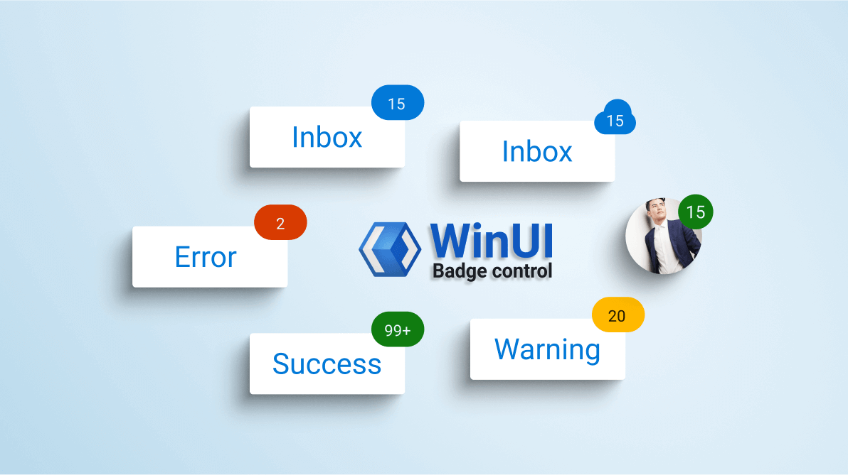
When you want to show a notification that prompts your customers to act based on any of the following scenarios, then the badge control comes in handy:
- Message received in an application (chat apps).
- New version or an update to an app.
- Process status information.
The WinUI Badge is a notification control. It is used to notify users about new or unread messages, notifications, status, and more. You can easily integrate it with controls like ListBox and Pivot.
In this blog post, we will learn how to integrate the WinUI Badge control and use its features in your application.
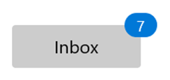
Adding WinUI Badge to an element
Let’s create a button control and add the WinUI Badge Control to your application.
Follow these steps to add the WinUI Badge control manually in the XAML file:
- First, create a project using the instructions provided in the WinUI 3 desktop app for C# and .NET 5 documentation.
- Then, install the latest Syncfusion.Notifications.WinUI NuGet package in the project.
- Now, import the Syncfusion.UI.Xaml.Notifications control namespace in the XAML page.
- Finally, initialize the BadgeContainer control. Assign the Badge control to its Badge property and assign a button or any other host control to the Content property.
Refer to the following code.<Grid> <notify:BadgeContainer Name="badgeContainer" HorizontalAlignment="Center" VerticalAlignment="Center" > <notify:BadgeContainer.Badge> <notify:SfBadge HorizontalAlignment="Right" VerticalAlignment="Top" Height="20" Width="25" Content="7" /> </notify:BadgeContainer.Badge> <notify:BadgeContainer.Content> <Button Content="Outlook" Height="35" Width="130" /> </notify:BadgeContainer.Content> </notify:BadgeContainer> </Grid>
Change Badge alignment
The WinUI Badge control allows you to change its position to any corner of the host control using the HorizontalAlignment and VerticalAlignment properties.
Refer to the following code example.
<Grid>
    <notify:BadgeContainer Name="badgeContainer"
                               HorizontalAlignment="Center"
                               VerticalAlignment="Center"
                               >
        <notify:BadgeContainer.Badge>
            <notify:SfBadge
                    HorizontalAlignment="Right"
                    VerticalAlignment="Center"
                    Height="20"
                    Width="25"
                    Content="7"
            />
        </notify:BadgeContainer.Badge>
        <notify:BadgeContainer.Content>
            <Button Content="Outlook" Height="35" Width="130" />
        </notify:BadgeContainer.Content>
    </notify:BadgeContainer>
</Grid>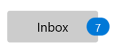
Note: For more details, refer to the different alignment options in the WinUI Badge control documentation.
Change Badge position
Using the HorizontalAnchor and VerticalAnchor properties, you can move the Badge control horizontally or vertically inside, outside, or in the middle of the border in the host control.
The default value of the HorizontalAnchor and VerticalAnchor properties is Center.
Refer to the following code example.
<notify:BadgeContainer Name="badgeContainer"
                               HorizontalAlignment="Center"
                               VerticalAlignment="Center"
                               >
    <notify:BadgeContainer.Badge>
        <notify:SfBadge
                HorizontalAnchor="Center"
                VerticalAnchor="Outside"
                    Height="20"
                    Width="25"
                    Content="7"
            />
    </notify:BadgeContainer.Badge>
    <notify:BadgeContainer.Content>
        <Button Content="Outlook" Height="35" Width="130" />
    </notify:BadgeContainer.Content>
</notify:BadgeContainer>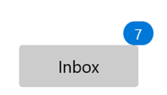
The Badge control also allows you to apply custom positions using the HorizontalPosition and VerticalPosition properties like in the following code example.
<notify:BadgeContainer x:Name="container"
                               HorizontalAlignment="Center" VerticalAlignment="Center" >
    <notify:BadgeContainer.Badge>
        <notify:SfBadge Height="20" Width="20"
                                HorizontalAnchor="Custom"
                                VerticalAnchor="Custom"
                                HorizontalPosition="0.8"
                                VerticalPosition="0.1"
                                Content="7"
                                Shape="Ellipse" />
    </notify:BadgeContainer.Badge>
    <notify:BadgeContainer.Content>
        <Image Source="HostImage.png" Height="75" Width="75" />
    </notify:BadgeContainer.Content>
</notify:BadgeContainer>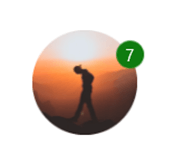
Note: For more details, refer to the predefined and custom positioning in the WinUI Badge control documentation.
Distinct and attractive colors
Use the Fill property to apply distinctive colors to the background of the Badge control based on the status of the host control. This feature comes in handy when you need to prompt the users to act based on the application’s status.
Refer to the following code example.
<notify:BadgeContainer Name="badgeContainer"
                               HorizontalAlignment="Center"
                               VerticalAlignment="Center"
                               >
    <notify:BadgeContainer.Badge>
        <notify:SfBadge
                    Fill="Success"
                    Height="20"
                    Width="25"
                    Content="99+"
            />
    </notify:BadgeContainer.Badge>
    <notify:BadgeContainer.Content>
        <Button Content="Outlook" Height="35" Width="130" />
    </notify:BadgeContainer.Content>
</notify:BadgeContainer>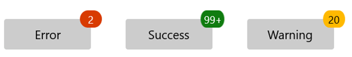
Predefined and custom shapes
You can change the shape of the Badge control using the predefined shapes available in the Shape property. Also, you can apply a custom shape using the CustomShape property.
Refer to the following code example.
<!--SfBadge with predefined shape-->
<notify:BadgeContainer Name="badgeContainer"
                               HorizontalAlignment="Left"
                               VerticalAlignment="Center"
                               >
    <notify:BadgeContainer.Badge>
        <notify:SfBadge
                    Shape="Oval"
                    Height="20"
                    Width="25"
                    Content="7"
            />
    </notify:BadgeContainer.Badge>
    <notify:BadgeContainer.Content>
        <Button Content="Outlook" Height="35" Width="130" />
    </notify:BadgeContainer.Content>
</notify:BadgeContainer>

<!--SfBadge with custom shape-->
<notify:BadgeContainer Name="badgeContainer"
                               HorizontalAlignment="Left"
                               VerticalAlignment="Center"
                               >
    <notify:BadgeContainer.Badge>
        <notify:SfBadge
                    Shape="Custom"
                    CustomShape="M16.057999,0C19.938004,1.2542023E-07 23.380997,2.294006 24.832001,5.7030019 25.012009,6.126006 25.421005,6.4270009 25.900009,6.5299977 29.384003,7.2799977 32,10.303007 32,13.912992 32,18.084988 28.512009,21.479 24.220001,21.479L5.697998,21.479C2.5550003,21.479 0,18.989986 0,15.936002 0,12.877989 2.5550003,10.39401 5.697998,10.39401 5.7389984,10.39401 5.7789993,10.39401 5.8199997,10.394987 6.2430038,10.406004 6.598999,10.093992 6.5740051,9.7049845 6.5650024,9.5490092 6.5600052,9.3930043 6.5600052,9.2369984 6.5600052,4.1430048 10.820999,1.2542023E-07 16.057999,0z"
                    Height="20"
                    Width="25"
                    Content="7"
            />
    </notify:BadgeContainer.Badge>
    <notify:BadgeContainer.Content>
        <Button Content="Outlook" Height="35" Width="130" />
    </notify:BadgeContainer.Content>
</notify:BadgeContainer>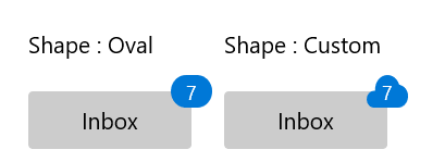
Set visual effects
Also, you can apply required animation or visual effects using the AnimationType property based on the Opacity or Scale values.
Refer to the following code example.
<notify:BadgeContainer Name="badgeContainer"
                               HorizontalAlignment="Left"
                               VerticalAlignment="Center"
                               >
    <notify:BadgeContainer.Badge>
        <notify:SfBadge
                    x:Name="sfBadge"
                    AnimationType="Scale"
                    Height="20"
                    Width="25"
                    Content="7"
            />
    </notify:BadgeContainer.Badge>
    <notify:BadgeContainer.Content>
        <Button Content="Outlook" Height="35" Width="130" />
    </notify:BadgeContainer.Content>
</notify:BadgeContainer>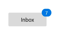
Auto repositioning the badge
When a user resizes the application containing the host of the Badge control, then the Badge will automatically update its position to the assigned alignment position based on the host control’s size.
GitHub reference
Also, you can download the complete example for the notification Badge control in WinUI.
Conclusion
Thanks for reading! With these amazing features, we believe our WinUI Badge control fits your expectations and requirements. Use this control to display a notification count, the number of unread messages in an email category, the status of product support, etc. To see more, you can download and check out our demo app in the Windows Store.
For existing customers, the newest version of Essential Studio® is available for download from the license and downloads page. If you are not yet a customer, you can try our 30-day free trial to check out these new features.
You can also contact us through support forums, feedback portal, or the Direct-Trac support system. We are always happy to assist you!
 No spam, just valuable updates.