
 Sheik Syed
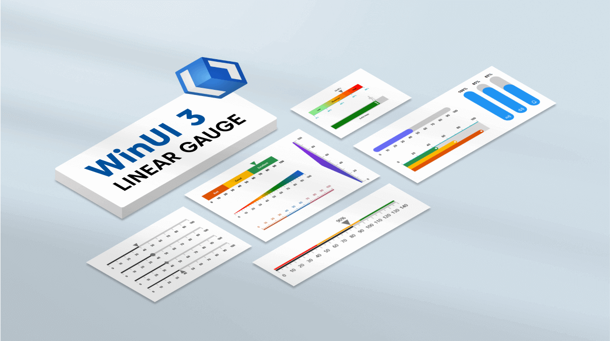
The WinUI 3 Linear Gauge control is a multipurpose data visualization control that displays numerical values on a linear scale horizontally or vertically. It has a rich set of features, such as ranges and pointers, that are fully customizable and extendable. You can use it to create a value indicator, linear progress bar, thermometer, bullet chart, and more.
The WinUI Linear Gauge control’s main features:
- Linear axis
- Ranges
- Bar pointer
- Shape marker pointer
- Content marker pointer
- Pointer animation
- Pointer interaction
Let’s check these features out and learn how to integrate the WinUI 3 Linear Gauge control into your application.
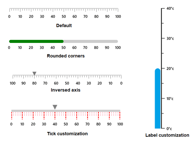
Linear axis
The Linear axis is a linear scale on which a set of values are plotted. It has three sub-elements:
- Axis line: A linear line, we can customize its thickness, color, and edge corner styles. Its color can be either solid or a linear gradient.
- Ticks: There are two types of ticks, major and minor, and we can easily customize their styles.
- Labels: Lables allow you to add numeric content to depict the values in the scale. You can easily customize the label styles and value formats.
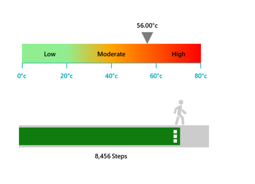
Linear range
A Linear range is a visual element that helps you quickly visualize where a range value falls on the axis track. It will denote the selected range of values using the start and end points in an axis. We can add any number of ranges with different styles to a Linear Gauge. You can also customize the range position, thickness, and color with a gradient.
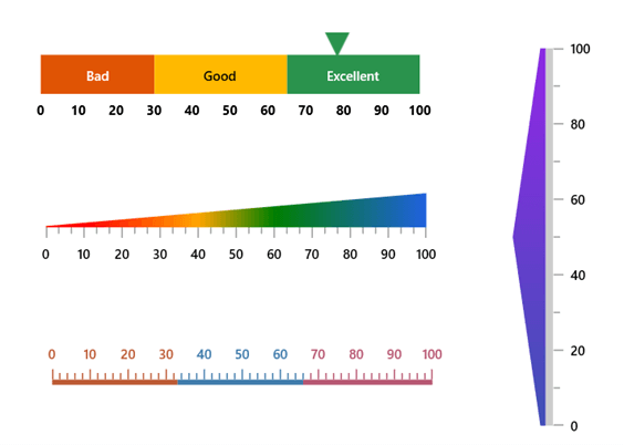
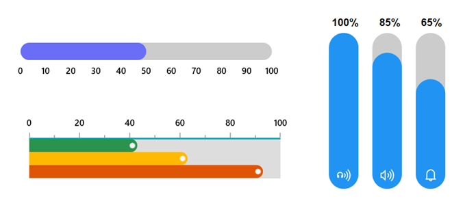
Bar pointer
A bar pointer is an accenting line that can be placed on a Linear Gauge to mark the current value in the axis. The bar pointers always start from the minimum value of the axis and end on the specified value. You can add any number of bar pointers inside the axis to indicate values. You can also customize the bar pointer’s thickness, color, corner styles, and position.
Marker pointer
Marker pointers are used to indicate specific values on the axis. There are two types of marker pointers, shape pointer and content pointer.
Shape pointer
The shape marker pointer has these predefined shapes:
- Triangle
- Inverted triangle
- Circle
- Diamond
- Rectangle
We can customize the size, position, and color of the shape pointer.
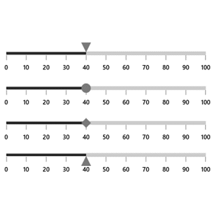
Content pointer
If the predefined shapes in the shape marker pointer don’t suit your needs, then you can use the content marker pointer. It allows you to use any kind of content such as icons, text, or images as marker pointers, with a complete set of custom options.
Pointer animation
The WinUI 3 Linear Gauge control provides visual appeal when the pointer moves from one value to another. It also supports various pointer animations.
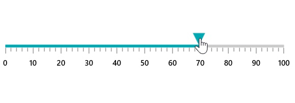
Pointer interaction
Drag a marker pointer from one value to another to change the value at run time.
Add the WinUI 3 Linear Gauge control to your application
We have seen the features of the WinUI 3 Linear Gauge control. Let’s learn how to create a simple WinUI 3 application with the Linear Gauge control to demonstrate its basic usage.
Step 1: Create a WinUI 3 application.
First, create a simple project using the instructions provided in the getting started with WinUI 3 apps and Build apps with the Windows App SDK documentation.
Step 2: Install the NuGet package.
Then, install the latest Syncfusion.Gauges.WinUI NuGet package in the application from NuGet or from the installed location, C:\Program Files (x86)\Syncfusion\Essential Studio®\WinUI\xx.x.x.xx\NuGetPackages.
Note: The xx.x.x.xx denotes the version of the Syncfusion WinUI 3 – Windows App SDK Gauge package.
Step 3: Add the namespace and initialize the Linear Gauge control.
Now, import the Syncfusion.UI.Xaml.Gauges namespace in the XAML file and initialize the Linear Gauge control as shown in the following code example.
xmlns:gauge="using:Syncfusion.UI.Xaml.Gauges"
…
<gauge:SfLinearGauge />
Step 4: Add axis to the Linear Gauge.
You can set a linear axis for the gauge using the Axis property of the SfLinearGauge class. Then, specify the minimum and maximum values of the axis using the Minimum and Maximum properties.
Refer to the following code example.
<gauge:SfLinearGauge>
   <gauge:SfLinearGauge.Axis>
       <gauge:LinearAxis Minimum="0"
                Maximum="140" />
   </gauge:SfLinearGauge.Axis>
</gauge:SfLinearGauge>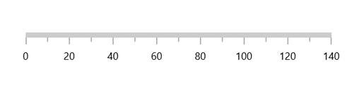
Step 5: Add a range to the Linear Gauge.
The range contains a list of range elements. You can add any number of ranges inside the axis. Specify the start value, end value, and background color for a range using the StartValue, EndValue, and Background properties, respectively.
Refer to the following code example.
<gauge:SfLinearGauge>
     <gauge:SfLinearGauge.Axis>
            <gauge:LinearAxis Maximum="140"
                     Interval="10">
                 <gauge:LinearAxis.Ranges>
                      <gauge:LinearGaugeRange StartValue="0"
                                        EndValue="50"
                                        Background="Red" />
                      <gauge:LinearGaugeRange StartValue="50"
                                        EndValue="100"
                                        Background="Orange" />
                      <gauge:LinearGaugeRange StartValue="100"
                                        EndValue="140"
                                        Background="Green" />
                 </gauge:LinearAxis.Ranges>
           </gauge:LinearAxis>
    </gauge:SfLinearGauge.Axis>
</gauge:SfLinearGauge>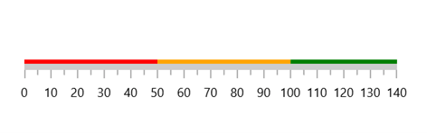
Step 6: Add a pointer to the Linear Gauge.
Pointers contain a variety of pointer elements, and you can add any kind of pointer – such as bar pointers, shape pointers, and content pointers – to the linear axis to indicate a value. The Value property is used to specify the value of the pointer.
Refer to the following code example.
<gauge:SfLinearGauge>
    <gauge:SfLinearGauge.Axis>
          <gauge:LinearAxis Maximum="140"
                     Interval="10">
              ...
              <gauge:LinearAxis.BarPointers>
                   <gauge:BarPointer Value="90" />
              </gauge:LinearAxis.BarPointers>

              <gauge:LinearAxis.MarkerPointers>
                 <gauge:ShapePointer Value="90"
                             VerticalAnchor="End"
                             OffsetPoint="0,-8" />

                 <gauge:ContentPointer Value="90"
                               VerticalAnchor="End"
                               OffsetPoint="0,-28">
                     <gauge:ContentPointer.Content>
                         <TextBlock Text="90%" />
                     </gauge:ContentPointer.Content>
                 </gauge:ContentPointer>

            </gauge:LinearAxis.MarkerPointers>
        </gauge:LinearAxis>
   </gauge:SfLinearGauge.Axis>
</gauge:SfLinearGauge>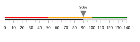
GitHub reference
For more information, refer to our WinUI Linear Gauge Getting Started demo.
Conclusion
Thanks for reading! I hope you enjoyed learning about the Syncfusion WinUI 3 Linear Gauge control and its features. For more details, refer to our WinUI Linear Gauge user guide and GitHub demos. Additionally, you can download and check out our demo app in the Windows Store. Use this control to design your brightness, volume, and gradient controls.
If you aren’t a customer yet, you can try our 30-day free trial to check out these features.
If you need a specific feature in our WinUI Linear Gauge control, please let us know in the comments section below. You can also contact us through our support forums, Direct-Trac, or feedback portal. We are always happy to assist you!
 No spam, just valuable updates.