

Welcome to our Chart of the Week blog series!
Today, we’ll visualize data on US school revenue as a share of GDP by funding source using the Syncfusion .NET MAUI Stacked Area Chart.
Before we dive in, it’s important to understand the significance of visualizing data. Imagine you are on a sales or marketing team, and you need to analyze product sales revenue reports over a period. The dataset is very large, making it difficult to fully understand the information from raw numbers alone. Visualizations like stacked area charts offer a clear and straightforward way to analyze such data, making the information more accessible and easier to understand.
A stacked area chart allows users to observe changes in values over time while highlighting the contributions of each component. This chart type is particularly effective in displaying the proportional distribution of revenue sources, giving us a comprehensive view of finances.
The following GIF image shows the stacked area chart we’re going to create.
Let’s get started with this Syncfusion .NET MAUI Stacked Area Chart!
Step 1: Gather the data
Before building the chart, we need to gather the US school revenue as a share of GDP by funding sources data. We can download the data in CSV format.
Step 2: Prepare the data for the chart
Let’s create the FundingSourceModel class that includes the properties to store the details about the data.
Refer to the following code example.
public class FundingSourceModel
{
    public string Year {get; set;}
    public double LocalFund {get; set;}
    public double StateFund {get; set;}
    public double FederalFund {get; set;}

    public FundingSourceModel(string year, double localFund, double stateFund, double federalFund)
    {
        Year = year;
        LocalFund = localFund;
        StateFund = stateFund;
        FederalFund = federalFund;
    }
}
Next, create the FundingSourceViewModel class to configure the data over the years. Then, store it in an observable collection using the FundingSourceCollection property.
public class FundingSourceViewModel
{
    private ObservableCollection<FundingSourceModel> fundingSourceCollection;
    public ObservableCollection<FundingSourceModel> FundingSourceCollection
    {
        get
        {
            return fundingSourceCollection;
        }
        set
        {
            fundingSourceCollection = value;
        }
    }
    public FundingSourceViewModel()
    {
        FundingSourceCollection = new ObservableCollection<FundingSourceModel>();
        ReadCSV();
    }
}
Then, convert the CSV data to a collection of funding data using the ReadCSV method.
public void ReadCSV()
{
    Assembly executingAssembly = typeof(App).GetTypeInfo().Assembly;
    Stream? inputStream = executingAssembly.GetManifestResourceStream("PublicSchoolsFunding.Resources.raw.data.csv");

    string? line;
    List<string> lines = new List<string>();

    if (inputStream != null)
    {
        using StreamReader reader = new StreamReader(inputStream);
        while ((line = reader.ReadLine()) != null)
        {
            lines.Add(line);
        }
        lines.RemoveAt(0);

        foreach (var dataPoint in lines)
        {
            string[] data = dataPoint.Split(',');

            string year = data[0];
            var localFund = Convert.ToDouble(data[1]);
            var stateFund = Convert.ToDouble(data[2]);
            var federalFund = Convert.ToDouble(data[3]);
            FundingSourceCollection.Add(new FundingSourceModel(year, localFund, stateFund, federalFund));
        }
    }
}
Step 3: Configure the Syncfusion.NET MAUI Cartesian Charts
Now, we configure the Syncfusion .NET MAUI Cartesian Charts control using this documentation.
Refer to the following code example.
<chart:SfCartesianChart>

 <chart:SfCartesianChart.XAxes>
  <chart:CategoryAxis/>
 </chart:SfCartesianChart.XAxes>

 <chart:SfCartesianChart.YAxes>
  <chart:NumericalAxis/>
 </chart:SfCartesianChart.YAxes>

</chart:SfCartesianChart>
Step 4: Bind data to the Stacked Area Chart
To visualize the funding data, we‘ll use the Syncfusion stacked area series.
Make sure to configure the FundingSourceViewModel class to bind its properties to the chart’s BindingContext.
Refer to the following code example.
<ContentPage.BindingContext>
 <viewModel:FundingSourceViewModel x:Name="viewModel"/>
</ContentPage.BindingContext>

<chart:SfCartesianChart>
 . . .
 <chart:StackingAreaSeries x:Name="Series1"
                           ItemsSource="{Binding FundingSourceCollection}"
                           XBindingPath="Year"
                           YBindingPath="FederalFund"/>

 <chart:StackingAreaSeries x:Name="Series2"
                           ItemsSource="{Binding FundingSourceCollection}"
                           XBindingPath="Year"
                           YBindingPath="StateFund"/>

 <chart:StackingAreaSeries x:Name="Series3"
                           ItemsSource="{Binding FundingSourceCollection}"
                           XBindingPath="Year"
                           YBindingPath="LocalFund"/>

</chart:SfCartesianChart>
In the previous code example, we’ve bound the ItemSource property with the FundingSourceCollection. The XBindingPath and YBindingPath properties are bound with the year and type of fund data, respectively.
Step 5: Customize the chart appearance
Let’s customize the Syncfusion .NET MAUI Stacked Area Chart appearance to enhance its readability.
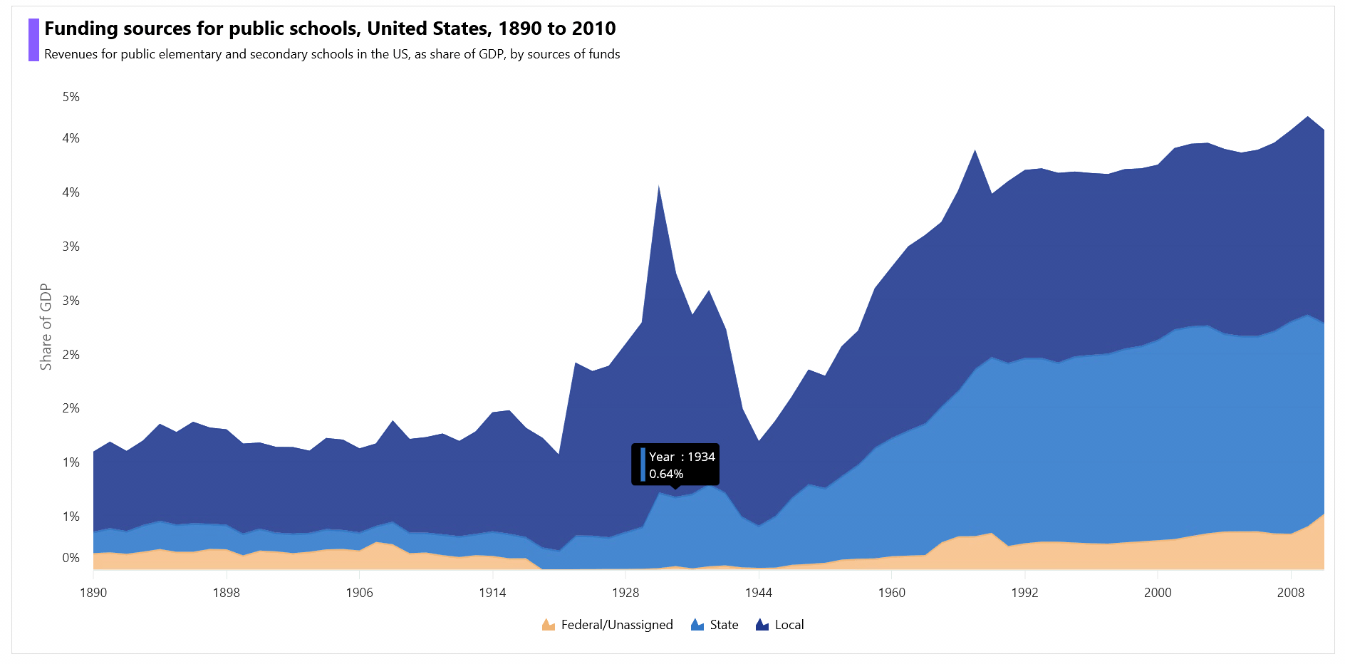
Customize the chart title
Refer to the following example to customize the chart title.
<chart:SfCartesianChart>

 <chart:SfCartesianChart.Title>
  <HorizontalStackLayout Padding="0,0,0,20">

   <BoxView BackgroundColor="#FF855FF2"
            Margin="5,0,5,0"
            HeightRequest="40"
            WidthRequest="10"/>

   <VerticalStackLayout>
    <Label Text="Funding sources for public schools, United States, 1890 to 2010"
           TextColor="Black"
           FontSize="18"
           FontFamily="TimeSpan"
           FontAttributes="Bold"
           Margin="0,0,0,0" />

    <Label Text="Revenues for public elementary and secondary schools in the US, as share of GDP, by source of funds"
           TextColor="Black"
           FontSize="12"
           FontFamily="TimeSpan"
           Margin="0,5,0,0"/>

    </VerticalStackLayout>

  </HorizontalStackLayout>
 </chart:SfCartesianChart.Title>

</chart:SfCartesianChart>
Customize the chart legend
Refer to the following code example to initialize the chart legend.
. . .
<chart:SfCartesianChart.Legend>
 <chart:ChartLegend Placement="Bottom"/>
</chart:SfCartesianChart.Legend>

. . .

<chart:StackingAreaSeries Label="Federal/Unassigned"
                          LegendIcon="SeriesType"/>

<chart:StackingAreaSeries Label="State"
                          LegendIcon="SeriesType"/>

<chart:StackingAreaSeries Label="Local"
                             LegendIcon="SeriesType"/>
Customize the chart axes
Now, customize the chart’s x- and y-axes using the LabelStyle, Interval, ShowMajorGridLines, EdgeLabelsDrawingMode, AxisLineStyle, and MajorTickStyle properties.
Refer to the following code example.
<chart:SfCartesianChart.XAxes>
 <chart:CategoryAxis ShowMajorGridLines="False" EdgeLabelsDrawingMode="Center" Interval="10"/>
</chart:SfCartesianChart.XAxes>

<chart:SfCartesianChart.YAxes>

 <chart:NumericalAxis>
  <chart:NumericalAxis.MajorTickStyle>
   <chart:ChartAxisTickStyle StrokeWidth="0" />
  </chart:NumericalAxis.MajorTickStyle>

  <chart:NumericalAxis.AxisLineStyle>
   <chart:ChartLineStyle StrokeWidth="0" />
  </chart:NumericalAxis.AxisLineStyle>

  <chart:NumericalAxis.LabelStyle>
   <chart:ChartAxisLabelStyle LabelFormat="0'%"/>
  </chart:NumericalAxis.LabelStyle>

  <chart:NumericalAxis.Title>
   <chart:ChartAxisTitle Text="Share of GDP"/>
  </chart:NumericalAxis.Title>
 </chart:NumericalAxis>
</chart:SfCartesianChart.YAxes>>
Customize the chart series
Then, customize the chart series using the Fill, Stroke, StrokeWidth, and Opacity properties.
<chart:SfCartesianChart.Series>

 <chart:StackingAreaSeries Fill="#E1AA74"
                           Opacity="0.8"
                           Stroke="#E1AA74"
                           StrokeWidth="1.5"/>
 <chart:StackingAreaSeries Fill="#3876BF"
                           Opacity="0.9"
                           Stroke="#3876BF"
                           StrokeWidth="1.5"/>
 <chart:StackingAreaSeries Fill="#2b408c"
                           Opacity="0.9"
                           Stroke="#3a4e99"
                           StrokeWidth="1.5"/>
</chart:SfCartesianChart.Series>
Adding interactivity to the chart
To enhance our chart’s readability with additional information, let’s add and customize the tooltip using the Tooltip template property.
<chart:SfCartesianChart.Resources>

 <DataTemplate x:Key="FederalTooltipTemplate">

  <HorizontalStackLayout>
   <BoxView BackgroundColor="#E1AA74" Margin="5,0,5,0" WidthRequest="5"/>

   <VerticalStackLayout>
    <Label Text="{Binding Item.Year, StringFormat='Year  : {0}'}" TextColor="White"/>
    <Label Text="{Binding Item.FederalFund,StringFormat='{0}%'}" TextColor="White"/>
   </VerticalStackLayout>
  </HorizontalStackLayout>

 </DataTemplate>

 <DataTemplate x:Key="StateTooltipTemplate">

  <HorizontalStackLayout>
   <BoxView BackgroundColor="#3876BF" Margin="5,0,5,0" WidthRequest="5"/>

   <VerticalStackLayout>
    <Label Text="{Binding Item.Year, StringFormat='Year  : {0}'}" TextColor="White"/>
    <Label Text="{Binding Item.StateFund, StringFormat='{0}%'}" TextColor="White"/>
   </VerticalStackLayout>
  </HorizontalStackLayout>

 </DataTemplate>

 <DataTemplate x:Key="LocalTooltipTemplate">

  <HorizontalStackLayout>
   <BoxView BackgroundColor="#2b408c" Margin="5,0,5,0" WidthRequest="5"/>

   <VerticalStackLayout>
    <Label Text="{Binding Item.Year,StringFormat='Year  : {0}'}" TextColor="White"/>
    <Label Text="{Binding Item.LocalFund, StringFormat='{0}%'}" TextColor="White"/>
   </VerticalStackLayout>
  </HorizontalStackLayout>

 </DataTemplate>
</chart:SfCartesianChart.Resources>
<chart:StackingAreaSeries EnableTooltip="True"
                          TooltipTemplate="{StaticResource FederalTooltipTemplate}"/>
<chart:StackingAreaSeries EnableTooltip="True"
                          TooltipTemplate="{StaticResource StateTooltipTemplate}"/>
<chart:StackingAreaSeries EnableTooltip="True"
                          TooltipTemplate="{StaticResource LocalTooltipTemplate}"/>
After running the previous code examples, the output will look like the following GIF image.
GitHub reference
For more details, refer to the complete project on GitHub.
Conclusion
Thanks for reading! In this blog, we’ve seen how to visualize the revenue of US schools as a share of GDP by funding sources using the Syncfusion .NET MAUI stacked area chart. We strongly encourage you to follow the steps outlined in this blog and share your thoughts in the comments below.
You can also contact us through our support forums, support portal, or feedback portal. We are always happy to assist you!


 No spam, just valuable updates.