
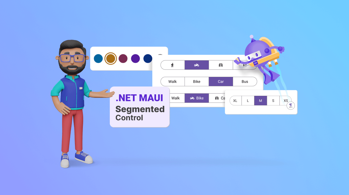
We are thrilled to introduce the new Syncfusion .NET MAUI Segmented Control as part of our 2023 Volume 3 release.
This innovative control offers a seamless selection experience by presenting several options through distinct buttons. These buttons are neatly arranged in a line and can feature text, an icon, or a blend of both.
Let’s see the key features of the new .NET MAUI Segmented Control and the steps to get started with it.
Key features
The .NET MAUI Segmented Control provides support for the following key features:
- Populating segment items
- Selection indicator
- Disabled segment items
- Scrolling
- Right-to-left layout
- Appearance customization
Let’s take a closer look at these features.
Populating segment items
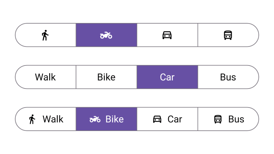
The Segmented Control offers a variety of options for populating segment items. It provides the flexibility to:
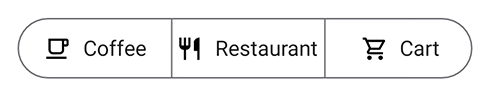
- Use text-only segments for straightforward labeling.
- Incorporate icons as intuitive visual cues.
- Combine text and icons to create visually engaging and user-friendly content.
This versatility enhances both the user experience and the aesthetic appeal of your application.
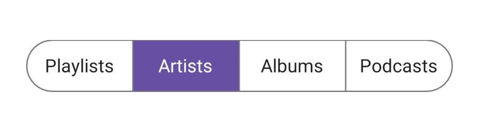
Selection indicator
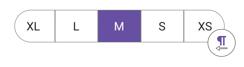
The .NET MAUI Segmented Control supports four distinct selection indicators to significantly improve the user interface:
- Fill
- Border
- Top border
- Bottom border
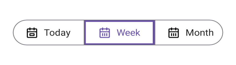
For instance, the Fill selection indicator visually highlights the selected segment by filling it with a contrasting color. This makes the selected item highly noticeable and the selection process more intuitive and visually appealing.
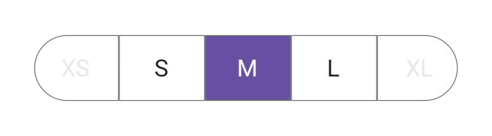
Alternatively, the Border selection indicator outlines the selected segment with a distinct border.
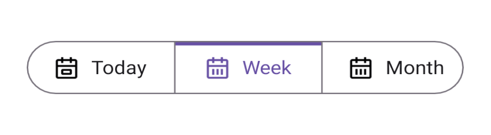
The Top Border indicator places a border at the top of the selected segment.
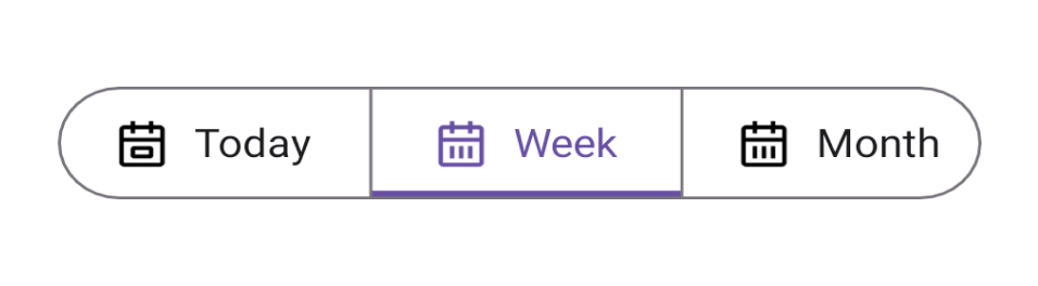
The Bottom border indicator places a border at the bottom of the selected segment.
Disable segment items
You can easily disable interaction and selection for certain segmented items to control user selections or restrict access as needed.
Scrolling
You can adjust the size and number of visible segments according to your needs.
For example, you can change the width of individual segments, which helps highlight specific segments or accommodate varying text lengths due to space limitations.
The Segmented Control can be configured to display a certain number of segments within the available width, and you can scroll to view the additional segments.
Right-to-left layout
The .NET MAUI Segmented Control also supports right-to-left (RTL) flow direction. This feature is useful in apps that use languages and cultures that read and write text from right to left, such as Arabic, Hebrew, and Persian.
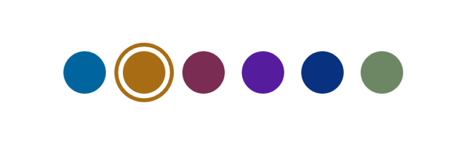
Appearance customization
You can customize the .NET MAUI Segmented Control’s appearance with a wide range of design options to modify its visual appeal and the user experience.
You can customize its design by changing text color, border color, border thickness, and corner radius, and even use data templates.
Note: For more details, refer to the .NET MAUI Segmented Control documentation.
Getting started with .NET MAUI Segmented Control
We have seen the vivid features of the .NET MAUI Segmented Control. Let’s see how to add the control to your .NET MAUI app.
Step 1: Create a .NET MAUI project
First, create a new .NET MAUI app in Visual Studio.
Step 2: Add the required NuGet package
Syncfusion .NET MAUI components are available in the NuGet Gallery. To add the SfSegmentedControl to your project, open the NuGet Package Manager in Visual Studio and search for Syncfusion.Maui.Buttons, and then install it.
Step 3: Register the handler
Syncfusion.Maui.Core is the required NuGet package for all Syncfusion .NET MAUI controls. So, we have to register the handler for Syncfusion Core in the MauiProgram.cs file.
Refer to the following code.
MauiProgram.cs
using Syncfusion.Maui.Core.Hosting;
public static class MauiProgram
{
public static MauiApp CreateMauiApp()
{
var builder = MauiApp.CreateBuilder();
builder.ConfigureSyncfusionCore();
builder.ConfigureSyncfusionCore();
}
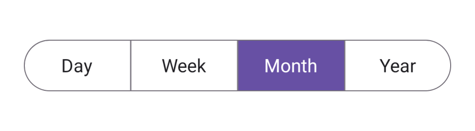
}Step 4: Initialize the .NET MAUI Segmented Control
Import the control namespace Syncfusion.Maui.Buttons in your XAML or C# code and initialize the SfSegmentedControl.
You can use the ItemsSource property of SfSegmentedControl to populate the segmented items.
Refer to the following code example.
MainPage.xaml
xmlns:buttons="clr-namespace:Syncfusion.Maui.Buttons;assembly=Syncfusion.Maui.Buttons"

<buttons:SfSegmentedControl x:Name="segmentedControl">
   <buttons:SfSegmentedControl.ItemsSource>
      <x:Array Type="{x:Type x:String}">
         <x:String>Day</x:String>
         <x:String>Week</x:String>
         <x:String>Month</x:String>
         <x:String>Year</x:String>
       </x:Array>
    </buttons:SfSegmentedControl.ItemsSource>
</buttons:SfSegmentedControl>
After executing the previous code examples, we’ll get the output shown in the following image.
GitHub reference
Refer to the .NET MAUI Segmented Control demo on GitHub to dive deeper into the control and its features.
Conclusion
Thanks for reading! In this blog, we explored the features of the new .NET MAUI Segmented Control available in our 2023 Volume 3 release. With this control, you can offer a seamless selection experience by presenting a spectrum of options through distinct buttons.
Also, visit our Release Notes and What’s New pages to discover this release’s other exciting updates. Try them out and leave your feedback in the comments section below.
For current Syncfusion customers, the newest version of Essential Studio® is available from the license and downloads page. If you are not a customer yet, try our 30-day free trial to check out these new features.
You can also contact us through our support forums, feedback portal, or support portal. We are always happy to assist you!


