Welcome to our Chart of the Week blog series!
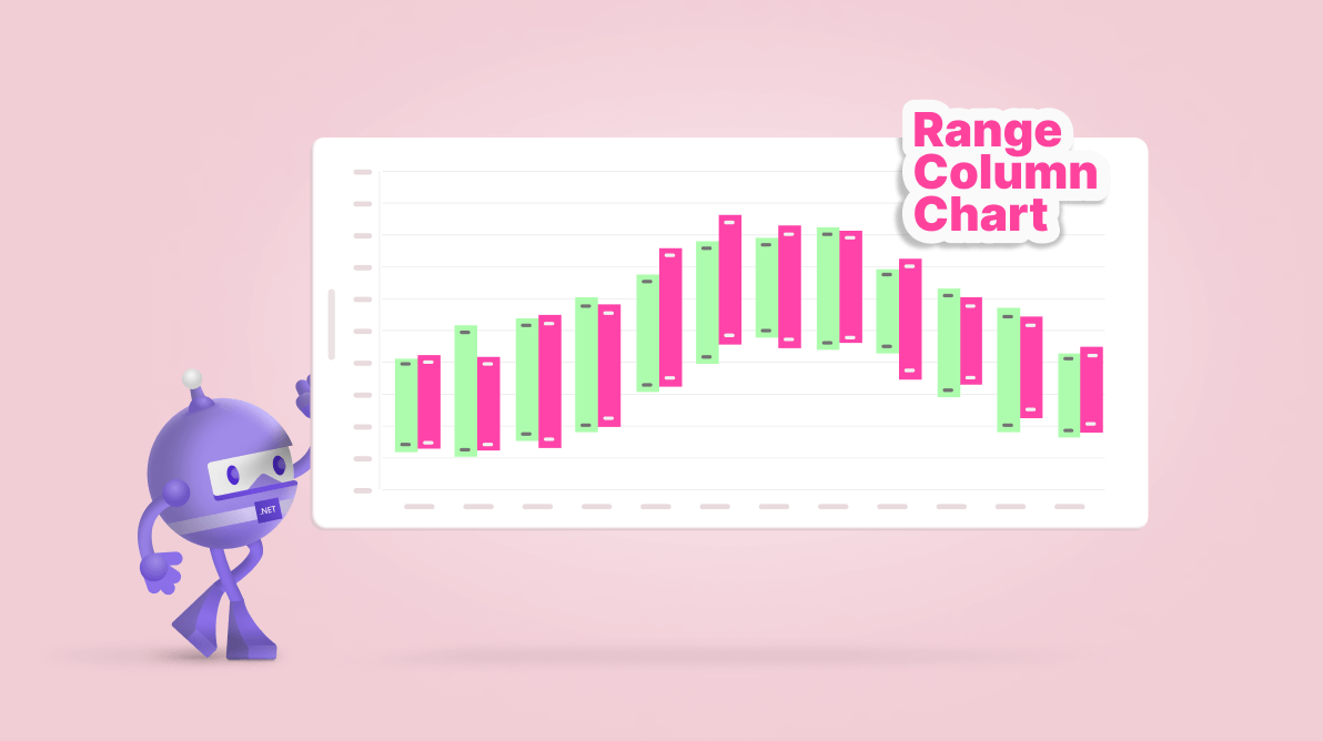
Today, we’ll analyze and compare average monthly temperature variations in Rome for 2021 and 2022 using the Syncfusion .NET MAUI Range Column Chart.
The .NET MAUI Range Column Chart is a powerful tool for visualizing data ranges. It plots two y-values per data point, representing a column’s upper and lower bounds. This allows for a dynamic and comprehensive view of your data. With features like real-time updates, high performance, and interactive elements such as zooming, panning, trackball, tooltip, and selection, your data analysis becomes an engaging experience.
This versatile control is aesthetically pleasing and compatible with desktop (Windows and Mac Catalyst) and mobile platforms (Android and iOS), making it a go-to choice for cross-platform data visualization needs.
The following image shows the chart we’re going to build.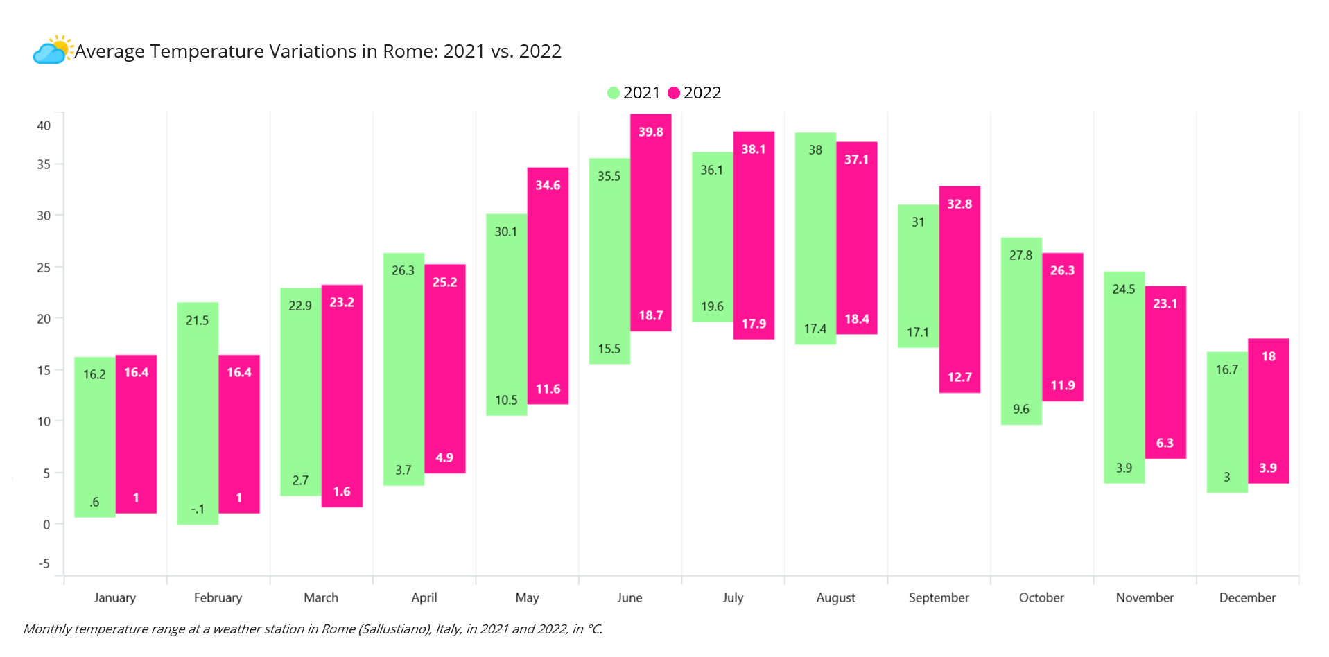
Let’s begin creating a range graph that illustrates temperature variations using the Syncfusion .NET MAUI Range Column Chart.
Step 1: Gathering the average temperature data
First, we need to gather data from the Weather Underground website. We’ll focus on obtaining the monthly temperature range in degrees Celsius for Rome (Sallustiano), Italy, for 2021 and 2022. Once we have this data, we will save it as a CSV file. After that, we can create the chart.
Step 2: Preparing the data for the chart
Create the Model class to hold the temperature data with the help of the Month, High2021, Low2021, High2022, and Low2022 properties.
Refer to the following code example.
Public class Model
{
    public Model(string month, double high2021, double low2021, double high2022, double low2022)
    {
        Month = month;
        High2021 = high2021;
        Low2021 = low2021;
        High2022 = high2022;
        Low2022 = low2022;
    }

    public string Month { get; set; }
    public double High2021 { get; set; }
    public double Low2021 { get; set; }
    public double High2022 { get; set; }
    public double Low2022 { get; set; }
}
Then, we generate the average temperature collection using the ViewModel class and its TemperatureCollection property. Assign the CSV data to the temperature range data collection using the ReadCSV method and store it in the TemperatureCollection property.
Refer to the following code example.
public class ViewModel
{
    List<Model> temperatureCollection;
    public List<Model> TemperatureCollection
    {
        get
        {
            return temperatureCollection;
        }
        set
        {
            temperatureCollection = value;
        }
    }

    public ViewModel()
    {
        TemperatureCollection = new List<Model>(ReadCSV());
    }

    public IEnumerable<Model> ReadCSV()
    {
        Assembly executingAssembly = typeof(App).GetTypeInfo().Assembly;
        Stream inputStream = executingAssembly.GetManifestResourceStream("RangeColumnSample.Resources.Raw.Rome monthly data.csv");

        string? line;
        List<string> lines = new List<string>();

        using StreamReader reader = new StreamReader(inputStream);
        while ((line = reader.ReadLine()) != null)
        {
            lines.Add(line);
        }

        return lines.Select(line =>
        {
            string[] data = line.Split(',');
            return new Model(data[0], Convert.ToDouble(data[1]), Convert.ToDouble(data[2]), Convert.ToDouble(data[4]), Convert.ToDouble(data[5]));
        });
    }
}
Step 3: Configuring the Syncfusion .NET MAUI Cartesian Charts
Now, configure the Syncfusion .NET MAUI Cartesian Charts control using this documentation.
Refer to the following code example.
<chart:SfCartesianChart>

 <chart:SfCartesianChart.XAxes>
  <chart:CategoryAxis>
  </chart:CategoryAxis>
 </chart:SfCartesianChart.XAxes>

 <chart:SfCartesianChart.YAxes>
  <chart:NumericalAxis>
  </chart:NumericalAxis>
 </chart:SfCartesianChart.YAxes>

</chart:SfCartesianChart>
Step 4: Bind the monthly temperature data to the range column chart
To compare the monthly average temperature variations for 2021 and 2022, we’ll use the Syncfusion RangeColumnSeries instance.
Refer to the following code example.
<chart:RangeColumnSeries  ItemsSource="{Binding TemperatureCollection}"
                          XBindingPath="Month" High="High2021" Low="Low2021">
</chart:RangeColumnSeries>

<chart:RangeColumnSeries  ItemsSource="{Binding TemperatureCollection}"
                          XBindingPath="Month" High="High2022"  Low="Low2022">
</chart:RangeColumnSeries>
In the above code example, we’ve bound the ItemSource with the TemperatureCollection property. We have specified the XBindingPath with the Month property for 2021 and 2022. The High and Low properties are bound with the respective high and low values for 2021 and 2022, respectively.
Step 5: Customizing the chart appearance
Let’s enhance the look of the range column chart. To do this, we will create a layout with a bordered container specifically for the range graph. We will use a Label to display the necessary content.
Refer to the following code example.
<Border BackgroundColor="White" Stroke="#BEB1AE" Margin="10,20,10,10" Padding="10">

 <Border.StrokeShape>
  <RoundRectangle CornerRadius="30"/>
 </Border.StrokeShape>

 <Grid>
  <Grid.RowDefinitions>
   <RowDefinition Height="8*"/>
   <RowDefinition Height="20"/>
  </Grid.RowDefinitions>

  <chart:SfCartesianChart>
  </chart:SfCartesianChart>

  <Label Grid.Row="1" FontSize="Caption" FontAttributes="Italic"
         Text="Monthly temperature range at a weather station in Rome (Sallustiano), Italy, in 2021 and 2022, in °C.">
  </Label>

 </Grid>

</Border>
Customizing range column series placement
We can place the range column series side by side or overlap them using the EnableSideBySideSeriesPlacement property. Additionally, we can personalize the chart by setting a background color and margins.
Refer to the following code example.
<chart:SfCartesianChart Margin="10" BackgroundColor="White" EnableSideBySideSeriesPlacement="True">
</chart:SfCartesianChart>
Adding a title to the chart
We can easily enhance the readability of the plotted data by adding a Title to the chart, as shown in the following code example.
<chart:SfCartesianChart.Title>
 <Grid>
  <Grid.RowDefinitions>
   <RowDefinition Height="Auto"/>
  </Grid.RowDefinitions>
  <HorizontalStackLayout Grid.Column="0">
   <Image Source="cloud.jpg" WidthRequest="40" HeightRequest="40"/>
   <Label VerticalOptions="Center"
          Text="Average Temperature Variations in Rome: 2021 vs. 2022" FontSize="18"/>
  </HorizontalStackLayout>
 </Grid>
</chart:SfCartesianChart.Title>
Customizing the chart legend
Refer to the following code to enable and customize the Legend to represent the years for which the range column series is plotted.
<chart:SfCartesianChart.Legend>
 <chart:ChartLegend ItemTemplate="{StaticResource LegendTemplate}">
 </chart:ChartLegend>
</chart:SfCartesianChart.Legend>

<chart:SfCartesianChart.Resources>
 <ResourceDictionary>
  <DataTemplate x:Key="LegendTemplate">
   <Grid ColumnDefinitions="Auto,Auto" ColumnSpacing="5">
    <HorizontalStackLayout>
     <Ellipse HorizontalOptions="Center" VerticalOptions="Center"
              HeightRequest="13" WidthRequest="13" Margin="0,3,3,0"
              Fill="{Binding IconBrush}"/>
     <Label Grid.Column="1" FontSize="16" VerticalTextAlignment="Center" Text="{Binding Item.Label}" TextColor="Black" HorizontalOptions="Center"  HorizontalTextAlignment="Start"/>
    </HorizontalStackLayout>
   </Grid>
  </DataTemplate>
 </ResourceDictionary>
</chart:SfCartesianChart.Resources>

<chart:RangeColumnSeries Label="2021">
</chart:RangeColumnSeries>

<chart:RangeColumnSeries Label="2022">
</chart:RangeColumnSeries>
Customizing the axes and gridlines
Let’s customize the x- and y-axes using properties such as LabelPlacement, LabelStyle, and ShowMajorGridLines, and adjust the y-axis range using the Minimum and Maximum properties.
<chart:SfCartesianChart.XAxes>
 <chart:CategoryAxis LabelPlacement="BetweenTicks">
  <chart:CategoryAxis.LabelStyle>
   <chart:ChartAxisLabelStyle TextColor="Black" FontSize="Caption"/>
  </chart:CategoryAxis.LabelStyle>
 </chart:CategoryAxis>
</chart:SfCartesianChart.XAxes>

<chart:SfCartesianChart.YAxes>
 <chart:NumericalAxis  Minimum="-5" Maximum="40" ShowMajorGridLines="False">
  <chart:NumericalAxis.LabelStyle>
   <chart:ChartAxisLabelStyle TextColor="Black" FontSize="Caption"/>
  </chart:NumericalAxis.LabelStyle>
 </chart:NumericalAxis>
</chart:SfCartesianChart.YAxes>
Customizing the chart series
We can also customize the chart series by adjusting the chart segment Width and applying colors using the Fill property. Refer to the following code example.
<chart:RangeColumnSeries Width="{x:OnPlatform Android='0.9', iOS='0.9', Default='0.8'}" Fill="#98fb98>
</chart:RangeColumnSeries>

<chart:RangeColumnSeries Width="{x:OnPlatform Android='0.9', iOS='0.9', Default='0.8'}" Fill="#ff1493">
</chart:RangeColumnSeries>
Adding data labels
Finally, enable and customize the data labels for each series in the chart as shown in the following code example.
<chart:RangeColumnSeries ShowDataLabels="True" >
 <chart:RangeColumnSeries.DataLabelSettings>
  <chart:CartesianDataLabelSettings UseSeriesPalette="False">
   <chart:CartesianDataLabelSettings.LabelStyle>
    <chart:ChartDataLabelStyle TextColor="Black"/>
   </chart:CartesianDataLabelSettings.LabelStyle>
  </chart:CartesianDataLabelSettings>
 </chart:RangeColumnSeries.DataLabelSettings>
</chart:RangeColumnSeries>

<chart:RangeColumnSeries ShowDataLabels="True" >
 <chart:RangeColumnSeries.DataLabelSettings>
  <chart:CartesianDataLabelSettings UseSeriesPalette="False">
   <chart:CartesianDataLabelSettings.LabelStyle>
    <chart:ChartDataLabelStyle TextColor="White" FontAttributes="Bold"/>
   </chart:CartesianDataLabelSettings.LabelStyle>
  </chart:CartesianDataLabelSettings>
 </chart:RangeColumnSeries.DataLabelSettings>
</chart:RangeColumnSeries>
After executing all these code examples, we will get output like the following image.

GitHub reference
For more details, refer to the demo on GitHub.
Conclusion
Thanks for reading! In this blog, we’ve compared the average monthly temperature variations in Rome using the Syncfusion .NET MAUI Range Column Chart. We encourage you to follow the steps and share your experience in the comments section below.
You can also contact us through our support forum, support portal, or feedback portal. We are always happy to assist you!


Related blogs
- Syncfusion Essential Studio 2023 Volume 3 Is Here!
- Chart of the Week: Creating a Pareto Chart Using .NET MAUI Charts to identify Key Customer Complaints
- Creating a .NET MAUI Smart PDF Viewer App with Auto-Summary Generation Using OpenAI’s ChatGPT
- Advanced Date Customization in .NET MAUI Calendar Control