

Welcome to our Chart of the Week blog series!
Today, we’re venturing into the intriguing world of passport power in 2023, using the Syncfusion .NET MAUI Radial Bar Chart control.
In our globalized society, passport strength (defined by the number of countries one can visit without a visa or with minimal visa requirements) holds considerable importance. To bring this data to life, we’ve designed a dynamic radial bar chart that spotlights the most and least powerful passports in 2023.
The Syncfusion .NET MAUI Radial Bar Chart is a potent visualization tool. Join us as we navigate through creating this chart, uncovering insights into the evolving dynamics of international travel and diplomacy.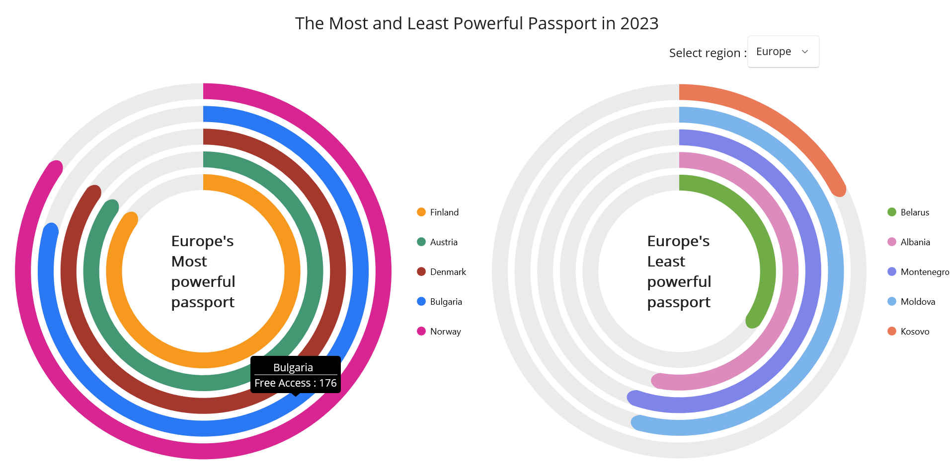
Let’s see the step-by-step guide to visualize the most and least powerful passports using the .NET MAUI Radial Bar Chart.
Step 1: Gather data on the most and least powerful passports
First, gather the data on most and least powerful passports in 2023.
Step 2: Prepare the data for the chart
Create a class model named PassportModel with the Country and Access properties to hold the data related to most and least powerful passports for the chart.
Refer to the following code example.
public class PassportModel
{
    public string Country { get; set; }
    public double Access { get; set; }
}
Then, generate the data collection that illustrates the most and least powerful passport sources using the PassportViewModel class with the WorldMostData, AsianMostData, EuropeanMostData, WorldLeastData, AsianLeastData, and EuropeanLeastData properties.
Refer to the following code example.
public string[] Region => new string[] { "Asia", "Europe", "World" };
public ObservableCollection<PassportModel> WorldMostData { get; set; } = new ObservableCollection< PassportModel >();
public ObservableCollection< PassportModel > AsianMostData { get; set; } = new ObservableCollection< PassportModel >();
public ObservableCollection< PassportModel > EuropeanMostData { get; set; } = new ObservableCollection< PassportModel >();
public ObservableCollection< PassportModel > WorldLeastData { get; set; } = new ObservableCollection< PassportModel >();
public ObservableCollection< PassportModel > AsianLeastData { get; set; } = new ObservableCollection< PassportModel >();
public ObservableCollection< PassportModel > EuropeanLeastData { get; set; } = new ObservableCollection< PassportModel >();
public PassportViewModel()
{
// Populate WorldMostData
PopulateData(WorldMostData, new[]
{
("Japan", 190),("Austria", 189),("Belgium",188),("Canada",187),("Greece",186)
});
// Populate AsianMostData
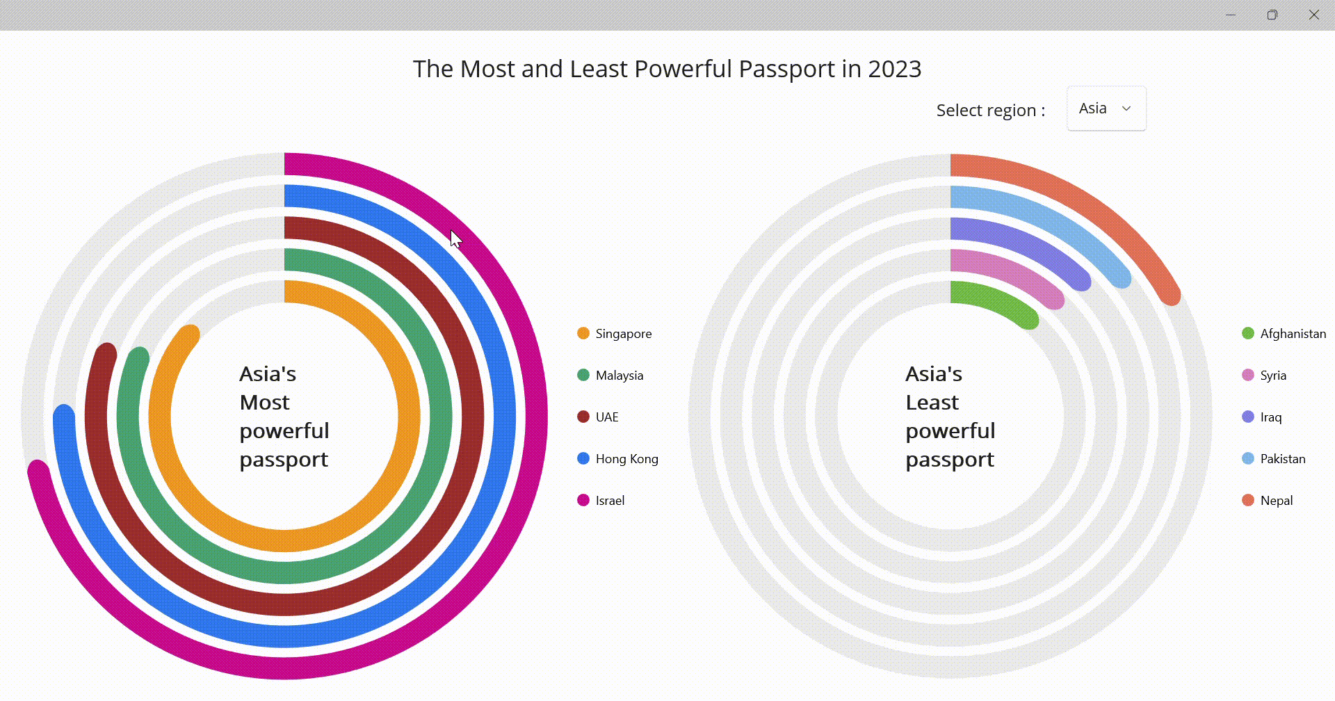
PopulateData(AsianMostData, new[]
{
("Singapore", 193), ("Malaysia", 181), ("UAE", 179),
("Hong Kong", 167), ("Israel", 159)
});
// Populate EuropeanMostData
PopulateData(EuropeanMostData, new[]
{
("Finland", 190), ("Austria", 189), ("Denmark", 189),
("Bulgaria", 176), ("Norway", 188)
});
// Populate WorldLeastData
PopulateData(WorldLeastData, new[]
{
("Iran", 43), ("Libya", 40), ("Sudan", 44),
("Yemen", 34), ("Somalia", 35)
});
// Populate AsianLeastData
PopulateData(AsianLeastData, new[]
{
("Afghanistan", 27), ("Syria", 28), ("Iraq", 29),
("Pakistan", 33), ("Nepal", 39)
});
// Populate EuropeanLeastData
PopulateData(EuropeanLeastData, new[]
{
("Belarus", 79), ("Albania", 119), ("Montenegro", 124),
("Moldova", 121), ("Kosovo", 40)
});
private void PopulateData(ObservableCollection< PassportModel > collection, IEnumerable<(string Country, int Access)> data)
{
foreach (var (country, access) in data)
{
collection.Add(new PassportModel { Country = country, Access = access });
}
}
}Step 3: Configure the Syncfusion .NET MAUI Circular Charts
Now, configure the Syncfusion .NET MAUI Circular Charts control using this documentation.
Refer to the following code example.
<chart:SfCircularChart>
</chart:SfCircularChart>
Step 4: Bind data to the .NET MAUI Radial Bar Chart
Let’s use the Syncfusion Radial Bar Chart to visualize the data.
Refer to the following code example. In it, bind the ItemsSource property with each region’s most and least powerful passport data. Then, bind the XBindingPath and YBindingPath properties with the Country and Access properties, respectively.
<chart:RadialBarSeries ItemsSource="{Binding AsiaMostData}"
                       XBindingPath="Country"
                       YBindingPath="Access"/>
<chart:RadialBarSeries ItemsSource="{Binding AsiaLeastData}"
XBindingPath="Country"
YBindingPath="Access"/>Step 5: Customizing the chart appearance
Let‘s elevate the aesthetics of the .NET MAUI Radial Bar Chart by tailoring its components, including the legend, center view, and tooltip.
a. Add ComboBox to select the different regions in the Radial Bar Chart
We’ll separately display the data on the most and least powerful passports. We’ll also implement a combo box to select the required regions: Asia, Europe, and the World.
Refer to the following code examples.
<Picker Grid.Row="0" Grid.Column="1" VerticalOptions="End" Margin="0,0,100,0" ItemsSource="{Binding Source={x:Reference viewModel},Path=Region}" SelectedItem="{Binding Source={x:Reference viewModel},Path=Region[0]}" SelectedIndex="0" SelectedIndexChanged="Picker_SelectedIndexChanged" HorizontalOptions="End">
</Picker>
private void Picker_SelectedIndexChanged(object sender, EventArgs e)
{
var picker = sender as Picker;
string selectedRegion = picker.SelectedIndex switch
{
0 => "Asia's",
1 => "Europe's",
_ => "World's"
};
label.Text = selectedRegion;
label1.Text = selectedRegion;
var mostData = picker.SelectedIndex switch
{
0 => viewModel.AsianMostData,
1 => viewModel.EuropeanMostData,
_ => viewModel.WorldMostData
};
var leastData = picker.SelectedIndex switch
{
0 => viewModel.AsianLeastData,
1 => viewModel.EuropeanLeastData,
_ => viewModel.WorldLeastData
};
series.ItemsSource = mostData;
series1.ItemsSource = leastData;
}b. Customize the chart legend
Refer to the following code example to enable and customize the legend to indicate which countries are associated with each color.
Refer to the following code example.
<chart:SfCircularChart.Legend>
 <chart:ChartLegend Placement="Right ">
 </chart:ChartLegend>
</chart:SfCircularChart.Legend>
c. Customize the chart color and size
Next, customize the chart’s size and color using the PaletteBrushes, InnerRadius, GapRatio, and other properties.
Refer to the following code example.
public List<Brush> CustomBrushes { get; set; }
CustomBrushes = new List<Brush>
 {
     new SolidColorBrush(Color.FromArgb("#F6991E")),
     new SolidColorBrush(Color.FromArgb("#439772")),
     new SolidColorBrush(Color.FromArgb("#A4382D")),
     new SolidColorBrush(Color.FromArgb("#2A78F4")),
     new SolidColorBrush(Color.FromArgb("#D82591")),
 };
CustomBrushes1 = new List<Brush>
{
    new SolidColorBrush(Color.FromArgb("#70ad47")),
    new SolidColorBrush(Color.FromArgb("#dd8abd")),
    new SolidColorBrush(Color.FromArgb("#7f84e8")),
    new SolidColorBrush(Color.FromArgb("#7bb4eb")),
    new SolidColorBrush(Color.FromArgb("#ea7a57"))
};
<chart:RadialBarSeries x:Name="series"
ItemsSource="{Binding AsianMostData}"
XBindingPath="Country"
YBindingPath="Access"
MaximumValue="220"
InnerRadius="0.3"
GapRatio="0.3"
EnableTooltip="True"
TooltipTemplate="{StaticResource tooltipTemplate}"
Radius="1"
PaletteBrushes="{Binding CustomBrushes}">d. Add text at the center of the chart
Let’s add a center view to demonstrate the region that has contributed the data for the chart. The center view will be updated based on the item selected in the combo box.
Refer to the following code example.
<chart:RadialBarSeries.CenterView>
 <VerticalStackLayout>
  <Label Text="Asia's" Style="{StaticResource style}" FontSize="{OnPlatform Android=10,iOS='10',Default=20}" x:Name="label1"></Label>
  <Label Text="Least" Style="{StaticResource style}" FontSize="{OnPlatform Android='10',iOS='10',Default=20}"/>
  <Label Text="powerful" Style="{StaticResource style}" FontSize="{OnPlatform Android='10',iOS='10',Default=20}"/>
  <Label Text="passport" Style="{StaticResource style}" FontSize="{OnPlatform Android='10',iOS='10',Default=20}"/>
 </VerticalStackLayout>
</chart:RadialBarSeries.CenterView>
After executing the previous code examples, we’ll get output like in the following image.
GitHub reference
For more details, refer to the project on the GitHub repository.
Conclusion
Thanks for reading! In this blog, we’ve seen how to visualize the data on the most and least powerful passports using the Syncfusion .NET MAUI Radial Bar Chart. We strongly encourage you to follow the steps outlined in this blog and share your feedback in the comments section below.
If you require any assistance, please don’t hesitate to contact us via our support forum, support portal, or feedback portal. We are always happy to help you!


 No spam, just valuable updates.