

Welcome to our Chart of the Week series.
This blog will use the Syncfusion .NET MAUI Column Chart to create a multiple-column chart that analyzes and compares data points grouped into subcategories. Multiple-column charts are commonly used in business analytics to compare sales performance across various products or regions. The following column chart compares the revenue growth rates of e-health and meditation apps in the U.S.
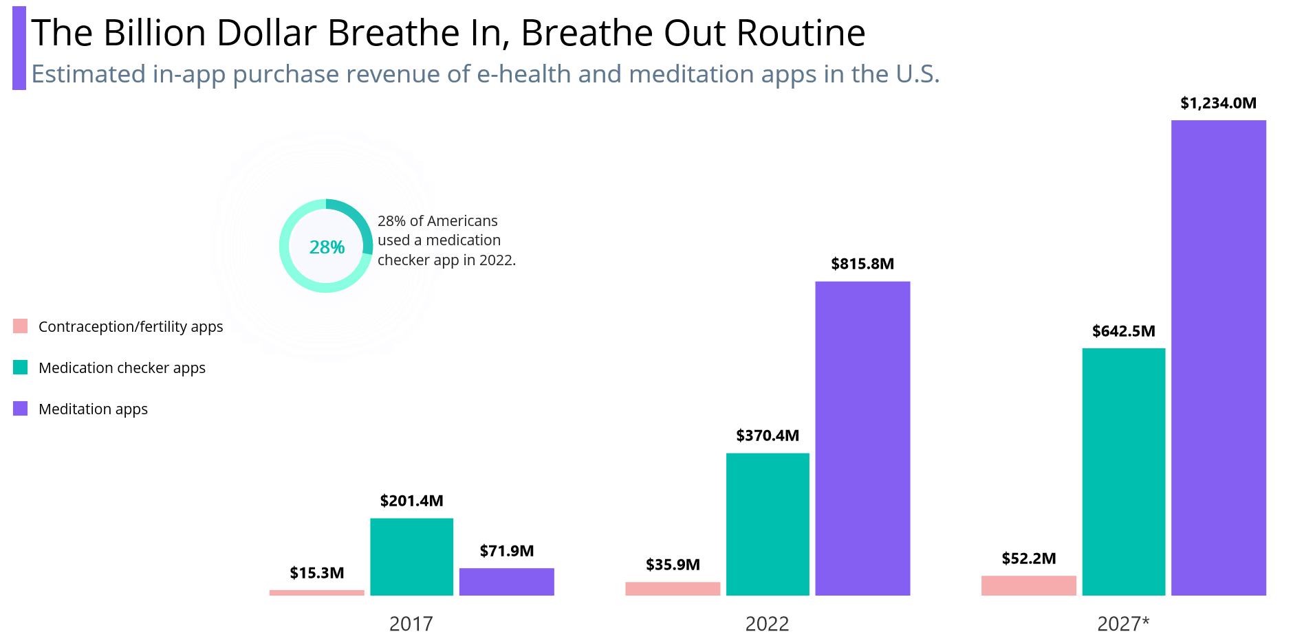
According to the Statista Health Market Insights study, the COVID-19 pandemic led to higher in-app purchases of medication checkers and meditation apps, generating $1.2 billion in revenue in the United States in 2022. Joanne Kim, the researcher of the study, noted a 200% increase in telehealth app downloads between 2019 and 2020. By 2027, the combined revenue from in-app purchases of mindfulness apps and medication checkers is projected to reach nearly $2 billion.
Refer to the following image.
Let’s see the steps to create this purchase revenue graph using the Syncfusion .NET MAUI Column Chart.
Step 1: Gather purchase revenue data
For this blog, we will use data from the Statista Health Market Insights study.
Step 2: Populate data for the chart
Let’s define the RevenueDetailModel class with the Year, FertilityAppRevenue, MedicationCheckerAppRevenue, and MeditationAppRevenue properties to store the purchase year and revenue data. This class will also hold the number of meditation app users in 2022 through the MeditationAppUsers and Year properties.
Refer to the following code example.
public class RevenueDetailModel
{
     public RevenueDetailModel(string year, double fertilityApp, double medicationCheckerApp, double meditationApp)
     {
         Year = year;
         FertilityApp = fertilityApp;
         MedicationCheckerApp = medicationCheckerApp;
         MeditationApp = meditationApp;
     }

     public RevenueDetailModel(string year, double meditationAppUserPercentage)
     {
         Year = year;
         MeditationAppUserPercentage = meditationAppUserPercentage;
     }

     public string Year { get; set; }
     public double FertilityApp { get; set; }
     public double MedicationCheckerApp { get; set; }
     public double MeditationApp { get; set; }
     public double MeditationAppUserPercentage { get; set; }
 }
Now, we generate a collection of e-health and meditation app purchase revenue details using the RevenueDetails class. Here, we’ll also create a collection to store the number of MeditationAppUsers in 2022.
public class RevenueDetails
{
    public RevenueDetails()
    {
        AppRevenues = new List<RevenueDetailModel>();
        MeditationAppUsers = new List<RevenueDetailModel>() ;

        AppRevenues.Add(new RevenueDetailModel("2017", 15.3, 201.4, 71.9));
        AppRevenues.Add(new RevenueDetailModel("2022", 35.9, 370.4, 815.8));
        AppRevenues.Add(new RevenueDetailModel("2027*", 52.2, 642.5, 1234));

        MeditationAppUsers.Add(new RevenueDetailModel("2022", 28));
    }
    public List<RevenueDetailModel> AppRevenues { get; set; }
    public List<RevenueDetailModel> MeditationAppUsers { get; set; }
}
Step 3: Configuring Syncfusion .NET MAUI Cartesian Charts
Then, let’s configure the Syncfusion .NET MAUI Cartesian Charts control by referring to this documentation.
Refer to the following code example.
<Chart:SfCartesianChart x:Name="chart">
 <Chart:SfCartesianChart.XAxes>
  <Chart:CategoryAxis/>
 </Chart:SfCartesianChart.XAxes>
 <Chart:SfCartesianChart.YAxes>
  <Chart:NumericalAxis/>
 </Chart:SfCartesianChart.YAxes>
</Chart:SfCartesianChart>
Step 4: Binding data to the column chart
To visualize the e-health and meditation app purchase data in our chart, we will utilize the Syncfusion ColumnSeries instance. We’ll create separate column series for each app.
Configuring the chart series involves specifying the ItemSource property with the AppRevenues property, XBindingPath to indicate the purchase year, and YbindingPath to represent each app’s revenue in millions.
Refer to the following code example.
<Chart:ColumnSeries XBindingPath="Year" YBindingPath="FertilityApp" ItemsSource="{Binding AppRevenues}"/>
<Chart:ColumnSeries XBindingPath="Year" YBindingPath="MedicationCheckerApp" ItemsSource="{Binding AppRevenues}"/>
<Chart:ColumnSeries XBindingPath="Year" YBindingPath="MeditationApp" ItemsSource="{Binding AppRevenues}"/>
Step 5: Customizing the chart appearance
We can enhance the appearance of our chart by including a chart title and legend and customizing the chart’s plot area background view, axis elements, series, etc.
Adding a chart title
Refer to the following code example to add a title to the chart. This will provide context to the data being plotted.
<Chart:SfCartesianChart.Title>
 <Grid Margin="{OnPlatform iOS='-40, 0, 0, 0', MacCatalyst='-5, 0, 0,0'}">
  <Grid.ColumnDefinitions>
   <ColumnDefinition Width="{OnPlatform Android='13', WinUI='13', iOS='13', MacCatalyst='20'}"/>
   <ColumnDefinition Width="*"/>
  </Grid.ColumnDefinitions>
  <VerticalStackLayout Background="#FF855FF2" Margin="0, 5" Grid.RowSpan="2"/>
  <VerticalStackLayout Grid.Column="1" Margin="5" >
   <Label Text="The Billion Dollar Breathe In, Breathe Out Routine"
          HorizontalTextAlignment="Start"
          FontSize="{OnPlatform Android='Title', WinUI='Header', iOS='Title', MacCatalyst='40'}" TextColor="Black"/>
   <Label Text="Estimated in-app purchase revenue of e-health and meditation app in the U.S."
          HorizontalTextAlignment="Start"
          FontSize="{OnPlatform Android='Header', WinUI='Title', iOS='Header', MacCatalyst='30'}"
          TextColor="#FF5E768E"/>
  </VerticalStackLayout>
 </Grid>
</Chart:SfCartesianChart.Title>
Adding a chart legend
The legend contains a list of series in the chart. Enabling the chart legend allows us to identify the corresponding data series in the chart.
<Chart:ColumnSeries Label="Contraception/fertility apps"/>
<Chart:ColumnSeries Label="Medication checker apps" />
<Chart:ColumnSeries Label="Meditation apps"/>
We can customize the legend using the ItemTemplate property of the ChartLegend class.
<Chart:SfCartesianChart.Legend>
 <Chart:ChartLegend Placement="Left">
  <Chart:ChartLegend.ItemTemplate>
   <DataTemplate>
    <StackLayout Orientation="Horizontal" Margin="{OnPlatform MacCatalyst='20, 0, 0, 0'}">
     <Rectangle HeightRequest="{OnPlatform MacCatalyst='22', Android='13', WinUI='15', iOS='15'}" WidthRequest="{OnPlatform MacCatalyst='22', Android='13', WinUI='15', iOS='15'}" Fill="{Binding IconBrush}"/>
     <Label Margin="10,0,10,0" VerticalTextAlignment="Center"
            Text="{Binding Item.Label}"
            FontSize="{OnPlatform WinUI='14', Android='10', MacCatalyst='22', iOS='15'}" TextColor="Black"/>
    </StackLayout>
   </DataTemplate>
  </Chart:ChartLegend.ItemTemplate>
 </Chart:ChartLegend>
</Chart:SfCartesianChart.Legend>
Chart’s plot area background view customization
The SfCartesianChart allows you to add any view to the chart plot area. In this example, we’ll add a SfCircularChart to the background of the Cartesian chart.
XAML
<Chart:SfCartesianChart.PlotAreaBackgroundView>
    <AbsoluteLayout>
        <Grid AbsoluteLayout.LayoutBounds="{OnPlatform Android='0.15, -0.1, 200, 100', WinUI='0.05, 0.25, 250, 100', iOS='0.05, 0.88, 100, 300', MacCatalyst='0.08, 0.2'}">
            <Grid.ColumnDefinitions>
                <ColumnDefinition Width="{OnPlatform Android='100', WinUI='100', MacCatalyst='175', iOS='100'}"/>
                <ColumnDefinition Width="{OnPlatform Android='150', WinUI='150', MacCatalyst='230', iOS='150'}"/>
            </Grid.ColumnDefinitions>
            <Chart:SfCircularChart>
                <Chart:SfCircularChart.Resources>
                    <ResourceDictionary>
                        <local:CornerRadiusConverter x:Key="innerRadiusConverter"/>
                    </ResourceDictionary>
                </Chart:SfCircularChart.Resources>
                <Chart:RadialBarSeries Radius="1" x:Name="series" InnerRadius="0.7" StartAngle="-90" EndAngle="270" TrackFill="#77FFDB" MaximumValue="100" ItemsSource="{Binding MeditationAppUsers}" XBindingPath="Year" YBindingPath="MeditationAppUserPercentage">
                    <Chart:RadialBarSeries.CenterView>
                        <Border x:Name="border" Stroke="GhostWhite" HeightRequest="{Binding CenterHoleSize}" WidthRequest="{Binding CenterHoleSize}" BackgroundColor="GhostWhite">
                            <Border.StrokeShape>
                                <RoundRectangle BackgroundColor="GhostWhite" CornerRadius="{Binding CenterHoleSize,Converter={StaticResource innerRadiusConverter},Source={x:Reference series}}"/>
                            </Border.StrokeShape>
                            <Border.Shadow>
                                <Shadow Brush="GhostWhite" Opacity="{OnPlatform Android='0.6',iOS='0.6',WinUI='0.5',MacCatalyst='0.5'}" Radius="{OnPlatform Android='20',iOS='20',WinUI='50',MacCatalyst='50'}"/>
                            </Border.Shadow>
                            <StackLayout>
                                <Label Text="28%" FontAttributes="Bold" TextColor="#FF00BFAF" FontSize="17" VerticalOptions="CenterAndExpand" HorizontalOptions="Center" />
                            </StackLayout>
                        </Border>
                    </Chart:RadialBarSeries.CenterView>
                </Chart:RadialBarSeries>
            </Chart:SfCircularChart>
            <Label Text="28% of Americans used a medication checker app in 2022." FontSize="{OnPlatform Android='13', MacCatalyst='22', iOS='13'}" Margin="{OnPlatform Android='0,25,0,0', WinUI='0,15,0,0', MacCatalyst='0, 50, 0, 0', iOS='0, 120, 0, 0'}" Grid.Column="1" />
        </Grid>
    </AbsoluteLayout>
</Chart:SfCartesianChart.PlotAreaBackgroundView>
C#
public class CornerRadiusConverter : IValueConverter
{
    public object Convert(object value, Type targetType, object parameter, CultureInfo culture)
    {
        if (value != null)
        {
            return new CornerRadius((double)value / 2);
        }
        return 0;
    }
    public object ConvertBack(object value, Type targetType, object parameter, CultureInfo culture)
    {
        return value;
    }
}
Chart axis customization
Refer to the following code example to configure the axes and customize the axis elements.
<Chart:SfCartesianChart.XAxes>
 <Chart:CategoryAxis ShowMajorGridLines="False" >
  <Chart:CategoryAxis.AxisLineStyle>
   <Chart:ChartLineStyle StrokeWidth="0"/>
  </Chart:CategoryAxis.AxisLineStyle>
  <Chart:CategoryAxis.MajorTickStyle>
   <Chart:ChartAxisTickStyle StrokeWidth="0"/>
  </Chart:CategoryAxis.MajorTickStyle>
  <Chart:CategoryAxis.LabelStyle>
   <Chart:ChartAxisLabelStyle FontSize="{OnPlatform Android='15', WinUI='20', MacCatalyst='20', iOS='15'}"/>
  </Chart:CategoryAxis.LabelStyle>
 </Chart:CategoryAxis>
</Chart:SfCartesianChart.XAxes>
<Chart:SfCartesianChart.YAxes>
 <Chart:NumericalAxis IsVisible="False" Maximum="{OnPlatform MacCatalyst='1300'}" ShowMajorGridLines="False"/>
</Chart:SfCartesianChart.YAxes>
Chart series customization
Let’s enhance the series’ appearance by assigning different fill colors to each series and enabling data labels for the series segments.
<Chart:ColumnSeries ShowDataLabels="True" Fill="#FFF6ACAD" DataLabelSettings="{StaticResource labelSettings}"/>
<Chart:ColumnSeries Spacing="0.1" ShowDataLabels="True" Fill="#FF00BFAF" DataLabelSettings="{StaticResource labelSettings}"/>
<Chart:ColumnSeries ShowDataLabels="True" Fill="#FF855FF2" DataLabelSettings="{StaticResource labelSettings}"/>
Refer to the following code example to configure the data labels for each column in the chart with the desired label format.
<Grid.Resources>
 <Chart:CartesianDataLabelSettings x:Key="labelSettings"
                                   LabelPlacement="Outer"
                                   UseSeriesPalette="False">
  <Chart:CartesianDataLabelSettings.LabelStyle>
   <Chart:ChartDataLabelStyle FontSize="{OnPlatform Android='10', WinUI='15', iOS='10', MacCatalyst='15'}"
                              FontAttributes="Bold"
                              LabelFormat="$#,###.0M"/>
  </Chart:CartesianDataLabelSettings.LabelStyle>
 </Chart:CartesianDataLabelSettings>
</Grid.Resources>
After executing the previous code examples, we’ll get an output like in the following image.
GitHub reference
For more details, refer to the project on GitHub.
Conclusion
Thanks for reading! In this blog, we’ve seen how to visualize the purchase revenue using Syncfusion’s .NET MAUI multiple-column chart. To create a stunning and informative chart, follow these steps and customize it to your needs. Provide your feedback in the comments section below!
You can also reach us through our support forum, support portal, or feedback portal. We are always happy to assist you!


 No spam, just valuable updates.