

Welcome to our Chart of the Week blog series.
This blog will use the Syncfusion .NET MAUI waterfall chart to track monthly sales data. Waterfall charts are useful for plotting the cumulative effect of a set of provided positive and negative values. The waterfall series is represented by rectangles and a connector between them.
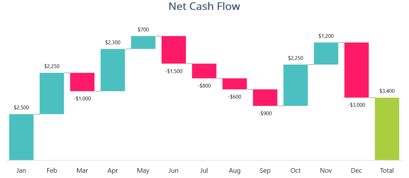
The following waterfall chart shows the monthly sales for a year, depicting the funds gained or lost each month.
Let’s start creating a graph of net cash flow using the Syncfusion .NET MAUI waterfall chart.
Step 1: Gathering data
To create a waterfall chart, first, we need to gather the data. Here, we are going to use randomly generated data. Waterfall charts can be used to analyze and compare the cash flows of various business aspects, such as entire companies, marketing campaigns, and individual stores.
Step 2: Populate data for the chart
Let’s define the NetCashFlowModel class. This class will store the month, fund, and summary details of the sales using the Month, Fund, and IsSum properties.
Refer to the following code example.
public class NetCashFlowModel
{
    public string Month { get; set; }
    public double Fund { get; set; }
    private bool isSum = false;
    public bool IsSum
    {
        get {return isSum;}
        set {isSum = value;}
    }
}
Then, generate the data collection for net cash flow using the NetCashFlow class.
Public class NetCashFlow
{
    public NetCashFlow()
    {
        Data = new List<NetCashFlowModel>();
        Data.Add(new NetCashFlowModel() { Month = “Jan”, Fund = 2500 });
        Data.Add(new NetCashFlowModel() { Month = “Feb”, Fund = 2250 });
        Data.Add(new NetCashFlowModel() { Month = “Mar”, Fund = -1000 });
        Data.Add(new NetCashFlowModel() { Month = “Apr”, Fund = 2300 });
        Data.Add(new NetCashFlowModel() { Month = “May”, Fund = 700 });
        Data.Add(new NetCashFlowModel() { Month = “Jun”, Fund = -1500 });
        Data.Add(new NetCashFlowModel() { Month = “Jul”, Fund = -800 });
        Data.Add(new NetCashFlowModel() { Month = “Aug”, Fund = -600 });
        Data.Add(new NetCashFlowModel() { Month = “Sep”, Fund = -900 });
        Data.Add(new NetCashFlowModel() { Month = “Oct”, Fund = 2250 });
        Data.Add(new NetCashFlowModel() { Month = “Nov”, Fund = 1200 });
        Data.Add(new NetCashFlowModel() { Month = “Dec”, Fund = -3000 });
        Data.Add(new NetCashFlowModel() { Month = “Total”, IsSum=true });
    }
    public List<NetCashFlowModel> Data { get; set; }
}
Step 3: Configure Syncfusion .NET MAUI Charts
Now, configure the Syncfusion .NET MAUI Charts control by referring to this documentation.
Refer to the following code example.
<Chart:SfCartesianChart x:Name=”chart”>
 <Chart:SfCartesianChart.Xaxes>
  <Chart:CategoryAxis>
  </Chart:CategoryAxis>
 </Chart:SfCartesianChart.Xaxes>
 <Chart:SfCartesianChart.Yaxes>
  <Chart:NumericalAxis>
  </Chart:NumericalAxis>
 </Chart:SfCartesianChart.Yaxes>
</Chart:SfCartesianChart>
Step 4: Binding data to the waterfall chart
To bind net cash flow data to our chart, we‘ll use the Syncfusion WaterfallSeries class.
Refer to the following code example.
<Chart:WaterfallSeries XBindingPath="Month" YBindingPath="Fund" SummaryBindingPath="IsSum" ItemsSource="{Binding Data}">
</Chart:WaterfallSeries>
In the previous code example, we’ve bound the ItemsSource property with a collection of net cash flow data from the NetCashFlow class. The XBindingPath and YBindingPath are bound with the Month and Fund properties which indicate the data points that need to be used for the x- and y-axes, respectively. SummaryBindingPath provides the summary values of the series based on its associated property’s (IsSum) Boolean flag value.
Step 5: Customizing the chart appearance
We can enhance the appearance of our waterfall chart by customizing various elements, such as the appearance of axis elements, series, and titles.
Let’s add a title to the chart to provide a quick overview of the plotted data. Refer to the following code example.
<Chart:SfCartesianChart.Title>
 <Label Text="Net Cash Flow" HorizontalTextAlignment="Center" TextColor="#FF455E7A" FontSize="Title" FontAttributes="Bold"/>
</Chart:SfCartesianChart.Title>
Then, customize the appearance of the axis elements using the following code example.
<Chart:SfCartesianChart.XAxes>
 <Chart:CategoryAxis ShowMajorGridLines="False">
  <Chart:CategoryAxis.MajorTickStyle>
   <Chart:ChartAxisTickStyle StrokeWidth="0"/>
  </Chart:CategoryAxis.MajorTickStyle>
  <Chart:CategoryAxis.LabelStyle>
   <Chart:ChartAxisLabelStyle FontSize="15"/>
  </Chart:CategoryAxis.LabelStyle>
 </Chart:CategoryAxis>
</Chart:SfCartesianChart.XAxes>
<Chart:SfCartesianChart.YAxes>
 <Chart:NumericalAxis IsVisible="False"
                      Maximum="8000"
                      ShowMajorGridLines="False"/>
</Chart:SfCartesianChart.YAxes>
We can modify the appearance of the waterfall series by customizing the color of the segments and by enabling connector lines and data labels for the series. We can customize the segment color based on its functionality using the NegativePointsBrush and SummaryPointsBrush properties. The NegativePointsBrush is used to fill the negative segments of the series, while the SummaryPointsBrush is used to fill the summary segments of the series.
<Chart:WaterfallSeries NegativePointsBrush="#FFFE1A67" Fill="#FF4CC0C0" SummaryPointsBrush="#FFA9CF41"/>
To add connector lines and data labels in the chart, use the ShowConnectorLine and ShowDataLabels properties. Refer to the following code example.
<Chart:WaterfallSeries ShowDataLabels="True" ShowConnectorLine="True">
 <Chart:WaterfallSeries.ConnectorLineStyle>
  <Chart:ChartLineStyle StrokeDashArray="1,1" StrokeWidth="1" Stroke="black"/>
 </Chart:WaterfallSeries.ConnectorLineStyle>
 <Chart:WaterfallSeries.DataLabelSettings>
  <Chart:CartesianDataLabelSettings LabelPlacement="Outer" UseSeriesPalette="False">
   <Chart:CartesianDataLabelSettings.LabelStyle>
    <Chart:ChartDataLabelStyle LabelFormat="$#,##"/>
   </Chart:CartesianDataLabelSettings.LabelStyle>
  </Chart:CartesianDataLabelSettings>
 </Chart:WaterfallSeries.DataLabelSettings>
</Chart:WaterfallSeries>
After executing the previous code examples, we’ll output an image similar to the following image.
GitHub reference
For more information, refer to the Creating a Waterfall Chart to Track Monthly Sales project on GitHub.
Conclusion
Thanks for reading! In this blog, we’ve seen how to visualize monthly sales data using the Syncfusion .NET MAUI waterfall chart. This helps us visualize trends and changes in net cash flow over a period. We encourage you to follow the steps provided in this blog and share your thoughts in the comments below.
You can also contact us via our support forum, support portal, or feedback portal. We are always happy to assist you!


 No spam, just valuable updates.