

We’re excited to share some fantastic news with our community! In the latest Syncfusion Essential Studio® 2023 Vol. 4 release, we added a new control to transform how you design and interact with your apps: the .NET MAUI Cards control!
This control allows you to create dismissible cards or a stack of cards. You can organize a sequence of cards where only one card is visible at a time. You can easily navigate through the stack by swiping to reveal the next card in the sequence.
Let’s explore its features and the steps to get started!
Key features
The key features of the .NET MAUI Cards control are as follows:
- Card layout
- Swiped card edge
- Dismissible cards
- Border customization
- Corner radius
- Indicator customization
Card layout
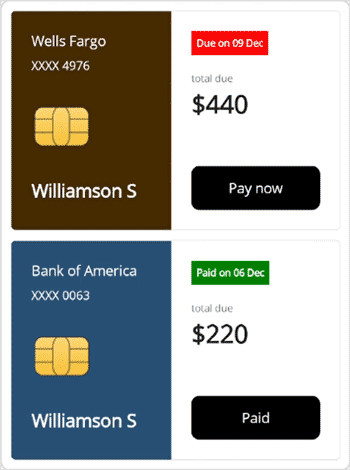
This feature allows you to create an appealing stack of cards where only one is visible at a time. Easily swipe through the stack to reveal the next card in the sequence. Stack the cards on the left, right, top, or bottom of the layout, and navigate effortlessly in all four directions.

Swiped cards at the edge
Cards that have been swiped will be visually represented at the edge, providing a clear cue that they have already been swiped.
Dismissible cards
Customize the dismissal experience by allowing cards to be dismissed with or without a fade-out effect. Control the dismissal direction—left or right—and restrict dismissals when needed. This flexibility ensures seamless and tailored user interaction.
Border customization
Easily customize the border of your cards to match your app’s theme. Effortlessly define the border’s color and thickness, allowing you to align the cards with your overall design aesthetic.
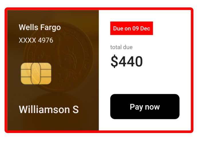
Corner radius
Elevate the appeal of your cards by customizing the corner radius. Achieve rounded edges and provide different corner radii to different edges, allowing for a polished and refined look.
Indicator customization
Make cards easier to understand with customizable indicators positioned at the edges of a card. These indicators signify specific states based on the current content of the card, providing users with valuable context.
Note: For more details, refer to the .NET MAUI Cards control documentation.
Getting started with the .NET MAUI Cards control
We have seen the key features of the .NET MAUI Cards control. Let’s learn how to integrate it into your .NET MAUI app and utilize its features:
Step 1: Create a .NET MAUI app
First, create a .NET MAUI application.
Step 2: Add the .NET MAUI Cards NuGet package
Syncfusion .NET MAUI controls are available in the NuGet gallery. To add the .NET MAUI Cards control to your project, open the NuGet package manager in Visual Studio, search for Syncfusion.Maui.Cards, and then install it.
Step 3: Register the handler
In the MauiProgram.cs file, register the handler for Syncfusion core.
using Syncfusion.Maui.Core.Hosting;

public static class MauiProgram
{
    public static MauiApp CreateMauiApp()
    {
        var builder = MauiApp.CreateBuilder();
        builder
          .UseMauiApp<App>()
          .ConfigureSyncfusionCore()
          .ConfigureFonts(fonts =>
          {
              fonts.AddFont("OpenSans-Regular.ttf", "OpenSansRegular");
              fonts.AddFont("OpenSans-Semibold.ttf", "OpenSansSemibold");
              fonts.AddFont("Roboto-Medium.ttf", "Roboto-Medium");
              fonts.AddFont("Roboto-Regular.ttf", "Roboto-Regular");
          });
        return builder.Build();
    }
}
Step 4: Add the namespace
Now, add the Syncfusion.Maui.Cards namespace in your XAML page.
xmlns:cards= "clr-namespace:Syncfusion.Maui.Cards;assembly=Syncfusion.Maui.Cards"
Step 5: Initialize the Syncfusion .NET MAUI Cards control
Finally, initialize the Syncfusion .NET MAUI Cards control. Refer to the following code example.
xmlns:cards="clr-namespace:Syncfusion.Maui.Cards;assembly=Syncfusion.Maui.Cards"
<Grid>
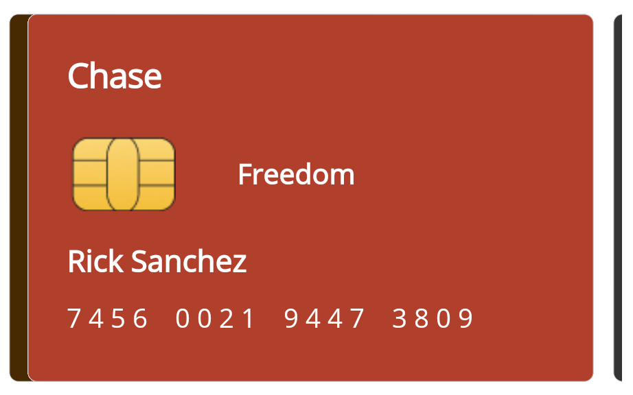
<cards:SfCardLayout x:Name="cardLayout" HeightRequest="220" WidthRequest="{OnPlatform Android=340, iOS=340, Default=360}" HorizontalCardSpacing="10" VerticalCardSpacing="0" Padding="20,20,20,10">
<cards:SfCardView x:Name="thirdCard" BorderColor="#9D6B1F" CornerRadius="20" Padding="-1,-1,0,0">
<Grid>
<Image Source="eyes.jpg" Aspect="AspectFill"/>
<Grid Padding="20" Background="#9D6B1F" Opacity="0.9">
<Grid.RowDefinitions>
<RowDefinition Height= "Auto"/>
<RowDefinition Height= "Auto"/>
<RowDefinition Height= "Auto"/>
<RowDefinition Height= "Auto"/>
<RowDefinition Height= "Auto"/>
</Grid.RowDefinitions>
<Grid Grid.Row= "1">
<Grid.ColumnDefinitions>
<ColumnDefinition Width= "60"/>
<ColumnDefinition Width="*"/>
</Grid.ColumnDefinitions>
<Image Source="cardchip.png" WidthRequest="40" HeightRequest="50" HorizontalOptions="Start" VerticalOptions="Start" Margin="0,20,0,0"/>
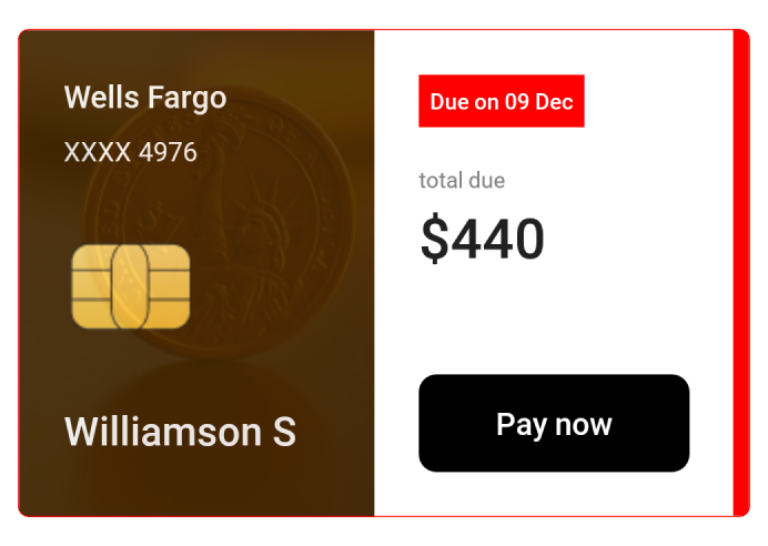
<Label Grid.Column="1" Text="Wells Fargo" HorizontalOptions="End" VerticalOptions="Start" TextColor="White" FontSize="16" FontFamily="Roboto-Medium"/>
</Grid>
<Label Grid.Row="2" HorizontalOptions="Start" VerticalOptions="Start" Text=" 8 5 7 1 7 2 7 2 9 5 8 0 3 1 5 7" TextColor="White" FontFamily="Roboto-Regular"/>
<Label Grid.Row="3" HorizontalOptions="Start" VerticalOptions="Start" Text="Valid till : 12/24" FontSize="12" TextColor="#f2debf" Padding="0,10,0,0" FontFamily="Roboto-Regular"/>
<Label Grid.Row="4" HorizontalOptions="Start" VerticalOptions="End" Text="Rick Sanchez" Padding="0,10,0,0" FontSize="16" TextColor="White" FontFamily="Roboto-Medium"/>
</Grid>
</Grid>
</cards:SfCardView>
<cards:SfCardView x:Name="secondCard" BorderColor="#224AD8" CornerRadius="20" Padding="-1,-1,0,0">
<Grid>
<Image Source="coinslandscape.jpg" Aspect="AspectFill"/>
<Grid Padding="20" Background="#224AD8" Opacity="0.9">
<Grid.RowDefinitions>
<RowDefinition Height= "Auto"/>
<RowDefinition Height= "Auto"/>
<RowDefinition Height= "Auto"/>
<RowDefinition Height= "Auto"/>
<RowDefinition Height= "Auto"/>
</Grid.RowDefinitions>
<Grid Grid.Row= "1">
<Grid.ColumnDefinitions>
<ColumnDefinition Width= "60"/>
<ColumnDefinition Width="*"/>
</Grid.ColumnDefinitions>
<Image Source="cardchip.png" WidthRequest="40" HeightRequest="50" HorizontalOptions="Start" VerticalOptions="Start" Margin="0,20,0,0"/>
<Label Grid.Column="1" Text="Chase" HorizontalOptions="End" VerticalOptions="Start" TextColor="White" FontSize="16" FontFamily="Roboto-Medium"/>
</Grid>
<Label Grid.Row="2" HorizontalOptions="Start" VerticalOptions="Start" Text=" 2 6 1 9 0 9 3 8 4 8 1 9 9 9 1 7" TextColor="White" FontFamily="Roboto-Regular"/>
<Label Grid.Row="3" HorizontalOptions="Start" VerticalOptions="Start" Text="Valid till : 04/25" FontSize="12" TextColor="#bdc9f5" Padding="0,10,0,0" FontFamily="Roboto-Regular"/>
<Label Grid.Row="4" HorizontalOptions="Start" VerticalOptions="End" Text="Rick Sanchez" Padding="0,10,0,0" FontSize="16" TextColor="White" FontFamily="Roboto-Medium"/>
</Grid>
</Grid>
</cards:SfCardView>
<cards:SfCardView x:Name="firstCard" BorderColor="#5716B0" CornerRadius="20" Padding="-1,-1,0,0">
<Grid>
<Image Source="buildinglandscape.jpg" Aspect="AspectFill"/>
<Grid Padding="20" Background="#5716B0" Opacity="0.9">
<Grid.RowDefinitions>
<RowDefinition Height= "Auto"/>
<RowDefinition Height= "Auto"/>
<RowDefinition Height= "Auto"/>
<RowDefinition Height= "Auto"/>
<RowDefinition Height= "Auto"/>
</Grid.RowDefinitions>
<Grid Grid.Row= "1">
<Grid.ColumnDefinitions>
<ColumnDefinition Width= "60"/>
<ColumnDefinition Width="*"/>
</Grid.ColumnDefinitions>
<Image Source="cardchip.png" WidthRequest="40" HeightRequest="50" HorizontalOptions="Start" VerticalOptions="Start" Margin="0,20,0,0"/>
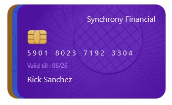
<Label Grid.Column="1" Text="Synchrony Financial" HorizontalOptions="End" VerticalOptions="Start" TextColor="White" FontSize="16" FontFamily="Roboto-Medium"/>
</Grid>
<Label Grid.Row="2" HorizontalOptions="Start" VerticalOptions="Start" Text=" 5 9 0 1 8 0 2 3 7 1 9 2 3 3 0 4" TextColor="White" FontFamily="Roboto-Regular"/>
<Label Grid.Row="3" HorizontalOptions="Start" VerticalOptions="Start" Text="Valid till : 06/26" FontSize="12" Padding="0,10,0,0" TextColor="#b88ef1" FontFamily="Roboto-Regular"/>
<Label Grid.Row="4" HorizontalOptions="Start" VerticalOptions="End" Text="Rick Sanchez" Padding="0,10,0,0" FontSize="16" TextColor="White" FontFamily="Roboto-Medium"/>
</Grid>
</Grid>
</cards:SfCardView>
</cards:SfCardLayout>
</Grid>After executing the previous code examples, you’ll get an output like in the following image.
GitHub references
For more details, refer to the .NET MAUI Cards control demo on GitHub.
Conclusion
Thanks for reading! In this blog, I explored the features of the new Syncfusion .NET MAUI Cards Control that rolled out in the 2023 Volume 4 release. You can learn more about the latest .NET MAUI advancements on our Release Notes and What’s New pages. Try them out and leave your feedback in the comments section below!
Download Essential Studio® for .NET MAUI to start evaluating them immediately.
If you have any questions, contact us through our support forum, support portal, or feedback portal. We are always happy to help you!

