Welcome to our Chart of the Week blog series!
In this blog, we’ll visualize machine impact test results using the Syncfusion .NET MAUI Box and Whisker Chart. This control is supported on desktop (Windows and Mac) and mobile platforms (Android and iOS).
A machine impact test is used to find the total energy absorbed by raw materials under high strain rates. This test assesses the material’s strength, resilience, and durability under real-world conditions where sudden impacts or shock loading may occur.
Let’s explore the steps to visualize the machine impact test results using the Syncfusion .NET MAUI Box and Whisker Chart.
Step 1: Gather the machine impact test data
Before creating the chart, let’s gather the data on the machine’s impact results.
Step 2: Prepare the data for the chart
Create the ImpactTestModel class with the MachineName property to store the name of the machine and the AbsorbedEnergy property to store a list of energy absorption values for that machine. The constructor of the ImpactTestResultModel class allows us to initialize these properties.
Refer to the following code example.
public class ImpactTestModel
{
    public string MachineName { get; set; }

    public List<double> AbsorbedEnergy { get; set; }

    public ImpactTestModel(string machineName, List<double> absorbedEnergy)
    {
        MachineName = machineName;
        AbsorbedEnergy = absorbedEnergy;
    }
}
Next, create the impact test results collection using the ImpactTestViewModel class and store the collection in an observable collection using the ImpactTestResults property.
Refer to the following code example.
public class ImpactTestViewModel
{
    public ObservableCollection<ImpactTestModel> ImpactTestResults { get; set; }

    public List<Brush> CustomBrushes { get; set; }

    public ImpactTestViewModel()
    {
      ImpactTestResults = new ObservableCollection<ImpactTestModel>
      {
         new ImpactTestModel("Tinius 1", new List<double> { 67.4,65.5,72.0,73.6,65.2,67.0,66.3,67.9,65.8,69.9,64.5,66.0,66.8,67.0,69.9,70.1,69.7,68.3,67.0,68.2,65.0,66.6,65.4,68.1 }),
         new ImpactTestModel("Tinius 2", new List<double> { 69.0,66.2,70.0,68.5,66.0,67.5,68.5,66.5,73.0,69.0,69.0,74.5,68.0,68.5,67.5,70.0,69.0,72.5,68.0,69.0,69.0,71.0,68.0,75.0,67.0 }),
         new ImpactTestModel("Satec", new List<double> { 73.0,78.9,75.0,72.3,72.4,74.1,72.0,70.9,74.5,72.0,72.5,72.4,74.0,75.0,70.9,70.9,76.6,74.2,69.5,68.8,68.5,70.1,73.0,70.9 }),
         new ImpactTestModel("Tokyo", new List<double> { 67.6,64.2,65.9,65.9,68.2,71.1,67.6,71.6,72.8,68.2,67.6,67.1,67.1,68.2,65.4,66.5,67.6,67.1,71.1,67.1,65.4,67.6,67.6,70.5,70.5 }),
      };
   }
}
Step 3: Configure the Syncfusion .NET MAUI Cartesian Charts
Configure the Syncfusion .NET MAUI Cartesian Charts using this documentation.
Refer to the following code example.
<chart:SfCartesianChart>
 <chart:SfCartesianChart.XAxes>
  <chart:CategoryAxis />
 </chart:SfCartesianChart.XAxes>

 <chart:SfCartesianChart.YAxes>
  <chart:NumericalAxis />
 </chart:SfCartesianChart.YAxes>
</chart:SfCartesianChart>
Step 4: Bind the data to the Box and Whisker Chart
To display the machine impact test results, we’ll use the Syncfusion BoxAndWhiskerSeries instance.
<chart:BoxAndWhiskerSeries ItemsSource="{Binding ImpactTestResults}"
                           XBindingPath="MachineName"
                           YBindingPath="AbsorbedEnergy"/>
In the previous code example, we’ve bound the ItemsSource property with the impact test results data collection. The XBindingPath and YBindingPath properties are bound with the MachineName and AbsorbedEnergy properties.
Step 5: Customizing the chart appearance
Let’s see how to customize the elements of the .NET MAUI Box and Whisker Chart to get a pleasing appearance.
Customizing the chart title
To customize the chart title, set the Title property of the SfCartesianChart control. Define the text, alignment, line break mode, font size, and font attributes for the title.
Refer to the following code example.
<chart:SfCartesianChart.Title>
 <Border Background="#6699cc" StrokeThickness="1" Margin="0">
  <Label Text="Analyzing the Machines' Impact Test Results"
         HorizontalTextAlignment="Center"
         VerticalTextAlignment="Center"
         TextColor="White"
         FontSize="17"
         FontAttributes="Bold"
         Margin="10"/>
 </Border>
</chart:SfCartesianChart.Title>
Customizing the chart axes
Refer to the following code example to customize the x- and y-axes of the chart using the Text, TextColor, and Interval properties.
<chart:SfCartesianChart.XAxes>
 <chart:CategoryAxis ShowMajorGridLines="False">
  <chart:CategoryAxis.Title>
   <chart:ChartAxisTitle Text="Machine Names" TextColor="Black"/>
  </chart:CategoryAxis.Title>
  <chart:CategoryAxis.LabelStyle>
   <chart:ChartAxisLabelStyle TextColor="Black"/>
  </chart:CategoryAxis.LabelStyle>
 </chart:CategoryAxis>
</chart:SfCartesianChart.XAxes>

<chart:SfCartesianChart.YAxes>
 <chart:NumericalAxis Interval="2" Maximum="80"
                      ShowMajorGridLines="False">
  <chart:NumericalAxis.Title>
   <chart:ChartAxisTitle Text="Absorbed Energy (in foot-pounds) "
                         TextColor="Black"/>
  </chart:NumericalAxis.Title>
  <chart:NumericalAxis.LabelStyle>
   <chart:ChartAxisLabelStyle TextColor="Black"/>
  </chart:NumericalAxis.LabelStyle>
 </chart:NumericalAxis>
</chart:SfCartesianChart.YAxes>
Customizing the Box and Whisker series
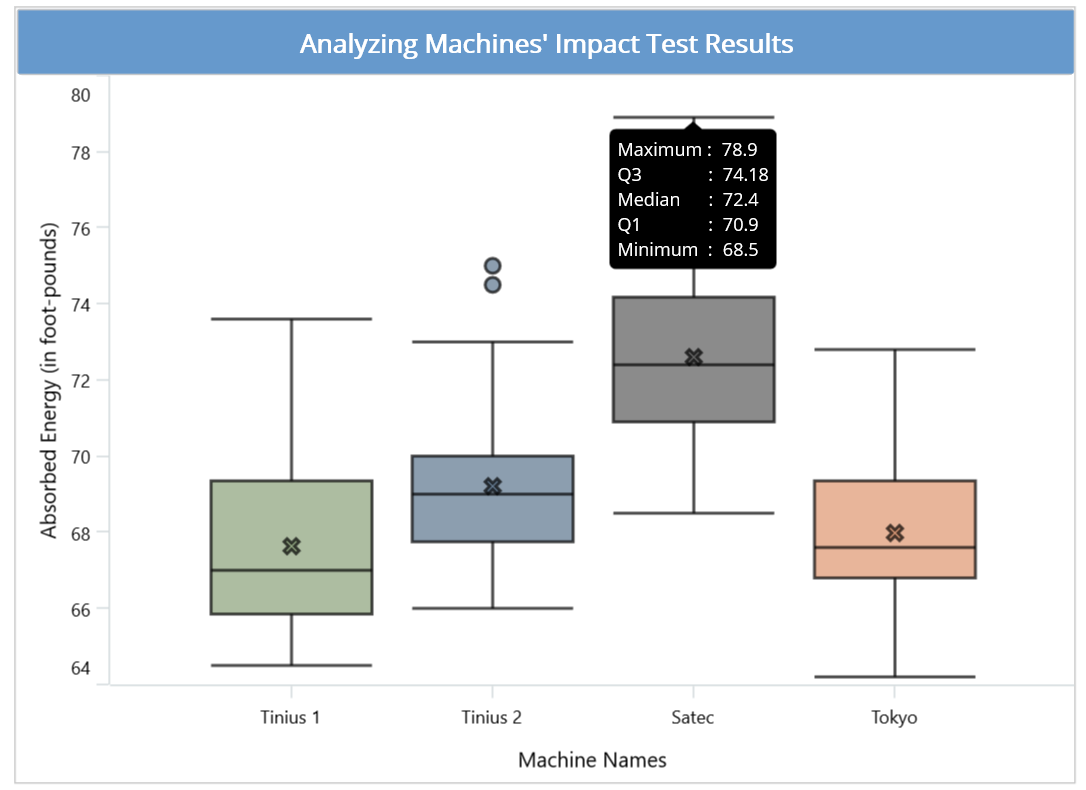
Refer to the following code examples to customize the BoxAndWhiskerSeries. In it, we customize the tooltip to display the maximum, minimum, median, lower quartile (Q1), and upper quartile (Q3) values.
<chart:BoxAndWhiskerSeries ShowMedian="True"
                            Stroke="Black"
                            StrokeWidth="2"
                            EnableTooltip="True"
                            EnableAnimation="True">
</chart:BoxAndWhiskerSeries>
Customizing the chart color
We can apply colors to differentiate the data for each machine using the PalettedBrushes property.
C#
public List<Brush> CustomBrushes { get; set; }

public ImpactTestAnalysisViewModel()
 {
     CustomBrushes = new List<Brush>();

     CustomBrushes.Add(new SolidColorBrush(Color.FromRgb(138, 161, 120)));
     CustomBrushes.Add(new SolidColorBrush(Color.FromRgb(90, 116, 140)));
     CustomBrushes.Add(new SolidColorBrush(Color.FromRgb(89, 89, 89)));
     CustomBrushes.Add(new SolidColorBrush(Color.FromRgb(222, 149, 110)));
 }
XML
<chart:BoxAndWhiskerSeries PaletteBrushes="{Binding CustomBrushes}"
                           Opacity="0.7">
</chart:BoxAndWhiskerSeries>
After executing the previous code examples, we’ll get output like in the following image.
GitHub reference
For more information, refer to the project on GitHub.
Conclusion
Thanks for reading! In this blog, we’ve seen how to visualize a machine impact test analysis using Syncfusion’s .NET MAUI Box and Whisker Chart. We encourage you to follow the steps discussed and share your thoughts in the comments below.
You can also contact us via our support forum, support portal, or feedback portal. We are always happy to assist you!