
Welcome to our Chart of the Week blog series!
Today, we’ll focus on a growing health concern—diabetes. Diabetes is a chronic condition that affects how a person’s body uses glucose and regulates blood sugar. It can lead to serious health complications over time, impacting the heart, blood vessels, eyes, kidneys, and nerves. One specific type of diabetes is type 1 diabetes, where a person is born with an immune system that attacks the insulin-producing cells in the pancreas, hindering the production of the insulin hormone that regulates blood sugar.
In our analysis, we’ll create a bar chart to compare the prevalence of type 1 diabetes across various countries. To achieve this, we’ll be leveraging the powerful features of the Syncfusion .NET MAUI bar chart control.
Now, let’s look at the chart that illustrates our data.
 Let’s explore the step-by-step process of creating a bar chart (sometimes called a transposed column chart) to visualize the prevalence of type 1 diabetes in several countries.
Step 1: Gather data
Before we dive into chart creation, the first step is gathering data. In our case, we’ve utilized the International Diabetes Foundation Report, a comprehensive source for type 1 diabetes prevalence data. This data will serve as the foundation for the bar chart.
Step 2: Populate the data for the chart
Define the DiabetesModel class, incorporating essential properties such as Country, Value, AgeCategory, and Count, to store data on diabetes.
Refer to the following code example.
public class DiabetesModel
{
    public string Country { get; set; }
    public double Value { get; set; }
    public string AgeCategory {  get; set; }
    public double Count {  get; set; }
    public DiabetesModel(string country, double value)
     {
          Country = country;
          Value = value;
     }
    //It is used to store the distribution by age of type 1 diabetes in the U.S.
     public DiabetesModel(double count, string ageCategory)
     {
          Count = count;
          AgeCategory = ageCategory;
     }
}
Generate a data collection using the DiabetesData class, specifically the Data property, to illustrate the prevalence of type 1 diabetes.
Refer to the following code example.
public class DiabetesData
{
public ObservableCollection<DiabetesModel> Data { get; set; }
public DiabetesData()
{
Data = new ObservableCollection<DiabetesModel>()
{
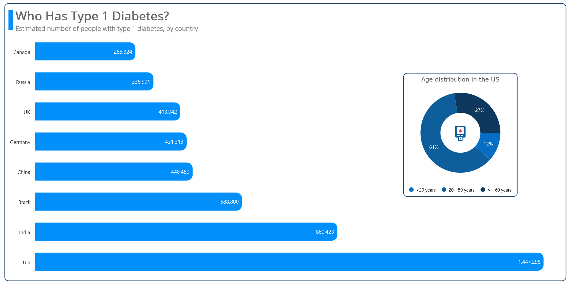
new DiabetesModel("U.S", 1447298),
new DiabetesModel("India", 860423),
new DiabetesModel("Brazil", 588800),
new DiabetesModel("China", 448480),
new DiabetesModel("Germany", 431313),
new DiabetesModel("UK", 413042),
new DiabetesModel("Russia", 336901),
new DiabetesModel("Canada", 285324),
};
}
}Step 3: Configure the Syncfusion .NET MAUI Cartesian Charts
Let’s configure the Syncfusion .NET MAUI Cartesian Charts control using this documentation.
A bar chart uses bars (columns) to represent data points and compare values across different categories. To render a bar chart, first, initialize the SfCartesianChart and switch the chart’s x- and y-axes by setting the IsTransposed property to true.
Then, create a column chart. To render a column chart, create an instance of ColumnSeries and add it to the Series collection property of SfCartesianChart (discussed in the next step).
Refer to the following code example.
<chart:SfCartesianChart IsTransposed="True">
 <chart:SfCartesianChart.XAxes>
  <chart:CategoryAxis />
 </chart:SfCartesianChart.XAxes>
 <chart:SfCartesianChart.YAxes>
  <chart:NumericalAxis />
 </chart:SfCartesianChart.YAxes>
</chart:SfCartesianChart>
Step 4: Bind the diabetes data to the Bar Chart
Now, bind the collected data on the prevalence of type 1 diabetes in various countries for the year 2022 to the Bar Chart.
Refer to the following code example.
<chart:ColumnSeries ItemsSource="{Binding Data}" XBindingPath="Country" YBindingPath="Value">
</chart:ColumnSeries>
In the previous code example, we bound the Data with the ItemsSource property. The XBindingPath and YBindingPath properties are bound to the Country and Value properties, respectively.
Step 5: Personalize the chart’s appearance
Now, let’s add some style to our chart to make it visually appealing and easy to understand.
Incorporating the chart title
Adding a chart title enhances the clarity of the presented data. Refer to the following code example.
<chart:SfCartesianChart.Title>
 <Grid Margin="0,0,0,10">
  <Grid.ColumnDefinitions>
   <ColumnDefinition Width="13"/>
   <ColumnDefinition Width="*"/>
  </Grid.ColumnDefinitions>
  <StackLayout Grid.RowSpan="2" Margin="0,8,0,6" Orientation="Vertical" BackgroundColor="#008FFB" />
  <StackLayout Grid.Column="1" Margin="5,0,0,0" HorizontalOptions="Start" Orientation="Vertical">
   <Label Text="Who Has Type 1 Diabetes?" FontSize="Large" FontAttributes="Bold" TextColor="#666666"/>
   <Label Text="Estimated number of people with type 1 diabetes, by country" FontSize="17" TextColor="Gray"/>
  </StackLayout>
 </Grid>
</chart:SfCartesianChart.Title>
Customizing the chart axis
To customize the chart axis, you can use the following properties:
- ShowMajorGridLines: To customize the visibility of the major grid lines.
- LabelStyle: To customize the style of the axis labels.
- AxisLineStyle: To customize the style of the axis line.
- MajorTickStyle: To customize the style of the major tick lines.
- IsVisible: To customize the visibility of the axis.
Refer to the following code example.
<chart:SfCartesianChart.XAxes>
 <chart:CategoryAxis ShowMajorGridLines="False">
  <chart:CategoryAxis.AxisLineStyle>
   <chart:ChartLineStyle StrokeWidth="0"/>
  </chart:CategoryAxis.AxisLineStyle>
  <chart:CategoryAxis.MajorTickStyle>
   <chart:ChartAxisTickStyle StrokeWidth="0"/>
  </chart:CategoryAxis.MajorTickStyle>
  <chart:CategoryAxis.LabelStyle>
   <chart:ChartAxisLabelStyle FontSize="{OnPlatform Android=10, iOS=10, Default=13.5}"/>
  </chart:CategoryAxis.LabelStyle>
 </chart:CategoryAxis>
</chart:SfCartesianChart.XAxes>
<chart:SfCartesianChart.YAxes>
 <chart:NumericalAxis IsVisible="False" ShowMajorGridLines="False"/>
</chart:SfCartesianChart.YAxes>
Personalizing the series width, corner radius, and color
To enhance the appearance of the series, you can customize the Width, CornerRadius, and Color properties. Refer to the following code example.
<chart:ColumnSeries CornerRadius="0,15,0,15" Width="{OnPlatform WinUI=0.6,MacCatalyst=0.6}" Fill="#008FFB">
</chart:ColumnSeries>
Adding the data label
To enhance the readability of the data, you can enable the chart data labels using the ShowDataLabels property.
<chart:ColumnSeries ShowDataLabels="True">

 <chart:ColumnSeries.DataLabelSettings>
  <chart:CartesianDataLabelSettings UseSeriesPalette="False">
   <chart:CartesianDataLabelSettings.LabelStyle>
    <chart:ChartDataLabelStyle LabelFormat="###,###" FontSize="{OnPlatform Android=10.5 , iOS=10.5 , Default=14}" TextColor="White"/>
   </chart:CartesianDataLabelSettings.LabelStyle>
  </chart:CartesianDataLabelSettings>
 </chart:ColumnSeries.DataLabelSettings>

</chart:ColumnSeries>
Incorporating plot area background view
As the prevalence of type 1 diabetes is higher in the United States than in other countries, we aim to enhance the informativeness of our Bar Chart. Let’s integrate a plot area background view that visually represents the distribution of type 1 diabetes by age in the U.S.
Refer to the following code example.
<chart:SfCartesianChart.PlotAreaBackgroundView>
    <AbsoluteLayout>
        <Border AbsoluteLayout.LayoutBounds="{OnPlatform WinUI='0.9,0.3,-1,-1',Android='1,-1,320,200', iOS='1,0,320,200', MacCatalyst='0.9,0.3,350,-1'}" AbsoluteLayout.LayoutFlags="PositionProportional" StrokeThickness="1.5" Stroke="#0e385d" StrokeShape="RoundRectangle 10" Margin="10">
            <chart:SfCircularChart>
                <chart:SfCircularChart.Title>
                    <Label Text="Age distribution in the US" FontSize="16" FontFamily="Verdana" HorizontalTextAlignment="Center" Padding="0,5,0,0" TextColor="#666666"/>
                </chart:SfCircularChart.Title>
                <chart:SfCircularChart.Legend>
                    <chart:ChartLegend Placement="Bottom"/>
                </chart:SfCircularChart.Legend>
                <chart:DoughnutSeries ItemsSource="{Binding USDetails}" XBindingPath="AgeCategory" YBindingPath="Count" InnerRadius="{OnPlatform Default=0.5,Android=0.6,iOS=0.6}" Radius="{OnPlatform Default=0.8,Android=1,iOS=1}" ShowDataLabels="True" PaletteBrushes="{Binding CustomBrushes}">
                    <chart:DoughnutSeries.DataLabelSettings>
                        <chart:CircularDataLabelSettings LabelPlacement="Inner" UseSeriesPalette="False">
                            <chart:CircularDataLabelSettings.LabelStyle>
                                <chart:ChartDataLabelStyle LabelFormat="0'%" FontSize="{OnPlatform Android=9,iOS=9, Default=13}" TextColor="White"/>
                            </chart:CircularDataLabelSettings.LabelStyle>
                        </chart:CircularDataLabelSettings>
                    </chart:DoughnutSeries.DataLabelSettings>
                    <chart:DoughnutSeries.CenterView>
                        <Grid Margin="-10,0,0,0">
                            <Path Data="{StaticResource PathData1}" Fill="#0d5e9b"/>
                            <Path Data="{StaticResource PathData2}" Fill="#E3465D"/>
                            <Path Data="{StaticResource PathData3}" Fill="#0d5e9b"/>
                            <Path Data="{StaticResource PathData4}" Fill="#0d5e9b"/>
                        </Grid>
                    </chart:DoughnutSeries.CenterView>
                </chart:DoughnutSeries>
            </chart:SfCircularChart>
        </Border>
    </AbsoluteLayout>
</chart:SfCartesianChart.PlotAreaBackgroundView>
To create the USDetails and CustomBrushes properties in the DiabetesData class, follow these steps:
- Navigate to the DiabetesData class.
- Add a new property called USDetails to store the distribution of type 1 diabetes by age in the U.S.
- Add another new property called CustomBrushes to store the collection of brushes for applying a doughnut chart, which is a child of the plot area background view.
Refer to the following code example. In it, we visualize the prevalence of type 1 diabetes in the U.S. across various age groups using the Syncfusion Doughnut Chart. In this chart, the legend displays the age categories along with the chart segments’ different colors.
public class DiabetesData
{
      public ObservableCollection<DiabetesModel> USDetails { get; set; }
      public ObservableCollection<Brush> CustomBrushes { get; set; }
      public DiabetesData()
      {
          USDetails = new ObservableCollection<DiabetesModel>()
          {
                new DiabetesModel(170408,"<20 years"),
                new DiabetesModel(880937,"20 - 59 years"),
                new DiabetesModel(397447,">= 60 years"),
          };
          CustomBrushes = new ObservableCollection<Brush>()
          {
              new SolidColorBrush(Color.FromArgb("#086ec5")),
              new SolidColorBrush(Color.FromArgb("#0d5e9b")),
              new SolidColorBrush(Color.FromArgb("#0e385d")),
          };
          CalculatePercentage(USDetails);
      }
      static void CalculatePercentage(ObservableCollection<DiabetesModel> data)
      {
          // Calculate the total sum of all values.
          double total = data.Sum(item => item.Count);
          // Calculate the percentage for each item and store it in the Count property.
          foreach (var item in data)
          {
              item.Count = (item.Count / total) * 100;
          }
       }
}
After executing the previous code examples, the output will look like the following image.
GitHub reference
For more details, refer to the complete project on the GitHub repository.

Conclusion
Thanks for reading! In this blog, we explored how to visualize data on the prevalence of type 1 diabetes in several countries for the year 2022 using the Syncfusion .NET MAUI Bar Chart. With this, we can understand the variations, and it can contribute to our knowledge of health patterns worldwide. We encourage you to follow the steps in this blog and share your feedback in the comments section below.
Current customers can download the latest version of Essential Studio from the License and Downloads page. If you are not yet a Syncfusion customer, feel free to try our 30-day free trial to experience all our features.
For questions, you can contact us via our support forums, support portal, or feedback portal. We are always eager to help you!


Related blogs
- Chart of the Week: Creating a .NET MAUI Multiple Fast Line Chart to Analyze the Impact of Exported Goods on GDP
- Chart of the Week: Creating a .NET MAUI Stacked Column Chart for Global Smartphone Shipments
- Chart of the Week: Creating a .NET MAUI Scatter Chart to Visualize CO2 Emissions vs. Fossil Fuel Consumption
- Introducing the New .NET MAUI PullToRefresh Control