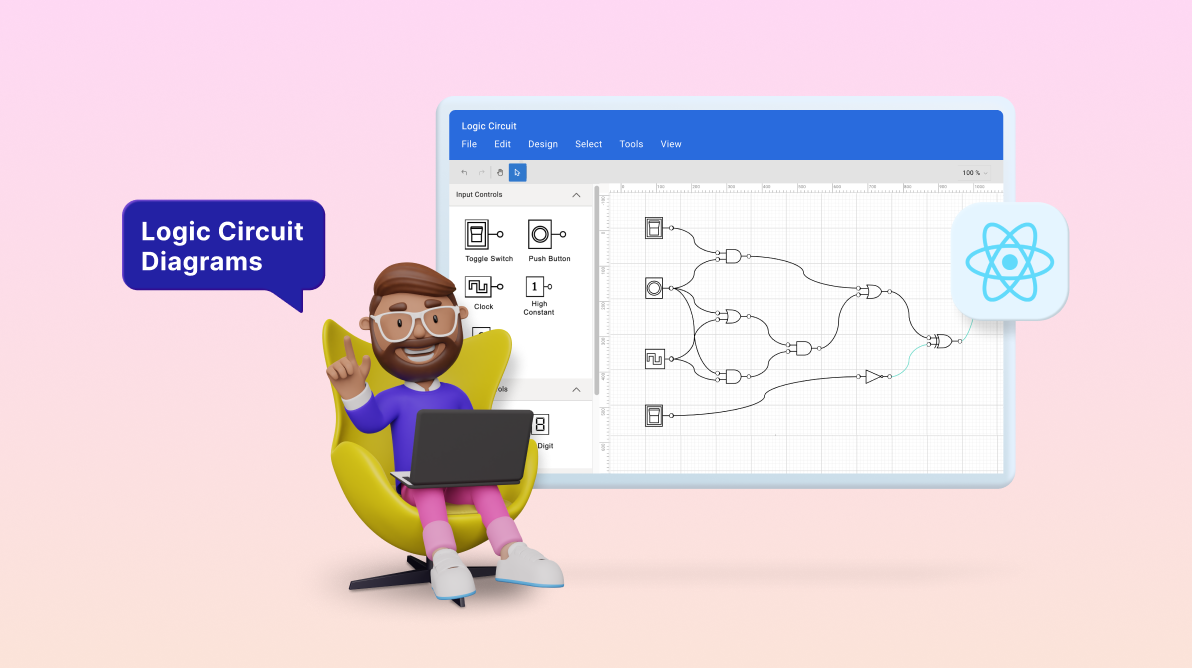
Welcome to the world of digital logic circuit design, where complexity meets creativity. The creation of a digital logic circuit diagram is no small feat.
It requires precision, clarity, and effective visual communication. However, the right tools can make this process significantly more manageable. One such tool is the versatile Syncfusion React Diagram control, which enables designers to draft high-quality logic circuits swiftly and effortlessly.
In this blog, we’ll journey through the functionalities of the React Diagram control. We’ll demonstrate how its interactive user interface, equipped with features like drag and drop, copy and paste, import and export, and pan and zoom, simplifies the process of circuit creation.
Furthermore, we’ll explore its rich feature set. By the end of this post, you’ll see why the React Diagram control is an indispensable tool for any digital logic design project.
Logic circuit diagram symbols
A logic circuit designer provides a variety of symbols for universal logical gates, flip-flops, input controls, output controls, and other components used in logic circuit diagrams.
Logic gates
Logic gates are the basic symbols used for any digital circuit design. Logic gates perform a Boolean logic function with one or more inputs and produce a single output. A logic circuit designer should have a collection of universal logic gates, including a buffer and a tri-state buffer.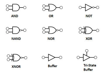
Flip-flops
A flip-flop is a circuit that has two stable states and can be used to store state information. The state can be changed by applying one or more control inputs and will have one or two outputs. A logic circuit designer should have SR, D, JK, and T flip-flops for designing.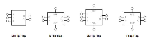
Input controls
Input controls can pass a high (true) or low (false) signal to logic gates or flip-flops. A logic circuit designer should provide the following input controls toggle switch, push button, clock, high constant, and low constant to design circuits.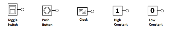
Output controls
You can connect output controls to the output pin of a logic gate or flip-flop to showcase its output state. A logical circuit designer should, at minimum, offer a light bulb and a 4-bit digit as output controls.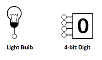
Prerequisites
- Install Node.js version 14.15.1.
- Set up the React Diagram control by following the getting started documentation.
Creating a diagram surface
Let’s create a diagram surface by following these steps:
- Create a folder and give it a name such as Logic Circuit Designer.
- Open your terminal or command prompt and execute the following command to install the Create React App NPM package globally:
npm install -g create-react-app
- Create a new React app. Give it your preferred app name and execute the following command:
npx create-react-app logic-circuit
- Change your working directory to the recently created app by using the following command:
cd logic-circuit
- To see your app in action, start a development server using the following command:
npm start
This will open your app in your default web browser at http://localhost:3000/.
- Open the json file and add the following dependencies:
"dependencies": {
    "@syncfusion/ej2-react-base": "*",
    "@syncfusion/ej2-react-buttons": "*",
    "@syncfusion/ej2-react-diagrams": "*",
    "@syncfusion/ej2-react-dropdowns": "*",
    "@syncfusion/ej2-react-inputs": "*",
    "@syncfusion/ej2-react-lists": "*",
    "@syncfusion/ej2-react-navigations": "*",
    "@syncfusion/ej2-react-popups": "*",
    "@syncfusion/ej2-react-splitbuttons": "*",
    "@testing-library/jest-dom": "^5.16.5",
    "@testing-library/react": "^13.4.0",
    "@testing-library/user-event": "^13.5.0",
    "react": "^18.2.0",
    "react-dom": "^18.2.0",
    "react-scripts": "5.0.1",
    "web-vitals": "^2.1.4"
},
- Use the following command to install all the above dependent packages:
npm install
- Add the dependent scripts and style CDN reference links in the index.html file.
<head>
    <link href="https://cdn.syncfusion.com/ej2/20.4.38/fluent.css" rel="stylesheet">
    <link href="https://cdn.syncfusion.com/ej2/ej2-react-buttons/styles/fluent.css" rel="stylesheet">
    <link href="https://maxcdn.bootstrapcdn.com/bootstrap/3.3.7/css/bootstrap.min.css" rel="stylesheet">
    <link href="https://cdn.syncfusion.com/ej2/20.4.38/ej2-base/styles/fluent.css" rel="stylesheet">
    <link href="https://cdn.syncfusion.com/ej2/20.4.38/ej2-react-popups/styles/fluent.css" rel="stylesheet">
    <link href="https://cdn.syncfusion.com/ej2/20.4.38/ej2-react-splitbuttons/styles/fluent.css" rel="stylesheet">
    <link href="https://cdn.syncfusion.com/ej2/20.4.38/ej2-react-navigations/styles/fluent.css" rel="stylesheet">
    <link href="https://cdn.syncfusion.com/ej2/20.4.38/ej2-react-inputs/styles/fluent.css" rel="stylesheet">
    <link href="https://cdn.syncfusion.com/ej2/20.4.38/ej2-react-dropdowns/styles/fluent.css" rel="stylesheet">
    <link href="index.css" rel="stylesheet">
    <link href="./assets/Diagram_Builder_Icon/style.css" rel="stylesheet">
    <link href="./assets/index.css" rel="stylesheet">
    <link href="./assets/dbstyle/diagrambuilder.css" rel="stylesheet" />
    <script src="https://cdn.syncfusion.com/ej2/syncfusion-helper.js" type="text/javascript"></script>
    <script src="https://cdn.syncfusion.com/ej2/20.4.38/dist/ej2.min.js" type="text/javascript"></script>
</head>
- To include the Diagram component in your app, import the DiagramComponent from the ej2-react-diagrams. Then, configure the required arguments, such as the width, height, and collection of nodes and connectors to be included in the diagram in the App.js file.
Refer to the following code example:
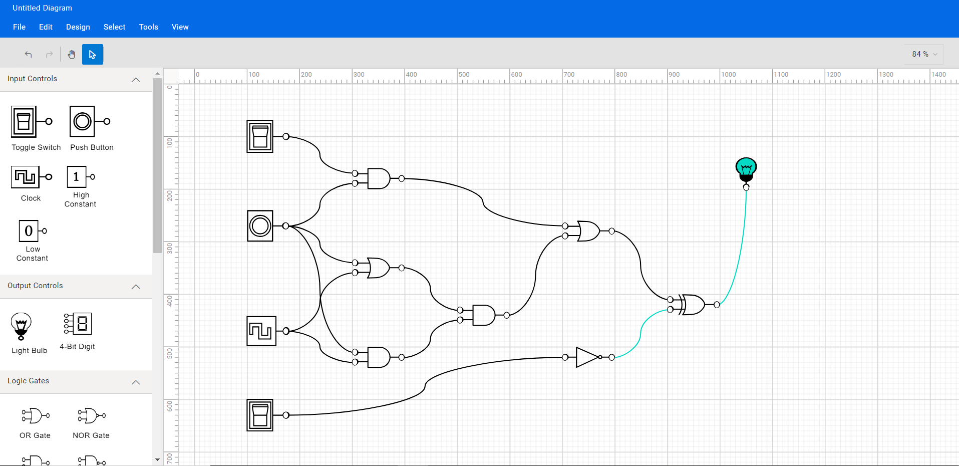
<div id="diagramContainerDiv" className='db-current-diagram-container'>
  <DiagramComponent ref={diagram=>
    (this.diagram = diagram)} id="diagram" width={"100%"} height={"100%"}
    scrollSettings={this.scrollSettings} rulerSettings={this.rulerSettings}
    pageSettings={this.pageSettings} nodes={this.nodes} connectors={this.connectors}
    backgroundColor="transparent" getConnectorDefaults={this.getConnectorDefaults.bind(this)}
    getNodeDefaults={this.getNodeDefaults.bind(this)}/>
</div>
The following image shows the initial Diagram appearance.
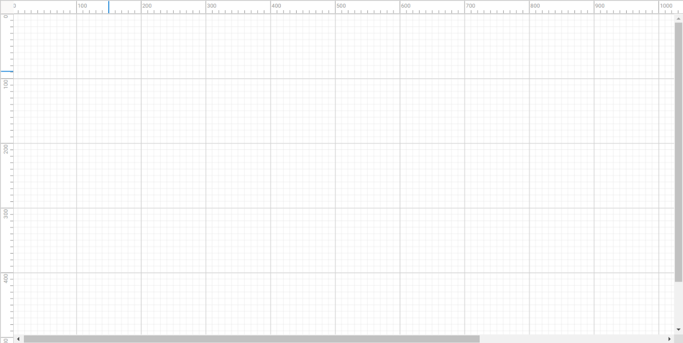

Creating a Diagram Canvas Using the React Diagram Library
Creating reusable logic circuit diagram symbols
The React Diagram control provides a gallery of reusable nodes and connectors called SymbolPalette. It displays a collection of palettes, each showing a set of nodes and connectors. We can drag and drop them onto the diagram canvas any number of times.
Follow these steps to create the diagram symbol palette with logic circuit shapes:
- Create an HTML div element that will act as the container for the Diagram symbol palette.
Refer to the following code example:
<div className='sidebar show-overview'>
 <div className="db-palette-parent">
  <SymbolPaletteComponent ref={symbolpalette => (this.symbolpalette) = symbolpalette} id="symbolpalette />
 </div>
</div>
- Initialize the Syncfusion Diagram symbol palette by passing the required arguments, such as the width, height, and collection of symbols to be included in the palette.
<div className='sidebar show-overview'>
 <div className="db-palette-parent">
  <SymbolPaletteComponent ref={symbolpalette => (this.symbolpalette) = symbolpalette} id="symbolpalette" width="100%" height="100%"
         expandMode={this.palettes.expandMode}
         palettes={this.palettes.palettes}
         symbolPreview={this.palettes.symbolPreview} symbolMargin={this.palettes.symbolMargin}
         getSymbolInfo={this.palettes.getSymbolInfo} />
 </div>
</div>
- Define and customize your palette symbols as needed. Refer to the following code:
export class Palettes {
  constructor() {
    this.expandMode = 'Multiple';
    this.symbolPreview = {height : 50, width : 50};
    this.symbolMargin = {left : 5, right : 5, top : 10, bottom : 10};
    this.palettes = [
      {
        id : 'input',
        expanded : true,
        symbols : this.input(),
        title : 'Input Controls'
      },
      {
        id : 'output',
        expanded : true,
        symbols : this.output(),
        title : 'Output Controls'
      },
      {
        id : 'flow',
        expanded : true,
        symbols : this.gates(),
        title : 'Logic Gates'
      },
      {
        id : 'flipflop',
        expanded : true,
        symbols : this.flipflops(),
        title : 'Flip flops'
      },
      {id : 'other', expanded : true, symbols : this.other(), title : 'Other'},
    ];
  }
  getSymbolInfo(symbol) {
    return {
      description : {
        text : symbol.shape['shape'],
        overflow : 'Wrap',
        fontSize : 12,
        margin : {top : 10, left : 0, right : 0, bottom : 0}
      }
    };
  }
  setPaletteNodeDefaults(node) {
    if (!(node.addInfo&& node.addInfo.type == = 'CustomShapes') &&
        (!node.children)) {
      if (node.id == = 'Terminator' || node.id == = 'Process') {
        node.width = 130;
        node.height = 65;
      } else {
        node.width = 50;
        node.height = 50;
      }
      node.ports = [
        {
          offset : {x : 0, y : 0.5},
          style : {fill : 'white'},
          visibility : PortVisibility.Connect | PortVisibility.Hover,
          constraints : PortConstraints.Draw
        },
        {
          offset : {x : 0.5, y : 0},
          style : {fill : 'white'},
          visibility : PortVisibility.Connect | PortVisibility.Hover,
          constraints : PortConstraints.Draw
        },
        {
          offset : {x : 1, y : 0.5},
          style : {fill : 'white'},
          visibility : PortVisibility.Connect | PortVisibility.Hover,
          constraints : PortConstraints.Draw
        },
        {
          offset : {x : 0.5, y : 1},
          style : {fill : 'white'},
          visibility : PortVisibility.Connect | PortVisibility.Hover,
          constraints : PortConstraints.Draw
        }
      ];
      node.style.strokeColor = '#3A3A3A';
    }
  }
  getPalettes(text) {
    let palettes = [];
    if (text.indexOf('Flow') != = -1) {
      palettes.push({
        id : 'flow',
        expanded : true,
        symbols : this.getFlowShapes(),
        title : 'Flow Shapes'
      });
    }
    if (text.indexOf('Basic') != = -1) {
      palettes.push({
        id : 'basic',
        expanded : false,
        symbols : this.getBasicShapes(),
        title : 'Basic Shapes'
      });
    }
    if (text.indexOf('BPMN') != = -1) {
      palettes.push({
        id : 'bpmn',
        expanded : false,
        symbols : this.getBPMNShapes(),
        title : 'BPMN Shapes'
      });
    }
    if (text.indexOf('Connectors') != = -1) {
      palettes.push({
        id : 'connectors',
        expanded : false,
        symbols : this.getConnectors(),
        title : 'Connectors'
      });
    }
    if (text.indexOf('Electrical') != = -1) {
      palettes = palettes.concat(this.electricalShapes.getElectricalShapes());
    }
    if (text.indexOf('Network') != = -1) {
      palettes.push({
        id : 'network',
        expanded : false,
        symbols : this.networkShapes.getNetworkShapes(),
        title : 'Network Shapes'
      });
    }
    if (text.indexOf('Floorplan') != = -1) {
      palettes.push({
        id : 'floorplan',
        expanded : false,
        symbols : this.floorplans.getFloorPlans(),
        title : 'Floorplan Shapes'
      });
    }
    return palettes;
  }
  output() {
    const output = [
      {
        id : 'FullPath',
        height : 40,
        width : 30,
        offsetX : 140,
        offsetY : 100,
        shape : {type : 'Path', data : BulbCompletePath},
        style : {strokeColor : 'black', fill : 'black'},
        constraints : NodeConstraints.Default & ~NodeConstraints.Select &
            ~NodeConstraints.InConnect,
      },

      {
        id : 'BlackPart',
        height : 8,
        width : 14,
        offsetX : 140,
        offsetY : 108,
        shape : {type : 'Path', data : BulbBlackPart},
        style : {strokeColor : 'black', fill : 'black'},
        constraints : NodeConstraints.Default & ~NodeConstraints.Select &
            ~NodeConstraints.InConnect,
      },

      {
        id : 'InnerBluePart',
        height : 10,
        width : 14,
        offsetX : 140,
        offsetY : 97,
        shape : {type : 'Path', data : BulbInnerBluePart},
        style : {strokeColor : 'black', fill : 'white'},
        constraints : NodeConstraints.Default & ~NodeConstraints.Select &
            ~NodeConstraints.InConnect,
        visible : false,
      },

      {
        id : 'OuterBluePart',
        height : 28,
        width : 32,
        offsetX : 140,
        offsetY : 90,
        shape : {type : 'Path', data : BulbOuterBluePart},
        style : {strokeColor : 'black', fill : 'white'},
        constraints : NodeConstraints.Default & ~NodeConstraints.Select &
            ~NodeConstraints.InConnect,
        visible : false,
      },

      {
        id : 'Bulb',
        children :
            [ 'FullPath', 'BlackPart', 'InnerBluePart', 'OuterBluePart' ],
        shape : {shape : 'Light Bulb'},
        style : {fill : 'none', padding : '2'},
        constraints : NodeConstraints.Default & ~NodeConstraints.InConnect,
      },

      {
        id : '4-Bit Digit',
        shape : {type : 'Path', data : digitdata, shape : '4-Bit Digit'},
        style : {fill : '#000000', strokeWidth : 0},
        height : 55,
        width : 70,
        constraints : NodeConstraints.Default & ~NodeConstraints.InConnect,
      },
    ];
    return output;
  }
  input() {
    const input = [
      {
        id : 'SwOffOuter',
        height : 50,
        width : 65,
        offsetX : 140,
        offsetY : 100,
        shape : {type : 'Path', data : SwitchOffOuterRect},
        style : {strokeColor : 'black', strokeWidth : 2},
        constraints : NodeConstraints.Default & ~NodeConstraints.Select &
            ~NodeConstraints.InConnect,
      },
      {
        id : 'SwOffInner',
        height : 40,
        width : 30,
        offsetX : 127.5,
        offsetY : 100,
        shape : {type : 'Path', data : SwitchOffInnerRect},
        style : {strokeColor : 'black', strokeWidth : 2},
        constraints : NodeConstraints.Default & ~NodeConstraints.Select &
            ~NodeConstraints.InConnect,
      },

      {
        id : 'SwOff',
        height : 25,
        width : 20,
        offsetX : 127.5,
        offsetY : 100,
        shape : {type : 'Path', data : SwitchoffButton},
        style : {strokeColor : 'black', strokeWidth : 2},
        constraints : NodeConstraints.Default & ~NodeConstraints.Select &
            ~NodeConstraints.InConnect,
      },

      {
        id : 'SwOn',
        height : 25,
        width : 20,
        offsetX : 127.5,
        offsetY : 100,
        shape : {type : 'Path', data : SWitchOnButton},
        style : {
          strokeColor : 'transparent',
          strokeWidth : 2,
          fill : 'transparent'
        },
        constraints : NodeConstraints.Default & ~NodeConstraints.Select &
            ~NodeConstraints.InConnect,
        visible : false,
      },

      {
        id : 'Toggle Switch',
        children : [ 'SwOffOuter', 'SwOffInner', 'SwOff', 'SwOn' ],
        shape : {shape : 'Toggle Switch'},
        style : {fill : 'none'},
        constraints : NodeConstraints.Default & ~NodeConstraints.InConnect,
      },

      {
        id : 'PBOuterRect',
        height : 50,
        width : 65,
        offsetX : 140,
        offsetY : 100,
        shape : {type : 'Path', data : PushButtonOuterRect},
        style : {strokeColor : 'black', strokeWidth : 0, fill : 'black'},
        constraints : NodeConstraints.Default & ~NodeConstraints.Select &
            ~NodeConstraints.InConnect,
      },

      {
        id : 'PBOuterCircle',
        height : 27,
        width : 27,
        offsetX : 128,
        offsetY : 100,
        shape : {type : 'Path', data : PushButtonOuterCircle},
        style : {strokeColor : 'black', strokeWidth : 2, fill : 'white'},
        constraints : NodeConstraints.Default & ~NodeConstraints.Select &
            ~NodeConstraints.InConnect,
      },

      {
        id : 'PBInnerCircle',
        height : 20,
        width : 20,
        offsetX : 128,
        offsetY : 100,
        shape : {type : 'Path', data : PushButtonInnerCircle},
        style : {strokeColor : 'black', strokeWidth : 2, fill : 'white'},
        constraints : NodeConstraints.Default & ~NodeConstraints.Select &
            ~NodeConstraints.InConnect,
      },

      {
        id : 'PushButton',
        children : [ 'PBOuterRect', 'PBOuterCircle', 'PBInnerCircle' ],
        shape : {shape : 'Push Button'},
        style : {fill : 'white'},
        constraints : NodeConstraints.Default & ~NodeConstraints.InConnect,
      },

      {
        id : 'CLKOuterRect',
        height : 35,
        width : 65,
        offsetX : 140,
        offsetY : 100,
        shape : {type : 'Path', data : ClockOuterRectangle},
        style : {strokeColor : 'black', strokeWidth : 2},
        constraints : NodeConstraints.Default & ~NodeConstraints.Select &
            ~NodeConstraints.InConnect,
      },

      {
        id : 'CLKInnerPart',
        height : 20,
        width : 30,
        offsetX : 130,
        offsetY : 100,
        shape : {type : 'Path', data : ClockInnerPart},
        style : {strokeColor : 'black', strokeWidth : 2, fill : 'white'},
        constraints : NodeConstraints.Default & ~NodeConstraints.Select &
            ~NodeConstraints.InConnect,
      },

      {
        id : 'Clock',
        children : [ 'CLKOuterRect', 'CLKInnerPart' ],
        shape : {shape : 'Clock'},
        style : {fill : 'none'},
        constraints : NodeConstraints.Default & ~NodeConstraints.InConnect,
      },

      {
        id : 'High Constant',
        shape :
            {shape : 'High Constant', type : 'Path', data : highconstantdata},
        style : {fill : '#000000', strokeWidth : 0},
        height : 55,
        width : 70,
        constraints : NodeConstraints.Default & ~NodeConstraints.InConnect,
      },

      {
        id : 'Low Constant',
        shape : {shape : 'Low Constant', type : 'Path', data : lowconstantdata},
        style : {fill : '#000000', strokeWidth : 0},
        height : 55,
        width : 70,
        constraints : NodeConstraints.Default & ~NodeConstraints.InConnect,
      },
    ];
    return input;
  }
  gates() {
    const gates = [
      {
        id : 'OR Gate',
        shape : {type : 'Path', data : orData, shape : 'OR Gate'},
        style : {fill : '#000000', strokeWidth : 0},
        height : 45,
        width : 79,
        constraints : NodeConstraints.Default & ~NodeConstraints.InConnect,
      },
      {
        id : 'NOR Gate',
        shape : {type : 'Path', data : nordata, shape : 'NOR Gate'},
        style : {fill : '#000000', strokeWidth : 0},
        height : 45,
        width : 79,
        constraints : NodeConstraints.Default & ~NodeConstraints.InConnect,
      },

      {
        id : 'AND Gate',
        shape : {type : 'Path', data : andData, shape : 'AND Gate'},
        style : {fill : '#000000', strokeWidth : 0},
        height : 45,
        width : 79,
        constraints : NodeConstraints.Default & ~NodeConstraints.InConnect,
      },

      {
        id : 'NAND Gate',
        shape : {type : 'Path', data : nanddata, shape : 'NAND Gate'},
        style : {fill : '#000000', strokeWidth : 0},
        height : 45,
        width : 79,
        constraints : NodeConstraints.Default & ~NodeConstraints.InConnect,
      },

      {
        id : 'Buffer Gate',
        shape : {type : 'Path', data : buffer, shape : 'Buffer'},
        style : {fill : '#000000', strokeWidth : 0},
        height : 45,
        width : 79,
        constraints : NodeConstraints.Default & ~NodeConstraints.InConnect,
      },

      {
        id : 'Not Gate',
        shape : {type : 'Path', data : notData, shape : 'NOT Gate'},
        style : {fill : '#000000', strokeWidth : 0},
        height : 45,
        width : 79,
        constraints : NodeConstraints.Default & ~NodeConstraints.InConnect,
      },

      {
        id : 'XOR Gate',
        shape : {type : 'Path', data : xorData, shape : 'XOR Gate'},
        style : {fill : '#000000', strokeWidth : 0},
        height : 45,
        width : 79,
        constraints : NodeConstraints.Default & ~NodeConstraints.InConnect,
      },

      {
        id : 'XNOR Gate',
        shape : {type : 'Path', data : xnorData, shape : 'XNOR Gate'},
        style : {fill : '#000000', strokeWidth : 0},
        height : 45,
        width : 79,
        constraints : NodeConstraints.Default & ~NodeConstraints.InConnect,
      },
    ];
    return gates;
  }
  flipflops() {
    const flipflops = [
      {
        id : 'JK Flip-Flop',
        shape : {shape : 'JK Flip-Flop', type : 'Path', data : jkflipflopdata},
        style : {fill : '#000000', strokeWidth : 0},
        height : 90,
        width : 70,
        constraints : NodeConstraints.Default & ~NodeConstraints.InConnect,
      },

      {
        id : 'D Flip-Flop',
        shape : {shape : 'D Flip-Flop', type : 'Path', data : dflipflop},
        style : {fill : '#000000', strokeWidth : 0},
        height : 90,
        width : 65,
        constraints : NodeConstraints.Default & ~NodeConstraints.InConnect,
      },

      {
        id : 'T Flip-Flop',
        shape : {shape : 'T Flip-Flop', type : 'Path', data : tflipflopdata},
        style : {fill : '#000000', strokeWidth : 0},
        height : 90,
        width : 65,
        constraints : NodeConstraints.Default & ~NodeConstraints.InConnect,
      },

      {
        id : 'SR Flip-Flop',
        shape : {shape : 'SR Flip-Flop', type : 'Path', data : srflipflopdata},
        style : {fill : '#000000', strokeWidth : 0},
        height : 78,
        width : 73,
        constraints : NodeConstraints.Default & ~NodeConstraints.InConnect,
      },
    ];
    return flipflops;
  }

  other() {
    const other = [
      {
        id : 'Label',
        shape : {type : 'Text', content : 'Text'},
        style : {
          strokeColor : 'black',
          strokeWidth : 2,
          fill : 'black',
          color : 'white'
        },
        height : 50,
        width : 60,
        constraints : NodeConstraints.Default &
            ~(NodeConstraints.InConnect | NodeConstraints.OutConnect),
      },

      {
        id : 'Bus',
        shape : {type : 'Path', data : busdata, shape : 'Bus'},
        style : {fill : '#000000', strokeWidth : 0},
        height : 45,
        width : 80,
        constraints : NodeConstraints.Default & ~NodeConstraints.InConnect,
      },

      {
        id : 'Pull Up',
        shape : {type : 'Path', data : pullupdata, shape : 'Pull Up'},
        style : {fill : '#000000', strokeWidth : 0},
        height : 45,
        width : 73,
        constraints : NodeConstraints.Default & ~NodeConstraints.InConnect,
      },

      {
        id : 'Pull Down',
        shape : {type : 'Path', data : pulldowndata, shape : 'Pull Down'},
        style : {fill : '#000000', strokeWidth : 0},
        height : 45,
        width : 73,
        constraints : NodeConstraints.Default & ~NodeConstraints.InConnect,
      },
    ];
    return other;
  }
}
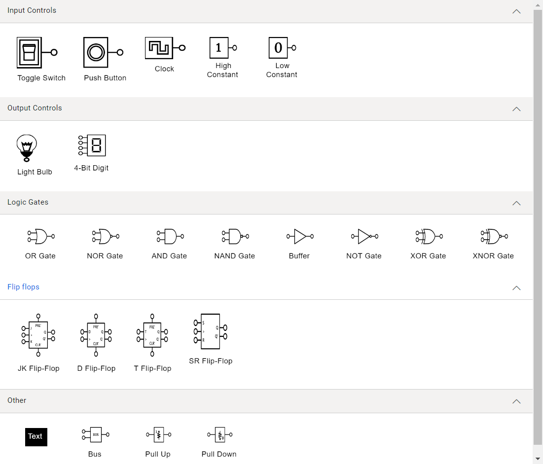
The following image shows the symbol palette filled with logic circuit shapes.
Note: Refer to the symbol palette in React Diagram documentation for more info on adding symbols, grouping symbols, and customizing the symbol palette appearance.
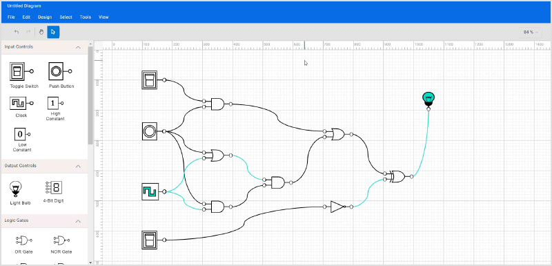
Creating a digital logic circuit
Now, we can design a digital logic circuit diagram by adding shapes from the symbol palette to the diagram surface and connecting them using connectors.
Step #1: Add logic circuit symbols to the editor
To add the logic circuit symbols in the editor, drag the desired symbols from the symbol palette onto the diagramming canvas.
Refer to the following GIF image.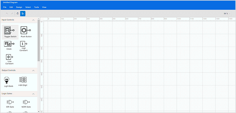
Step #2: Moving symbols
You can change the position of a symbol on the diagram surface by clicking the symbol and dragging it anywhere.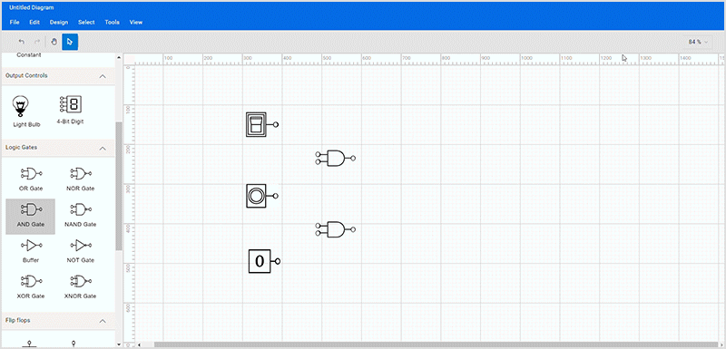
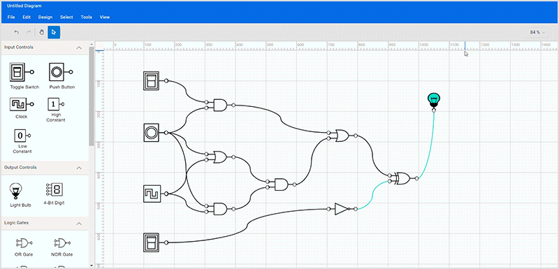
Step #3: Connect symbols
You’ll notice that each diagram symbol has input and output connection points, represented by small circles on the symbol. These points let you easily and consistently draw connectors between circuit components.
Creating a connection is straightforward. Hover over the connection point, and a colored dot will appear to indicate the start of the connection. Click, drag the connector, and drop it onto another symbol’s input connection point.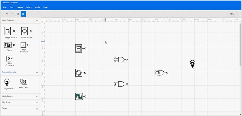
Note: For more details, refer to the connection ports documentation.
Step #4: Loading and saving the diagram
The Diagram control also supports saving your current work and resuming it later by loading the saved diagram back to the diagram canvas. You can achieve this using the load and save functionality shown in the following image.
Step #5: Print and export diagram
You can export the created logical circuit diagram as an image or print it directly from a printer. You can achieve this using the exporting and printing functionality of the Diagram control.
Step #6: Pan and zoom
You can zoom in or out of the diagram by holding Ctrl and scrolling the mouse wheel or by clicking the dropdown button at the top right corner of the designer.
Refer to the following image.
When a large diagram is loaded, only a certain portion of the diagram is visible. The remaining portions are clipped. Clipped portions can be explored by using the scrollbars at the edges of the diagram surface or by panning the diagram. You can pan the diagram by selecting the panning tool in the toolbar, represented by a hand symbol, or by choosing Tools –> Pan tool and then clicking and holding the pointer in the diagram area.
GitHub references
You can download the source project for this digital logical circuit designer from this GitHub location.

Conclusion
Thanks for reading! In this blog, we’ve seen how to easily create a digital logic circuit diagram designer using the Syncfusion React Diagram library. Similarly, you can use it to create other diagrams like organization charts, flow charts, and network diagrams.
If you’re already a Syncfusion user, you can download the product setup here. Otherwise, you can download a free 30-day trial and explore what else our React suite can do.
Please let us know in the comments section below if you have any questions. You can also contact us through our support forum, support portal, or feedback portal. We are always happy to assist you!