
 Niranjan Kumar Gopalan
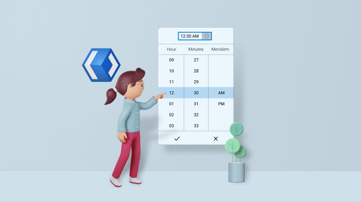
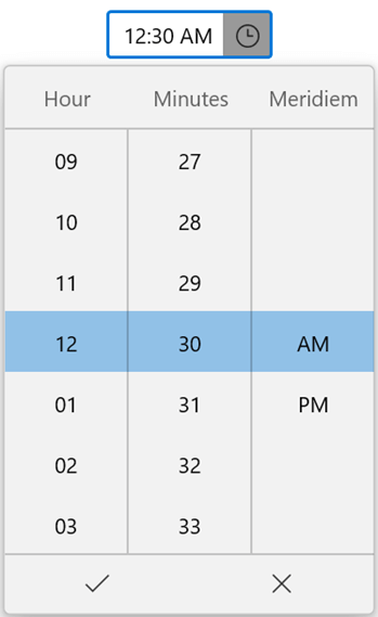
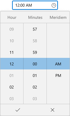
Our Syncfusion WinUI Time Picker control provides an intuitive, touch-friendly interface for selecting times from a drop-down spinner quickly. It supports different time formats, editing times with validation, and a watermark text display. It also allows users to select or enter a time and clear the selected time.
In this blog, we will learn how to add the WinUI Time Picker control to your application and customize its marvelous features!
Getting started with the WinUI Time Picker
Follow these steps to manually add the WinUI Time Picker control to the XAML file of your application:
- First, create a project using the instructions provided in the WinUI 3 desktop app for C# and .NET 5 documentation.
- Then, install the Syncfusion.Editors.WinUI NuGet package in the project.
- Now, import the Syncfusion.UI.Xaml.Editors control namespace in the XAML page.
- Finally, initialize the WinUI TimePicker control. Refer to the following code example.
<Window
    x:Class="WinUI_ TimePicker.MainWindow"
    xmlns="http://schemas.microsoft.com/winfx/2006/xaml/presentation"
    xmlns:x="http://schemas.microsoft.com/winfx/2006/xaml"
    xmlns:local="using:WinUI_TimePicker "
    xmlns:d="http://schemas.microsoft.com/expression/blend/2008"
    xmlns:mc="http://schemas.openxmlformats.org/markup-compatibility/2006"
    xmlns:editors="using:Syncfusion.UI.Xaml.Editors"
    mc:Ignorable="d">

    <Grid>
        <editors:SfTimePicker x:Name=“timePicker”
            HorizontalAlignment="Center"
            VerticalAlignment="Top"
            />
    </Grid>
</Window>
Thus, we have included the Syncfusion WinUI 3 Time Picker control in the application. Now, let’s see how to customize its features.
Limit the available time
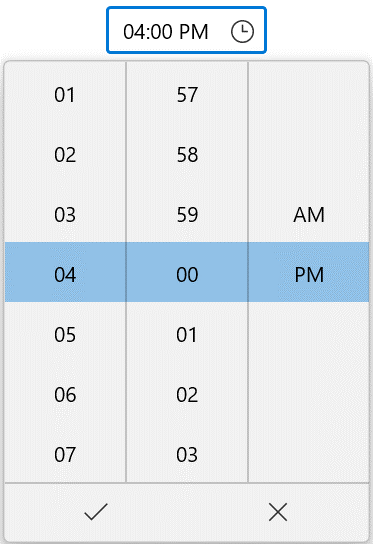
You can restrict users to selecting time values within a minimum and maximum range using the MinTime and MaxTime properties.
By default, the value of MinTime is 1/1/1921 10:37:16 PM and MaxDate is 12/31/2121 10:37:16 PM. You can change these to limit users, for example, to selecting travel times in a day within the available time range.
Refer to the following code example.
public sealed partial class MainWindow : Window
{
    public MainWindow()
    {
        this.InitializeComponent();
        SfTimePicker timePicker = new SfTimePicker();
        timePicker.HorizontalAlignment = HorizontalAlignment.Center;
        timePicker.VerticalAlignment = VerticalAlignment.Center;
        timePicker.MinTime = new DateTimeOffset(DateTime.Now.AddMinutes(-2));
        timePicker.MaxTime = new DateTimeOffset(DateTime.Now.AddMinutes(2));
        this.Content = timePicker;
    }
} |  |
Setting Minimum and Maximum Time in WinUI Time Picker
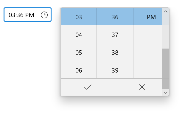
Restrict specific times
You can restrict the users from selecting specific times using the BlackoutTimes collection property.
By default, the value of the BlackoutTimes property is null. By changing it, you can indicate the times that don’t have any transportation available.
Refer to the following code example.
 public class ViewModel
{
    public DateTimeOffset? SelectedTime { get; set; }
    public DateTimeOffsetCollection BlackoutTimes { get; set; }
    public ViewModel()
    {
        SelectedTime = DateTimeOffset.Now.Date;
        BlackoutTimes = new DateTimeOffsetCollection();
        BlackoutTimes.Add(new DateTimeOffset(DateTimeOffset.Now.Year, DateTimeOffset.Now.Month, DateTimeOffset.Now.Day, 0, 3, 0, DateTimeOffset.Now.Offset));
        BlackoutTimes.Add(new DateTimeOffset(DateTimeOffset.Now.Year, DateTimeOffset.Now.Month, DateTimeOffset.Now.Day, 0, 58, 0, DateTimeOffset.Now.Offset));
        BlackoutTimes.Add(new DateTimeOffset(DateTimeOffset.Now.Year, DateTimeOffset.Now.Month, DateTimeOffset.Now.Day, 1, 0, 0, DateTimeOffset.Now.Offset));
        BlackoutTimes.Add(new DateTimeOffset(DateTimeOffset.Now.Year, DateTimeOffset.Now.Month, DateTimeOffset.Now.Day, 3, 0, 0, DateTimeOffset.Now.Offset));
        BlackoutTimes.Add(new DateTimeOffset(DateTimeOffset.Now.Year, DateTimeOffset.Now.Month, DateTimeOffset.Now.Day, 9, 0, 0, DateTimeOffset.Now.Offset));
        BlackoutTimes.Add(new DateTimeOffset(DateTimeOffset.Now.Year, DateTimeOffset.Now.Month, DateTimeOffset.Now.Day, 10, 0, 0, DateTimeOffset.Now.Offset));
    }
}
By default, the Time Picker allows you to set an empty value in the editor using the SelectedTime property. You can keep users from assigning empty values by setting the value of the AllowNull property to false. This way, you can instruct users to fill the mandatory fields. The default value of the SelectedTime property is null and the AllowNull property is true.
Cancel the selected time that is being changed
The WinUI Time Picker will notify you whenever you select a time in the dropdown or assign a new time value to the SelectedTime property by triggering the SelectedTimeChanging event.
Users are restricted from selecting a blackout time from a dropdown; however, users can give text input through the editor. If the currently selected time is invalid (a blockout time), then you can cancel updating the value of the SelectedTime property with ease using the SelectedTimeChanging event.
The SelectedTimeChanging event contains the following properties:
- OldTime – Gets the previously selected time.
- NewTime – Gets the currently selected time.
- Cancel – Gets or sets whether to cancel the selected time value update.
Note: The SelectedTimeChanging event is called before the SelectedTimeChanged event when a time is selected.
Refer to the following code example.
private void TimePicker_SelectedTimeChanging(object sender, TimeChangingEventArgs e)
{
    var oldTime = e.OldTime;
    var newTime = e.NewTime;

    if (oldTime > newTime)
    {
        //Cancels the selected time change.
        e.Cancel = true;
    }
}

private void TimePicker_SelectedTimeChanged(object sender, SelectedDateTimeChangedEventArgs e)
{
    var oldTime = e.OldDateTime;
    var newTime = e.NewDateTime;
}
Show watermark
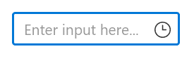
You can display hints or information using the PlaceHolderText property when no time is selected or the value of the SelectedTime property is null.
<editors:SfTimePicker x:Name=“timePicker”
            HorizontalAlignment="Center"
            VerticalAlignment="Top"
            PlaceholderText="HH:MM"
            />
Change the clock type
You can easily change the time format used in the dropdown using the ClockIdentifier property. The default value of the ClockIdentifier property is 12HourClock.
Refer to the following code example. Here, we have set the 24HourClock time format to the Time Picker control.
<Grid>
        <editors:SfTimePicker x:Name=“timePicker”
            HorizontalAlignment="Center"
            ClockIdentifier="24HourClock"
            VerticalAlignment="Center"
            />
 </Grid>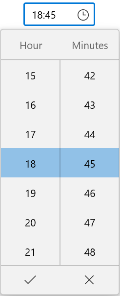
Change the language
You can also localize the Time Picker control to assist worldwide travelers speaking different languages using the Language property. The default value of the Language property is en-US. Also, find the distinct languages supported in the Time Picker control.
Refer to the following code example. Here, ar-SA refers to Arabic- Saudi Arabia.
<Grid>
        <editors:SfTimePicker x:Name=“timePicker”
            HorizontalAlignment="Center"
            Language="ar-SA"
            VerticalAlignment="Top"
            />
</Grid>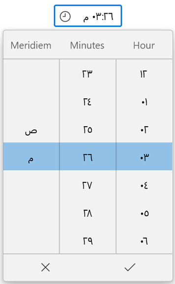
The Time Picker control updates the flow direction visually based on the applied language type. By default, the value of the FlowDirection property is LeftToRight.
Refer to the following code example.
<Grid>
        <editors:SfTimePicker x:Name=“timePicker”
            HorizontalAlignment="Center"
            Language="ar-SA"
            FlowDirection="LeftToRight"
            VerticalAlignment="Center"
            />
</Grid>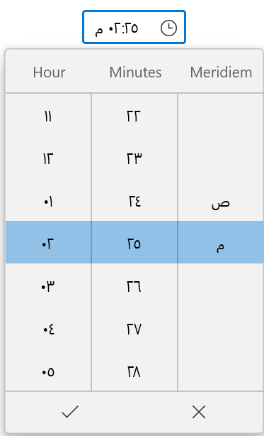
Customize the dropdown button
You can customize the dropdown button in the WinUI Time Picker control using the DropDownButtonTemplate property. The default value of the DropDownButtonTemplate is null.
Refer to the following code example.
<Grid>
    <editors:SfTimePicker x:Name=“timePicker”
            HorizontalAlignment="Center"
            VerticalAlignment="Center"
            >
        <editors:SfTimePicker.DropDownButtonTemplate>
            <DataTemplate>
                <Path Data="M30.299999,0L29.700008,2.7000046C29.700008,2.8000031,29.700008,2.9000015,29.600002,3.0999985L29.600002,3.2000046C29.500012,3.4000015,29.299999,3.7000046,29.000012,4L21.700007,11.800003 25.900005,29 23.1,32 16.1,17.599998 10.6,23.5 11.1,28 9.0000011,30.300003 6.5000006,25.099998 1.7000046,22.400002 3.9000021,20.099998 8.2000056,20.700005 13.700006,14.800003 0,7.2000046 2.7000047,4.3000031 19.1,8.9000015 26.299999,1.2000046C26.600002,0.90000153,26.900005,0.70000458,27.200008,0.59999847L27.299999,0.59999847 27.600002,0.59999847z" Stretch="Uniform" Fill="Black" Width="20" Height="20" />
            </DataTemplate>
        </editors:SfTimePicker.DropDownButtonTemplate>
    </editors:SfTimePicker>
</Grid>
Also, you can open the dropdown button programmatically by setting the value of the IsOpen property to true. By default, the value of the IsOpen property is false.
Change dropdown alignment and height
Easily modify the position of the dropdown from the editor using the DropDownPlacement property. By default, the value of the DropDownPlacement property is Auto. The dropdown smartly shifts its alignment based on the available space in the application.
You can also change the height of the dropdown to limit the number of time values shown using the DropDownHeight property. The default value of the DropDownHeight property is NaN.
Refer to the following code example.
<editors:SfTimePicker x:Name=“timePicker”
            DropDownPlacement="Right"
            DropDownHeight="200"
            />
Customize the dropdown header
You can add hints in the drop-down header using the DropDownHeader property by setting the value of the ShowDropDownHeader property to true. Also, you can customize the header template of the dropdown using the DropDownHeaderTemplate property.
By default, the value of the DropDownHeader property is string.Empty, ShowDropDownHeader is false and DropDownHeaderTemplate is null.
Refer to the following code example.
<editors:SfTimePicker x:Name=“timePicker”
            HorizontalAlignment="Center"
            VerticalAlignment="Top"
            ShowDropDownHeader="True"
            DropDownHeader="Time of departure"
            ShowColumnHeaders="True"
            >
    <editors:SfTimePicker.DropDownHeaderTemplate>
        <DataTemplate>
            <StackPanel Orientation="Horizontal">
                       <TextBlock HorizontalAlignment="Center"
                               VerticalAlignment="Center"
                               Foreground="DarkOliveGreen"
                               Text="{Binding }"
                               />

                   <Path Data="M15.131557,14.452016L12.919611,19.613015 17.016516,19.613015 20.702427,14.452016z M2.1861391,5.1610125L2.9891357,12.387015 14.450447,12.387015 22.708384,12.38701 28.387038,12.387015C29.241036,12.387015 29.935033,11.693014 29.935033,10.839014 29.935033,9.9850143 29.241036,9.2900136 28.387038,9.2900136L22.73777,9.2900136 22.709431,9.2909997 14.451491,9.2909997 14.424871,9.2900136 5.5051265,9.2900136C5.0611281,9.2900136,4.6661296,9.0060142,4.5261302,8.5850137L3.3851342,5.1610125z M12.91953,2.0650023L15.131535,7.2259973 20.703478,7.2259973 17.016518,2.0650023z M11.354611,0L17.547516,0C17.881496,-1.9915387E-07,18.19448,0.16200235,18.38747,0.43299852L23.23983,7.226013 28.387038,7.226013C30.379031,7.226013 32.000026,8.8470138 32.000026,10.839014 32.000026,12.831015 30.379031,14.452016 28.387038,14.452016L23.239108,14.452016 18.387485,21.245015C18.193489,21.516017,17.881496,21.677017,17.547503,21.677017L11.353647,21.677017C11.007655,21.677017 10.683663,21.503017 10.492668,21.214015 10.301672,20.923017 10.268673,20.558015 10.405669,20.239015L12.885867,14.452016 2.0651398,14.452016C1.5381413,14.452016,1.0971432,14.056015,1.0381432,13.533016L0.0061473846,4.2430118C-0.025852203,3.9520119 0.068146706,3.6590117 0.2631464,3.4400118 0.45914555,3.2220116 0.73914433,3.0970116 1.0321436,3.0970116L4.1291313,3.0970116C4.5741301,3.0970116,4.9681282,3.3810118,5.1081276,3.8020118L6.2491236,7.226013 12.88616,7.226013 10.405649,1.4389951C10.268567,1.1199948 10.301647,0.75399758 10.492562,0.46400441 10.6836,0.17500284 11.00757,-1.9915387E-07 11.354611,0z"
                                Width="25"
                                Height="25"
                                Fill="DarkOliveGreen"
                                Stretch="Uniform"
                                Margin="5,5,5,5"
                                HorizontalAlignment="Center"
                                VerticalAlignment="Center"
                              />
            </StackPanel>
        </DataTemplate>
    </editors:SfTimePicker.DropDownHeaderTemplate>
</editors:SfTimePicker>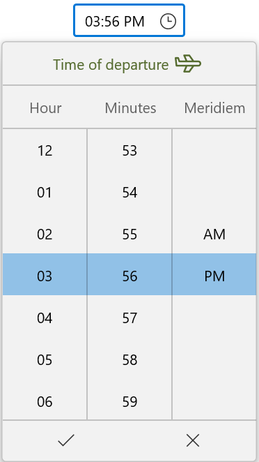
Hide the dropdown columns header
By default, when you open the dropdown of the WinUI Time Picker control, the headers for each field column will be displayed to represent the field names. Also, you can hide these columns’ header by setting the value of the ShowColumnHeaders to false. The default value of the ShowColumnHeaders property is true.
Refer to the following code example.
<editors:SfTimePicker x:Name=“timePicker”
            HorizontalAlignment="Center"
            VerticalAlignment="Center"
            ShowColumnHeaders="False"
            />
Customize the appearance of item cells in the dropdown
You can also customize the appearance of the item cells in the dropdown using the ItemContainerStyle and ItemTemplateSelector properties. The default value of the ItemContainerStyle and ItemTemplateSelector properties is null.
Refer to the following code.
public class TimeItemTemplateSelector : DataTemplateSelector
{
    public DataTemplate DefaultTemplate { get; set; }
    public DataTemplate AlarmTemplate { get; set; }
    public DataTemplate SleepTemplate { get; set; }
    public DataTemplate GroupMeetingTemplate { get; set; }

    protected override DataTemplate SelectTemplateCore(object item, DependencyObject container)
    {
        DateTimeFieldItemInfo dateTimeField = item as DateTimeFieldItemInfo;
        if (dateTimeField.Field == DateTimeField.Hour12)
        {
            switch (dateTimeField.DateTime.Value.Hour)
            {
                case 2:
                    return SleepTemplate as DataTemplate;
                case 5:
                    return AlarmTemplate as DataTemplate;
                case 10:
                    return GroupMeetingTemplate as DataTemplate;
                case 14:
                    return GroupMeetingTemplate as DataTemplate;
                case 17:
                    return AlarmTemplate as DataTemplate;
                case 22:
                    return SleepTemplate as DataTemplate;
            }
        }

        return base.SelectTemplateCore(item, container);
    }
}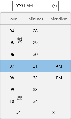
Note: For more details, refer to Customize the cell’s style in dropdown spinner documentation.
Also, customize all the field columns and item cells inside the dropdown using the TimeFieldPrepared event.
Refer to the following code example.
/// <summary>
/// Get the ItemsSource for minute or second column.
/// </summary>
/// <returns>Return the ItemsSource for minute or second column.</returns>
private static ObservableCollection<string> GetMinutesOrSeconds(string pattern)
{
ObservableCollection<string> minutes = new ObservableCollection<string>();
NumberFormatInfo provider = new NumberFormatInfo();
for (int i = 0; i < 60; i = i + 5)
{
if (i > 9 || pattern == "%s" || pattern == "{second.integer}" || pattern == "%m" || pattern == "{minute.integer}")
{
minutes.Add(i.ToString(provider));
}
else
{
minutes.Add("0" + i.ToString(provider));
}
}
return minutes;
}
private void SfTimePicker_TimeFieldPrepared(object sender, DateTimeFieldPreparedEventArgs e)
{
if (e.Column != null)
{
//Minutes interval changed as 5.
if (e.Column.Field == DateTimeField.Minute || e.Column.Field == DateTimeField.Second)
{
e.Column.ItemsSource = GetMinutesOrSeconds(e.Column.Format);
}
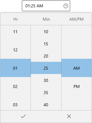
if (e.Column.Field == DateTimeField.Hour12)
{
e.Column.Header = "Hr";
e.Column.ItemHeight = 60;
e.Column.ItemWidth = 100;
}
else if (e.Column.Field == DateTimeField.Minute)
{
e.Column.Header = "Min";
e.Column.ItemHeight = 40;
e.Column.ItemWidth = 100;
}
else if (e.Column.Field == DateTimeField.Meridiem)
{
e.Column.Header = "AM/PM";
e.Column.ItemHeight = 60;
e.Column.ItemWidth = 100;
}
e.Column.ShowHeader = true;
}
}
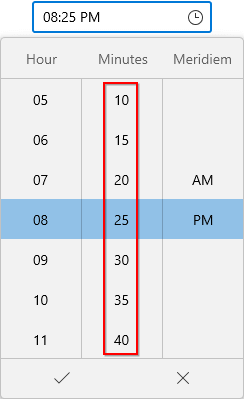
Apply custom time intervals
You can apply custom time intervals to restrict the users to selecting times from specific minute or hour intervals by using the TimeFieldPrepared event.
Refer to the following code.
/// <summary>
/// Get the ItemsSource for minute or second column.
/// </summary>
/// <returns>Return the ItemsSource for minute or second column.</returns>
private static ObservableCollection<string> GetMinutesOrSeconds(string pattern)
{
    ObservableCollection<string> minutes = new ObservableCollection<string>();
    NumberFormatInfo provider = new NumberFormatInfo();
    for (int i = 0; i < 60; i = i + 5)
    {
        if (i > 9 || pattern == "%s" || pattern == "{second.integer}" || pattern == "%m" || pattern == "{minute.integer}")
        {
            minutes.Add(i.ToString(provider));
        }
        else
        {
            minutes.Add("0" + i.ToString(provider));
        }
    }

    return minutes;
}

private void SfTimePicker_TimeFieldPrepared(object sender, DateTimeFieldPreparedEventArgs e)
{
    if (e.Column != null)
    {
        //Minutes interval changed as 5.
        if (e.Column.Field == DateTimeField.Minute || e.Column.Field == DateTimeField.Second)
        {
            e.Column.ItemsSource = GetMinutesOrSeconds(e.Column.Format);
        }
}
GitHub reference
For more details, refer to the WinUI 3 Time Picker GitHub demos and documentation.
Conclusion
Thanks for reading! In this blog post, we have seen how to get started with the WinUI Time Picker control and customize its features. We hope it fits your expectations and requirements for choosing a time value. Try out our WinUI Time Picker control and leave your feedback!
You can download the other WinUI demos from GitHub and Microsoft Store.
For existing customers, the newest version of Essential Studio® is available for download from the license and downloads page. If you are not yet a customer, you can try our 30-day free trial to check out these new features.
You can also contact us through support forums, feedback portal, or the Direct-Trac support system. We are always happy to assist you!
 No spam, just valuable updates.