
 Sasi Kumar Arumugam
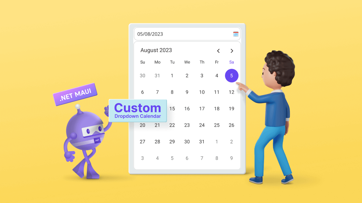
The Syncfusion .NET MAUI Calendar control provides users with an intuitive and user-friendly way to select dates. It allows users to choose dates from month, year, decade, and century view interfaces. While it provides a standard date selection mechanism, an even more intuitive and visually appealing approach is sometimes desired.
So, in this blog, we’ll explore how to enhance the user experience by creating a custom dropdown calendar using our .NET MAUI Calendar control.
Note: If you are new to our .NET MAUI Calendar control, please refer to its getting started documentation before proceeding.
Dropdown calendar: overview
A dropdown calendar is a user interface component that combines date labels with a dropdown UI. It offers a clever solution to optimize space while providing a more intuitive and visually appealing date selection experience.
Within a compact design, users can effortlessly navigate and select dates, making it an excellent addition to your app’s user interface.
Let’s see how to design this with code examples.
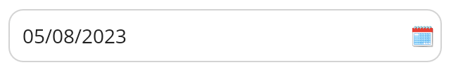
Design the selected date box
The selected date box in a dropdown calendar can effectively display the chosen date. When users select a date from the dropdown calendar, the box updates to show the selected date prominently. Thoughtfully designing the selected date box enhances the clarity and elevates the dropdown calendar’s overall aesthetic.
In this section, we’ll design the selected date box with a surrounding border and display an additional calendar icon alongside the date. This visual representation effectively explains the function of the date box.
Refer to the following code example.
<Grid HorizontalOptions="Center" HeightRequest="50" VerticalOptions="Start">
<Border x:Name="dateLabel" Margin="0, 5" VerticalOptions="Start" Stroke="LightGray" StrokeThickness="1" StrokeShape="RoundRectangle 10, 10, 10, 10">
<Grid>
<Grid.ColumnDefinitions>
<ColumnDefinition Width="*"/>
<ColumnDefinition Width="Auto"/>
</Grid.ColumnDefinitions>
<Label Text="{Binding SelectedDateString}" Margin="10, 0, 5, 0" VerticalOptions="CenterAndExpand"/>
<Label Grid.Column="1" Text="🗓" Margin="5, 0" VerticalOptions="CenterAndExpand"/>
</Grid>
</Border>
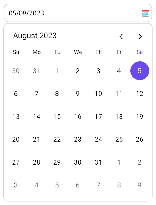
</Grid>Refer to the following output image.
Integrating calendar into dropdown UI
Let’s integrate the .NET MAUI Calendar component into a dropdown menu. This will allow users to navigate through months horizontally, select a specific date, and seamlessly close the calendar after choosing.
We’ll use the SfPopup control to design the dropdown UI. The pop-up will be displayed while interacting with the selected date box. Customizing the pop-up styles, such as the corner radius, border, border thickness, and background color, creates a UI that resembles a dropdown.

In this design, a surrounding border visually separates the calendar component from the selected date box. This helps distinguish the two elements and contributes to a more intuitive user experience.
Refer to the following code to design the dropdown UI using the Popup control.
<popup:SfPopup Grid.Row="1" x:Name="popup" ShowFooter="False" ShowOverlayAlways="False" WidthRequest="310" HeightRequest="370" ShowHeader="False" Padding="5, 10">
 <popup:SfPopup.PopupStyle>
  <popup:PopupStyle MessageBackground="White" Stroke="LightGray" StrokeThickness="2" CornerRadius="10" />
 </popup:SfPopup.PopupStyle>
 <popup:SfPopup.ContentTemplate>
  <DataTemplate>
   <calendar:SfCalendar x:Name="calendar" DisplayDate="{Binding DisplayDate, Mode=TwoWay}" SelectedDate="{Binding SelectedDate, Mode=TwoWay}" View="{Binding CurrentView, Mode=TwoWay}" NavigationDirection="Horizontal" SelectionChanged="OnCalendarSelectionChanged" WidthRequest="300" HeightRequest="350" />
  </DataTemplate>
 </popup:SfPopup.ContentTemplate>
</popup:SfPopup>
Configure the calendar behavior
While opening the dropdown, configuring the display date and calendar view is necessary to show and select dates in the dropdown calendar:
- Setting the display date to the selected date ensures the calendar opens with the currently chosen month, providing a seamless user experience. This prevents the calendar from displaying a different month than the one selected and improves the overall user experience.
- Setting the calendar view to the month view for the easiest date selection experience.
Refer to the following code to configure the Calendar while opening.
private void OnTapGestureTapped(object sender, EventArgs e)
{
     DropdownViewModel bindingContext = (DropdownViewModel)this.BindingContext;
     //// Update the calendar display date value based on the currently selected date value for showing the selected date month.
     bindingContext.DisplayDate = bindingContext.SelectedDate;
     //// Need to show month view while opening the calendar dropdown.
     bindingContext.CurrentView = CalendarView.Month;
     popup.ShowRelativeToView(dateLabel, PopupRelativePosition.AlignBottom, 0, 5);
}
GitHub reference
For more information, refer to designing a dropdown calendar using the .NET MAUI Calendar demo.
Conclusion
Thanks for reading! This blog briefly overviewed designing a dropdown calendar using the Syncfusion .NET MAUI Calendar. With it, you can create visually stunning and highly intuitive user interfaces for date selection. Try out the steps and share your feedback or ask questions in the comments section.
Download the Syncfusion product setup on our License and Downloads page if you’re a customer. If you’re not, try our 30-day free trial and see how our components can enhance your projects. You can also find our .NET MAUI demo apps on Google Play and the Microsoft Store.
For inquiries, you can also reach us through our support forum, support portal, or feedback portal. We are always happy to assist you!
 No spam, just valuable updates.