
 Vidura Senevirathne
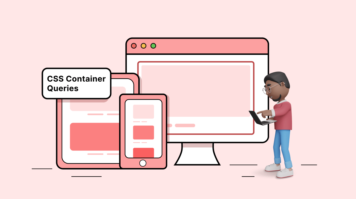
Imagine you have a grid of items you want to display in columns. With traditional responsive design techniques, you might use media queries to change the number of columns based on the viewport’s width.
What if I told you that there is a new method called container queries that you can use to style elements just by considering their container size?
CSS container queries solve most of the issues with writing media queries and allow developers to apply styles based on the size of the container without considering the viewport or other device characteristics.
In this article, I will discuss CSS container queries in depth with code examples to give you a better understanding.
What are CSS container queries?
CSS container queries, also known as element queries, are a new CSS feature that allows developers to apply styles to inner elements based on the size of their container rather than the size of the viewport. As a result, developers can design more flexible and responsive layouts without having to use fixed breakpoints.

Basics of CSS container queries
Before getting started with CSS container queries, there are a few things you need to understand.
1. Naming containment context
Naming a containment context in CSS container queries allows you to target a specific containment context with distinct styles using the @container at-rule.
To create a containment context, you need to apply the container property to an element and give the containment context a name using the container-name property. In addition, you need to decide between size, inline-size, or normal values for the container-type property. These values do the following:
- size: The container query will consider the inline and block dimensions of the parent container.
- inline-size: The container query will only consider the inline dimensions of the container.
- normal: The element only remains a query container for container style queries, not for container-size queries.
The following example creates a containment context named navbar and uses it within the @container at-rule to apply the styles when the minimum width of the navbar containment context is 500 px or more.
.container {
  container-type: inline-size;
  container-name: navbar;
}

@container navbar (min-width: 500px) {
 .ul {
   display: grid;
 }
}
2. CSS container query length units
When you use container queries to add styles to a container, you must use container query length units. These units tell how long something is compared to the size of a query container. Components that use length units can be used in different containers without developers having to figure out new length values.
The container query length units are:
- cqw: 1% of the width of a query container.
- cqh: 1% of the height of a query container.
- cqi: 1% of the inline size of a query container.
- cqb: 1% of the block size of a query container.
- cqmin: cqmin is the smaller of cqi or cqb.
- cqmax: cqmax is the greater of cqi or cqb.
In the following example, the inline size of the container is used to set the font size of a heading.
@container (min-width: 500px) {
  .nav-bar h1 {
	font-size: max(1.75em, 1.1em + 2cqi);
  }
}
3. Fallbacks for CSS container queries
Currently, container queries are not supported in all browser versions. Therefore, it is essential to ensure styles are compatible with browsers that do not support container queries. In such cases, you can use the grid property or media queries as fallback styles.
.container{
  display: grid;
  grid-template-columns: 1fr 1fr;
}

@media (max-width: 700px) {
  .container{
	grid-template-columns: 1fr;
  }
}
Writing your first CSS container query
To use container queries, you first need to define a container element that will serve as the reference for the query. Then you can use the @container rule to specify styles that should be applied based on the dimensions of the container.
For example, suppose you have a container element with the class .container and want to apply different styles based on the container’s width. You could use the following CSS:
/* html file */
<html lang="en">
<head>
<title>Container Queries</title>
</head>
<body>
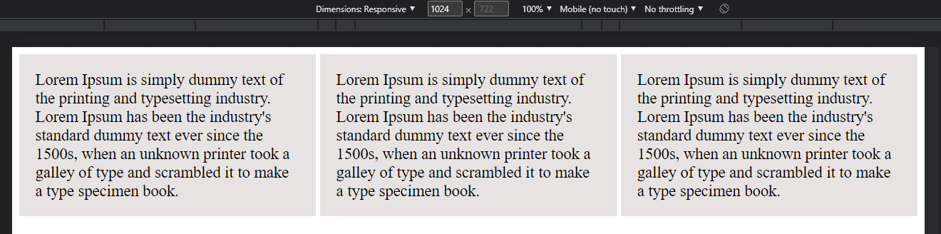
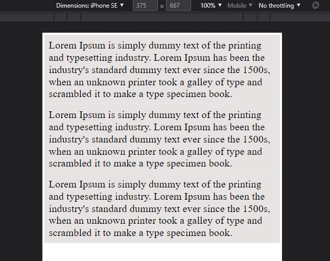
<div class="container">
<div class="paragraph">
Lorem Ipsum is ...
</div>
<div class="paragraph">
Lorem Ipsum is ...
</div>
<div class="paragraph">
Lorem Ipsum is ...
</div>
</div>
</body>
</html>
/* css file */
.container {
container-type: inline-size;
container-name: maincontainer;
display: grid;
gap: 1em;
grid-template-columns: 1fr 1fr 1fr;
}
@container maincontainer (min-width: 500px) {
grid-template-columns: 1fr;
}
.paragraph{
background: rgb(231, 227, 227);
padding:1em;
font-size: 18px;
}In this example, the first block of styles will be applied to all .container classes by default. The second block of styles will be applied to .container classes with a width of at least 500 px.
 You can use the min-width, max-width, min-height, and max-height media query conditions in a @container rule to specify the dimensions of the container that should trigger the styles. You can combine these conditions using logical operators (e.g., and, or) to create more complex queries.
Browser support
Container queries are currently supported in the following browser versions:
- Chrome 105
- Edge 150
- Firefox 110
- Opera 91
- Safari 16
You can find the detailed browser support specification here.
Advantages of CSS container queries
- It is easy to loop over all child elements.
- It is easy to select a specific element using the selector syntax.
- You can include a custom class name in the query string that will replace your custom class’s value when the page is rendered.
- No need for a separate container for a link and its target. You can use the same container for both.
- CSS container queries are very easy to use and understand.
- Create flexible layouts without using floats or display properties.
Disadvantages of CSS container queries
- Not all browsers support CSS container queries. Both container queries and query units are supported only in Firefox 109 and higher versions.
- You have to add classes for each parent element you want to select. This can be an issue if you have many features on your page and only want to add classes for some of them manually.
- You have to use a CSS selector, which is not ideal for users who are not as familiar with CSS.
- You cannot use relative or absolute positions on child items.
- Inheriting from parent elements is not possible unless you use floats.
Conclusion
CSS container queries are an exciting addition to the CSS world. They provide an alternative for media queries, and developers can easily handle styles based on container sizes. I hope this article gave you a basic understanding of CSS container queries and how they work.
Thank you for reading.
The Syncfusion JavaScript suite is the only toolkit you need to build an application. It contains over 80 high-performance, lightweight, modular, and responsive UI components in a single package. Download the free trial and evaluate the controls today.
If you have any questions or comments, you can contact us through our support forums, support portal, or feedback portal. We are always happy to assist you!
 No spam, just valuable updates.