

Business analysts and solution architects prefer to analyze larger data sets in a shorter time span in order to make better decisions faster. But they also expect to extract a concise summary out of thousands of unorganized rows and columns, which is a very time-consuming process. To tame this process, Syncfusion offers the Essential JS 2 Pivot Table, which displays summarized business data both in a tabular (grid) and graphical (chart) format. Reorganizing and summarizing large amounts of data is no longer difficult using this powerful tool.
You can easily customize and obtain a desired report on the fly and modify it at runtime to visualize aggregated and comparative information. In addition to its existing great feature list, with 2019 Volume 3 release, the Pivot Table can now connect to the SSAS OLAP cube data source. So, you can visualize it with dimensions, hierarchies, measures, named sets, and much more. You can also check out the Essential JS 2 Pivot Table in other web platforms: Angular, React, Vue, JavaScript, ASP.NET MVC, ASP.NET Core and Blazor.
Now, let me walk you through the significant features that are supported with this OLAP data source.
Connecting to SSAS OLAP cube
All you need to do to connect to the online SSAS OLAP cube is set the following dataSource properties:
- providerType: set its value to SSAS to name the type of data source with which you are about to connect.
- URL: accepts the connection string of the server to connect.
- cube: accepts the valid cube name available on the connected data source.
- catalog: accepts the valid database available on the connected server.
- localeIdentifier: Defines the localization. By default, the system language will be used when this is not set explicitly.
Other than these properties, you also need to define properties like rows, columns, values, and filters under the dataSourceSettings to set the appropriate dimensions, hierarchies, measures, etc., on appropriate axes.
let pivotGridObj: PivotView = new PivotView({
    dataSourceSettings: {
        catalog: 'Adventure Works DW 2008 SE',
        cube: 'Adventure Works',
        providerType: 'SSAS',
        url: 'https://bi.syncfusion.com/olap/msmdpump.dll',
        localeIdentifier: 1033,
        rows: [
            { name: '[Customer].[Customer Geography]', caption: 'Customer Geography' },
        ],
        columns: [
            { name: '[Product].[Product Categories]', caption: 'Product Categories' },
            { name: '[Measures]', caption: 'Measures'},
        ],
        values: [
            { name: '[Measures].[Customer Count]', caption: 'Customer Count' },
            { name: '[Measures].[Internet Sales Amount]', caption: 'Internet Sales Amount'}
        ],
        filters: [
            { name: '[Date].[Fiscal]', caption: 'Date Fiscal' },
        ],
    },
});
pivotGridObj.appendTo('#PivotView');
Supported features with OLAP data sources
Let’s dive into the essential feature list of the Pivot Table control connected to the SSAS OLAP data source.
Drill down and up
OLAP cube supports two kinds of hierarchies:
- Attribute hierarchy—Has only a single level of members.
- User-defined hierarchy—Supports multiple levels of members.
Using this drill-down and up functionality, you can explore and navigate up to the nth level of parent-child hierarchies. There is a built-in icon placed beside each member of the user-defined hierarchies to identify the state of the member. Simply click on those icons to drill up or down.
NOTE: These icons are not included for attribute hierarchy members.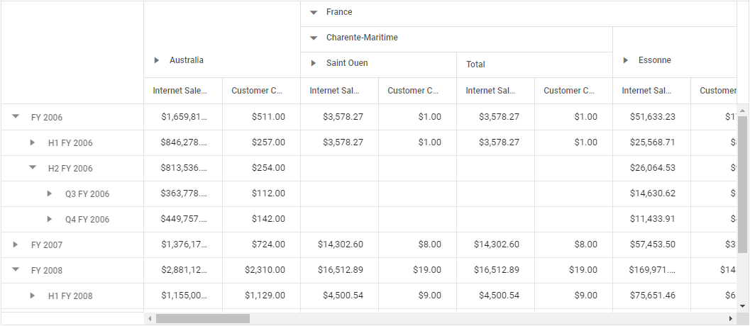
Grouping
The same layout for the grouping bar is retained when the Pivot Table is bound with the relational data source. That way, you can dynamically change the OLAP report during runtime by simply dragging the desired pivot fields between different axes, like columns, rows, values, and filters.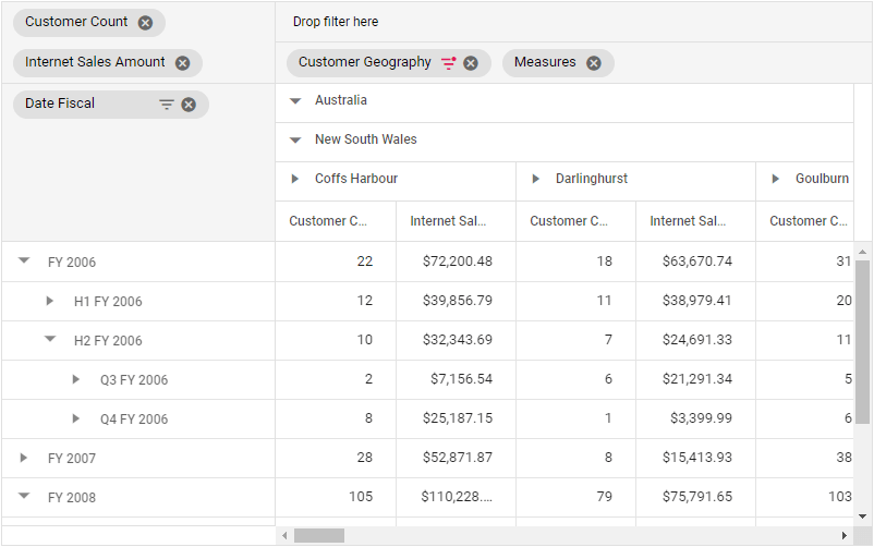
Field list
As the grouping bar is intended to change the OLAP reports dynamically, you can use the field list option to do the same. An additional quality with this field list option is that it facilitates creating a new OLAP report on the fly. Looking at the field list UI, you can see a tree view that includes the connected cube elements, such as dimensions, hierarchies, levels, measures, and named sets.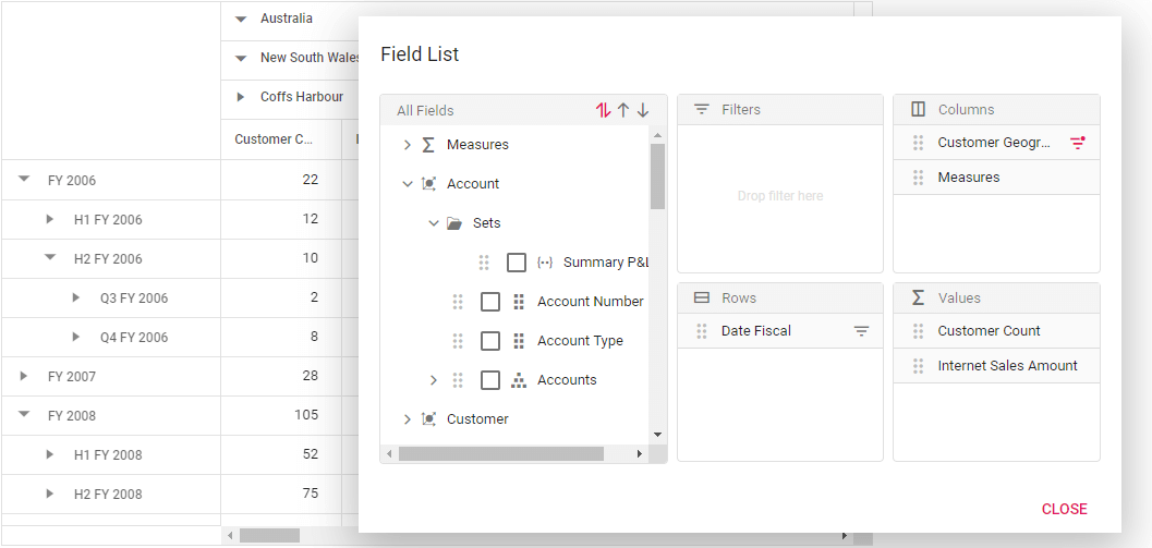
Calculated fields
With the calculated fields option, you can easily create new members and measures by using the existing hierarchies and measures from the connected cube. Just like the field list UI, the calculated field UI has the connected cube elements in a tree view-like structure with drag-and-drop support. You can frame an expression manually under the Expression section or simply drag an element from the tree view section to create the new members or measures.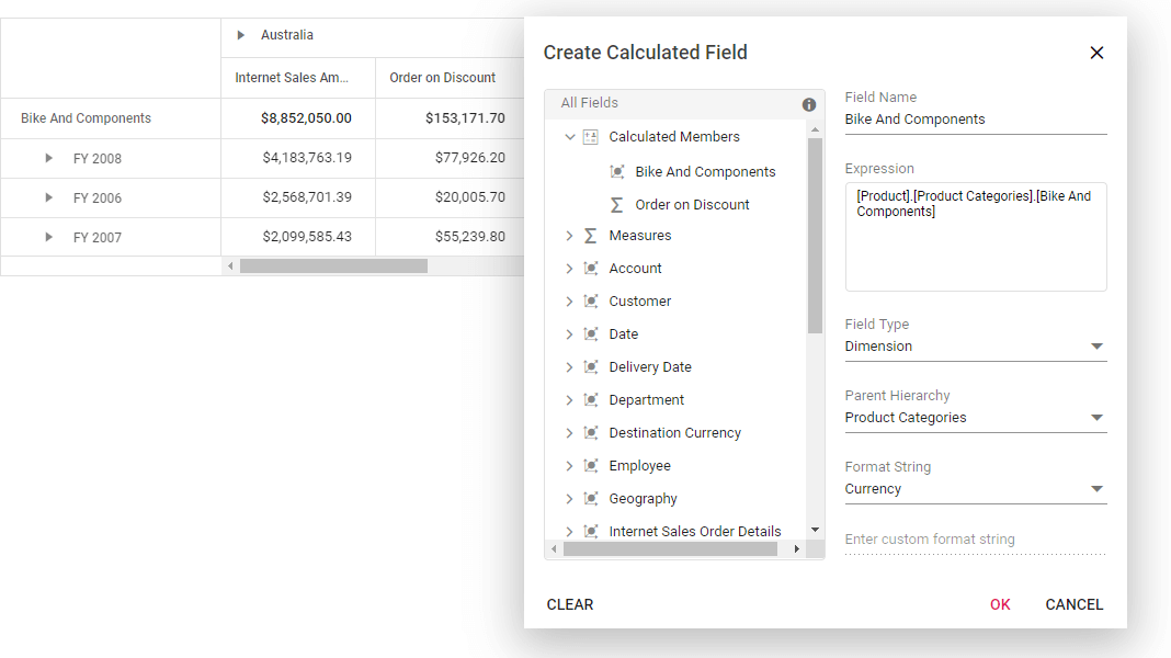
Sorting
You can sort the hierarchy members of the Pivot Table in ascending, descending, or default order (as such from cube). By default, all the members of pivot table are displayed in ascending order, but it supports sorting both the attribute and user-defined hierarchy members.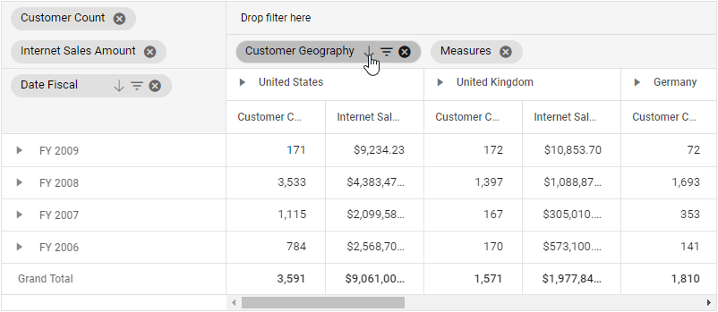
Filtering
You can set the Pivot Table to display only selected members by using the filtering options. A built-in filter icon will be displayed over the pivot fields on the grouping bar and field list UI. Clicking on it will open the member editor dialog and show the different filtering operations achievable through the UI. There are three kinds of filtering: member filtering, label filtering, and value filtering.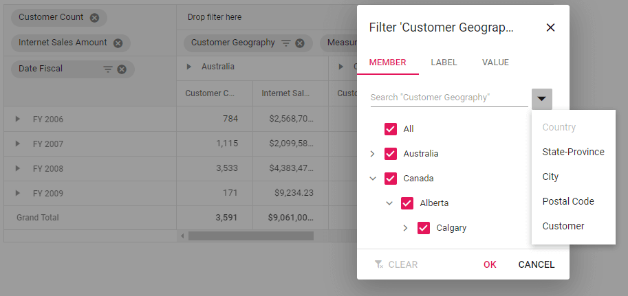
Conditional formatting
By using the built-in conditional formatting options of Pivot Table, you can customize the table cell values based on specific conditions. You can also apply multiple conditions at the same time and remove any applied conditions on demand via the UI, as depicted in the following image.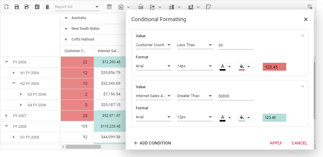
Number formatting
Set the desired formats, like currency or percentage, to project the exact measures bound to an OLAP report on a pivot table. This kind of formatting can be set only through code-behind while framing the OLAP report. The formats applied to any measures can be persisted, even if it is removed and added (state persistence).
  let pivotGridObj: PivotView = new PivotView({
      dataSourceSettings: {
          //codes here
          formatSettings: [
              { name: '[Measures].[Internet Sales Amount]', format: 'C0' },
              { name: '[Measures].[Customer Count]', format: 'E' }
          ],
      },
  });
  pivotGridObj.appendTo('#PivotView');
Drill through
Drill through is a powerful feature to expose the value of raw items that are used to frame any aggregated value. Say, for example, you want to know the detailed data or an original value of a summary cell. Simply double-click on a cell to drill through and view the detailed report in a new window. Along with raw items, it also holds information like row headers, column headers, and the aggregated value of a clicked cell. In general, one should have the drill-through provision enabled on OLAP cube for retrieving that information.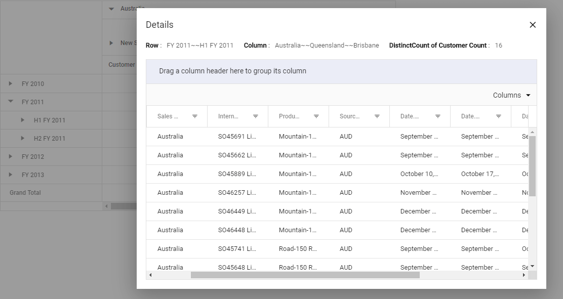
Virtualization
Start to load large amounts of data, up to 1 million records, and view them on demand through virtual scrolling options without any performance degradation. Here, the cell data is set to occupy only the viewport area of the pivot table and to continue to update on every scroll action. Even the other UI operations, such as drill up and down, filtering, sorting, and drag and drop, can work perfectly with any number of records.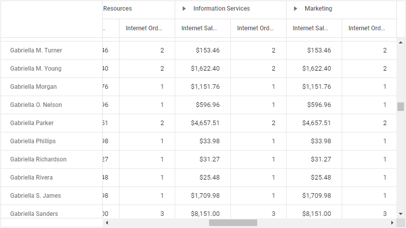
Defer layout update
With defer layout update option, you can update the Pivot Table on demand rather than updating it for every UI operation. In such cases, whenever any UI operation is performed through field list, only the report gets updated instead of generating the entire pivot table again and again, thus saving the time.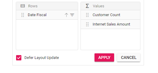
Other common features supported with OLAP data source
Apart from the major supported features discussed so far, let me also list out other features of the Pivot Table that work well when you connect it with an OLAP data source.
| Feature | Description |
| Frozen headers | View the headers even when scrolling. By default, this option is enabled on Pivot Table and can’t be disabled. |
| Scroll state maintenance | The scroll position will be maintained even after an update is made on the Pivot Table. |
| Show or hide totals | Show or hide the subtotals on specific level(s) in a hierarchy that are bound to the OLAP report. Also, show or hide grand totals specifically in row and column axes. |
| Tooltip | A pop-up shows while the cursor hovers over the value cells, showing information about the row headers, column headers, measures, and aggregated value with appropriate formatting. |
| Showing measures on rows | Bind measures on a row axis. By default, it will bind on a column axis. |
| Measures at different positions | Drop measures at the desired position among other hierarchies on the axis. |
| Filter axis | Show the filter status of a hierarchy on the pivot field bound to the filter (slicer) axis. |
| Hyperlink | Users can set hyperlinks on specific Pivot Table cells based on the cell type and predefined conditions. |
| Toolbar | This built-in UI is at the top of the Pivot Table, containing frequently used options. For example: report manipulation, table view, chart view with types, show MDX query, exporting, show or hide totals, conditional formatting, and field list. |
| RTL | Display the Pivot Table in a right-to-left direction. |
| Exporting | A pivot table bound with an OLAP data source can be exported to PDF, Excel, and CSV formats. |
| Column resize | You can resize any column by using the cursor and selecting the border of that column. |
| Column reorder | Reorder any column within the Pivot Table. |
| Cell selection | Select any cells and retrieve those selected cells’ information, along with their headers. |
Summary
To summarize, we have seen how to connect the SSAS OLAP cube data source to the Essential JS 2 Pivot Table component with all its relevant properties. Also, I have listed out the major and common features that should work well when a pivot table is connected to an OLAP data source. Try all these features with our 2019 Volume 3 release.
Try connecting your Pivot Table component to an OLAP data source referring to the shared code example. If you have any questions, please let me know through the comments section below.
Also, explore the other available features of the Pivot Table in our documentation and demos pages. You can download the free 30-day trial to start using the Pivot Table or check it out on GitHub. You can also contact us through our support forum, Direct-Trac or feedback portal. We are always happy to assist you!


 No spam, just valuable updates.
Comments (1)
[…] How to create Pivot Table with OLAP Data in JavaScript (Ramesh Govindaraj) […]