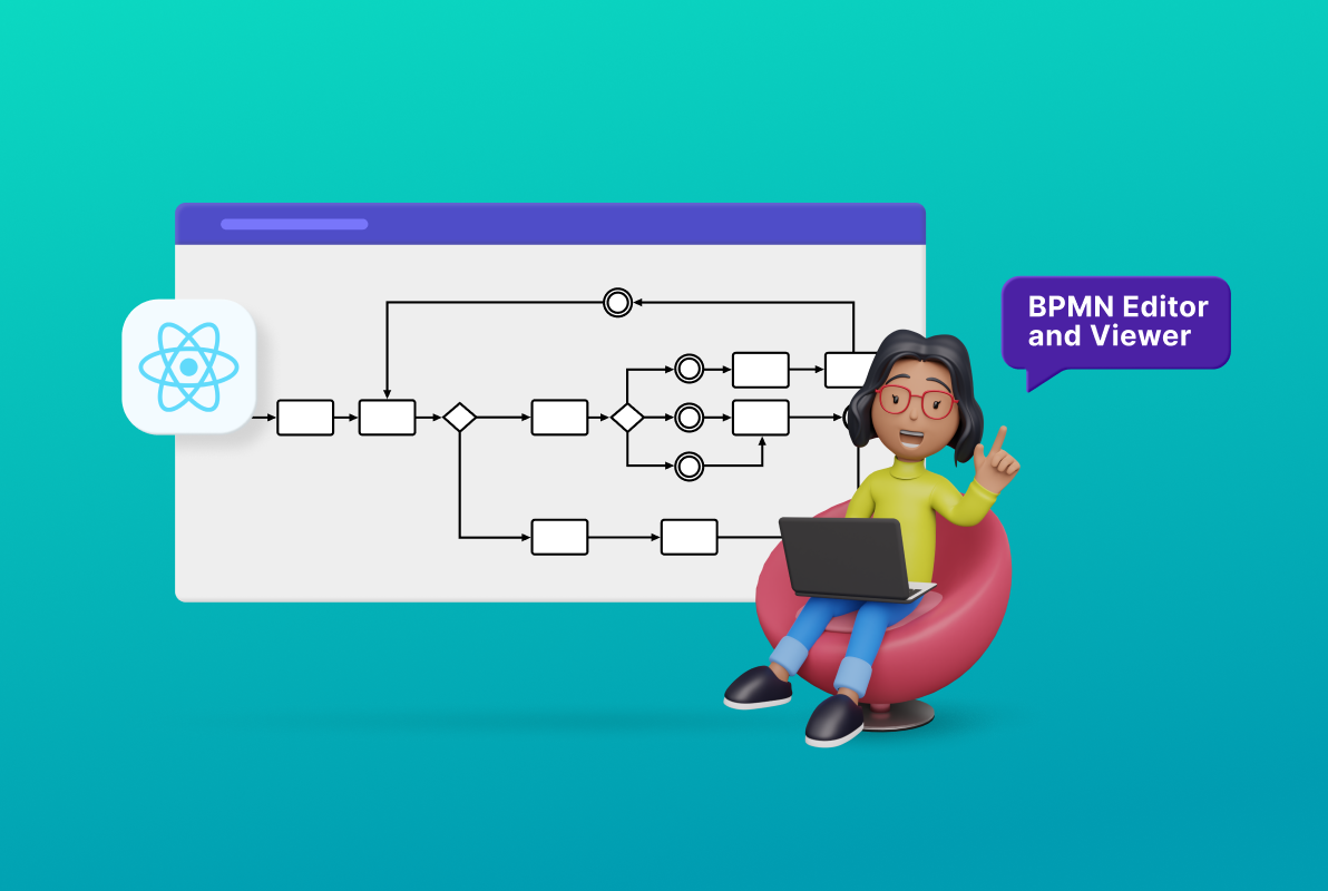
A business process model and notation (BPMN) diagram creates a visual representation of a complex business process in a form similar to a flowchart. We can share BPMN diagrams across organizations and industries to communicate the necessary information to complete a process.
In this blog, we’ll see how to create a BPMN viewer and editor with an interactive user interface using the Syncfusion React Diagram control.
Prerequisites
- Install Node.JS version – 14.15.1/14.17.3
BPMN shapes
The BPMN shapes are used to represent internal business processes in a graphical notation. They enable you to communicate procedures in a standard manner. These shapes are popular and intuitive graphics that can be easily understood by all stakeholders, including business users, business analysts, software developers, and data architects.
The React Diagram control supports the following BPMN shapes.
| Shape | Symbol | Description |
| Event |  | Represents something that happens during a business process. |
| Gateway |  | Used to control the flow of a process. |
| Activity |  | Describes the kind of work being done in a particular process instance. |
| Message |  | The content of a communication. |
| DataStore |  | Store or access data associated with a business process. |
| DataObject |  | Represents information flowing with the process. Examples: Data placed into a process, data resulting from a process, or data that needs to be collected or stored. |
| TextAnnotation |  | Points at or references another BPMN shape. |
| Group |  | Organizes tasks or processes that are significant in the overall process. |
| ExpandedSubProcess |  | The extended version of the Group symbol. |
| SequenceFlow | 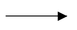 | Represents the typical path between two flow objects. |
| ConditionalSequenceflow |  | Controls the flow of a process based on certain conditions. |
| DefaultSequenceFlow | 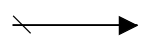 | Represents the default sequence flow and that other conditional flows are not valid. It is indicated by a backslash at the beginning of the sequence. |
| Association | 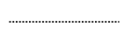 | Represents a relationship between artifacts and flow objects. |
| DirectionalAssociation | 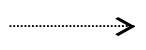 | A directional association is used with data objects to show that a data object is either an input or output from an activity. This is represented as a dotted graphical line with an arrow at one end. |
| BiDirectionalAssociation | 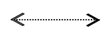 | A bidirectional association is used with data objects to show that a data object is both input and output from an activity. This is represented as a dotted graphical line with arrows at both ends. |
| MessageFlow | 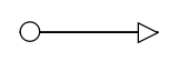 | Shows the flow of messages between two participants. |
| InitiatingMessageflow | 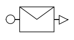 | Represents an activity or event in one pool that can initiate a message to another pool. |
| NonInitiatingMessageflow | 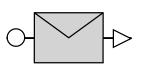 | Represents an activity or event in one pool that can’t initiate a message to another pool. |
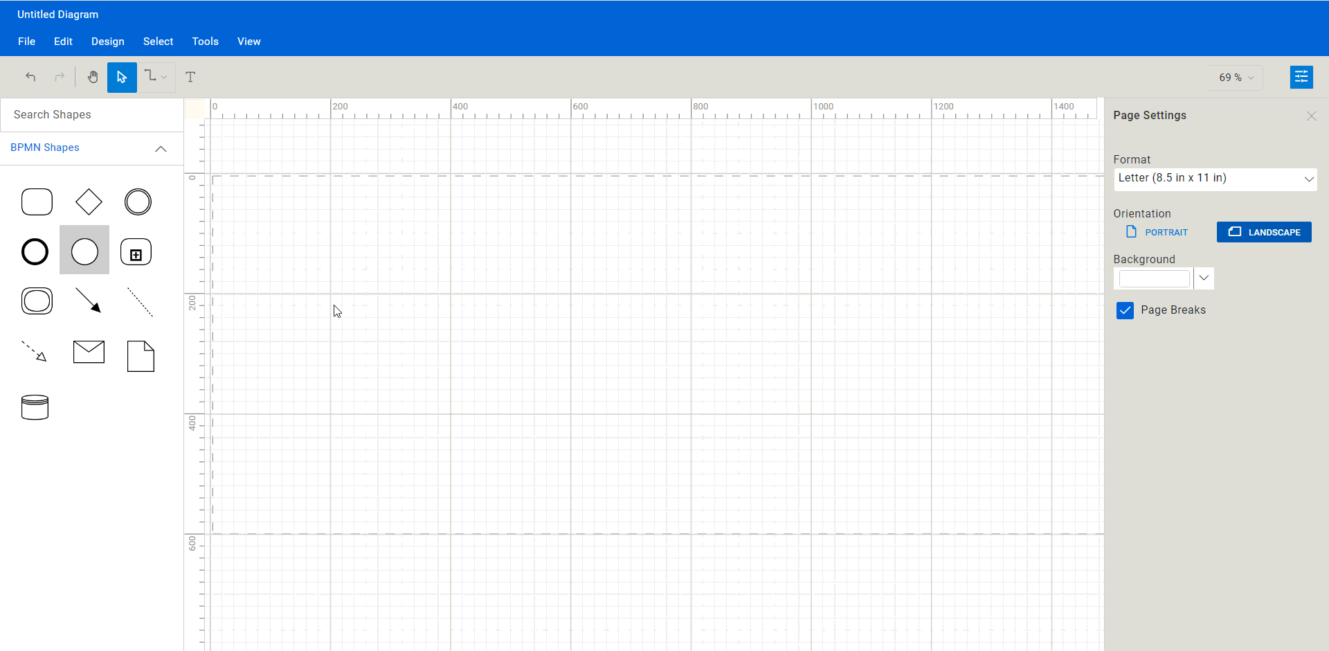
Create the BPMN editor surface
Note: If you are new to our React Diagram control, please refer to the Getting Started documentation before proceeding.
Follow these steps to add a Syncfusion React Diagram control to your web application.
Step #1: Create a folder and name it BPMN Editor.
Step #2: Open your terminal or command prompt. Then, run the following command to install the Create React App NPM package globally.
npm install -g create-react-app
Step #3: Create a new React app using the following command.
npx create-react-app bpmn-editor
Step #4: Change your working directory to the newly created app.
cd bpmn-editor
Step #5: To see your app in action, start a development server using the following command.
npm start
This will open your app in your default web browser at http://localhost:3000.
Step #6: Then, open the package.json file and add the following dependency packages.
"dependencies": {
    "@syncfusion/ej2-react-base": "*",
    "@syncfusion/ej2-react-buttons": "*",
    "@syncfusion/ej2-react-diagrams": "*",
    "@syncfusion/ej2-react-dropdowns": "*",
    "@syncfusion/ej2-react-inputs": "*",
    "@syncfusion/ej2-react-lists": "*",
    "@syncfusion/ej2-react-navigations": "*",
    "@syncfusion/ej2-react-popups": "*",
    "@syncfusion/ej2-react-splitbuttons": "*",
    "@testing-library/jest-dom": "^5.16.5",
    "@testing-library/react": "^13.4.0",
    "@testing-library/user-event": "^13.5.0",
    "react": "^18.2.0",
    "react-dom": "^18.2.0",
    "react-scripts": "5.0.1",
    "web-vitals": "^2.1.4"
},
Step #7: Use the following command to install all the dependent packages.
npm install
Step #8: Add the dependent scripts and style CDN reference links in the index.html file.
<head>
.........
.........
.........
<link href="https://cdn.syncfusion.com/ej2/20.4.38/fluent.css" rel="stylesheet">
<link href="https://cdn.syncfusion.com/ej2/ej2-react-buttons/styles/fluent.css" rel="stylesheet">
<link href="https://maxcdn.bootstrapcdn.com/bootstrap/3.3.7/css/bootstrap.min.css" rel="stylesheet">
<link href="https://cdn.syncfusion.com/ej2/20.4.38/ej2-base/styles/fluent.css" rel="stylesheet">
<link href="https://cdn.syncfusion.com/ej2/20.4.38/ej2-react-popups/styles/fluent.css" rel="stylesheet">
<link href="https://cdn.syncfusion.com/ej2/20.4.38/ej2-react-splitbuttons/styles/fluent.css" rel="stylesheet">
<link href="https://cdn.syncfusion.com/ej2/20.4.38/ej2-react-navigations/styles/fluent.css" rel="stylesheet">
<link href="https://cdn.syncfusion.com/ej2/20.4.38/ej2-react-inputs/styles/fluent.css" rel="stylesheet">
<link href="https://cdn.syncfusion.com/ej2/20.4.38/ej2-react-dropdowns/styles/fluent.css" rel="stylesheet">
<link href="index.css" rel="stylesheet">
<link href="./assets/Diagram_Builder_Icon/style.css" rel="stylesheet">
<link href="./assets/index.css" rel="stylesheet">
<link href="./assets/dbstyle/diagrambuilder.css" rel="stylesheet" />
<script src="https://cdn.syncfusion.com/ej2/syncfusion-helper.js" type="text/javascript"></script>
<script src="https://cdn.syncfusion.com/ej2/20.4.38/dist/ej2.min.js" type="text/javascript"></script>
.........
.........
.........
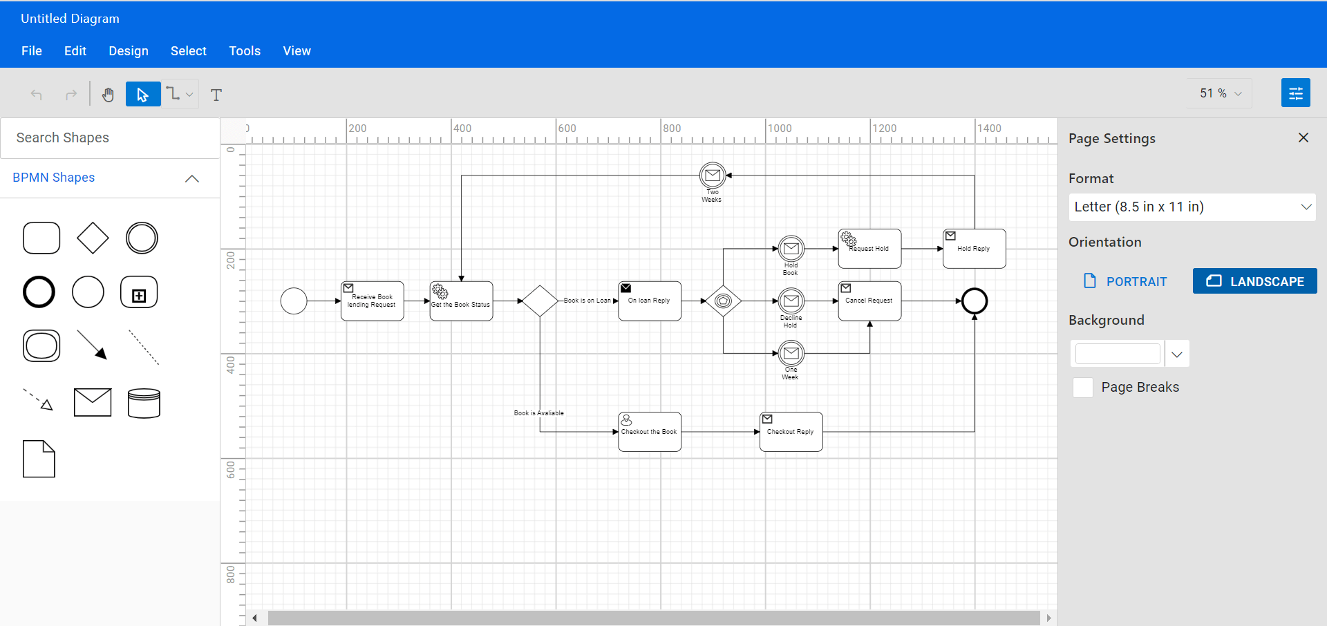
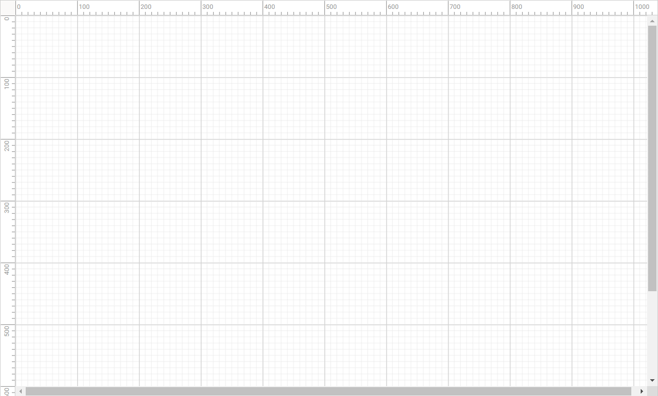
</head>Step #9: To include the Diagram component in your React app, import the DiagramComponent from the ej2-react-diagrams package. Then, pass the required arguments, such as the width, height, and the collection of nodes and connectors to be included in the diagram in the App.js file.
// Iinitialize diagram.
<div id="diagramContainerDiv" className='db-current-diagram-container'>
  <DiagramComponent ref={diagram => (this.diagram = diagram)}
                 id="diagram"
                 width={"100%"}
                 height={"100%"}
                 rulerSettings={this.rulerSettings}
                 pageSettings={this.pageSettings}
                 nodes={this.nodes}
                 connectors={this.connectors}
                 getNodeDefaults={this.getNodeDefaults.bind(this)}
                 getConnectorDefaults={this.getConnectorDefaults.bind(this)}
               />
 </div>
Refer to the following image.
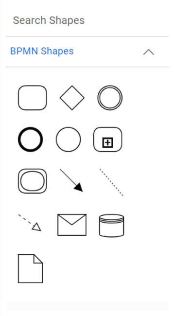
Create reusable BPMN symbols
The React Diagram control provides a gallery of reusable nodes and connectors called SymbolPalette. It displays a collection of palettes, and each palette shows a set of nodes and connectors. We can drag them onto the diagram canvas any number of times.
Follow these steps to create a Diagram symbol palette with BPMN shapes.
Step #1: Initialize the Syncfusion Diagram’s symbol palette by calling the ej.Diagram.Palette() constructor method. Pass the required arguments, such as the width, height, and the collection of symbols to be included in the palette.
<div className='sidebar show-overview'>
   <div className="db-palette-parent">
   <SymbolPaletteComponent ref={symbolpalette => (this.symbolpalette) = symbolpalette}
      id="symbolpalette" width="100%" height="100%"
      expandMode={"Mulitiple" }
      allowdrag={true}
      palettes={id: 'bpmnshapes', expanded: true,
                symbols: this.bpmnShapes(), title: 'BPMN Shapes'}
      enableSearch='true'/>
     </div>
 </div>
Step #3: Then, define your palette symbols and customize them as needed.
//Initialize bpmn shapes for symbol palette.
bpmnShapes(){
const symbols = [
    {
        id: 'Task', width: 35, height: 30,
        shape: {
            type: 'Bpmn', shape: 'Activity', activity: {
                activity: 'Task',
            },
        },
    },
    {
        id: 'Gateway', width: 30, height: 30,
        shape: { type: 'Bpmn', shape: 'Gateway',}
    },
    {
        id: 'Intermediate_Event', width: 30, height: 30, shape: {
            type: 'Bpmn', shape: 'Event',
            event: { event: 'Intermediate' }
        },
    },
    {
        id: 'End_Event', width: 30, height: 30,  shape: {
            type: 'Bpmn', shape: 'Event',
            event: { event: 'End' }
        },
    },
    {
        id: 'Start_Event', width: 30, height: 30, shape: {
            type: 'Bpmn', shape: 'Event',
            event: { event: 'Start' }
        },
    },
    {
        id:'Collapsed_Sub-process', width:35,height:30,shape: {
            type: 'Bpmn', shape: 'Activity', activity: {
                activity: 'SubProcess', subProcess: { collapsed: true, boundary: 'Default' }
            },
        },
    },
     {
        id: 'Expanded_Sub-Process', width: 35, height: 30,
        constraints: ej.diagrams.NodeConstraints.Default | ej.diagrams.NodeConstraints.AllowDrop,
        shape: {
            shape: 'Activity', type: 'Bpmn',
            activity: {
                activity: 'SubProcess', subProcess: {
                    type: 'Transaction', collapsed: false,
                    processes: [], transaction: {
                        cancel: { visible: false }, failure: { visible: false }, success: { visible: false }
                    }
                }
            }
        },
    },
    {
        id:'Sequence_Flow',
        sourcePoint: { x: 0, y: 0 }, targetPoint: { x: 30, y: 30 },
        type: 'Straight',targetDecorator:{shape:'Arrow',style:{fill:'black'}},
        shape: { type: 'Bpmn', flow: 'Sequence',sequence: 'Normal'
        },
    },
    {
        id:'Association_Flow',
        sourcePoint: { x: 0, y: 0 }, targetPoint: { x: 30, y: 35 },
        type: 'Straight',style:{strokeDashArray:"2 2"},
        targetDecorator:{shape:'None'},sourceDecorator:{shape:'None'},
        shape: { type: 'Bpmn', flow: 'Association',association:'Default'},
    },
    {
        id:'Message Flow',
        sourcePoint: { x: 0, y: 0 }, targetPoint: { x: 30, y: 22 },type: 'Straight',
        sourceDecorator:{shape:'None'},targetDecorator:{shape:'Arrow',style:{fill:'white'}},
        style:{strokeDashArray:'4 4'}
    },
    {
        id: 'Message', width: 35,
        height: 25,shape: { type: 'Bpmn', shape: 'Message',},
      },
        {
        id:'Data_Source', width:30,height:28, shape: {
            type: 'Bpmn', shape: 'DataSource',
        }
    },
    {
        id: 'Data_Object', width: 30, height: 35,
        shape: { type: 'Bpmn', shape: 'DataObject', dataObject: { collection: false, type: 'None' } },
    },]

]
return symbols;
};
Refer to the following image.
Create the BPMN diagram
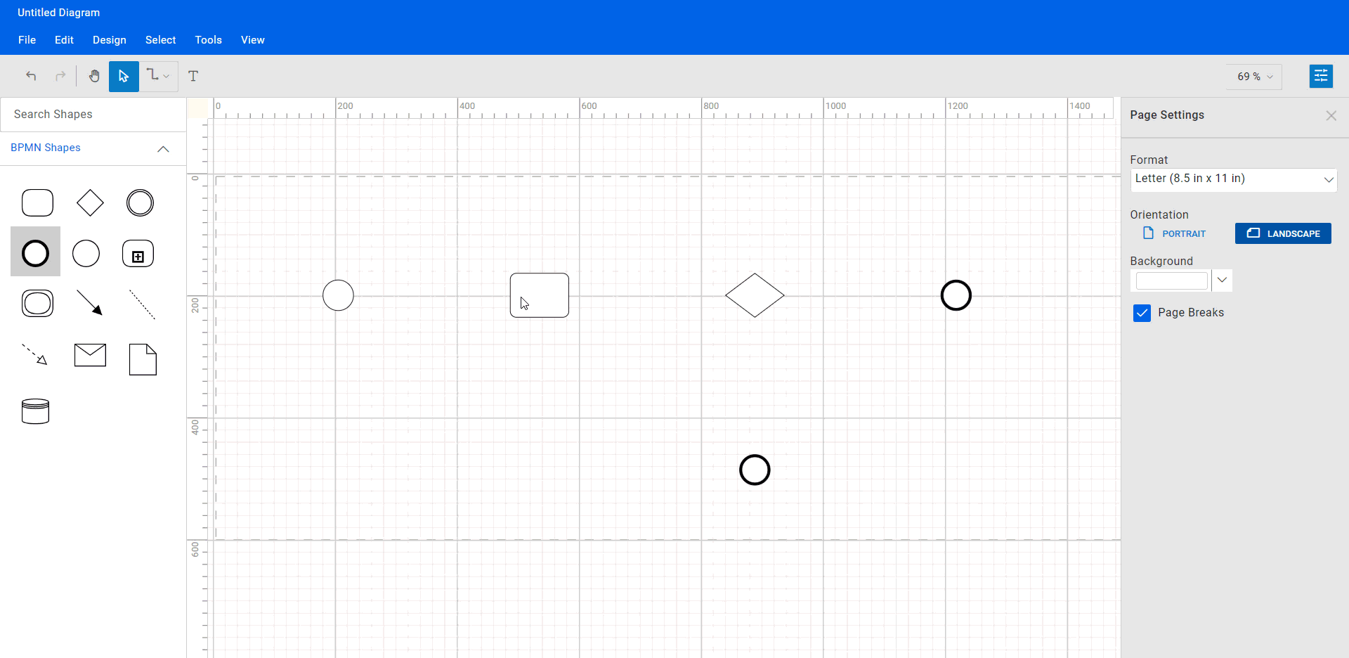
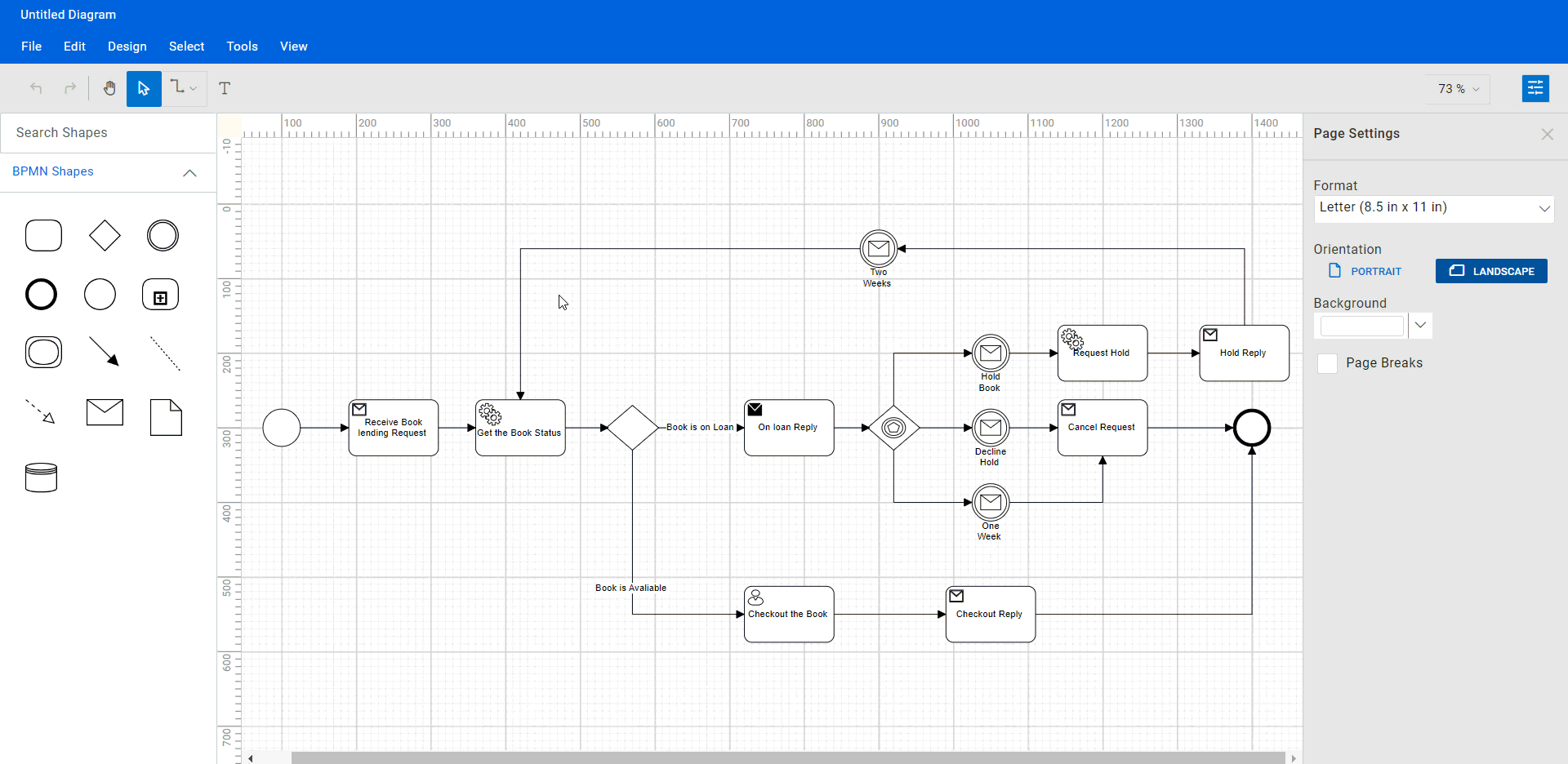
Now, we can easily create the BPMN diagram by dragging the BPMN symbols from the symbol palette, dropping, arranging, and connecting them.
Step #1: Add BPMN shapes to the editor
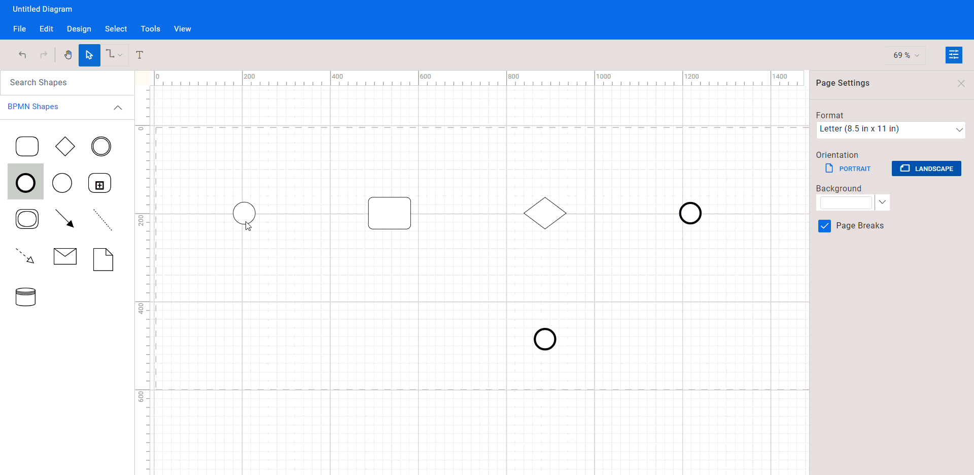
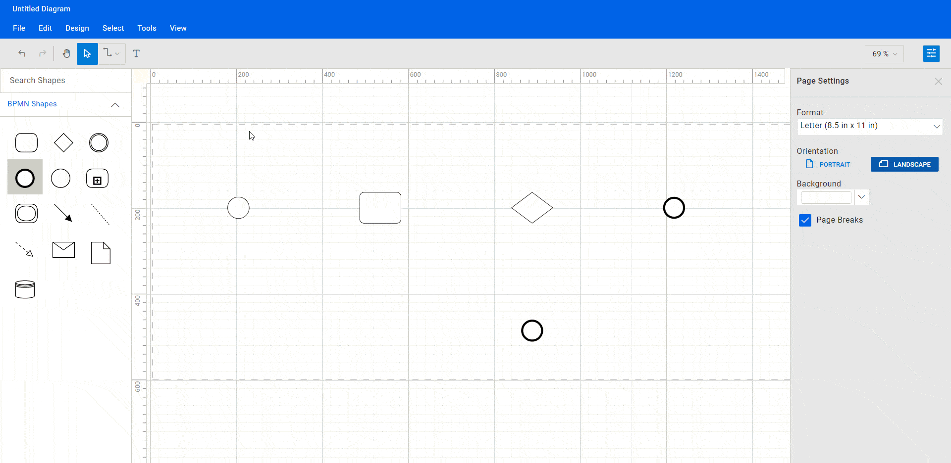
To create a BPMN diagram, start by dragging symbols from the BPMN shapes symbol palette onto the diagramming canvas. Arrange the symbols in a way that makes it clear where the start and end points of the business process are, as well as how the various nodes are connected.
By organizing the symbols in a clear and logical order, you can help readers understand where to begin and how to follow the flow of the process.
Refer to the following GIF image.
It’s important to choose the correct symbols for each task or event, as each symbol represents a specific meaning in the BPMN notation. For example, a task is represented by a rectangle with rounded corners, while a start event is represented by a circle.
In a React Diagram control, you can right-click on a BPMN shape to access the shortcut menu and view or modify the shape’s underlying data or attributes. By changing the attributes of a shape, you can customize its appearance and the information associated with it.
For example, you can specify the type of task that will be performed using the task shape’s properties. There are several task types available, including user, service, and receive. To change the task type for a task shape, right-click on the shape, select Task Type from the shortcut menu, and then choose the desired task type.
Once you have selected a new task type, the appearance of the task shape will change to reflect the selected type. For example, the user-type task will have a small sketch of a person in the upper left corner, indicating that it is a user-defined task.
Refer to the following GIF image.
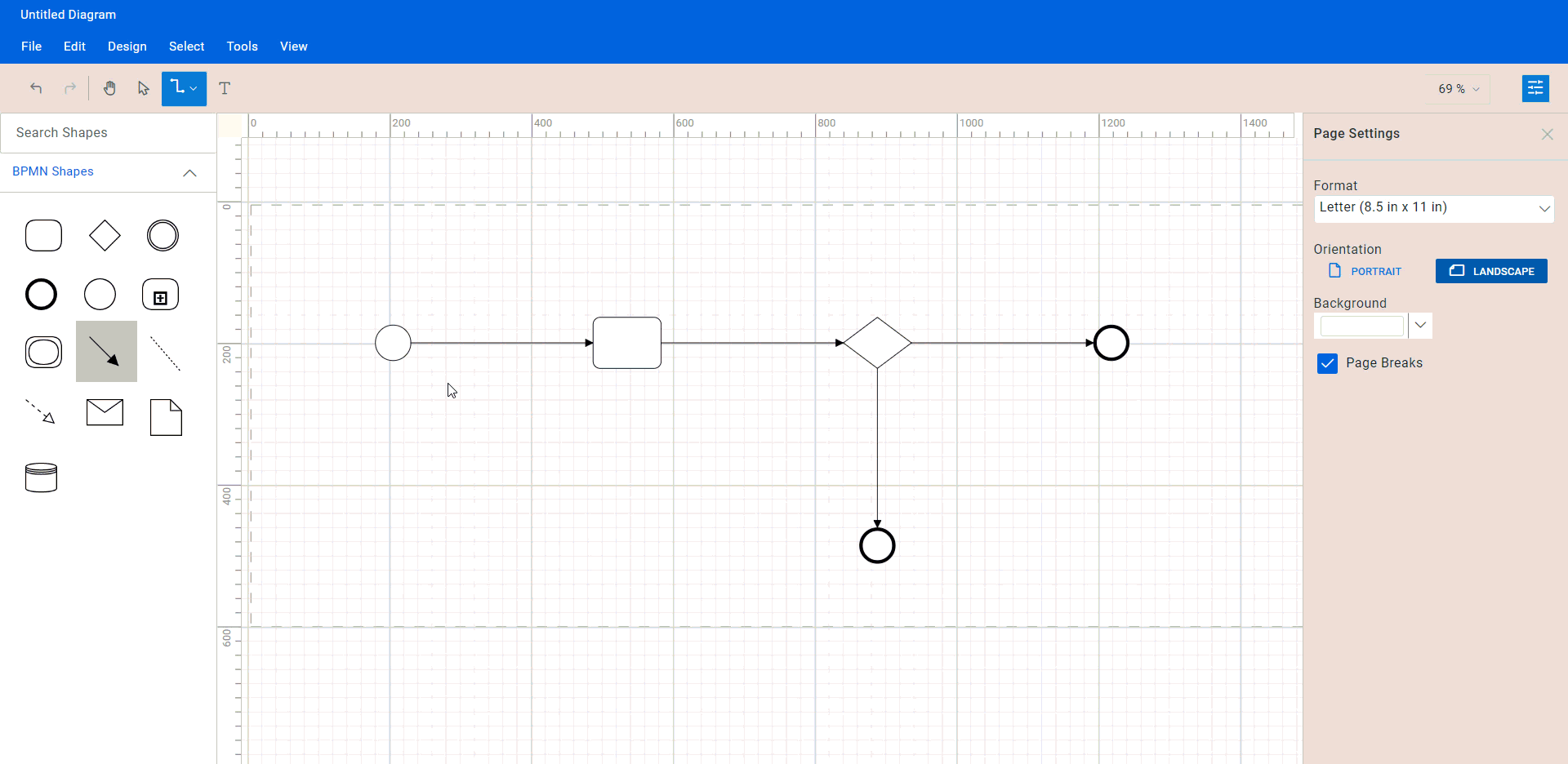
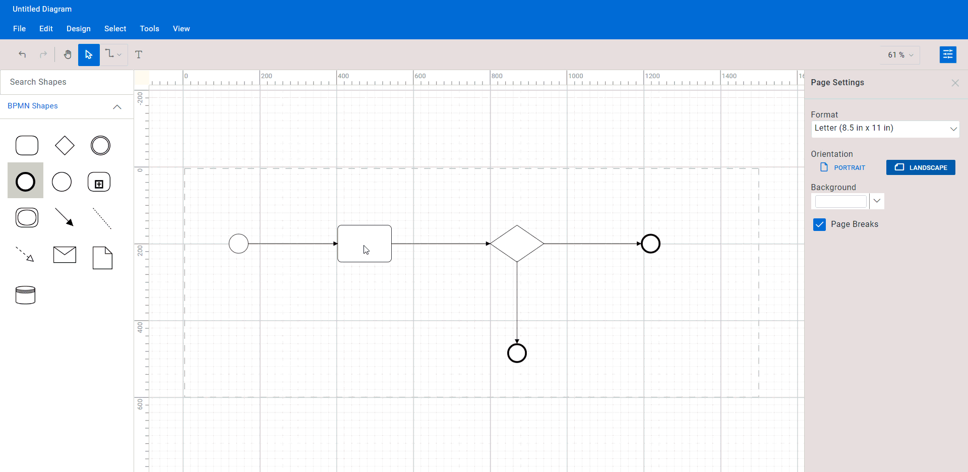
Step #2: Connect BPMN shapes
While creating a BPMN diagram, it is essential to connect diagram shapes to demonstrate the relationship among them. The React Diagram control has features that make this process simple and straightforward using the draw user handle and connector tools.
The draw user handle is a small icon that appears on each diagram shape when it is selected. You can use this feature to create a connection between two shapes quickly. To do so, simply click and drag the draw user handle icon from the first shape and drop it onto the second shape. A connector will automatically be created between the two shapes.
Refer to the following GIF image.
If you prefer to use the connector tool, you can easily access it from the toolbar or by using the Tools > Connector Tool menu option. To use this tool, simply select it, click on the first shape you want to connect, and then drag your mouse to the second shape. When you release the mouse, a connector will be created between the two shapes.
After creating the connectors, you can customize their appearance by changing the style, color, and thickness of the lines. To select and move the shapes and connectors in your diagram, switch back to the Pointer tool by clicking the icon in the toolbar.
In the React Diagram control, you can change the type of connector in a BPMN diagram by right-clicking the connector and selecting the desired type from the context menu. By default, all connectors created using the draw user handle or connector tool are sequence flow connectors.
You can right-click the connector and select the desired type from the shortcut menu. For example, if you want to change a sequence flow connector to a message flow connector, you can right-click on the connector and select Message Flow from the options. Once you have changed the type of connector, the appearance of the connector will change to reflect the new type. For example, a message flow connector will have an arrowhead at each end, whereas an association connector will have a dotted line.
Note: For more details, refer to the BPMN Flows in React Diagram control documentation.
Step #3: Add labels to BPMN shapes.
You can provide additional information and make the diagram more informative by adding labels to the shapes.
To add labels to a BPMN shape, simply double-click on the shape or select it and press the F2 key. This will open a text box where you can type the required text. After entering the text, you can either press the Esc key or deselect the node to close the text box.
Refer to the following GIF image.
Step #4: Load and save Diagram.
The React Diagram control provides a useful feature that allows you to save your work and resume it later by loading the saved diagram back onto the diagram canvas.
To save your current diagram, simply go to the File menu and select Save, which will save your diagram as a file on your local drive.
To load an existing diagram file, go to File -> Open. This will open the file dialog box. From there, you can browse and select the saved diagram file that you want to load.
This feature provides great flexibility and convenience, allowing you to pick up where you left off on a diagram or to make changes to a previously saved diagram. It’s an essential feature for any diagramming app that enables users to create and manage complex diagrams.
Refer to the following GIF image.
Note: For more details, refer to the loading and saving diagrams in the React Diagram control documentation.
Step #5: Undo or redo the diagram action
The React Diagram control supports undo and redo operations, tracking the changes made to a diagram. You can use these features to delete a mistake or restore an action you previously undid.
To undo an action, use the Ctrl + Z keyboard shortcut, click the Undo button, on the toolbar, or use the Undo command from the Edit menu. This will undo the most recent action that was performed.
To redo an action that has been undone, you can use the Ctrl + Y keyboard shortcut, click the Redo button on the toolbar, or use the Redo commands from the Edit menu. This will redo the most recently undone action.
Step #6: Export the BPMN diagram
The React Diagram control allows you to export the diagram as an image file in different formats, such as JPEG, PNG, and SVG. By exporting the diagram as an image file, you can easily share it via email or other digital means or embed it in a document or presentation.
To do this, click on the File menu and select Export. A dialog box will appear where you can specify the name and file format of the image. In addition, you can choose to export only the content area of the diagram by excluding the blank areas or export the entire diagram (including blank areas) based on the width and height specified in the page settings.
Step #7: Print the BPMN diagram
To print a diagram, click the File menu and select Print. This will open the print dialog box, where you can select your printer and customize the print settings, such as orientation, paper size, and page margins. Once you have configured the print settings, click Print to print the BPMN diagram.
Step #8: Pan and zoom the BPMN diagram
The React Diagram control supports the following panning and zooming options.
Pan using the scrollbars: The most straightforward way to pan a diagram is by using the scrollbars on its right and bottom sides.
Pan using the mouse wheel: You can also pan a diagram by using the mouse wheel. To scroll up or down, rotate the mouse wheel forward or backward; to scroll left or right, hold the Shift key while rotating the scroll wheel forward or backward.
Pan using the pan tool: By selecting the pan tool from the toolbar, you can pan a diagram. Then, hold down the left mouse button and drag the mouse to move the diagram in any direction.
Zoom using keyboard shortcuts: The most efficient way to zoom in and out of a diagram is to use the Ctrl + shortcut.
Zoom using the toolbar option: Another way to zoom in or out in a diagram is to use the zoom dropdown located in the upper-right corner of the app window. In the zoom dropdown, you can set the zoom level to a specific percentage or fit the entire diagram to the window.
References
For more details, refer to the web and GitHub demos for the BPMN editor and viewer using React Diagram.
Conclusion
Thanks for reading! In this blog, we’ve explored how to create an interactive BPMN editor using the powerful and versatile features of the Syncfusion React Diagram control. With this tool, you can now easily demonstrate complex business workflows with ease. Try it out and leave feedback in the comments section below!
In addition to creating interactive BPMN viewers and editors, the Syncfusion Diagram control offers a variety of features that make it well-suited for creating editors for other types of diagrams, including organizational charts, flowcharts, mind maps, floor plans, network diagrams, or logic circuit diagrams. Feel free to have a look at our online examples and documentation to explore the many other features and functionalities of the Syncfusion React Diagram control.
If you’re an existing Syncfusion user, the newest version of Essential Studio is available for download from the License and Downloads page. Alternatively, if you’re new to Syncfusion, you can take advantage of our 30-day free trial to explore the features and capabilities of our products.
You can reach out to us through our support forum, support portal, or feedback portal. Our team is committed to providing prompt and comprehensive support to ensure a seamless and enjoyable experience with our products.