
 Hari Venkatesh E
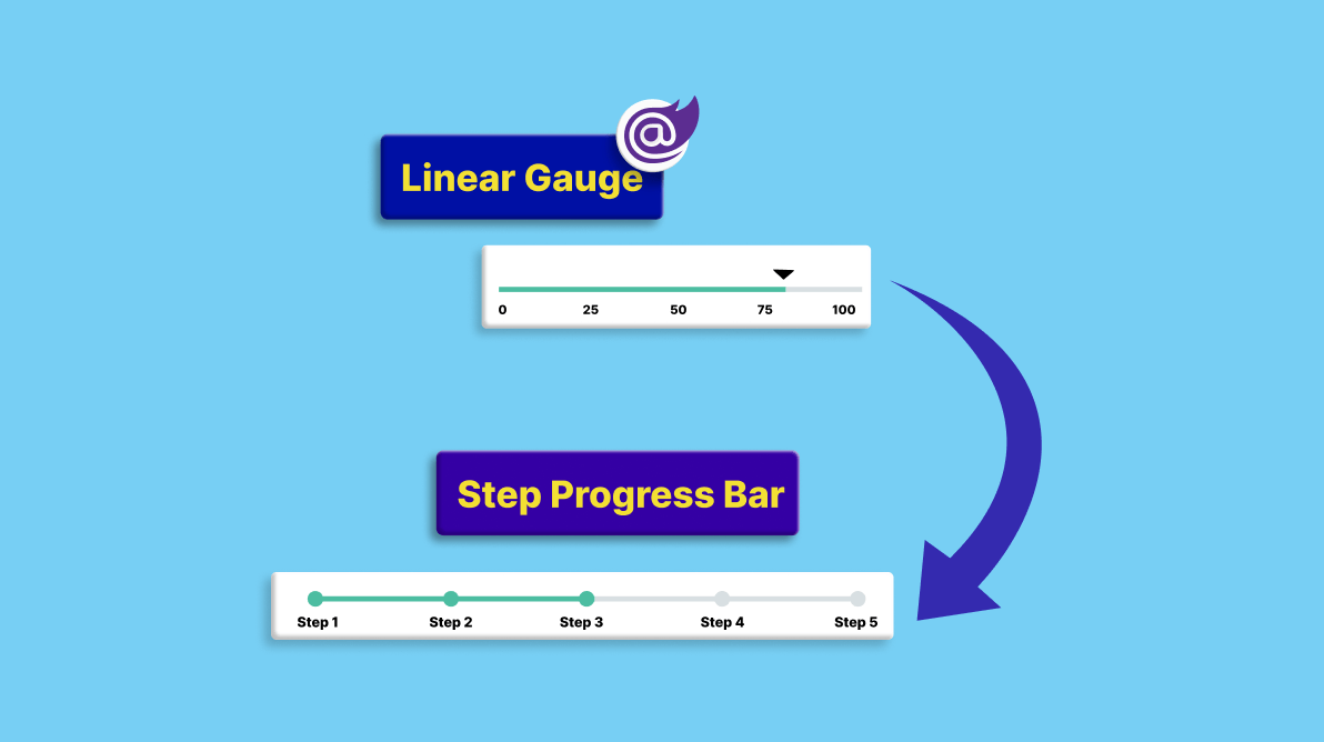
As developers, we can effectively reconstruct a specific component by changing the appearance of our component’s sub-elements.
To demonstrate, this blog will customize the appearance of the Syncfusion Blazor Linear Gauge component to replicate a step progress bar component.
Let’s get started!
Blazor Linear Gauge: An overview
The Blazor Linear Gauge visually represents data on a horizontal or vertical scale with a pointer or multiple pointers indicating specific values. It is used to design real-time apps such as thermometers, sound boards, and battery indicators.
Its key features are:
- Axis: An axis is a vertical or horizontal line or scale that helps display numerical values at regular intervals.
- Major ticks: The major ticks are line strokes, like in a ruler, that indicate the major intervals of the numeric values.
- Minor ticks: The smaller line strokes between the major ticks are known as minor ticks.
- Range: A range is a visual element that lets you quickly determine the data points between a start and end on the axis. Also, multiple ranges with different styles can be added.
- Pointer: A pointer indicates the appropriate resultant value on an axis. The pointer indicator can be a circle, triangle, diamond, bar, or an image.
- Labels: A label displays appropriate text identifying the intervals.
- Annotation: An annotation can display anything, such as a table, an image, or HTML DOM elements, at the desired location in and around the Linear Gauge’s container. Multiple annotations can be added.
Note: For more details, refer to the Getting started with Blazor Linear Gauge documentation.
Designing a step progress bar by customizing the Blazor Linear Gauge
Let’s begin customizing the appearance of the Blazor Linear Gauge component to reproduce the following step progress bar structure.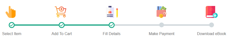
The previous image clearly shows that we need a horizontal line with appropriate images for each step, circle-shaped marker pointers, and labels at regular intervals.
We’ll use the axis ranges, labels, and pointer elements of the Blazor Linear Gauge component, and we don’t need the minor and major ticks, so we must hide them.
Refer to the following code example.
[Index. razor]

@using Syncfusion.Blazor.LinearGauge;

<div align="center">
 <SfLinearGauge Orientation="Orientation.Horizontal" Width="70%">
  <LinearGaugeAnnotations>
   <LinearGaugeAnnotation AxisValue="5" ZIndex="1" X="-30" Y="-80">
    <ContentTemplate>
     <img src="selectitem.png" style="width:50px;height:50px"><img />
    </ContentTemplate>
   </LinearGaugeAnnotation>
   <LinearGaugeAnnotation AxisValue="10" ZIndex="1" X="-30" Y="-80">
    <ContentTemplate>
     <img src="addtocart.png" style="width:50px;height:50px"><img />
    </ContentTemplate>
   </LinearGaugeAnnotation>
   <LinearGaugeAnnotation AxisValue="15" ZIndex="1" X="-24" Y="-80">
    <ContentTemplate>
     <img src="filldetails.png" style="width:50px;height:50px"><img />
    </ContentTemplate>
   </LinearGaugeAnnotation>
   <LinearGaugeAnnotation AxisValue="20" ZIndex="1" X="-25" Y="-80">
    <ContentTemplate>
     <img src="makepayment.png" style="width:50px;height:50px"><img />
    </ContentTemplate>
   </LinearGaugeAnnotation>
   <LinearGaugeAnnotation AxisValue="25" ZIndex="1" X="-24" Y="-80">
    <ContentTemplate>
     <img src="downloadebook.png" style="width:50px;height:50px"><img />
    </ContentTemplate>
   </LinearGaugeAnnotation>
  </LinearGaugeAnnotations>

  <LinearGaugeEvents AxisLabelRendering="AxisLabelChange" />
   <LinearGaugeAxes>
    <LinearGaugeAxis Minimum="5" Maximum="25" OpposedPosition="true">
     <LinearGaugeLine Width="5" />
     <LinearGaugeMajorTicks Height="0" />
     <LinearGaugeMinorTicks Height="0" />
     <LinearGaugeAxisLabelStyle Offset="24">
      <LinearGaugeAxisLabelFont FontFamily="inherit" Size="16px" />
     </LinearGaugeAxisLabelStyle>
     <LinearGaugePointers>
      <LinearGaugePointer PointerValue="5" Height="25" Width="25" Placement="Placement.Near" MarkerType="MarkerType.Image" ImageUrl="https://blazor.syncfusion.com/demos/_content/blazor_server_common_net7/images/linear-gauge/tick-icon.png" />
      <LinearGaugePointer PointerValue="10" Height="25" Width="25" Placement="Placement.Near" MarkerType="MarkerType.Image" ImageUrl="https://blazor.syncfusion.com/demos/_content/blazor_server_common_net7/images/linear-gauge/tick-icon.png" />
      <LinearGaugePointer PointerValue="15" Height="25" Width="25" Placement="Placement.Near" MarkerType="MarkerType.Image" ImageUrl="https://blazor.syncfusion.com/demos/_content/blazor_server_common_net7/images/linear-gauge/tick-icon.png" />
      <LinearGaugePointer PointerValue="20" Height="25" Width="15" Placement="Placement.Center" Position="Position.Cross" Color="#D1D9DD" MarkerType="MarkerType.Circle" Offset="-2" />
      <LinearGaugePointer PointerValue="25" Height="25" Width="15" Placement="Placement.Center" Position="Position.Cross" Color="#D1D9DD" MarkerType="MarkerType.Circle" Offset="-2" />
     </LinearGaugePointers>
     <LinearGaugeRanges>
      <LinearGaugeRange Start="5" End="10" StartWidth="5" EndWidth="5" Color="#1FAC8A" />
      <LinearGaugeRange Start="10" End="15" StartWidth="5" EndWidth="5" Color="#1FAC8A" />
      <LinearGaugeRange Start="15" End="20" StartWidth="5" EndWidth="5" Color="#D1D9DD" />
      <LinearGaugeRange Start="20" End="25" StartWidth="5" EndWidth="5" Color="#D1D9DD" />
     </LinearGaugeRanges>
   </LinearGaugeAxis>
  </LinearGaugeAxes>
 </SfLinearGauge>
</div>

@code {
    private void AxisLabelChange(AxisLabelRenderEventArgs args)
    {
        if (args.Text == "5")
            args.Text = "Select Item";
        else if (args.Text == "10")
            args.Text = "Add To Cart";
        else if (args.Text == "15")
            args.Text = "Fill Details";
        else if (args.Text == "20")
            args.Text = "Make Payment";
        else if (args.Text == "25")
            args.Text = "Download eBook";
        else
            args.Text = " ";
    }
}
Here are the key points to take from the previous code example:
- The Height property of the major and minor ticks is set to 0 to hide them.
- We’ve given the intervals 5, 10, 15, 20, and 25 as numeric values in the ranges but still labeled them Select Item, Add To Cart, Fill Details, Make Payment, and Download eBook to represent what the interval means.
- The first three intervals have an image pointer marker type, while the last two have a circle pointer marker type. To effectively place those pointers over the axis, the properties Placement, Position, and Offset are used.
- Annotation support is used to position the images to illustrate the labels.
Refer to the following output image.
Note:
- Animation isn’t possible with this customization.
- To see dynamic updates, the data in the APIs must be updated, and then the step progress bar will be refreshed.
References
For more details, refer to the demos on GitHub and our web site.
Conclusion
Thanks for reading! In this blog, we’ve explored how to customize the Blazor Linear Gauge to create a step progress bar with ease. In this way, you can also create a simple progress bar, slider, and a few other small components. Try out them and leave your feedback in the comments section below!
If you want to try out our Blazor components, download the latest version from our License and Downloads page. If you’re not yet a Syncfusion customer, we offer a 30-day free trial so you can explore all our features.
For questions, you can also contact us through our support forum, support portal, or feedback portal. We’re always here to help you!


 No spam, just valuable updates.