Blazor Linear Gauge - A Rich, Animated Gauge Component
- Easily visualize numeric values on a linear scale with features like multiple axes and orientations.
- Customize the appearance of gauges completely to simulate a thermometer, pressure gauge, ruler, etc.
- Display the Linear Gauge in vertical or horizontal orientation.
Quick Overview Video
Trusted by the world’s leading companies

Overview
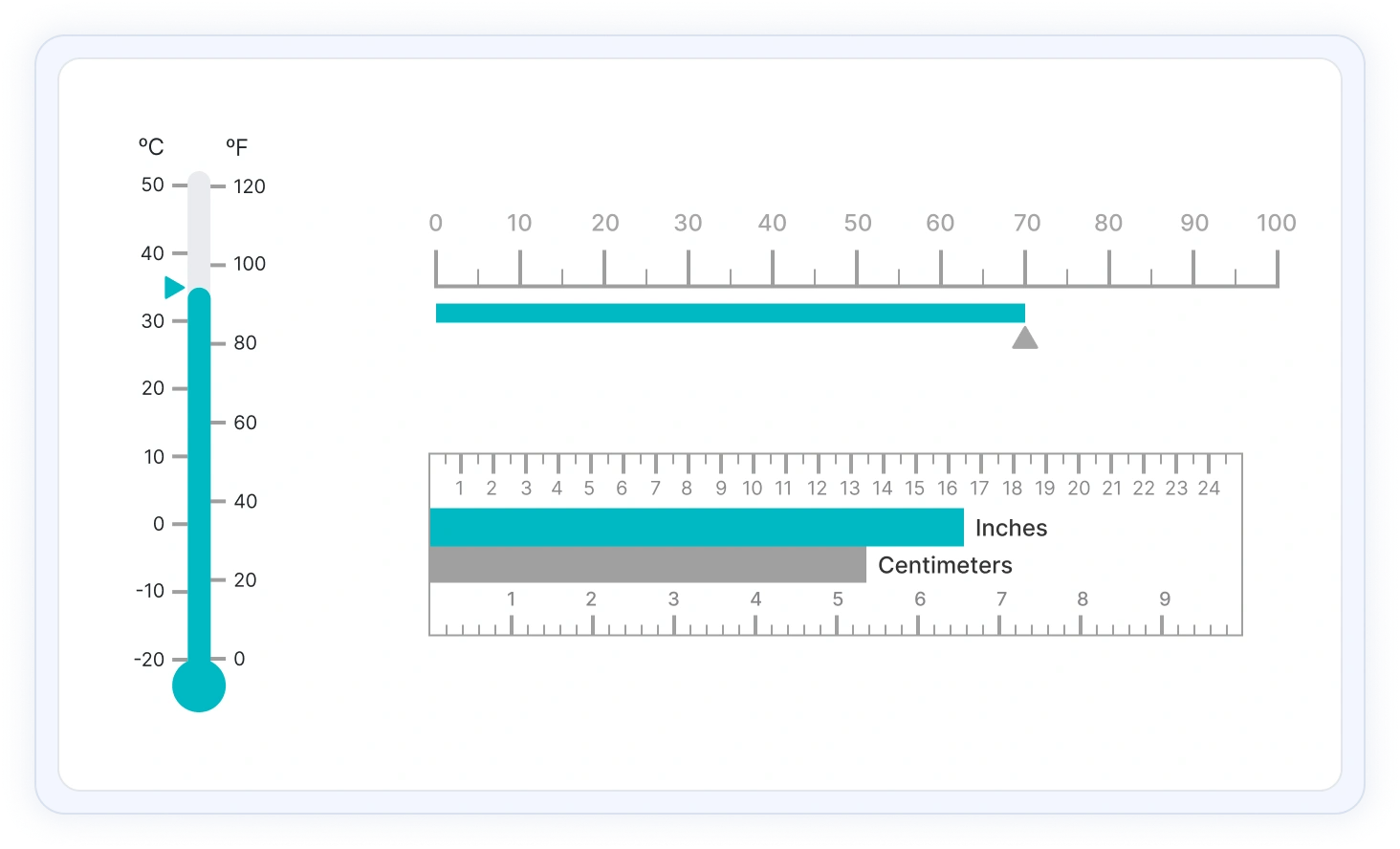
The Blazor Linear Gauge is an ideal component for visualizing numeric values on a linear scale with features like multiple axes and orientations. Completely customize the appearance of the gauge to simulate a thermometer, pressure gauge, ruler, etc.
Blazor Linear Gauge Code example
Easily get started with the Blazor Linear Gauge using a few simple lines of C# code as demonstrated below. Also explore our Blazor Linear Gauge Example which shows you how to include the Blazor Linear Gauge component with highlight customization.
@using Syncfusion.Blazor.LinearGauge;

<SfLinearGauge Orientation="Orientation.Horizontal" AnimationDuration="3000">
    <LinearGaugeAxes>
        <LinearGaugeAxis>
            <LinearGaugeAxisLabelStyle Offset="48">
                <LinearGaugeAxisLabelFont FontFamily="inherit"></LinearGaugeAxisLabelFont>
            </LinearGaugeAxisLabelStyle>
            <LinearGaugeMajorTicks Color="#9E9E9E" Interval="10" Height="20" />
            <LinearGaugeMinorTicks Color="#9E9E9E" Interval="2" Height="10" />
            <LinearGaugeAnnotations>
                <LinearGaugeAnnotation AxisIndex="0" AxisValue="10" X="10" Y="-70" ZIndex="1">
                    <ContentTemplate>
                        <div style="width: 70px;margin-left: -53%;margin-top: 5%;font-size: 16px;">10 MPH</div>
                    </ContentTemplate>
                </LinearGaugeAnnotation>
            </LinearGaugeAnnotations>
            <LinearGaugePointers>
                <LinearGaugePointer PointerValue="10" Height="15" Width="15" Placement="Placement.Near" Offset="-40" MarkerType="MarkerType.Triangle" />
            </LinearGaugePointers>
            <LinearGaugeRanges>
                <LinearGaugeRange Start="0" End="50" StartWidth="10" EndWidth="10" Color="#F45656" Offset="35" />
            </LinearGaugeRanges>
        </LinearGaugeAxis>
    </LinearGaugeAxes>
</SfLinearGauge>
Orientation
Position the Blazor Linear Gauge either vertically or horizontally. This is helpful when viewing the gauge on mobile devices.

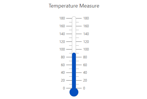
Containers
A container holds the ranges and pointers in a Blazor Linear Gauge. Customize the shape of the container to a rectangle, rounded rectangle, or thermometer.


Axes customization
The gauge axes are linear scales where a set of values can be plotted based on any business logic. You can also easily customize the appearance of the axes.
Label customization
Customize the look and feel of the default labels in the Blazor Linear Gauge by changing the font style, size, and color. Prefix or suffix text can also be added to the labels.
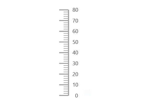
Ticks customization
Define the desired styles for major and minor ticks in the gauge by changing their height, width, and color.
Offset
To enhance readability, change the position of the default axes in the gauge by setting the offset value for labels, ticks, and axis lines.
Axis line
Add a border to the gauge by using axis lines. The appearance of the default axis in the Blazor Linear Gauge can also be customized.
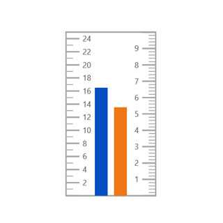
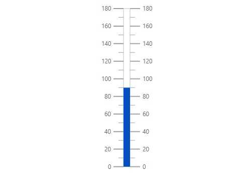
Multiple axes
The Blazor Linear Gauge allows you to add multiple axes to a gauge to design it like a thermometer, ruler, and more.
Inverse axis
Values in Blazor Linear Gauge axes can be reversed.
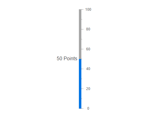
Range customization
A range in a Blazor Linear Gauge is a visual element that helps to visualize where a value falls on the axis quickly.
Range position
Change the position of a range or move it to any place inside the gauge.

Range width
The range width varies based on the values to enhance usage and readability.
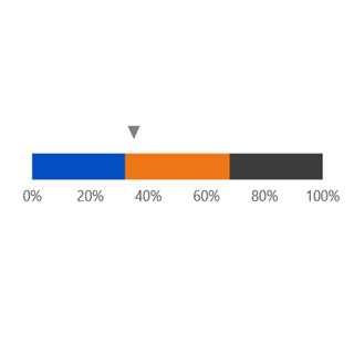
Multiple ranges
Add multiple ranges to the axis to show color variations.
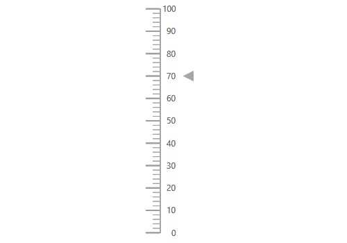
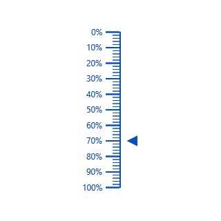
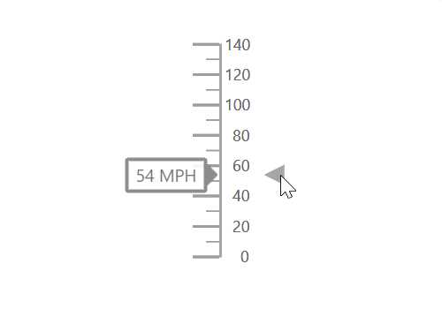
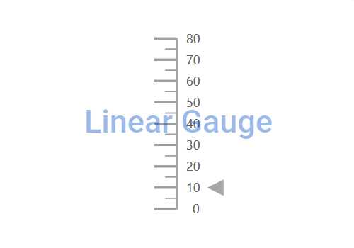
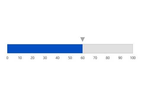
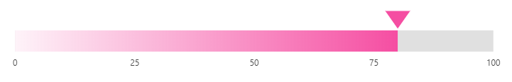
Pointer types
Indicate the values on an axis using pointers. The Blazor Linear Gauge component supports two types of pointers: marker and bar.
Marker pointer
Point out the current value by using the following types of marker pointers.

Pointer type
Change the marker pointer type to built-in inverted triangle, square, or circle shapes to highlight a value.

Marker pointer position
Change or move the marker pointers to any place inside the gauge.
Text pointer
Change the marker pointer type to text to indicate the axis value.
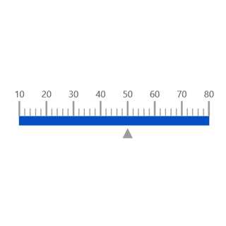
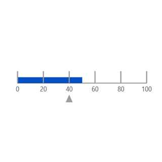
Bar pointer
Use a bar pointer to point to the current value from the start value of the axis.

Pointer position
Change or move the bar pointers to any place inside the gauge graphs.

Multiple pointers
Add more than one bar pointer to the axis to indicate multiple values.
Pointer animation
The Blazor Linear Gauge component is visually appealing with animated transitions. Experience smooth pointer transitions by moving the pointer from one place to another.
Pointer interaction
The interactive Blazor Linear Gauge component provides an option to drag the pointer from one place to another. Swipe gestures are used to control the pointer, and the value is changed at runtime.

Tooltip
The interactive Blazor Linear Gauge displays details about the pointer value when the tooltip hovers over the pointer.
Annotations
Display any HTML element as an annotation at a specific point of interest in the Linear Gauge. You can add multiple annotations in a gauge.
Appearance
The appearance of each element in the Blazor Linear Gauge, such as axes, ranges, axes intervals, pointer positions, label positions, and tick positions can be customized easily.


Gradient color
Colors applied to the range and pointer can change gradually to create a smooth color transition.
Gauge title
Add a title to visualize additional information on the Linear Gauge. You can customize the font of the title.
Touch and browser support
The interactive Linear Gauge component also supports touch interactions.

Touch support
All the features in the Blazor Linear Gauge will work on touch devices with zero configuration. Use the touch features such as tooltip and pointer drag without any customization.

Responsive design
You can view the Blazor Linear Gauge on various devices. It is also possible to hide specific elements in the gauges for particular screen sizes by making a very minimal change in the gauge events.

Cross-browser support
You can render the Blazor Linear Gauge component in all the modern browsers.
Other supported frameworks
The Linear Gauge is also available in our JavaScript, Angular, React, and Vue frameworks, which were built from their own TypeScript libraries:
 145+ UI components
1200+ interactive Blazor demos
8.7M+ downloads
145+ UI components
1200+ interactive Blazor demos
8.7M+ downloads

Not sure how to create your first Blazor Linear Gauge? Our tutorial videos and documentation can help.
I’d love to watch it now I’d love to read it nowBlazor Components – 145+ UI and DataViz Components
ALL COMPONENTS
SMART COMPONENTS
GRIDS
DATA VISUALIZATION
FILE VIEWERS & EDITORS
DROPDOWNS
NAVIGATION
INPUTS
BUTTONS
INTERACTIVE CHAT
Standalone UI SDKs
Integrate the DataGrid, Chart, Scheduler, Gantt, Rich Text Editor, File Manager, and Diagram UI components into applications to enable rich interaction and visualization, delivering a seamless user experience.
Document Solutions
Integrate the PDF Viewer, DOCX Editor, Spreadsheet Editor, and document-processing libraries into the Blazor applications to enable a smooth user experience.
Our Customers Love Us
Having an excellent set of tools and a great support team, Syncfusion® reduces customers’ development time.Here are some of their experiences.

Blazor components
The speed how they adding new Blazor controls and update theirs functionality.
I am using Blazor components. Searching for Blazor components I found that Syncfusion very fast adopted theirs controls for new development platform. Tech support is fast and excellent. The best of best is that they provide free controls for small business.

Igor L,

CEO, Small-Business
Syncfusion objects with a Blazor
I have used some of the Syncfusion objects with a Blazor application. The support group has always been very helpful.

Kris B,
Software Development Consultant, Small-Business
See Real Success Stories
Developers around the world trust Syncfusion’s Essential Studio to simplify complex projects and speed up delivery. With a vast library of UI controls, powerful SDKs, and reliable support, Essential Studio helps teams build enterprise-ready applications with confidence.
Read Our Customer StoriesIndustry
Software development
75% Cost reduction
50% Faster development
Industry
Utilities (oil and gas)
450+ hours saved
Streamlined processes and hours of development effort saved.
Advanced, flexible features
Empowered users through robust and versatile functionality.
Industry
Software and technology
1000+ of hours saved
Accelerated development with enterprise-ready UI components.
Efficient file management
Streamlined workflows with document libraries without building them from scratch.
Industry
Software and technology
2 Years of delay avoided
Two years of delays prevented with proactive planning.
On-time delivery
Projects delivered on schedule using trusted controls.
Industry
IT services and IT consulting
Improved performance
Large datasets handled with easy customization and quick debugging.
Highly customizable
Plug-and-play controls with quick template integration.
Industry
Professional services
Instant access
Quick availability of features and resources.
Reduced dependencies
Fewer dependencies for faster development.
Rated by users across the globe
Syncfusion Blazor Resources
Learning
 Documentation
 Documentation


Awards
Greatness—it’s one thing to say you have it, but it means more when others recognize it. Syncfusion® is proud to hold the following industry awards.

