
 Mageshyadav
The Theme Studio for WPF has been completely revamped to a new structure in our 2020 Volume 2 release. It helps users to transform their visual presentation into a new theme in minutes without any code or designer involvement. The following new, built-in themes have been introduced, providing a rich UI:
- Material Light
- Material Dark
- Material Light Blue
- Material Dark Blue
- Office2019 Colorful
- Office2019 Black
Material and Office 2019 themes in WPF applications
The new Material and Office 2019 themes can be applied to an entire application, resulting in a change in the skin of the framework and the Syncfusion controls, making the application more attractive.
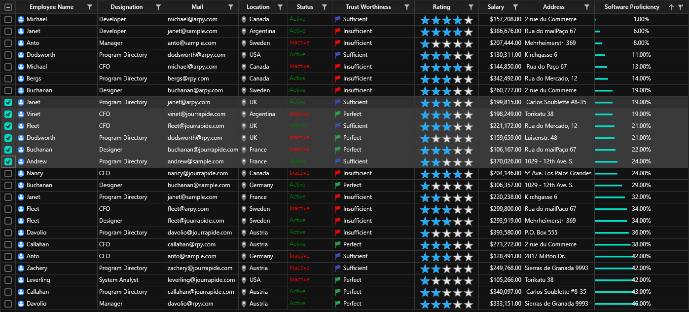
In this section, we will see how to apply these themes to an application step by step using the DataGrid control as an example.
How to apply themes to the Syncfusion WPF DataGrid control in your application
Follow these steps to apply themes to the Syncfusion WPF DataGrid control in your application:
Step 1: Please refer to this link to see how to get started with Syncfusion WPF DataGrid.
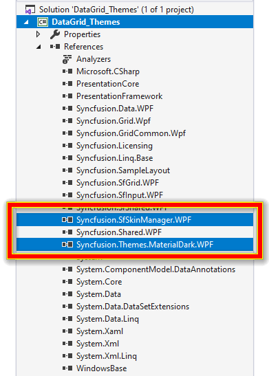
Step 2: Once the DataGrid is created, add the Syncfusion.SfSkinManager.WPF (Skin Manager Framework) assembly, which provides a convenient way to give both framework and Syncfusion controls an appealing appearance.
Step 3: Add the Syncfusion.Theme.MaterialDark.WPF theming assembly (or any other theming assembly of your choice) in order to use the dark theme effect. The libraries can be obtained from:
- Installed Location:
<drive>:\Program Files (x86)\Syncfusion\Essential Studio\WPF\18.2.0.44\Assemblies - Global Assembly Cache (GAC):
<drive>:\Windows\Microsoft.NET\assembly\GAC_MSIL - NuGet Package
Refer to the following screenshot.

Step 4: Now add a reference for the Syncfusion.SfSkinManager.WPF assembly to the application and import the SfSkinManager namespace in the main window.
Refer to the following code example.
<Window x:Class="GettingStarted.MainWindow"
        xmlns="http://schemas.microsoft.com/winfx/2006/xaml/presentation"
        xmlns:x="http://schemas.microsoft.com/winfx/2006/xaml"
        xmlns:local="clr-namespace:GettingStarted"
        xmlns:syncfusion="http://schemas.syncfusion.com/wpf"
	xmlns:syncfusionskin="clr-namespace:Syncfusion.SfSkinManager;assembly=Syncfusion.SfSkinManager.WPF">
Step 5: Finally, set the SfSkinManager‘s attached property, VisualStyle, to “MaterialDark” for the entire window so that all the framework and Syncfusion WPF controls added to the application have the Material dark theme applied.
Refer to the following code example.
<Window x:Class="GettingStarted.MainWindow"
        xmlns="http://schemas.microsoft.com/winfx/2006/xaml/presentation"
        xmlns:x="http://schemas.microsoft.com/winfx/2006/xaml"
        xmlns:local="clr-namespace:GettingStarted"
        xmlns:syncfusion="http://schemas.syncfusion.com/wpf"
	xmlns:syncfusionskin ="clr-namespace:Syncfusion.SfSkinManager;assembly=Syncfusion.SfSkinManager.WPF
        syncfusionskin:SfSkinManager.VisualStyle="MaterialDark">

    <Window.DataContext>
        <local:ViewModel/>
    </Window.DataContext>

    <Grid>
        <syncfusion:SfDataGrid x:Name="dataGrid" ItemsSource="{Binding EmployeeDetails}" />
    </Grid>

</Window>
After executing this code example, we will get output like the following screenshot.
It’s that simple!
Now, you may ask, how do I change the primary colors used during hovering, selection, or other scenarios? And am I limited to built-in colors alone?
No, you ‘re not. For this, we have created our Theme Studio, where you can choose and change the primary colors as you like. Let’s see how it works.
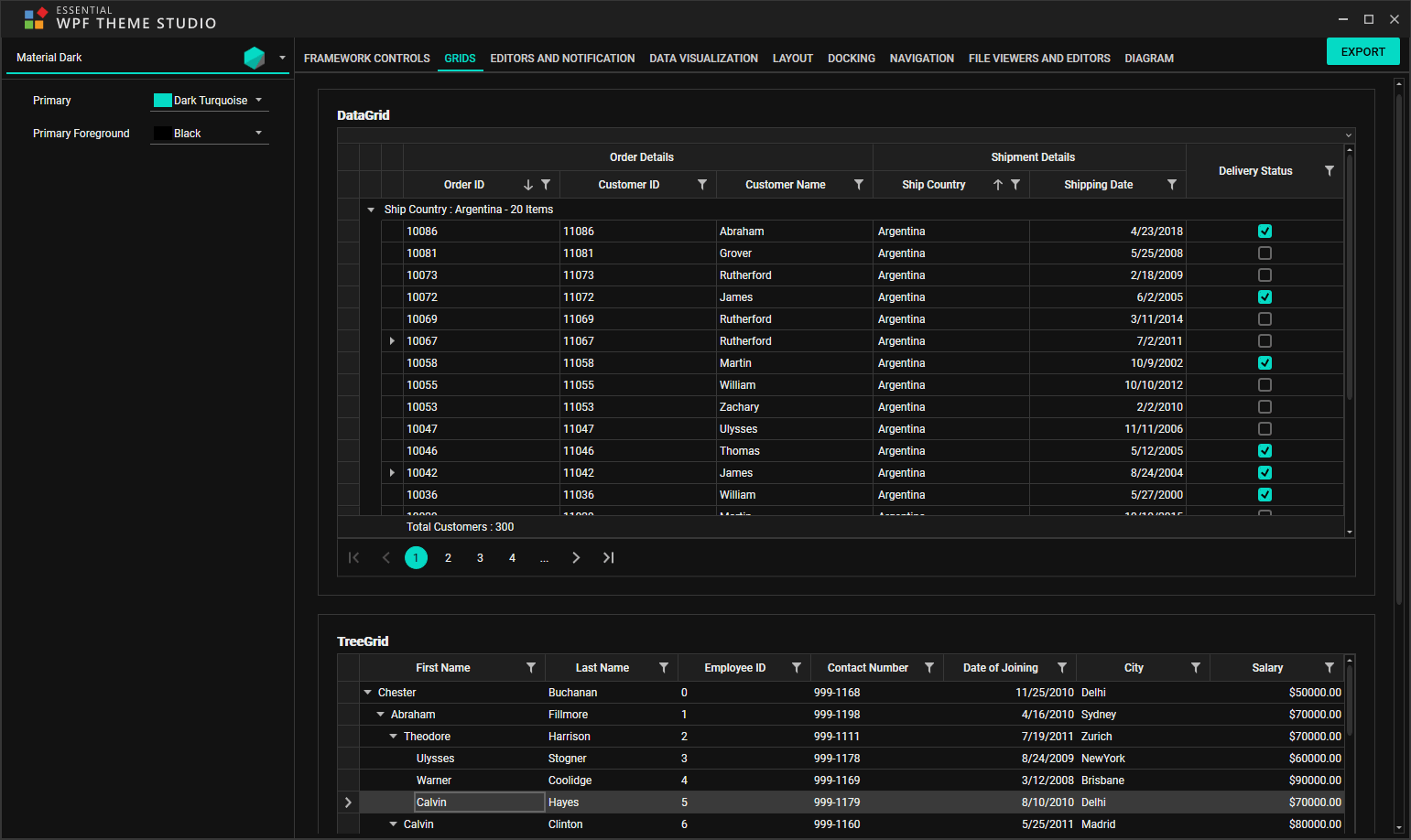
Customize themes using WPF Theme Studio application
The Theme Studio application has a special place in the start-up panel for its launch. On launching the application, you can see a couple of panels:
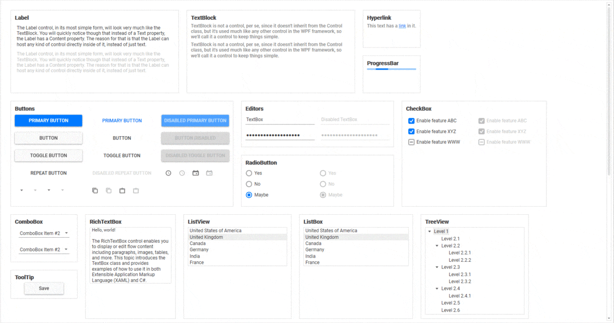
- The theme customization panel on the left has the primary color brushes mapped to appropriate colors from the controls skin.
- The control’s preview panel (skin of the control) on the right will be refreshed automatically on changing these colors.
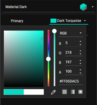
The primary brushes come with a built-in color picker control that provides a wide range of colors. When selecting a color from the color picker, the controls on the right side panel are automatically refreshed in a moment.
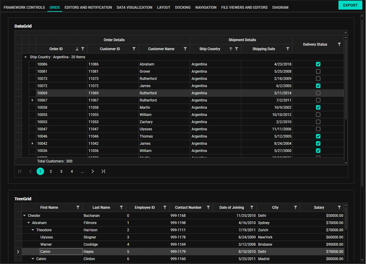
The Theme Studio is equipped with both framework and Syncfusion WPF controls for a quick preview. Since there are 80+ controls (excluding WPF framework controls), they are categorized based on their behaviors. The available categories are:
- Framework
- Grids
- Editors and notification
- Data visualization
- Layout
- Docking
- Navigation
- File viewers and editors
- Diagram
Users can easily navigate to the appropriate tab in order to preview the control appearance on color change. Interaction with controls is also possible. Refer to the following screenshot.
Once the new theme is created, the users can export it into .NET Framework and .NET Core projects.
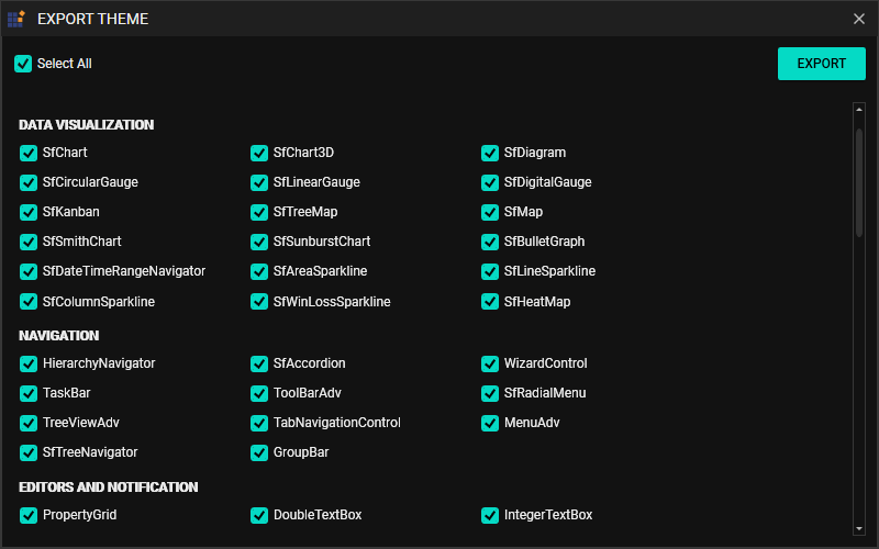
Export themes
To export a theme to a .NET project, please follow these steps:
Step 1: Select the Export option at the top-right corner of the application. Now an export dialog appears in which all the controls are showcased by category.
Step 2: Select either all or just the required controls based on your requirement. Selecting the required controls results in an optimal output and assembly size, which is highly recommended.
Refer to the following screenshot.
For demonstration purposes, we have modified and exported the “MaterialDark” theme project with changes in its primary colors.
On exporting the new theme to .NET projects, users can utilize it anytime, anywhere.
How to apply new themes in your application
In order to apply new themes to the framework and Syncfusion controls in an application, follow these steps:
Step 1: Attach and reference the exported theme project directly in the application.
(or)
Compile the exported theme project in release mode and add the generated assembly (*.dll) alone in the application.
The latter is the preferred option and, in this illustration, the exported “MaterialDark” theme project is compiled and “Syncfusion.Themes.MaterialDark.WPF” is used further.
Note: By default, the exported theme project has a ThemeStudio.snk key pair to sign an assembly with a strong name. If you want to use a private key pair instead of ThemeStudio.snk, which is already created at your end, please reference it in the exported theme project:
● To create a new key pair, refer here.
● To sign an assembly with a strong name, refer here.
Step 2: The steps to add the Syncfusion.SfSkinManager.WPF (Skin Manager Framework) and the exported MaterialDark theme are the same as we saw in the previous section.
Refer to the following screenshot.
Refer to the following code example.
<Window x:Class="GettingStarted.MainWindow"
        xmlns="http://schemas.microsoft.com/winfx/2006/xaml/presentation"
        xmlns:x="http://schemas.microsoft.com/winfx/2006/xaml"
        xmlns:local="clr-namespace:GettingStarted"
        xmlns:syncfusion="http://schemas.syncfusion.com/wpf"
	xmlns:syncfusionskin ="clr-namespace:Syncfusion.SfSkinManager;assembly=Syncfusion.SfSkinManager.WPF
        syncfusionskin:SfSkinManager.VisualStyle="MaterialDark">

    <Window.DataContext>
        <local:ViewModel/>
    </Window.DataContext>

    <Grid>
        <syncfusion:SfDataGrid x:Name="dataGrid" ItemsSource="{Binding EmployeeDetails}" />
    </Grid>

</Window>
After executing this code example, we will get output like the following screenshot.
What’s next?
In the Theme Studio for WPF, we are planning to provide additional themes, along with a few more controls like a pivot grid and syntax editor. The additional themes will be Office2019 White, Office2019 DarkGray, and Office2019 High Contrast to provide the best user experience.
References
Conclusion
It’s this simple to apply themes and create new themes by using Syncfusion WPF Theme Studio. These features will definitely make your application more attractive and they are available in our 2020 Volume 2 release. You can check out all these features in our release notes and on the What’s New page.
So, let’s play with the WPF Theme Studio and present our application with elegant themes!
For existing customers, the new Essential Studio® version is available for download from the License and Downloads page. If you are not yet a Syncfusion customer, you can try our 30-day free trial to check out our available features.
If you wish to send us feedback or ask any questions, please use the comments section below. You can also contact us through our support forum, Direct-Trac, or feedback portal. We are always happy to assist you!


 No spam, just valuable updates.
Comments (1)
Something similar to Xamarin.Forms?