Syncfusion’s .NET MAUI Charts controls have been enhanced with new features and chart types in the 2023 Volume 2 release. These robust charting controls provide comprehensive options for visualizing data in various scenarios.
Let’s explore the exciting additions and improvements introduced in our .NET MAUI charts for this 2023 Volume 2 release.
New chart types in Cartesian Charts
Six new chart types were added to the .NET MAUI Cartesian Charts control.
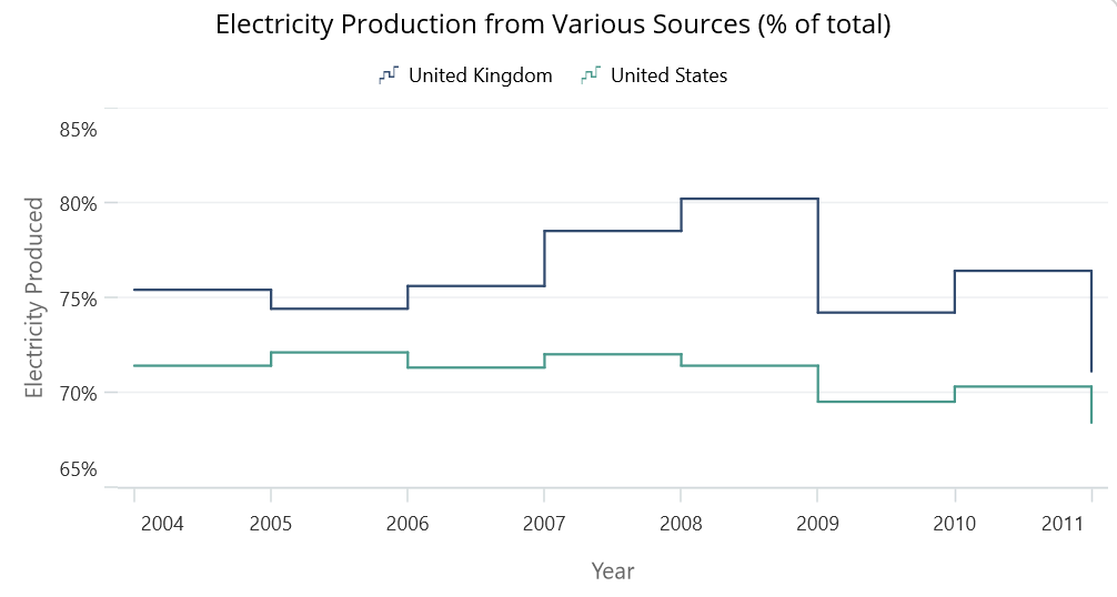
Step line chart
The step line chart displays data points as connected horizontal and vertical line segments, creating a stepped pattern. It is useful for visualizing data that changes abruptly at specific points in time or along an axis. This chart type is commonly used to represent stock market trends or other data with sudden shifts.
Refer to the following code example.
<chart:SfCartesianChart Title="Electricity Production from Various Sources (% of total)">

 <chart:SfCartesianChart.XAxes>
  <chart:CategoryAxis/>
 </chart:SfCartesianChart.XAxes>
 <chart:SfCartesianChart.YAxes>
  <chart:NumericalAxis/>
 </chart:SfCartesianChart.YAxes>
 <chart:StepLineSeries ItemsSource="{Binding ElectricityProductionDataUK}"
                       XBindingPath="Name"
                       YBindingPath="Value"/>
 <chart:StepLineSeries ItemsSource="{Binding ElectricityProductionDataUS}"
                       XBindingPath="Name"
                       YBindingPath="Value"/>
</chart:SfCartesianChart>
Step area chart
Like the step line chart, the step area chart also uses stepped line segments. However, the area between the segments is filled instead of just lines, creating a visually appealing stepped area. It is suitable for representing cumulative data or displaying changes in data over time.
Refer to the following code example.
<chart:SfCartesianChart Title="Stock Price Comparison in February 2023">

 <chart:SfCartesianChart.XAxes>
  <chart:DateTimeAxis/>
 </chart:SfCartesianChart.XAxes>

 <chart:SfCartesianChart.YAxes>
  <chart:NumericalAxis/>
 </chart:SfCartesianChart.YAxes >
 <chart:StepAreaSeries
        ItemsSource="{Binding StepAreaDataA}"
        XBindingPath="Date"
        YBindingPath="Value"/>
 <chart:StepAreaSeries
        ItemsSource="{Binding StepAreaDataB}"
        XBindingPath="Date"
        YBindingPath="Value"/>
</chart:SfCartesianChart>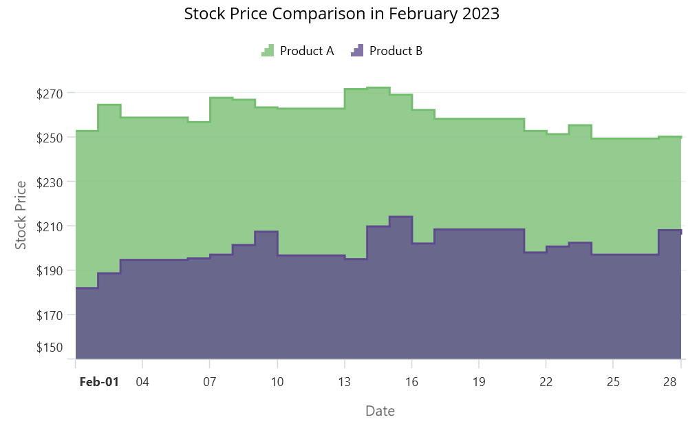
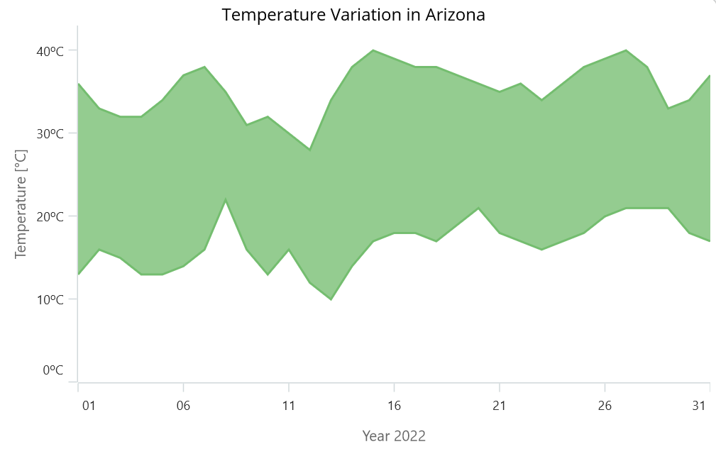
Range area chart
The range area chart displays a range of values for each data point, typically represented by a shaded area between two lines. It is commonly used to visualize data with minimum and maximum values, such as temperature ranges or stock price fluctuations. This type of chart aids in comprehending the variations or dissemination of data.
Refer to the following code example.
<chart:SfCartesianChart Title="Temperature Variation in Arizona">
 <chart:SfCartesianChart.XAxes>
  <chart:DateTimeAxis/>
 </chart:SfCartesianChart.XAxes>
 <chart:SfCartesianChart.YAxes >
  <chart:NumericalAxis/>
 </chart:SfCartesianChart.YAxes>
 <chart:RangeAreaSeries
        ItemsSource="{Binding RangeAreaData1}"
        XBindingPath="Date"
        High="Value"
        Low="Size"/>

</chart:SfCartesianChart>
100% stacked column chart
This chart type is ideal for comparing the proportions of different categories within a single column. Each column is divided into segments, representing the contribution of each category as a percentage of the total column height. It helps in understanding the relative distribution of data across categories.
Refer to the following code example.
<chart:SfCartesianChart Title="Worldwide Net Sales of Macy's Inc. by Product Category (In Million US Dollars)">
 <chart:SfCartesianChart.XAxes>
  <chart:CategoryAxis/>
 </chart:SfCartesianChart.XAxes>
 <chart:SfCartesianChart.YAxes>
  <chart:NumericalAxis/>
 </chart:SfCartesianChart.YAxes>
 <chart:StackingColumn100Series ItemsSource="{Binding MacysSalesDataA}"
                                XBindingPath="Name"
                                YBindingPath="Value"/>
 <chart:StackingColumn100Series ItemsSource="{Binding MacysSalesDataB}"
                                XBindingPath="Name"
                                YBindingPath="Value"/>
 <chart:StackingColumn100Series ItemsSource="{Binding MacysSalesDataC}"
                                XBindingPath="Name"
                                YBindingPath="Value"/>
 <chart:StackingColumn100Series ItemsSource="{Binding MacysSalesDataD}"
                                XBindingPath="Name"
                                YBindingPath="Value"/>
</chart:SfCartesianChart>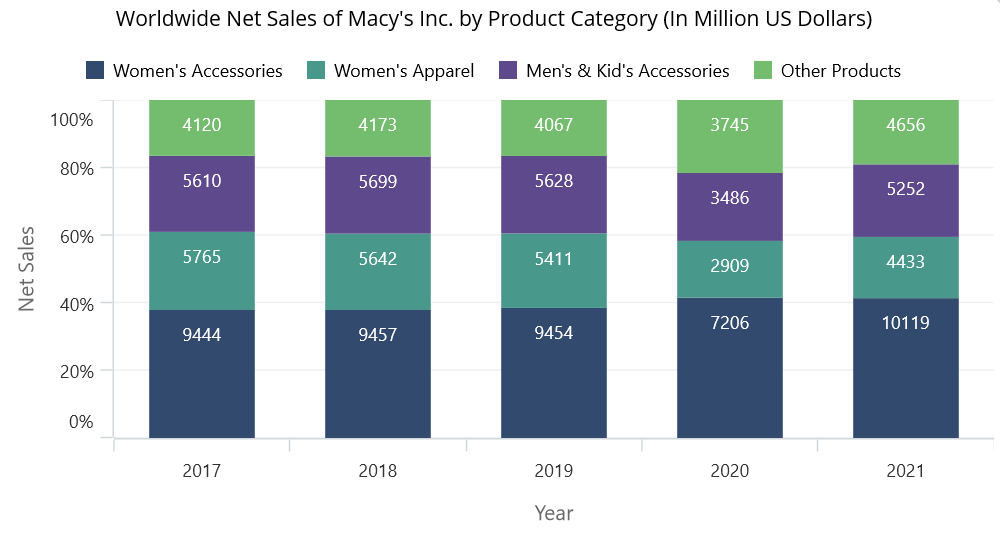
Candle chart
The candle chart is also known as the Japanese candlestick chart. It is commonly used in financial analysis. It represents the opening, closing, high, and low prices of a stock or commodity within a specified time period. The candle’s body is filled or hollow, indicating whether the closing price is higher or lower than the opening price. It provides insights into price trends and market sentiments.
Refer to the following code example.
<chart:SfCartesianChart x:Name="Chart" Title="Stock Data of AEIS">
 <chart:SfCartesianChart.XAxes>
  <chart:DateTimeAxis/>
 </chart:SfCartesianChart.XAxes>
 <chart:SfCartesianChart.YAxes>
  <chart:NumericalAxis/>
 </chart:SfCartesianChart.YAxes>
 <chart:CandleSeries ItemsSource="{Binding StockData}"
                     XBindingPath="Date"
                     Open="Open"
                     High="High"
                     Low="Low"
                     Close="Close"/>
</chart:SfCartesianChart>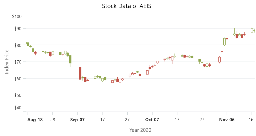
OHLC (open-high-low-close) chart
The OHLC chart is similar to the candle chart and is widely used in financial analysis. It displays the opening, high, low, and closing prices of a security or commodity within a specific time frame. It provides a comprehensive view of price movements, including the highest and lowest prices reached during the time period. Traders and investors use this chart to analyze price patterns and make informed decisions.
Refer to the following code example.
<chart:SfCartesianChart Title="XNAS of ABM">
 <chart:SfCartesianChart.XAxes>
  <chart:DateTimeAxis/>
 </chart:SfCartesianChart.XAxes>

 <chart:SfCartesianChart.YAxes>
  <chart:NumericalAxis/>
 </chart:SfCartesianChart.YAxes>
 <chart:HiLoOpenCloseSeries ItemsSource="{Binding StockDataOHLC}"
                            XBindingPath="Date"
                            Open="Open"
                            High="High"
                            Low="Low"
                            Close="Close"/>

</chart:SfCartesianChart>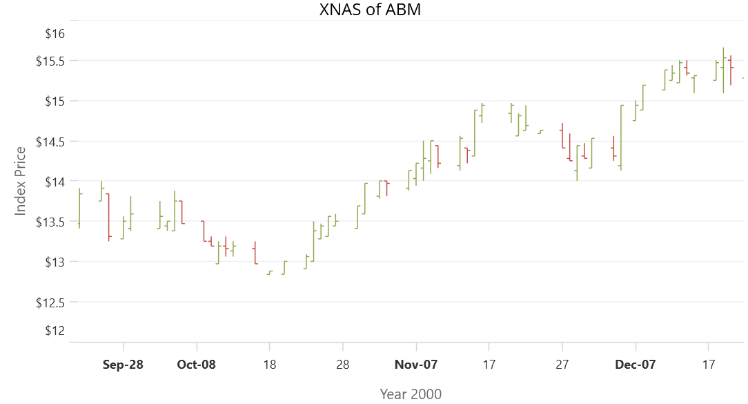
Grouping feature in Circular Charts
The new grouping feature in the .NET MAUI Circular Charts control allows users to group small segments into the others category. When there are multiple small segments that have values below a certain threshold, they can be combined into a single slice labeled as others in the legend. This helps us to simplify the chart’s appearance and make it easier to read and interpret.
Refer to the following code example.
<chart:SfCircularChart Title="World Economy in 2021">
 <chart:PieSeries ItemsSource="{Binding GroupToData}"
                  XBindingPath="Name"
                  YBindingPath="Value"
                  GroupTo="3"
                  GroupMode="Value"/>
</chart:SfCircularChart>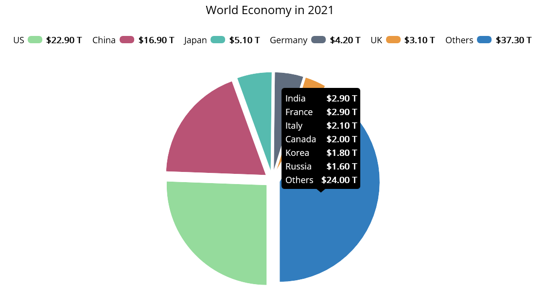
Surface drawing mode in Pyramid Chart
The .NET MAUI Pyramid Chart control now supports a surface drawing mode. This mode enhances the chart’s data point creation based on a percentage of available size. By utilizing this feature, developers can create visually stunning pyramid charts that capture users’ attention and convey metrics effectively.
Refer to the following code example.
<chart:SfPyramidChart ItemsSource=”{Binding FinancialData}”
                      XBindingPath=”Name”
                      YbindingPath=”Size”
                      Mode=”Surface”>
</chart:SfPyramidChart>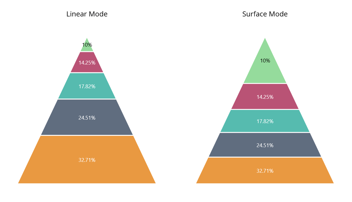
Conclusion
Thanks for reading! In this blog, we have seen the new chart types and features added to Syncfusion’s .NET MAUI Charts controls for the 2023 Volume 2 release. Use them to enhance the readability of your chart data.
Check out our Release Notes and What’s New pages to see the other updates of 2023 Volume 2.
For existing customers, the new version is available for download from the License and Downloads page. If you are not yet a Syncfusion customer, you can try our 30-day free trial to check out our available features.
You can also contact us through our support forum, support portal, or feedback portal. We are always happy to assist you!