We are happy to introduce the Xamarin.Forms Avatar View component. This component is available with our Essential Studio® for Xamarin.Forms 2019 Vol. 3 (beta) release.
Nowadays, almost all mobile apps need a user interface like a circle image that displays initials and an avatar image (like contact lists, images in tokens, and chat user displays). We at Syncfusion understand the requirement for this simple, but essential control and now deliver the feature-rich Xamarin.Forms Avatar View control. In this blog post, we will summarize the key features of the Xamarin.Forms Avatar View.
Show single or double initials
Are you looking for a letter avatar? Xamarin.Forms Avatar View is powered by a built-in parse engine. So, the Avatar control can generate initials based on the text you provide. The following code example illustrates the display of initials.
<avatar:SfAvatarView ContentType="Initials"
                     AvatarName="Selva Ganapathy Kathiresan"
                     InitialsType="DoubleCharacter"/>

Load custom images
Our Xamarin.Forms Avatar View can load custom images through the image source. The following code example illustrates loading a custom image.
<avatar:SfAvatarView ContentType="Custom"
                     ImageSource="image.png"/>

Use 30 predefined vector avatar images
Xamarin.Forms Avatar View is loaded with 30 predefined vector images. You can use one of them when your app doesn’t have a user’s actual image. The following code example helps you show a vector avatar.
<avatar:SfAvatarView ContentType="AvatarCharacter"
                     AvatarCharacter="Avatar10"/>

Group view
A group view is one of the most common UIs you come across in any chat application. Almost all chat applications support group chat, which will require a common group picture to represent the group. An interesting part of Xamarin.Forms Avatar View is that it will automatically turn into a group view when you assign a group source to it. The following code example illustrates how to populate a group view.
<avatar:SfAvatarView ContentType="Group"
                     GroupSource="{Binding PeopleCollection}"
                     ImageSourceMemberPath="Image"
                     InitialsMemberPath="Name"/>

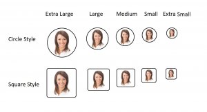
Visual style
Xamarin.Forms Avatar View comes with a predefined style as per design guidelines. It will take care of all the sizing specifications based on the style factor. The following code example shows how to apply visual styles.
<avatar:SfAvatarView AvatarShape="Circle"
                     AvatarSize="Medium"/>

Set gradient
The highly customizable Xamarin.Forms Avatar View control allows you to customize its background with gradient colors. The Xamarin.Forms Gradient view is integrated with the control. So, you can directly apply a linear gradient or radial gradient look to the control. The following code example will help you to set a gradient background.
<avatar:SfAvatarView ContentType="Custom"
                           ImageSource="image.png">
     <avatar:SfAvatarView.BackgroundGradient>
            <gradient:SfLinearGradientBrush>
                <gradient:SfLinearGradientBrush.GradientStops>
                    <gradient:SfGradientStop Color="#2d265b" Offset="0.0" />
                    <gradient:SfGradientStop Color="#b8495c" Offset="1.0" />
                </gradient:SfLinearGradientBrush.GradientStops>
            </gradient:SfLinearGradientBrush>
     </avatar:SfAvatarView.BackgroundGradient>
</avatar:SfAvatarView>

Add badge view to show status
Xamarin.Forms Avatar View is compatible with the Xamarin.Forms Badge View control. So, you can show a status by adding it into the Xamarin.Forms Badge View. The following code shows how to import a badge view.
<badge:SfBadgeView>
   <badge:SfBadgeView.Content>
      <avatar:SfAvatarView ContentType="Custom"
                           ImageSource="image.png"/>
   </badge:SfBadgeView.Content>
   <badge:SfBadgeView.BadgeSettings>
       <badge:BadgeSetting BadgePosition="BottomRight"
                           BadgeType="Success"
                           BadgeIcon="Available"/>
   </badge:SfBadgeView.BadgeSettings>
</badge:SfBadgeView>

Customize beyond the limit
The Xamarin.Forms Avatar View control is quite customizable. You can customize aspects like its corner radius, background, and border color and thickness. The following code example shows how to customize the width and height, and the border corners, thickness, and color.
 <avatar:SfAvatarView ContentType="Custom"
                      ImageSource="image.png"
                      WidthRequest="100"
                      HeightRequest="75"
                      BorderColor="LightBlue"
                      BorderWidth="5"
                      CornerRadius="50,0,50,0"/>

Conclusion
In this blog post, we have gone through the Syncfusion Xamarin.Forms Avatar View control. You can download the beta version of the 2019 Volume 3 release to evaluate this new control.
If you have any questions or require clarification about these controls, please let us know in the comments below. You can also contact us through our support forum, Direct-Trac, or Feedback Portal. We are happy to assist you!