
 Niranjan Kumar Gopalan
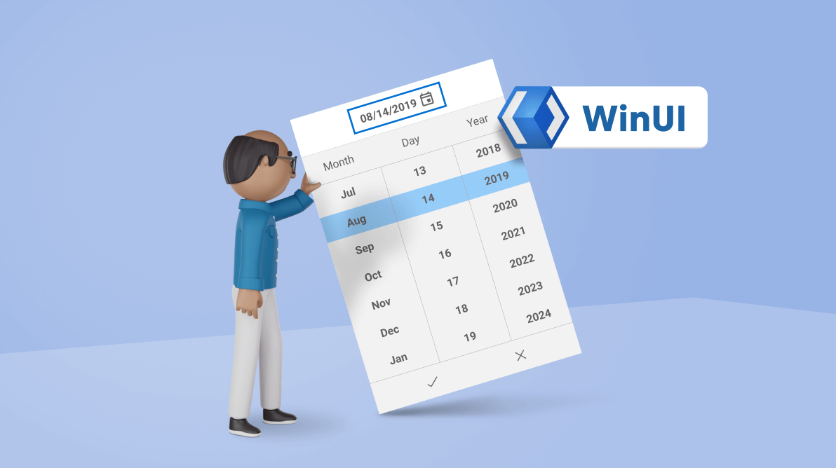
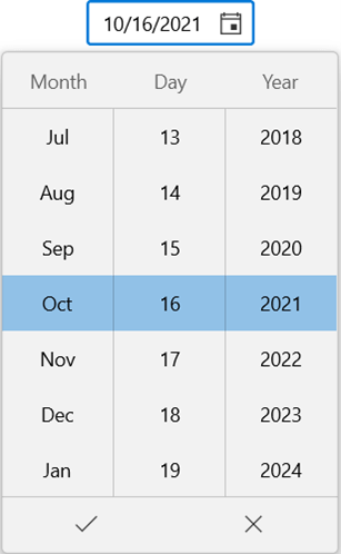
The WinUI Date Picker control provides an intuitive, touch-friendly interface for selecting a required date from a dropdown spinner. You can validate input values when using the free-form editing and customize the format of the input value and the fields shown in the dropdown. You can also select or enter a date and clear the selected date on demand.
In this blog post, we will learn how to include the WinUI Date Picker control and use its features in your application.
Adding WinUI Date Picker control to an application
Follow these steps to add the WinUI Date Picker control in the XAML file of your application manually:
- First, create a project using the instructions provided in the WinUI 3 desktop app for C# and .NET 5 documentation.
- Then, install the Syncfusion.Editors.WinUI NuGet package in the project.
- Next, import the Syncfusion.UI.Xaml.Editors control namespace in the XAML page.
- Finally, initialize the WinUI Date Picker control. Refer to the following code example.
<Window
x:Class="WinUI_ DatePicker.MainWindow"
xmlns="http://schemas.microsoft.com/winfx/2006/xaml/presentation"
xmlns:x="http://schemas.microsoft.com/winfx/2006/xaml"
xmlns:local="using:WinUI_ DatePicker "
xmlns:d="http://schemas.microsoft.com/expression/blend/2008"
xmlns:mc="http://schemas.openxmlformats.org/markup-compatibility/2006"
xmlns:editors="using:Syncfusion.UI.Xaml.Editors"
mc:Ignorable="d">

<Grid>
<editors:SfDatePicker x:Name="datePicker"
HorizontalAlignment="Center"
VerticalAlignment="Top"
/>
</Grid>
</Window>
Thus, we have included the Syncfusion WinUI 3 Date Picker control in our application. Now, let’s see how to use its stunning features.
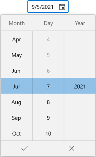
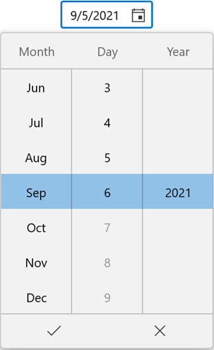
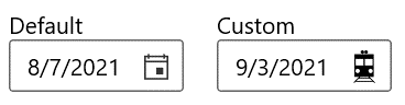
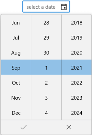
Limit the available dates
You can restrict the users to selecting the date values within a minimum and maximum range using the MinDate and MaxDate properties.
By default, the value of MinDate is 1/1/1921 and MaxDate is 12/31/2121. When used in any travel booking application, this function is useful for limiting the min date to the current date.
Refer to the following code example.
public sealed partial class MainWindow : Window
{
public MainWindow()
{
this.InitializeComponent();
SfDatePicker datePicker = new SfDatePicker();
datePicker.HorizontalAlignment = HorizontalAlignment.Center;
datePicker.VerticalAlignment = VerticalAlignment.Center;
datePicker.MinDate = new DateTimeOffset(new DateTime(2021, 07, 07));
datePicker.MaxDate = new DateTimeOffset(new DateTime(2021, 09, 07));

this.Content = datePicker;
}
} |  |
Setting Minimum and Maximum Dates in WinUI Date Picker
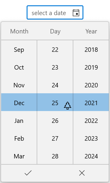
Restrict specific dates
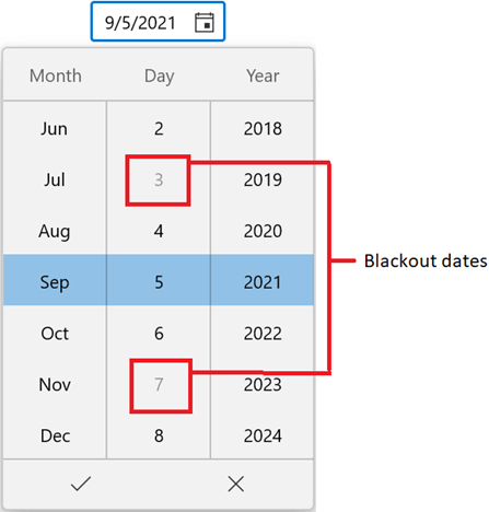
You can restrict the users from selecting specific dates in the dropdown using the BlackoutDates collection property.
By default, the value of the BlackoutDates property is null. We can use this feature, for example, to indicate that there will be no transportation available on blackout dates in any travel booking application.
Refer to the following code example.
public sealed partial class MainWindow : Window
{
public DateTimeOffsetCollection BlackOutDates { get; set; }
public MainWindow()
{
this.InitializeComponent();
SfDatePicker datePicker = new SfDatePicker();
datePicker.HorizontalAlignment = HorizontalAlignment.Center;
datePicker.VerticalAlignment = VerticalAlignment.Center;
datePicker.BlackoutDates = GetBlackOutDates();

this.Content = datePicker;
}

private DateTimeOffsetCollection GetBlackOutDates()
{
BlackOutDates = new DateTimeOffsetCollection();
BlackOutDates.Add(new DateTimeOffset(new DateTime(2021, 09, 03)));
BlackOutDates.Add(new DateTimeOffset(new DateTime(2021, 09, 07)));
BlackOutDates.Add(new DateTimeOffset(new DateTime(2021, 09, 24)));
BlackOutDates.Add(new DateTimeOffset(new DateTime(2021, 10, 07)));
BlackOutDates.Add(new DateTimeOffset(new DateTime(2021, 10, 13)));

return BlackOutDates;
}
}
By default, the Date Picker allows you to set an empty value in the editor using the SelectedDate property. Also, you can restrict assigning empty values by setting the value of the AllowNull property to false. The default value of the SelectedDate property is null and the AllowNull property is true.
Cancel the selected date being changed
You will be notified whenever you select a date in the dropdown or assign a new date value to the SelectedDate property through the SelectedDateChanging event.
Note: The SelectedDateChanging event will be triggered as soon as a date is selected but before SelectedDateproperty is updated.
Users are restricted from selecting a blackout date from the dropdown; however, users can give text input through the editor. If the currently selected date is invalid (a blackout date), you can cancel updating the value of the SelectedDate property with ease using the SelectedDateChanging event.
The SelectedDateChanging event contains the following properties:
- OldDate: Gets the previously selected date.
- NewDate: Gets the currently selected date.
- Cancel: Gets or sets whether to cancel the selected date value update.
Refer to the following code example.
private void SfDatePicker_SelectedDateChanging(object sender, DateChangingEventArgs e)
{
var oldDate = e.OldDate;
var newDate = e.NewDate;

//Cancels the selected date update.
if (newDate > new DateTimeOffset(new DateTime(2022, 01, 01)))
{
e.Cancel = true;
}
}
Show watermark
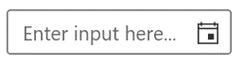
You can display hints or information using the PlaceHolderText property when no date is selected or the value of the SelectedDate property is null.
<editors:SfDatePicker x:Name="datePicker"
HorizontalAlignment="Center"
VerticalAlignment="Top"
PlaceholderText="Enter input here..."
/>
Change the calendar type
You can easily change the calendar type in the dropdown using the CalendarIdentifier property. The default value of the CalendarIdentifier property is GregorianCalendar.
Refer to the following code example. We have set the Date Picker to the Hijri calendar type.
<Grid>
<editors:SfDatePicker x:Name="datePicker"
HorizontalAlignment="Center"
CalendarIdentifier="HijriCalendar"
VerticalAlignment="Center"
/>
</Grid>
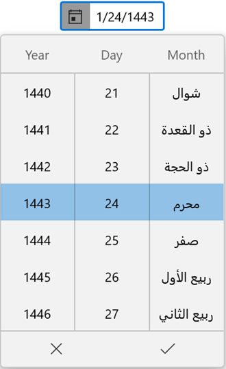
Note: For more details, refer to the distinct types of calendars supported in the Date Picker control.
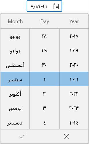
Change the language
You can also localize the Date Picker control to assist global users speaking different languages using the Language property. The default value of the Language property is en-US.
Refer to the following code example. Here, the “ar-SA” refers to Arabic—Saudi Arabia.
<Grid>
<editors:SfDatePicker x:Name="datePicker"
HorizontalAlignment="Center"
Language="ar-SA"
VerticalAlignment="Top"
/>
</Grid>
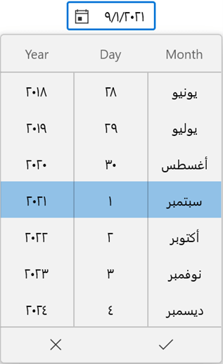
Note: For more details, refer to the distinct types of languages supported in the Date Picker control.
The Date Picker control updates the flow direction visually based on the applied language and calendar type. By default, the value of the FlowDirection property is LeftToRight.
Refer to the following code example.
<Grid>
<editors:SfDatePicker x:Name="datePicker"
HorizontalAlignment="Center"
Language="ar-SA"
FlowDirection="LeftToRight"
VerticalAlignment="Center"
/>
</Grid>
Customize the Date Picker
Let’s see how to customize the dropdown button and the dropdown in the WinUI Date Picker control to elegantly design your application.
Customize the dropdown button
You can customize the dropdown button in the Date Picker control using the DropDownButtonTemplate property. The default value of the DropDownButtonTemplate is null.
Refer to the following code example.
<Grid>
<editors:SfDatePicker x:Name="datePicker"
HorizontalAlignment="Center"
VerticalAlignment="Center"
>
<editors:SfDatePicker.DropDownButtonTemplate>
<DataTemplate>
<Path Data="M4.600031,27.799988L2.6000334,29.799988 17.999978,29.799988 15.999981,27.799988z M6.499992,25.899994L5.4999934,26.899994 15.199994,26.899994 14.199995,25.899994z M16.49998,18C15.400006,18 14.400007,18.899994 14.400007,20.099976 14.400007,21.199982 15.300031,22.199982 16.49998,22.199982 17.600015,22.199982 18.600015,21.299988 18.600015,20.099976 18.600015,18.899994 17.600015,18 16.49998,18z M3.9999953,18C2.9000209,18 1.9000221,18.899994 1.900022,20.099976 1.9000221,21.199982 2.8000453,22.199982 3.9999953,22.199982 5.1000305,22.199982 6.1000291,21.299988 6.1000291,20.099976 6.1000291,18.899994 5.1000305,18 3.9999953,18z M10.999987,8.3999939L10.999987,14.799988 18.499978,14.799988 18.499978,8.3999939z M2.1000343,8.3999939L2.1000343,14.799988 9.6000253,14.799988 9.6000253,8.3999939z M0.90002347,3.7999878L3.4999958,3.7999878 16.99998,3.7999878 19.600013,3.7999878 19.600013,6.3999939 19.600013,23.299988 19.600013,25.899994 16.99998,25.899994 15.499981,25.899994 20.899999,31.299988 20.300025,32 18.900003,30.599976 18.900003,30.699982 1.900022,30.699982 1.900022,30.599976 0.70001127,31.799988 0,31.199982 4.200007,27 4.200007,26.899994 4.3000437,26.899994 5.3000422,25.899994 3.4999958,25.899994 0.90002347,25.899994 0.90002347,23.299988 0.90002347,6.3999939z M12.199998,0C13.10002,0 13.900007,0.79998779 13.900007,1.6999817 13.900007,2.5999756 13.10002,3.3999939 12.199998,3.3999939 11.300036,3.3999939 10.499988,2.5999756 10.499988,1.6999817 10.499988,0.79998779 11.199999,0 12.199998,0z M8.6000262,0C9.4999886,0 10.300037,0.79998779 10.300037,1.6999817 10.300037,2.5999756 9.4999886,3.3999939 8.6000262,3.3999939 7.7000027,3.3999939 6.9000159,2.5999756 6.9000159,1.6999817 6.9000159,0.79998779 7.6000276,0 8.6000262,0z" Stretch="Uniform" Fill="Black" Width="20" Height="20" />
</DataTemplate>
</editors:SfDatePicker.DropDownButtonTemplate>
</editors:SfDatePicker>
</Grid>
You can open the dropdown button programmatically by setting the value of the IsOpen property to true. By default, the value of the IsOpen property is false.
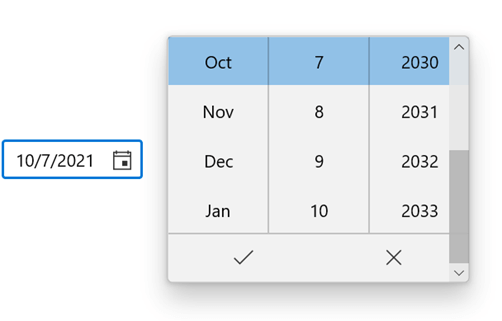
Change dropdown alignment and height
Easily modify the position of the dropdown from the editor using the DropDownPlacement property. By default, the value of the DropDownPlacement property is Auto. The dropdown smartly shifts its alignment based on the space available in the application.
You can also change the height of the dropdown to limit the number of date values shown using the DropDownHeight property. The default value of the DropDownHeight property is NaN.
Refer to the following code example.
<editors:SfDatePicker x:Name="datePicker"
HorizontalAlignment="Center"
VerticalAlignment="Center"
DropDownPlacement="Right"
DropDownHeight="200"
/>
Customize the dropdown header
Add hints in the dropdown header using the DropDownHeader property by setting the value of the ShowDropDownHeader property to true. Also, you can customize the header template of the dropdown using the DropDownHeaderTemplate property.
By default, the value of the DropDownHeader property is string.Empty, ShowDropDownHeader is false, and DropDownHeaderTemplate is null.
Refer to the following code example.
<editors:SfDatePicker x:Name="datePicker"
HorizontalAlignment="Center"
VerticalAlignment="Top"
ShowDropDownHeader="True"
DropDownHeader="Select your birthday"
ShowColumnHeaders="True"
>
<editors:SfDatePicker.DropDownHeaderTemplate>
<DataTemplate>
<StackPanel Orientation="Horizontal">
<TextBlock HorizontalAlignment="Center"
VerticalAlignment="Center"
Foreground="DeepSkyBlue"
Text="{Binding }"
/>
<Path
Width="25"
Height="25"
Margin="5,5,5,10"
HorizontalAlignment="Center"
VerticalAlignment="Bottom"
Fill="DeepSkyBlue"
Data="M13.599971,11.699997L13.599971,16.199997 4.400023,16.199997 4.400023,18 13.599971,18 13.599971,29.699997 17.700006,29.699997 17.700006,18 27.099966,18 27.099966,16.199997 17.700006,16.199997 17.700006,11.699997z M24.49999,1.5999985C23.400017,1.5999985 21.599968,2.2999954 19.999992,3.4000015 17.799982,5 16.499994,7.0999985 17.299982,7.9000015 17.400019,8 17.59997,8.0999985 17.900019,8.1999969L18.900017,8.1999969C19.999992,8 21.400017,7.4000015 22.700005,6.4000015 24.99999,4.7999954 26.200003,2.7999954 25.49999,2 25.299978,1.6999969 24.900015,1.5999985 24.49999,1.5999985z M6.400022,1.5999985C5.9999981,1.5999985 5.7000103,1.6999969 5.4000225,2 4.7000108,2.7999954 5.9999981,4.7999954 8.2000093,6.4000015 9.4999962,7.4000015 10.900021,8 11.999996,8.1999969L12.999995,8.1999969C13.200007,8.1999969 13.40002,8.0999985 13.599971,7.9000015 14.299983,7.0999985 13.099971,5.0999985 10.900021,3.4000015 9.2999849,2.2999954 7.5999727,1.5999985 6.400022,1.5999985z M5.4000225,0C7.0999732,0 9.4999962,0.90000153 11.700008,2.5 13.499995,3.7999954 14.799982,5.4000015 15.400019,6.6999969 15.999994,5.4000015 17.299982,3.7999954 19.099968,2.5 21.400017,0.90000153 23.900017,0 25.49999,0 26.299978,0 26.900015,0.19999695 27.299978,0.59999847 28.49999,2 26.900015,5 23.599968,7.4000015 23.200005,7.6999969 22.700005,8 22.29998,8.1999969L31.700001,8.1999969 31.700001,18 28.599966,18 28.599966,32 28.299978,32 3.0999741,32 3.0999741,18 0,18 0,8.1999969 8.5999727,8.1999969C8.2000093,7.9000015 7.7999849,7.6999969 7.2999854,7.4000015 4.0999741,5 2.4000234,2 3.5999741,0.59999847 3.9999986,0.19999695 4.5999741,0 5.4000225,0z"
Stretch="Uniform" />
</StackPanel>
</DataTemplate>
</editors:SfDatePicker.DropDownHeaderTemplate>
</editors:SfDatePicker>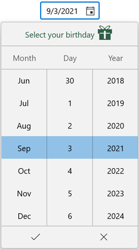
Hide the dropdown columns’ header
By default, when you open the dropdown of the Date Picker control, the headers for each field column will be displayed to represent the respective field names. You can hide these columns’ headers by setting the value of the ShowColumnHeaders property to false. The default value of the ShowColumnHeaders property is true.
Refer to the following code example.
<editors:SfDatePicker x:Name="datePicker"
HorizontalAlignment="Center"
VerticalAlignment="Center"
ShowColumnHeaders="False"
/>
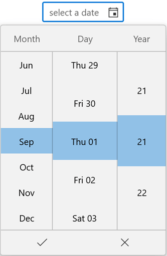
Customize the appearance of item cells in the dropdown
You can customize the appearance of the item cells in the dropdown using the ItemContainerStyle and ItemTemplateSelector properties. The default value of both the properties is null.
Note: For more details, refer to the Customize the cell’s style in dropdown spinner documentation.
You can also customize all the field columns and item cells inside the dropdown using the DateFieldPrepared event.
Refer to the following code example.
private void datePicker_DateFieldPrepared(object sender, DateTimeFieldPreparedEventArgs e)
{
if (e.Column != null)
{
if (e.Column.Field == DateTimeField.Day)
{
e.Column.Format = "ddd dd";
e.Column.ShowHeader = true;
e.Column.Header = "Day";
e.Column.ItemHeight = 60;
e.Column.ItemWidth = 100;
e.Column.ShouldLoop = true;
}
else if (e.Column.Field == DateTimeField.MonthName)
{
e.Column.ShowHeader = true;
e.Column.Header = "Month";
e.Column.ItemHeight = 40;
e.Column.ItemWidth = 75;
e.Column.ShouldLoop = true;
}
else if (e.Column.Field == DateTimeField.Year)
{
e.Column.Format = "yy";
e.Column.ShowHeader = true;
e.Column.Header = "Year";
e.Column.ItemHeight = 80;
e.Column.ItemWidth = 75;
e.Column.ShouldLoop = true;
}
}
}
GitHub reference
For more details, refer to the WinUI 3 Date Picker demos on GitHub and documentation.
Conclusion
Thanks for reading! With its splendid features, we believe that the WinUI Date Picker control perfectly fits your expectations and requirements for choosing a date value. Try out our WinUI Date Picker control and leave your feedback in the comments section given below!
You can download other examples for WinUI controls from this GitHub repository.
For existing customers, the newest version of Essential Studio® is available for download from the license and downloads page. If you are not yet a customer, you can try our 30-day free trial to check out these new features.
You can also contact us through support forums, the feedback portal, or the Direct-Trac support system. We are always happy to assist you!
 No spam, just valuable updates.