
 Nijamudeen
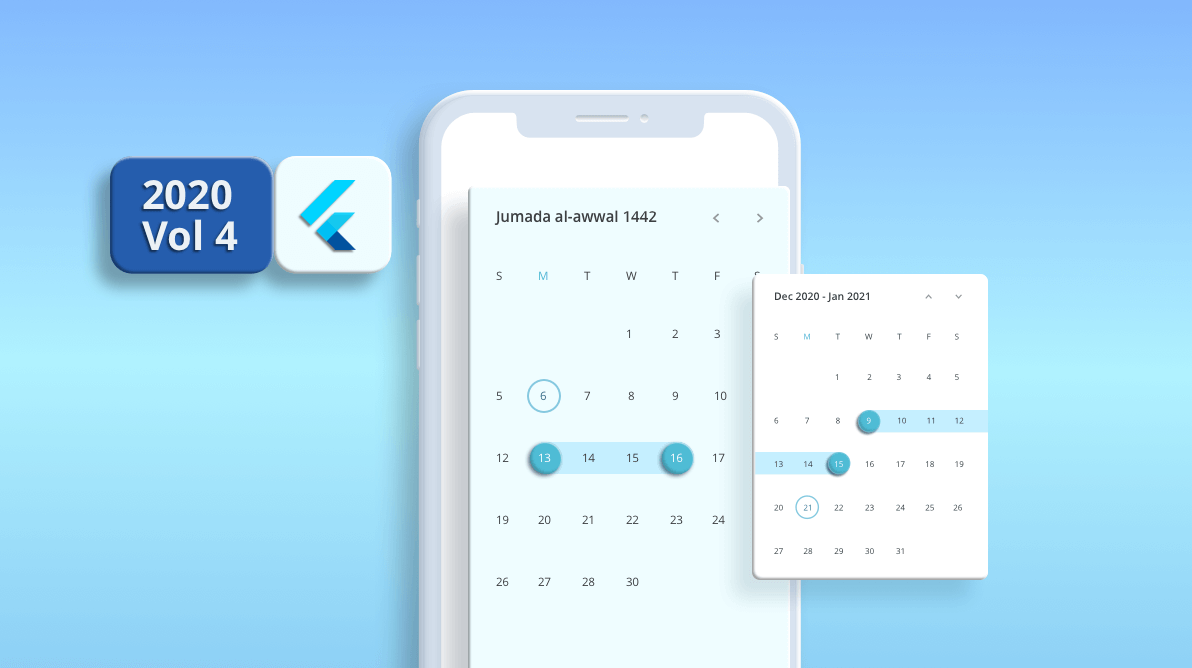
The Flutter Date Range Picker is packed with many awesome new features in our Essential Studio® 2020 Volume 4 release.
The Date Range Picker is a lightweight widget that allows users to easily select a single date, multiple dates, or a range of dates. It provides month, year, decade, and century views to quickly navigate to a desired date. It supports minimum, maximum, and disabled dates feature to restrict date selection.
Let’s see its new features!
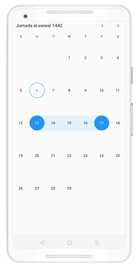
Hijri calendar
Along with the Gregorian calendar, the Flutter Date Range Picker allows you to display the Hijri calendar. It is an Islamic calendar and you can display it using the SfHijriDateRangePicker property in the Date Range Picker package.
Refer to the following code example.
@override
Widget build(BuildContext context) {
  return MaterialApp(
    home: Scaffold(body: SfHijriDateRangePicker()),
  );
}
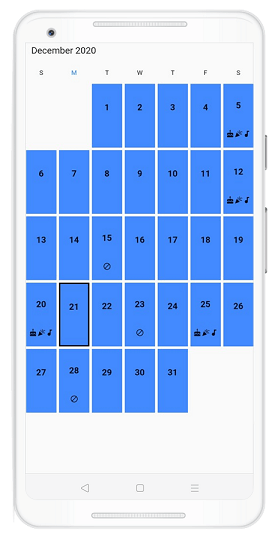
Cell builder
This feature allows you to design your own custom view for the month and year cells by customizing the cellBuilder property.
Refer to the following code.
class MyAppState extends State<MyApp> {
  DateRangePickerController _controller;

  @override
  void initState() {
    _controller = DateRangePickerController();
    super.initState();
  }

  @override
  Widget build(BuildContext context) {
    return MaterialApp(
      home: Scaffold(
          body: SfDateRangePicker(
              controller: _controller,
			  cellBuilder:
                (BuildContext context, DateRangePickerCellDetails details) {
              final bool isToday = isSameDate(details.date, DateTime.now());
              final bool isBlackOut = isBlackedDate(details.date.day);
              final bool isSpecialDate = isSpecialDay(details.date.day);
              return Container(
                margin: EdgeInsets.all(2),
                padding: EdgeInsets.only(top: kIsWeb ? 5 : 10),
                decoration: BoxDecoration(
                    color: Colors.blueAccent,
                    border: isToday
                        ? Border.all(color: Colors.black, width: 2)
                        : null),
                child: Column(
                  mainAxisSize: MainAxisSize.max,
                  mainAxisAlignment: MainAxisAlignment.spaceAround,
                  children: <Widget>[
                    Text(
                      details.date.day.toString(),
                      style: TextStyle(
                        fontSize: kIsWeb ? 11 : 15,
                        fontWeight: FontWeight.bold,
                      ),
                    ),
                    isBlackOut
                        ? Icon(
                            Icons.block_sharp,
                            size: 13,
                          )
                        : isSpecialDate
                            ? Row(
                                mainAxisAlignment: MainAxisAlignment.center,
                                children: [
                                  Icon(
                                    Icons.cake,
                                    size: 13,
                                  ),
                                  Icon(
                                    Icons.celebration,
                                    size: 13,
                                  ),
                                  Icon(
                                    Icons.audiotrack,
                                    size: 13,
                                  )
                                ],
                              )
                            : Container()
                  ],
                ),
              );
            },
              )),
    );
  }
}
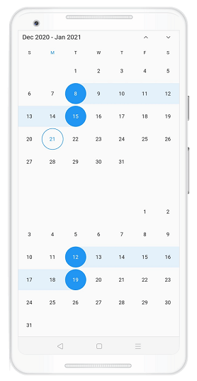
Vertical picker
You can arrange two date range pickers vertically using the enableMultiView and navigationDirection properties.
Refer to the following code.
@override
Widget build(BuildContext context) {
  return MaterialApp(
    home: Scaffold(
        body: SfDateRangePicker(
      enableMultiView: true,
      navigationDirection: DateRangePickerNavigationDirection.vertical,
      viewSpacing: 10,
    )),
  );
}
Conclusion
In this blog post, we walked you through the new features in our Flutter Date Range Picker, available with our 2020 Volume 4 release. You can explore other features in the Date Range Picker documentation, where you can find detailed explanations and code examples.
For existing customers, the newest version of Essential Studio® is available for download from the License and Downloads page. If you are not yet a Syncfusion customer, you can try our 30-day free trial to check out our available features.
Please feel free to try out the samples available in our GitHub location and share your feedback or ask questions in the comments section. You can also contact us through our support forum, Direct-Trac, or feedback portal. We are always happy to assist you!


 No spam, just valuable updates.