
 Sheik Syed
Every release since its debut, we’ve made improvements and added useful features to our Xamarin.Forms Image Editor control. We’ve continued this effort in the 2019 Volume 3 release, where we added the following new features:
- Support for image filter effects.
- Option to add read-only text.
- Provision to enable or disable resize functionality for added objects.
In this blog, I’m going to explain these new features with examples.
Image filter effects support
The Image Editor filter effects allow users to apply different color filters to an image. This feature is used to manipulate the colors of existing images, enhancing their color and texture. The Image Editor control offers six types of image effects options:
- Hue
- Saturation
- Brightness
- Contrast
- Blur
- Sharpen
The effects can be applied either through the Image Editor toolbar or through code by using the ApplyImageEffect method.
Next, I will demonstrate applying individual filters to the following image.

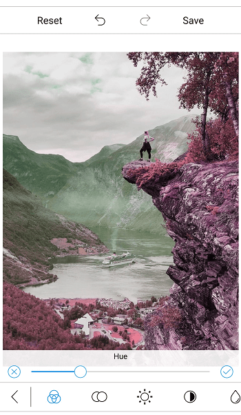
Hue
The hue represents the dominant wavelength of the color in an image. The value of the hue effect ranges from -180 to 180. The value 0 means there is no change in the hue effect and the image is displayed with its original color. To apply the hue effect to an image, use Hue option in toolbar, or use either the following XAML or C# code:
<imageeditor:SfImageEditor Source="{Binding Image}" x:Name="imageEditor" ImageEffect="Hue" EffectValue="-90" >
imageEditor.ApplyImageEffect(ImageEffect.Hue, -90);
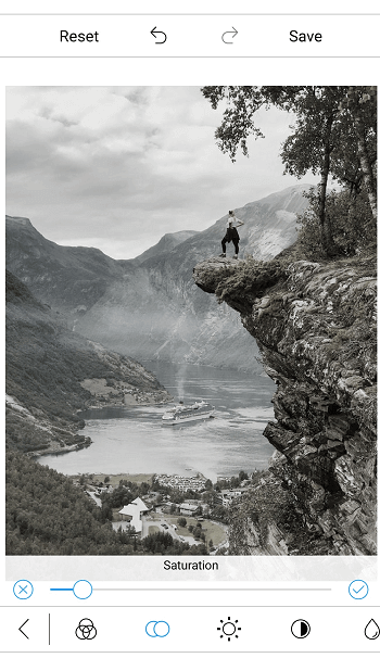
Saturation
The saturation is the intensity of the color. The value of the saturation effect ranges from -100 to 100. The value 0 means there is no change in the saturation effect and the image is presented in its original color. If the value is -100, the image will be black and white. If the value is 100, the image color will be oversaturated. To apply the saturation effect to the image, use the Saturation option in the toolbar, or use either the following XAML or C# code.
<imageeditor:SfImageEditor Source="{Binding Image}" x:Name="imageEditor" ImageEffect="Saturation" EffectValue="-80" >
imageEditor.ApplyImageEffect(ImageEffect.Saturation, -80);
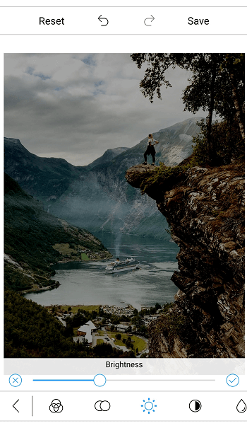
Brightness
The brightness represents how bright the color of an image is. The value of the brightness effect ranges between -100 and 100. The value 0 means there is no change in the brightness and the image is displayed in its original color. Positive values increase the brightness of an image and negative values decrease it. When the value is 100, the image will be at full brightness and appear completely white. When the value is -100, there is no brightness, making the image appear black. To apply the brightness effect to the image, use the Brightness option in the toolbar, or use either the following XAML or C# code:
<imageeditor:SfImageEditor Source="{Binding Image}" x:Name="imageEditor" ImageEffect="Brighness" EffectValue="-20" >
imageEditor.ApplyImageEffect(ImageEffect.Brightness, -20);
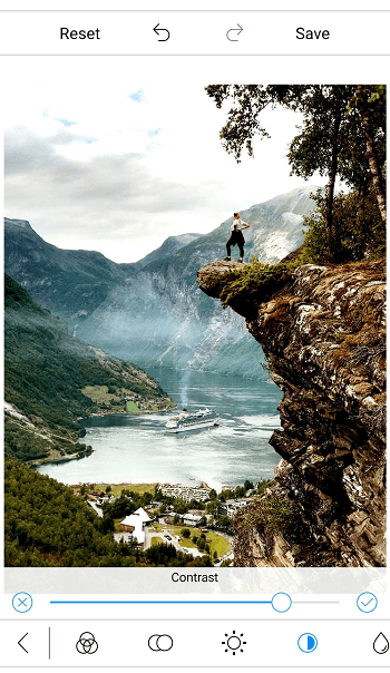
Contrast
The contrast represents the difference between colors in an image. The value of contrast ranges from -100 to 100. The value 0 means there is no change in the contrast effect and the image is its original color. The value -100 will result in a completely grayscale image, and the value 100 will result in an over-contrasted image. To apply the contrast effect to the image, use the Contrast option in the toolbar, or use either the following XAML or C# code.
<imageeditor:SfImageEditor Source="{Binding Image}" x:Name="imageEditor" ImageEffect="Contrast" EffectValue="75" >
imageEditor.ApplyImageEffect(ImageEffect.Contrast, 75);
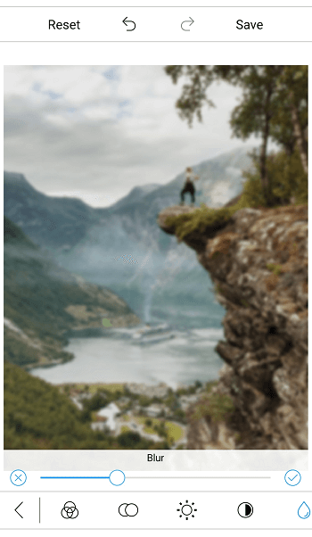
Blur
The blur represents the clarity of the image. The blur effect value ranges from 0 to 6. The value 0 means there is no change in the image, and the blurring of the image will increase based on the increased effect value. To apply the blur effect to the image, use the Blur option in toolbar, or use either the following XAML or C# code.
<imageeditor:SfImageEditor Source="{Binding Image}" x:Name="imageEditor" ImageEffect="Blur" EffectValue="2" >
imageEditor.ApplyImageEffect(ImageEffect.Blur, 2);
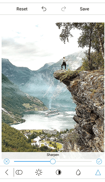
Sharpen
Sharpen is used to highlight and enhance the edges of objects in an image. The sharpen effect value ranges from 0 to 6. The value 0 means there is no change in the image, and the sharpness of the image increases based on the increased effect value. To apply the sharpen effect to the image, use the Sharpen option in the toolbar, or use either the following XAML or C# code.
<imageeditor:SfImageEditor Source="{Binding Image}" x:Name="imageEditor" ImageEffect="Sharpen" EffectValue="3" >
imageEditor.ApplyImageEffect(ImageEffect.Sharpen, 3);
Create custom color styles for images
By applying a combination of different filter effects to an image, you can create your own image color style as shown in the next image. For example, use the following code to create a limestone color style and apply it to an image.
if(item.ImageName == "Limestone")
{
     imageEditor.ApplyImageEffect(ImageEffect.Hue, -147);
     imageEditor.ApplyImageEffect(ImageEffect.Saturation, 84);
     imageEditor.ApplyImageEffect(ImageEffect.Brightness, -16);
     imageEditor.ApplyImageEffect(ImageEffect.Contrast, 14);
}
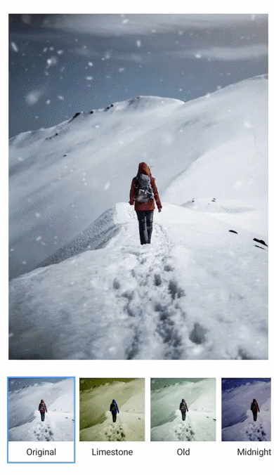
You can download this custom color style demo from GitHub.
Option to add read-only text
Now, the Image Editor also supports adding read-only text by restricting the text pop-up while tapping on added text. To add read-only text, set the IsEditable property in TextSettings to false before adding the text. By default, this property is set to true.
imageEditor.AddText("text", new TextSettings { IsEditable = false });
Provision to enable or disable resize functionality of added objects
Now, you can also control the resizing functionality of added images, shapes, and custom views by using the IsResizable property of PenSettings, TextSettings, and CustomViewSettings in the Image Editor as shown in the following code.
image.AddShape(ShapeType.Rectangle, new PenSettings { Color = Color.Red, Bounds = new Rectangle(20, 20, 35, 35), IsResizable = false });
Conclusion
In addition to these features, we have included some minor improvements and bug fixes. Try out these new features and enhancements in our 2019 Volume 3 release.
If you don’t have a Syncfusion license, but would like to try out these new features, you can sign up for a free 30-day trial.
If you have any questions about these features, please let us know in the comments below. You can also contact us through our support forum, Direct-Trac, or our feedback portal. We are happy to assist you!
We hope you will also like the following posts:
 No spam, just valuable updates.