
 Leomaris Reyes
In this article, we will enhance your XAML skills by replicating a waiting list UI inspired by this Dribble design.
Start by knowing the structure
Let’s start by grasping the fundamental structure of the waiting list UI. To facilitate this, we’ve divided the article into clear steps, each representing a cluster of visual elements essential for replicating the UI.
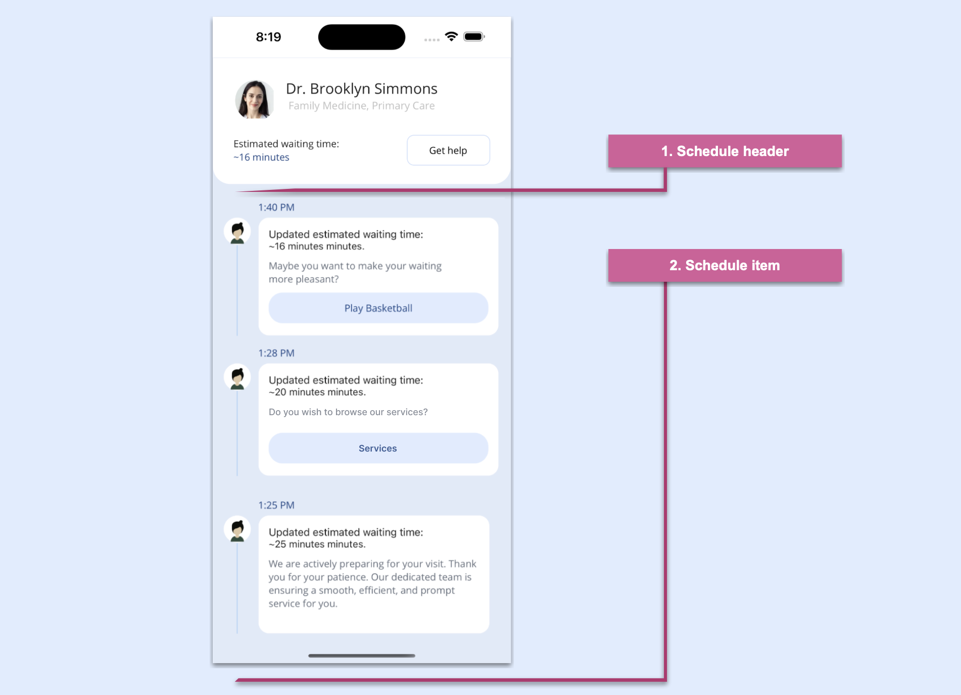
Refer to the following image.
What specific skills will you be learning in XAML?
In addition to strengthening your XAML skills, you will learn to use:
- Syncfusion .NET MAUI ListView: To display your information in a list in portrait or landscape orientation.
- Syncfusion .NET MAUI Avatar View: To provide user images.
- Border: To add a border to the desired visual elements.
- VerticalStackLayout: To organize child views in a one-dimensional vertical stack.
- HorizontalStackLayout: To organize child views in a one-dimensional horizontal stack.

Schedule header
In the schedule header, we’ll render the following UI elements:
Main layout
First, we’ll generate a page named MainPage.xaml, which serves as the container for the main layout that organizes the blocks outlined in the previous image. The chosen layout is VerticalStackLayout, to optimize the utilization of screen space.
Refer to the following code example.
<!-- Main layout -->
<VerticalStackLayout BackgroundColor="#e1eaf8"
                     Margin="0,0,0,-65">
    <!-- Step 1: Add all the elements contained in the schedule header -->
    <!-- Step 2: Add all the elements contained in the schedule item -->
</VerticalStackLayout>
We have finished implementing the main layout, so let’s design the schedule header in XAML.
Designing the schedule header
The schedule header encompasses an avatar, name, role, description, minutes, and a Get Help button. Notably, the design incorporates rounded bottom edges, achieved using the Border control.
Refer to the following code example.
<!-- 1. Schedule header -->
<Border StrokeShape="RoundRectangle 0,0,25,25"
        StrokeThickness="0"
        BackgroundColor="White">

    <Grid RowDefinitions="Auto,Auto,Auto,Auto,Auto"
          ColumnDefinitions="Auto,*"
          Padding="30">
        <!-- Add the Avatar element -->
        <!-- Add name & role elements -->
        <!-- Add description & minutes elements -->
        <!-- Add the Get Help button element -->
    </Grid>
</Border>Adding .NET MAUI Avatar View reference
To display the user image, we will use thre Syncfusion .NET MAUI Avatar View:
- To add the .NET MAUI Avatar Viewto your project, open the NuGet package manager in Visual Studio, search for Syncfusion.Maui.Core, and then install it.
 To register the handler for Syncfusion core, go to your MauiProgram.cs file. Add the Syncfusion.Maui.Core.Hosting namespace. Then, add the following line of code just after the line .UseMauiApp<App>() in the CreateMauiApp method.
.ConfigureSyncfusionCore();
- Then, add the namespace for .NET MAUI Avatar View.
xmlns:syncAvatar="clr-namespace:Syncfusion.Maui.Core;assembly=Syncfusion.Maui.Core"
- Then, add the namespace for .NET MAUI Avatar View.
- Initialize and configure the Avatar View using the ImageSource property.
<!-- Avatarview -->
<sfControl:SfAvatarView Grid.Column="0" Grid.Row="0" Grid.RowSpan="2"
                        ContentType="Custom"
                        ImageSource="model.jpeg"
                        VerticalOptions="Start"
                        Stroke="Transparent"
                        HorizontalOptions="Start"
                        WidthRequest="60"
                        HeightRequest="60"
                        CornerRadius="30"/>
- Initialize and configure the Avatar View using the ImageSource property.
Designing the UI elements
To enhance the user experience, let’s enhance specific UI elements within the schedule header.
Designing name and role elements
Refer to the following code example to design the name and role elements.
 <!-- Name & role -->
<Label Grid.Column="0" Grid.Row="0" Grid.ColumnSpan="2" HorizontalTextAlignment="Center" Text="Dr. Brooklyn Simmons" FontSize="21"/>
<Label Grid.Column="0" Grid.Row="1" Grid.ColumnSpan="2" HorizontalTextAlignment="Center"  Text="Family Medicine, Primary Care" FontSize="15" TextColor="Silver" Margin="0,0,0,35"/>
Designing description and minutes
Refer to the following code example to design the description and minutes elements to ensure transparency about the estimated waiting time.
 <!-- Description & minutes -- >
<Label Grid.Column="0" Grid.Row="2" Text="Estimated waiting time:"/>
<Label Grid.Column="0" Grid.Row="3" Text="~16 minutes" TextColor="#224785"/>
Streamlining assistance with a Get help button
Refer to the following code example to design the Get help button.
<!-- Get help button -->
<Button Grid.Column="1" Grid.Row="2" Grid.RowSpan="3"  WidthRequest="120" HorizontalOptions="End" Text="Get help" BackgroundColor="Transparent" TextColor="Black" CornerRadius="10" BorderWidth="1" VerticalOptions="Center" BorderColor="#cddefa" Margin="10,0,0,0"/>
Building the schedule items
Let’s create a list of cards for the schedule, like in the following image.
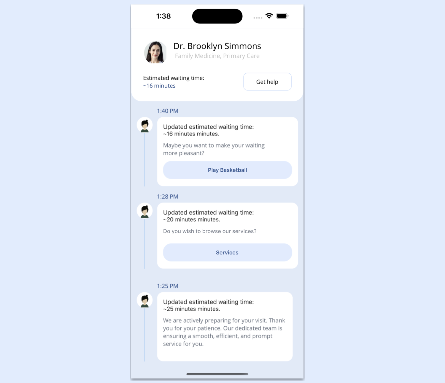
This section includes the following elements:
- Populating the cards list.
- Designing the individual elements in a card.
Populating the cards list
We’ll add some mock data to visualize the final list result by following these steps. Feel free to use any data you prefer.
1. Create a Model folder
Set up a Model folder and add the Schedule.cs class to it. Define the necessary attributes that we’ll be utilizing.
Refer to the following code example.
public class Schedule
{
    private string picture;
    private string minutes;
    private string description;
    private string time;
    private bool playBasket;
    private bool readArticle;

    public string Picture
    {
        get { return picture; }
        set { picture = value; }
    }

    public string Minutes
    {
        get { return minutes; }
        set { minutes = value; }
    }

    public string Description
    {
        get { return description; }
        set { description = value; }
    }

    public string Time
    {
        get { return time; }
        set { time = value; }
    }

    public bool PlayBasket
    {
        get { return playBasket; }
        set { playBasket = value; }
    }

    public bool ReadArticle
    {
        get { return readArticle; }
        set { readArticle = value; }
    }
}
2. Develop a ViewModel with mock data
Let’s set up a ViewModel populated with mock data. First, create a folder named ViewModel. Then, create a file called ScheduleViewModel.cs in it.
public class ScheduleViewModel
{
    private ObservableCollection<Schedule> scheduleCollection;

    public ObservableCollection<Schedule> Schedule
    {
        get { return scheduleCollection; }
        set { scheduleCollection = value; }
    }

    internal void GenerateInfo()
    {
        scheduleCollection = new ObservableCollection<Schedule>();
        scheduleCollection.Add(new Schedule { Time = "1:40 PM", Picture = "", Minutes = "16 minutes", Description = "Maybe you want to make your waiting more pleasant?", PlayBasket = true, ReadArticle = false });
        scheduleCollection.Add(new Schedule { Time = "1:25 PM", Picture = "", Minutes = "25 minutes", Description = "We are actively preparing for your visit. Thank you for your patience. Our dedicated team is ensuring a smooth, efficient, and prompt service for you.", PlayBasket = false, ReadArticle = true });
        scheduleCollection.Add(new Schedule { Time = "1:28 PM", Picture = "", Minutes = "20 minutes", Description = "Maybe you want to make your waiting more pleasant?", PlayBasket = true, ReadArticle = false });
    }

    public ScheduleViewModel()
    {
        GenerateInfo();
    }
}
Then, populate this ViewModel with mock data to simulate the appearance of the schedule list. Lastly, ensure that your XAML includes references to this ViewModel.
public MainPage()
{
    InitializeComponent();
    BindingContext = new ViewModels.ScheduleViewModel();
}
3. Adding the ListView
Once we have the mock data ready to display in the UI list, let’s add a list view. This will enable us to visualize the previously added mock data. For this, we will use the Syncfusion .NET MAUI ListView control.
First, refer to the Getting started with .NET MAUI ListView documentation. Then, follow these steps to implement the control:
- Add the Syncfusion.Maui.ListView NuGet package.
 Go to the MauiProgram.cs file and register the handler for the Syncfusion .NET MAUI ListView. To do so, navigate to the CreateMauiApp method and then, just before the line return builder.Build();, add the builder.ConfigureSyncfusionListView(); method.
- Now, add Syncfusion.Maui.ListView namespace in the XAML page.
xmlns:syncfusion="clr-namespace:Syncfusion.Maui.ListView;assembly=Syncfusion.Maui.ListView"
- Finally, initialize the ListView control using the following code example in your XAML page.
<listView:SfListView ItemsSource="{Binding Schedule}"
                     ItemSize="215"
                     ScrollBarVisibility="Never">
    <listView:SfListView.ItemTemplate>
        <DataTemplate>
            <Grid ColumnDefinitions="Auto,*"
                  RowDefinitions="Auto,Auto,*,Auto,Auto,Auto"
                  Padding="15,20,20,0">
                <!-- Add the time, avatar, and line elements. -->
                <!-- Add the border: minutes, and description elements. -->
            </Grid>
        </DataTemplate>
    </listView:SfListView.ItemTemplate>
</listView:SfListView>
- Finally, initialize the ListView control using the following code example in your XAML page.
Designing the individual item elements in a card
Let’s design the individual elements within each schedule card.
Time, avatar, and line
We will display the time description using a simple Label. For the avatar, we will use the Syncfusion AvatarView again (since it’s already implemented, you won’t need to implement it again).
We’ll use a BoxView to create the line. Note that it’s also possible to create this line using a .NET MAUI line shape. However, for this exercise, we’ll use the BoxView.
Refer to the following code example.
<!-- Time -->
<Label Grid.Row="0" Grid.Column="1" Text="{Binding Time}" TextColor="#1b4485" Margin="10,0,0,5"/>

<!-- Avatar -->
<sfControl:SfAvatarView Grid.Column="0" Grid.Row="1"
                        ContentType="Default"
                        VerticalOptions="Start"
                        Stroke="Transparent"
                        BackgroundColor="White"
                        HorizontalOptions="Start"
                        WidthRequest="40"
                        HeightRequest="40"
                        CornerRadius="20"/>

<!-- Line -->
<BoxView Grid.Column="0" Grid.Row="2" Grid.RowSpan="2" Opacity="0.3" HorizontalOptions="FillAndExpand" WidthRequest="1" Color="#1690F4"/>
Border: minutes and description
We’ve reached the final section of code to complete our UI! Here, we’ll add a Border control to achieve the card’s rounded effect and include necessary information like the duration in minutes and description.
Refer to the following code example.
<Border Grid.Column="1" Grid.Row="1" Grid.RowSpan="2"
        Margin="10,0,0,0"
        StrokeShape="RoundRectangle 15"
        StrokeThickness="0"
        BackgroundColor="White"
        HeightRequest="170">
    <VerticalStackLayout Padding="15" Spacing="10">
        <!-- Minutes -->
        <Label>
            <Label.FormattedText>
                <FormattedString>
                    <Span Text="Updated estimated waiting time:" FontSize="15"/>
                    <Span Text="{Binding Minutes, StringFormat='~{0} minutes.'}" FontSize="14"/>
                </FormattedString>
            </Label.FormattedText>
        </Label>
        <!-- Description -->
        <Label Text="{Binding Description}" TextColor="#636c7a" />
        <Button Text="Play Basketball" BackgroundColor="#e0ecff" IsEnabled="True" IsVisible="{Binding PlayBasket}" CornerRadius="20" TextColor="#1b4485"/>
    </VerticalStackLayout>
</Border>
That’s all! Our UI is done!
GitHub reference
Check out the complete example for this on GitHub demos.
Conclusion
Thanks for reading! In this blog, we enhanced your XAML knowledge by teaching you how to replicate a waiting list UI using Syncfusion .NET MAUI controls. Try out the steps outlined in the post and leave your thoughts in the comments section below.
Syncfusion’s .NET MAUI controls were created from the ground up using .NET MAUI, which makes them feel like native framework controls. These controls are optimized to manage large amounts of data, making them ideal for building top-notch, cross-platform mobile and desktop apps.
If you have any questions or need assistance, don’t hesitate to reach out to us through our support forum, support portal, or feedback portal. We are always available to help you!


Related blogs
- Syncfusion .NET MAUI 2024 Road Map
- Chart of the Week: Creating a .NET MAUI Bar Chart to Visualize Type 1 Diabetes Prevalence
- Introducing the New .NET MAUI PullToRefresh Control
- Introducing the .NET MAUI Navigation Drawer Control
- Chart of the Week: Creating a .NET MAUI Multiple Fast Line Chart to Analyze the Impact of Exported Goods on GDP
 No spam, just valuable updates.