While developing an application, effective communication and preservation of information across components are vital, especially when navigating between pages. While passing information between components is a common approach, state maintenance may be more optimal for handling complex scenarios.
This blog elucidates the steps to implement state maintenance in the Syncfusion Blazor Tabs component.
Understanding state in Blazor
In Blazor, the user’s state resides in the server’s memory within a circuit. State management involves preserving the app state even after a connection loss or disconnection. The state within a user’s circuit encompasses various aspects:
- UI-related data, including component instances and rendered output.
- Property/field values of component instances.
- Dependency injection service instance data.
Note that by default, Blazor can only manage internal states, meaning the variables are closely tied to the component where they are defined. Consequently, the associated variables will be lost when a component is deleted. A simple page navigation serves as an example for this scenario.
Necessity for state management
In Blazor, an app is connected to the server through a circuit holding the user’s state. This connection can be disrupted or lost due to reasons such as:
- Many users accessing the server cause increased memory usage and circuit disconnection.
- Users reload the app or webpage, leading to circuit disconnection.
These disruptions can result in the loss of the user’s state, potentially causing critical data loss for processes like:
- Multistep webforms.
- Shopping carts.
Loss of data after completing multistep processes or creating a shopping list can lead to unnecessary time consumption. In Blazor, data is stored in the local cache to counteract this, ensuring that the state persists even in the event of circuit disconnection.
Persisting state in Blazor Tabs
Rendering content within the Blazor Tabs offers flexibility. The content rendering of tabs can be accomplished in three ways:
This section will elaborate on maintaining the state for the Blazor Tabs across these three content-rendering modes.
Dynamic rendering
Dynamic rendering is the default rendering mode. It initially loads the selected tab’s content and makes it available in the DOM. If you choose another tab, the content in the DOM is replaced with that tab’s content. While this boosts page loading performance by rendering only the currently active tab content, the downside is that tabs don’t retain their current state, since each tab loads fresh content when selected.
In this mode, state management must be handled at the application end. Maintaining state in tab content can be achieved using dependency injection service instance data.
Follow these steps to preserve the state in Blazor Tabs in dynamic rendering mode.
Step 1: Creating a state management service
To manage the state in memory (or in the circuit for Blazor Server), we need to establish a dedicated service for state handling. Refer to the following code example.
FormService.cs
public class FormService
{
    public string? UserName { get; set; }
    public string? MailAddress { get; set; }
}
Then, register the service in the Program.cs file.
var builder = WebApplication.CreateBuilder(args);

// Add services to the container.
builder.Services.AddRazorPages();
builder.Services.AddServerSideBlazor();
builder.Services.AddSingleton<WeatherForecastService>();
builder.Services.AddSingleton<FormService, FormService>();
builder.Services.AddSyncfusionBlazor();
Step 2: Configure dynamic rendering mode in Blazor Tabs
Inject the FormService and perform data binding directly on the Index.razor page. Finally, render the Syncfusion Blazor Tabs component with the dynamic rendering mode.
Index.razor
@using BlazorStateMaintenance.Data
@inject FormService form
@using Syncfusion.Blazor.Navigations
@using Syncfusion.Blazor.Inputs
@using Syncfusion.Blazor.Buttons

<SfTab @bind-SelectedItem="@selectedTab">
    <TabItems>
        <TabItem>
            <HeaderTemplate>Sign in</HeaderTemplate>
            <ContentTemplate>
                <div id="User details" style="padding:10px">
                    <form id="formId">
                        <div class="form-group">
                            <div class="e-float-input">
                                <SfTextBox Placeholder="Enter name" @bind-Value="form.UserName"></SfTextBox>
                            </div>
                            <div class="e-float-input">
                                <SfTextBox Placeholder="Email" @bind-Value="form.MailAddress" Type="InputType.Email"></SfTextBox>
                            </div>
                        </div>
                    </form>
                    <div style="text-align: center">
                        <SfButton @onclick="@OnSignin">Sign in</SfButton>
                        <SfButton @onclick="@OnSkip">Skip</SfButton>
                        @if (emptyField)
                        {
                            <div class="Error">* Please fill all fields</div>
                        }
                    </div>
                </div>
            </ContentTemplate>
        </TabItem>
        <TabItem>
            <HeaderTemplate>Syncfusion Blazor</HeaderTemplate>
            <ContentTemplate>
                <p>You can check out our Syncfusion Blazor demo here - https://blazor.syncfusion.com/demos/ </p>
                <br />
                <p>Also, the user guide will be available here - https://blazor.syncfusion.com/documentation/introduction/</p>
            </ContentTemplate>
        </TabItem>
        <TabItem>
            <HeaderTemplate>Feedback</HeaderTemplate>
            <ContentTemplate>
                <div id="Feedback_Form" style="padding:10px">
                    <form id="formId">
                        <div class="form-group">
                            <div class="e-float-input">
                                <SfTextBox Placeholder="Enter name" @bind-Value="form.UserName"></SfTextBox>
                            </div>
                            <div class="e-float-input">
                                <SfTextBox @bind-Value="form.MailAddress" Placeholder="Email" Type="InputType.Email"></SfTextBox>
                            </div>
                            <div class="e-float-input">
                                <SfTextBox @bind-Value="comments" Placeholder="Share your comments"></SfTextBox>
                            </div>
                        </div>
                    </form>
                    <div style="text-align: center">
                        <SfButton @onclick="@OnSubmit">Submit</SfButton>
                        @if (emptyField)
                        {
                            <div class="Error">* Please fill all fields</div>
                        }
                    </div>
                </div>
            </ContentTemplate>
        </TabItem>
    </TabItems>
</SfTab>

@code {
    private string comments { get; set; }
    private int selectedTab { get; set; } = 0;
    private Boolean emptyField = false;
    private void OnSignin()
    {
        if (form.UserName == null || form.MailAddress == null)
        {
            emptyField = true;
        }
        else
        {
            emptyField = false;
            this.selectedTab = 1;
        }
    }
    private void OnSkip()
    {
        this.selectedTab = 1;
    }
    private void OnSubmit()
    {
        if (form.UserName == null || form.MailAddress == null || this.comments == null)
        {
            emptyField = true;
        }
        else
        {
            emptyField = false;
            form.UserName = null;
            form.MailAddress = null;
            this.comments = null;
        }
    }
}
In this illustration, the FormService is seamlessly injected into the Index.razor page, establishing a direct binding between its properties and the content within the tabs. You can easily customize the bindings and content to align with the specific requirements of your app.
The FormService ensures persistence in in-memory storage even when the Blazor Tabs component undergoes destruction and recreation.
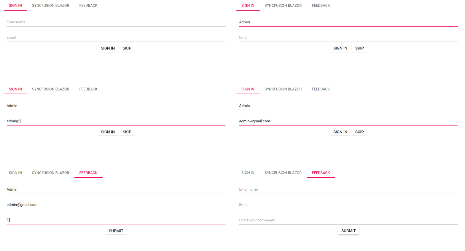
Refer to the following output image. In it, the username and email address are retained within the tab items, even during navigation.

On-demand rendering or lazy loading
We can enable on-demand rendering or lazy loading for the Blazor Tabs component by configuring the ContentLoad.Demand property to LoadOn. In this mode, only the content of the selected tab will be loaded initially and rendered upon selection. The content of the tabs loaded once will be maintained in the DOM. This approach ensures the persistence of tab states, such as scroller position and form values.
Refer to the following code example. The data entered in the first tab persists even when navigating to the third tab.
Index.razor
@using BlazorStateMaintenance.Data
@inject FormService form
@using Syncfusion.Blazor.Navigations
@using Syncfusion.Blazor.Inputs
@using Syncfusion.Blazor.Buttons

<SfTab LoadOn="ContentLoad.Demand" @bind-SelectedItem="@selectedTab">
    <TabItems>
        <TabItem>
            <HeaderTemplate>Sign in</HeaderTemplate>
            <ContentTemplate>
                <div id="User details" style="padding:10px">
                    <form id="formId">
                        <div class="form-group">
                            <div class="e-float-input">
                                <SfTextBox Placeholder="Enter name" @bind-Value="form.UserName"></SfTextBox>
                            </div>
                            <div class="e-float-input">
                                <SfTextBox Placeholder="Email" @bind-Value="form.MailAddress" Type="InputType.Email"></SfTextBox>
                            </div>
                        </div>
                    </form>
                    <div style="text-align: center">
                        <SfButton @onclick="@OnSignin">Sign in</SfButton>
                        <SfButton @onclick="@OnSkip">Skip</SfButton>
                        @if (emptyField)
                        {
                            <div class="Error">* Please fill all fields</div>
                        }
                    </div>
                </div>
            </ContentTemplate>
        </TabItem>
        <TabItem>
            <HeaderTemplate>Syncfusion Blazor</HeaderTemplate>
            <ContentTemplate>
                <p>You can check out our Syncfusion Blazor demo here - https://blazor.syncfusion.com/demos/ </p>
                <br />
                <p>Also, the user guide will be available here - https://blazor.syncfusion.com/documentation/introduction/</p>
            </ContentTemplate>
        </TabItem>
        <TabItem>
            <HeaderTemplate>Feedback</HeaderTemplate>
            <ContentTemplate>
                <div id="Feedback_Form" style="padding:10px">
                    <form id="formId">
                        <div class="form-group">
                            <div class="e-float-input">
                                <SfTextBox Placeholder="Enter name" @bind-Value="form.UserName"></SfTextBox>
                            </div>
                            <div class="e-float-input">
                                <SfTextBox @bind-Value="form.MailAddress" Placeholder="Email" Type="InputType.Email"></SfTextBox>
                            </div>
                            <div class="e-float-input">
                                <SfTextBox @bind-Value="comments" Placeholder="Share your comments"></SfTextBox>
                            </div>
                        </div>
                    </form>
                    <div style="text-align: center">
                        <SfButton @onclick="@OnSubmit">Submit</SfButton>
                        @if (emptyField)
                        {
                            <div class="Error">* Please fill all fields</div>
                        }
                    </div>
                </div>
            </ContentTemplate>
        </TabItem>
    </TabItems>
</SfTab>

@code {
    private string comments { get; set; }
    private int selectedTab { get; set; } = 0;
    private Boolean emptyField = false;
    private void OnSignin()
    {
        if (form.UserName == null || form.MailAddress == null)
        {
            emptyField = true;
        }
        else
        {
            emptyField = false;
            this.selectedTab = 1;
        }
    }
    private void OnSkip()
    {
        this.selectedTab = 1;
    }
    private void OnSubmit()
    {
        if (form.UserName == null || form.MailAddress == null || this.comments == null)
        {
            emptyField = true;
        }
        else
        {
            emptyField = false;
            form.UserName = null;
            form.MailAddress = null;
            this.comments = null;
        }
    }
}
Adjust the content within each tab as needed. The implemented logic ensures that user inputs in the first tab persist when navigating to the third tab.

On-initial rendering
We can activate the initial rendering mode for Blazor Tabs by configuring the ContentLoad.Init property to LoadOn. In this mode, the content of all tabs will be rendered during the initial load and retained in the DOM. Additionally, this mode allows access to the references of components rendered in other tabs. Utilize this mode when dealing with a limited number of tabs where maintaining tab state is crucial.
In the following code example, all three tabs are rendered during the initial load, and the data entered in the first tab persists even when the second or third tab is active. This mode is particularly useful when working with fewer tabs containing minimal content.
Index.razor
@using BlazorStateMaintenance.Data
@inject FormService form
@using Syncfusion.Blazor.Navigations
@using Syncfusion.Blazor.Inputs
@using Syncfusion.Blazor.Buttons

<SfTab LoadOn="ContentLoad.Init" @bind-SelectedItem="@selectedTab">
    <TabItems>
        <TabItem>
            <HeaderTemplate>Sign in</HeaderTemplate>
            <ContentTemplate>
                <div id="User details" style="padding:10px">
                    <form id="formId">
                        <div class="form-group">
                            <div class="e-float-input">
                                <SfTextBox Placeholder="Enter name" @bind-Value="form.UserName"></SfTextBox>
                            </div>
                            <div class="e-float-input">
                                <SfTextBox Placeholder="Email" @bind-Value="form.MailAddress" Type="InputType.Email"></SfTextBox>
                            </div>
                        </div>
                    </form>
                    <div style="text-align: center">
                        <SfButton @onclick="@OnSignin">Sign in</SfButton>
                        <SfButton @onclick="@OnSkip">Skip</SfButton>
                        @if (emptyField)
                        {
                            <div class="Error">* Please fill all fields</div>
                        }
                    </div>
                </div>
            </ContentTemplate>
        </TabItem>
        <TabItem>
            <HeaderTemplate>Syncfusion Blazor</HeaderTemplate>
            <ContentTemplate>
                <p>You can check out our Syncfusion Blazor demo here - https://blazor.syncfusion.com/demos/ </p>
                <br />
                <p>Also, the user guide will be available here - https://blazor.syncfusion.com/documentation/introduction/</p>
            </ContentTemplate>
        </TabItem>
        <TabItem>
            <HeaderTemplate>Feedback</HeaderTemplate>
            <ContentTemplate>
                <div id="Feedback_Form" style="padding:10px">
                    <form id="formId">
                        <div class="form-group">
                            <div class="e-float-input">
                                <SfTextBox Placeholder="Enter name" @bind-Value="form.UserName"></SfTextBox>
                            </div>
                            <div class="e-float-input">
                                <SfTextBox @bind-Value="form.MailAddress" Placeholder="Email" Type="InputType.Email"></SfTextBox>
                            </div>
                            <div class="e-float-input">
                                <SfTextBox @bind-Value="comments" Placeholder="Share your comments"></SfTextBox>
                            </div>
                        </div>
                    </form>
                    <div style="text-align: center">
                        <SfButton @onclick="@OnSubmit">Submit</SfButton>
                        @if (emptyField)
                        {
                            <div class="Error">* Please fill all fields</div>
                        }
                    </div>
                </div>
            </ContentTemplate>
        </TabItem>
    </TabItems>
</SfTab>

@code {
    private string comments { get; set; }
    private int selectedTab { get; set; } = 0;
    private Boolean emptyField = false;
    private void OnSignin()
    {
        if (form.UserName == null || form.MailAddress == null)
        {
            emptyField = true;
        }
        else
        {
            emptyField = false;
            this.selectedTab = 1;
        }
    }
    private void OnSkip()
    {
        this.selectedTab = 1;
    }
    private void OnSubmit()
    {
        if (form.UserName == null || form.MailAddress == null || this.comments == null)
        {
            emptyField = true;
        }
        else
        {
            emptyField = false;
            form.UserName = null;
            form.MailAddress = null;
            this.comments = null;
        }
    }
}
Refer to the following output image.

GitHub references
Explore the functional example of state maintenance in Blazor Tabs by visiting this GitHub repository.
Summary
We appreciate the time spent on this blog, where we explained the steps for maintaining the state in the Syncfusion Blazor Tabs component. We hope you found the information valuable. Take a hands-on approach by following the outlined steps and share your thoughts in the comments below.
For our existing Syncfusion customers, the new version of Essential Studio® is available on the License and Downloads page. If you’re not yet part of our community, sign up for a 30-day free trial to evaluate these features.
For questions, you can contact us through our support forums, support portal, or feedback portal. Your satisfaction is our priority, and we look forward to assisting you on your Syncfusion journey!


