
 Sasi Kumar Arumugam
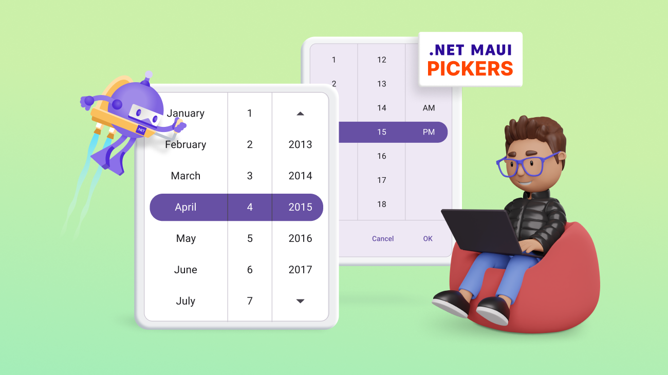
We are happy to introduce the new picker controls in our Syncfusion .NET MAUI suite from the 2023 Volume 3 release!
The Syncfusion .NET MAUI picker controls are fully customizable components that offer a simple yet attractive UI, enhancing your application with a smooth and touch-friendly user experience. These controls provide a unified UI across all platforms, simplifying the selection process.
Let’s explore the features of the following new picker controls rolled out in the 2023 Volume 3 release and the steps to get started with them:
Picker
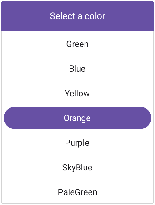
The new .NET MAUI Picker (SfPicker) is a versatile control that empowers users to select a single item from a list of options. It offers a seamless and highly customizable solution to enhance the user experience.
Key features
The key features of the .NET MAUI Picker control are as follows:
- Multiple columns: Users can select items from lists organized into multiple columns.
- Header view: Display and customize header text.
- Column header view: Use a customizable column header view to differentiate headings for each column.
- Footer view: Show or hide the footer view and customize the footer validation buttons (OK and Cancel).
- Selection view: Highlight a selected item and customize the appearance of the highlight.
- Picker modes: The .NET MAUI Picker control offers three display modes:
- Default mode: Seamlessly integrates the Picker into your app’s layout.
- Dialog mode: Presents the Picker in a pop-up dialog, offering a clean and focused interaction for users.
- Relative dialog mode: Presents the Picker in a pop-up dialog with the dialog’s position relative to the Picker’s location within the app layout.
- Picker interactions: Select an item through tap and scroll interactions.
- Item template: Customize the appearance of Picker items using item template support.
Getting started with .NET MAUI Picker control
Follow these steps to integrate the .NET MAUI Picker control into your app:
- First, create a new .NET MAUI app in Visual Studio.
- Syncfusion .NET MAUI components are available in the NuGet Gallery. To add the SfPicker to your project, open the NuGet package manager in Visual Studio, and search for Syncfusion.Maui.Picker, then install it.
- The Syncfusion.Maui.Core NuGet is a dependent package for all Syncfusion .NET MAUI controls. In the MauiProgram.cs file, register the handler for Syncfusion core.
MauiProgram.csusing Syncfusion.Maui.Core.Hosting; public static class MauiProgram { public static MauiApp CreateMauiApp() { var builder = MauiApp.CreateBuilder(); builder.ConfigureSyncfusionCore(); } }
- Finally, import the control namespace Syncfusion.Maui.Picker in XAML or C# code and then initialize the Picker control.
Refer to the following code to initialize the .NET MAUI Picker control and add items to it.
MainPage.xaml<ContentPage xmlns="http://schemas.microsoft.com/dotnet/2021/maui" xmlns:x="http://schemas.microsoft.com/winfx/2009/xaml" xmlns:picker="clr-namespace:Syncfusion.Maui.Picker;assembly=Syncfusion.Maui.Picker" x:Class="PickerMAUISample.MainPage"> <Frame HasShadow="False" CornerRadius="5" HorizontalOptions="Center" VerticalOptions="Center" Margin="0" Padding="0" WidthRequest="250" BorderColor="LightGray" HeightRequest="330"> <picker:SfPicker> <picker:SfPicker.HeaderView> <picker:PickerHeaderView Height="50" Text="Select a color" Background="#6750A4" > <picker:PickerHeaderView.TextStyle> <picker:PickerTextStyle FontSize="15" TextColor="White"/> </picker:PickerHeaderView.TextStyle> </picker:PickerHeaderView> </picker:SfPicker.HeaderView> <picker:SfPicker.Columns> <picker:PickerColumn SelectedIndex="4"> <picker:PickerColumn.ItemsSource> <x:Array Type="{x:Type x:String}" > <x:String>Pink</x:String> <x:String>Green</x:String> <x:String>Blue</x:String> <x:String>Yellow</x:String> <x:String>Orange</x:String> <x:String>Purple</x:String> <x:String>SkyBlue</x:String> <x:String>PaleGreen</x:String> <x:String>Gray</x:String> <x:String>LiteGreen</x:String> <x:String>Brown</x:String> </x:Array> </picker:PickerColumn.ItemsSource> </picker:PickerColumn> </picker:SfPicker.Columns> </picker:SfPicker> </Frame> </ContentPage>
Note: For more details, refer to the .NET MAUI Picker control documentation.
Date Picker
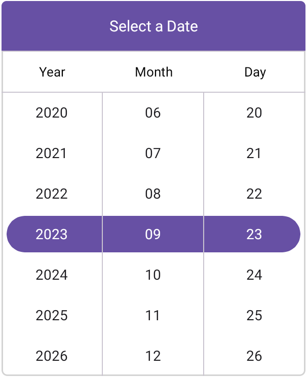
The new .NET MAUI Date Picker (SfDatePicker) control allows you to select a date from a list of dates, providing a seamless and highly customizable solution to enhance the user experience.
Key features
The key features of the .NET MAUI Date Picker control are as follows:
- Header view: Display and customize the header text.
- Column header view: Customize all the column header views and their text.
- Footer view: Show or hide the footer view and customize the footer validation buttons (OK and Cancel).
- Selection view: Highlight the selected date and customize the appearance of the highlight.
- Picker modes: The .NET MAUI Date Picker control offers three display modes:
- Default mode: Seamlessly integrates the Date Picker into your app’s layout.
- Dialog mode: Presents the Date Picker in a pop-up dialog, offering a clean and focused interaction for users.
- Relative dialog mode: Presents the Date Picker in a pop-up dialog with the dialog’s position relative to the picker’s location within the app layout.
- Picker interactions: You can select an item through tap and scroll interactions.
- Date formats: Offers eight predefined formats to represent the values of dates in different string formats.
- Date restriction: Restrict date selections to a specified range, ensuring users choose dates within the desired minimum and maximum dates.
- Intervals: The date values can be populated individually with intervals for days, months, and years.
Getting started with .NET MAUI Date Picker control
Follow these steps to integrate the .NET MAUI Date Picker control into your app:
- After creating a .NET MAUI app, open the NuGet package manager in Visual Studio, and search for Syncfusion.Maui.Picker, and then install it.
- Now, import the control namespace Syncfusion.Maui.Picker in XAML or C# code and then initialize the SfDatePicker control.
Refer to the following code to initialize the .NET MAUI Date Picker control and add items to it.MainPage.xaml
<ContentPage xmlns="http://schemas.microsoft.com/dotnet/2021/maui"
             xmlns:x="http://schemas.microsoft.com/winfx/2009/xaml"
             xmlns:picker="clr-namespace:Syncfusion.Maui.Picker;assembly=Syncfusion.Maui.Picker"
             x:Class="PickerMAUISample.MainPage">
 <Frame HasShadow="False" CornerRadius="5" HorizontalOptions="Center" VerticalOptions="Center" Margin="0" Padding="0" WidthRequest="300" BorderColor="LightGray" HeightRequest="370">
  <picker:SfDatePicker HeightRequest="370">
   <picker:SfDatePicker.HeaderView>
    <picker:PickerHeaderView Height="50" Background="#6750A4" Text="Select a Date">
     <picker:PickerHeaderView.TextStyle>
      <picker:PickerTextStyle TextColor="White" FontSize="15" />
     </picker:PickerHeaderView.TextStyle>
    </picker:PickerHeaderView>
   </picker:SfDatePicker.HeaderView>
  </picker:SfDatePicker>
 </Frame>
</ContentPage>
Note: For more details, refer to the .NET MAUI Date Picker control documentation.
Time Picker
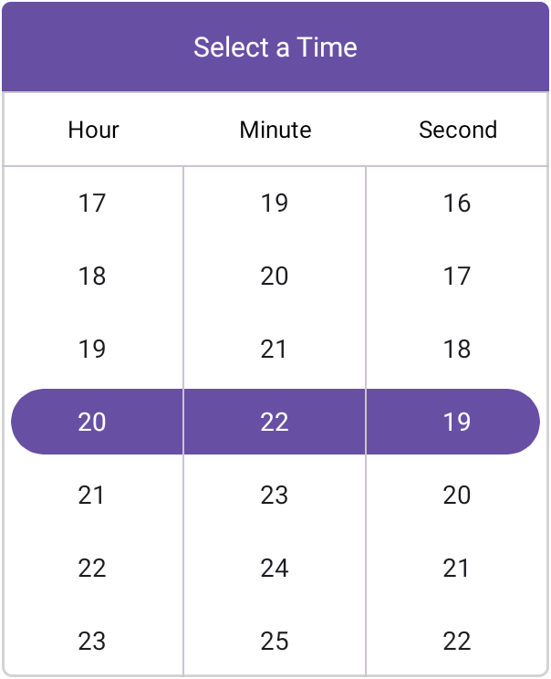
The .NET MAUI Time Picker (SfTimePicker) control enables users to select a time from a list of times, offering a seamless and highly customizable solution to enhance the user experience.
Key features
The key features of the .NET MAUI Time Picker control are as follows:
- Header view: Display and customize the header text.
- Column header view: Customize all column header views and their text.
- Footer view: Show or hide the footer view and customize the footer validation buttons (OK and Cancel).
- Selection view: Highlight the selected time and customize the appearance of the highlight.
- Picker modes: The .NET MAUI Time Picker control offers three display modes:
- Default mode: Seamlessly integrates the Time Picker into your app’s layout.
- Dialog mode: Presents the Time Picker in a pop-up dialog, offering a clean and focused interaction for users.
- Relative dialog mode: Positions the Time Picker’s pop-up dialog relative to the picker’s location within the app layout.
- Picker interactions: You can select an item through tap and scroll interactions.
- Time formats: Offers nine predefined formats to represent the values of the times in different string formats, enhancing flexibility and usability.
- Intervals: Time values can be populated individually with intervals for hours, minutes, and seconds, providing fine-grained control over time selection.
Getting started with the .NET MAUI Time Picker control
Follow these steps to integrate the .NET MAUI Time Picker control in your app:
- After creating a new .NET MAUI app, open the NuGet package manager in Visual Studio, search for Syncfusion.Maui.Picker, and then install it.
- Now, import the control namespace Syncfusion.Maui.Picker in XAML or C# code and then initialize the SfTimePicker control.
Refer to the following code to initialize the .NET MAUI Time Picker control and add items to it.
MainPage.xaml
<ContentPage xmlns="http://schemas.microsoft.com/dotnet/2021/maui"
             xmlns:x="http://schemas.microsoft.com/winfx/2009/xaml"
             xmlns:picker="clr-namespace:Syncfusion.Maui.Picker;assembly=Syncfusion.Maui.Picker"
             x:Class="PickerMAUISample.MainPage">
 <Frame HasShadow="False" CornerRadius="5" HorizontalOptions="Center" VerticalOptions="Center" Margin="0" Padding="0" WidthRequest="300" BorderColor="LightGray" HeightRequest="370">
  <picker:SfTimePicker HeightRequest="370">
   <picker:SfTimePicker.HeaderView>
    <picker:PickerHeaderView Height="50" Background="#6750A4" Text="Select a Time">
     <picker:PickerHeaderView.TextStyle>
      <picker:PickerTextStyle TextColor="White" FontSize="15" />
     </picker:PickerHeaderView.TextStyle>
    </picker:PickerHeaderView>
   </picker:SfTimePicker.HeaderView>
  </picker:SfTimePicker>
 </Frame>
</ContentPage>
Note: For more details, refer to the .NET MAUI Time Picker control documentation.
Date Time Picker
The .NET MAUI Date Time Picker (SfDateTimePicker) control enables you to select a date-time value from a list of dates and times, offering a seamless and highly customizable solution to enhance the user experience.
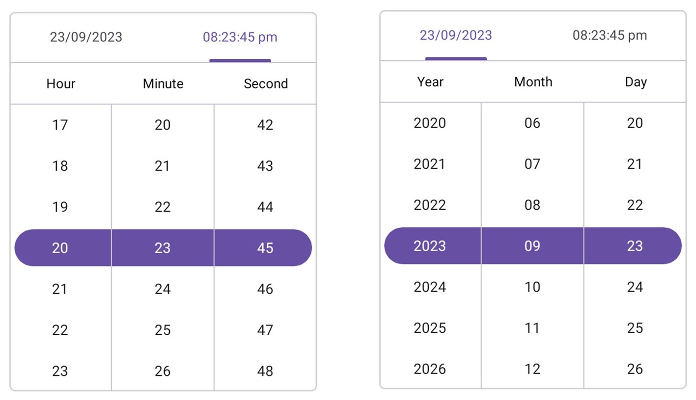
Key features
The key features of the .NET MAUI Date Time Picker control are as follows:
- Header view: Display and customize the header text and its selection.
- Column header view: Customize all column header views and their text.
- Footer view: Show or hide the footer view and customize the footer validation buttons (OK and Cancel).
- Selection view: Highlight the selected date-time and customize the appearance of the highlight.
- Picker modes: The .NET MAUI Date Time Picker control offers three display modes:
- Default mode: Seamlessly integrates the Date Time Picker into your app’s layout.
- Dialog Mode: Presents the Date Time Picker in a pop-up dialog, offering a clean and focused interaction for users.
- Relative dialog mode: Positions the Date Time Picker’s pop-up dialog relative to the picker’s location within the app layout.
- Picker interactions: You can select an item through tap and scroll interactions.
- Date formats: Offers eight predefined formats to represent the values of the dates in different string formats.
- Time formats: Offers nine predefined formats to represent the values of the times in different string formats, enhancing flexibility and usability.
- Date restriction: Restrict date-time selections to a specified range, ensuring users choose date-times within the desired minimum and maximum date-time values.
- Intervals: Date-time values can be populated individually with intervals for seconds, minutes, hours, days, months, and years.
Getting started with the .NET MAUI Date Time Picker control
Follow these steps to integrate the .NET MAUI Date Time Picker control in your app:
- After creating a .NET MAUI app, open the NuGet package manager in Visual Studio, and search for Syncfusion.Maui.Picker, and then install it.
- Now, import the control namespace Syncfusion.Maui.Picker in XAML or C# code and initialize the SfDateTimePicker control.
Refer to the following code to initialize the .NET MAUI Date Time Picker control and add items to it.
MainPage.xaml
<ContentPage xmlns="http://schemas.microsoft.com/dotnet/2021/maui"
             xmlns:x="http://schemas.microsoft.com/winfx/2009/xaml"
             xmlns:picker="clr-namespace:Syncfusion.Maui.Picker;assembly=Syncfusion.Maui.Picker"
             x:Class="PickerMAUISample.MainPage">
 <Frame HasShadow="False" CornerRadius="5" HorizontalOptions="Center" VerticalOptions="Center" Margin="0" Padding="0" WidthRequest="300" BorderColor="LightGray" HeightRequest="370">
  <picker:SfDateTimePicker HeightRequest="370" />
 </Frame>
</ContentPage>
Note: For more details, refer to the .NET MAUI Date Time Picker control documentation.
Conclusion
Thanks for reading! In this blog, we’ve explored the features of the new .NET MAUI picker controls introduced in the 2023 Volume 3 release. Try these controls out and share your feedback in the comments section below.
If you are not a Syncfusion customer, try our 30-day free trial to see how our components can enhance your projects.
If you have any questions, you can contact us through our support forum, support portal, or feedback portal. We are always happy to assist you!


 No spam, just valuable updates.