The ColorPicker control is a new component that was introduced in Essential Studio® 2014 Volume 3. It provides a rich visual interface for color selection. End users can either choose a custom color or select colors from a set of professionally-designed palettes.
You can also select colors in different specifications, such as Red Green Blue Alpha (RGBA) opacity, hue-saturation-value (HSV), and hexadecimal (HEX). The ColorPicker control provides a selection of basic colors, standard presets, custom colors, and color swatches.
Standard Model
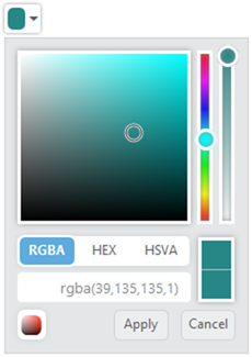
The ColorPicker control displays a drop-down menu with multiple ways to pick a specific color in a WYSIWYG manner. The selected color is displayed in the drop-down menu. You can also adjust the opacity value and hue value by moving the corresponding sliders.
1. The following code snippet is used to declare a ColorPicker control:
| <input type=”text” id=”colorPicker” /> |
2. The following code snippet will render the ColorPicker control:
<script> jQuery(function ($) { $(“#colorPicker”).ejColorPicker(); |
Figure 1: Standard Model
Palette Model
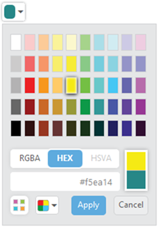
The ColorPicker palette model has 12 different palette patterns. Each pattern consists of 50 colors, and 600 colors are available by default.
Figure 2: Palette Model
Configure Custom Palette
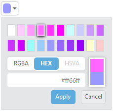
Custom palettes are created by passing either a comma-delimited string of hex values or an array of colors.
Figure 3: Custom Palette
Configure Recent Color Swatches
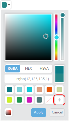
The ColorPicker control will keep up to 11 colors in a custom list. If you want to add a color from the picker or palette into a recent color list, then click the add button.
Figure 5: Recent Color Swatches
Conclusion
The ColorPicker control provides an efficient interface for end users to select colors in web applications. The appearance and functionality can also be customized to meet your requirements.


