
 Alan Sangeeth
Data representation is crucial in simplifying complex data and presenting it in an easily understandable format. With the growing volume of data and the need for real-time insights, robust data visualization tools have become essential. These tools provide visual representations of data that can be quickly interpreted.
This blog will explore how to enhance data visualization using a nested grid UI in the Syncfusion Blazor TreeGrid component.
What is a tree grid?
A tree grid is a data grid that presents data in a hierarchical structure, like a tree. It is used to display data that has parent-child relationships, where each child can have multiple subchildren. A tree grid is an excellent choice for displaying multiple levels of data relationships.
The Syncfusion Blazor TreeGrid is a feature-rich component used to visualize self-referential, hierarchical (in a tree-like structure) data effectively in a tabular format. Its rich feature set includes many functionalities like data binding, editing, sorting, filtering, paging, aggregating rows, and exporting to Excel, CSV, and PDF formats.
What is a nested grid UI?
A nested grid UI is a technique used to display a child grid within a parent grid. The nested grid UI can enhance data visualization in a tree grid. We can provide more detailed information about the data by displaying child grids within the parent grid.
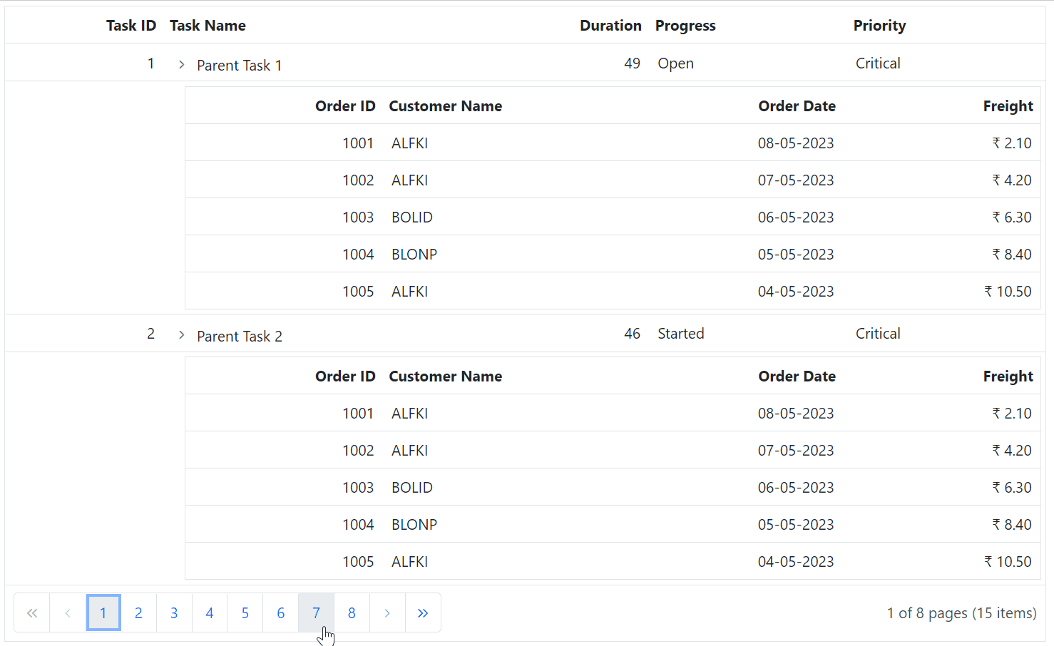
In this blog’s sample TreeGrid, each task (row) has a child grid beneath it that displays a list of orders associated with that task. The parent grid is a TreeGrid, and expanding a parent row displays its child rows. With the nested grid UI, all the parent and child rows are displayed in a grid structure that provides additional information about the rows.
Getting started with Blazor TreeGrid
Before proceeding, refer to the getting started with Blazor TreeGrid documentation.
How to render a nested grid UI in the TreeGrid
To implement the nested grid UI in the Blazor TreeGrid, we can use the DetailTemplate property in the TreeGridTemplates class of the component.
The DetailTemplate displays any custom elements beneath every row of the TreeGrid to provide additional information. Using this feature, we can define the grid displayed beneath every TreeGrid row.
Refer to the following code example. The DetailTemplate contains a div element that sets the child grid’s padding based on the row’s level. This ensures that the child grid is properly indented and aligned with the parent grid.
<SfTreeGrid @ref="grid" DataSource="@TreeData" AllowPaging="true" TValue="SelfReferenceData" AllowSelection="true" IdMapping="TaskID" ParentIdMapping="ParentID" TreeColumnIndex="1">
    <TreeGridPageSettings PageSize="2"></TreeGridPageSettings>
    <TreeGridSelectionSettings Type="Syncfusion.Blazor.Grids.SelectionType.Multiple"></TreeGridSelectionSettings>
    <TreeGridTemplates>
        <DetailTemplate>
            <div style="padding-left:@((context as SelfReferenceData).TreeLevel*18+164)px">
                <SfGrid DataSource="@Orders">
                    <GridColumns>
                        <GridColumn Field=@nameof(Order.OrderID) IsPrimaryKey=true HeaderText="Order ID" TextAlign="TextAlign.Right" Width="120"></GridColumn>
                        <GridColumn Field=@nameof(Order.CustomerID) HeaderText="Customer Name" Width="150"></GridColumn>
                        <GridColumn Field=@nameof(Order.OrderDate) HeaderText="Order Date" Format="d" Type="ColumnType.Date" TextAlign="TextAlign.Right" Width="130"></GridColumn>
                        <GridColumn Field=@nameof(Order.Freight) HeaderText="Freight" Format="C2" TextAlign="TextAlign.Right" Width="120"></GridColumn>
                    </GridColumns>
                </SfGrid>
            </div>
        </DetailTemplate>
    </TreeGridTemplates>
    <TreeGridColumns>
        <TreeGridColumn Field="TaskID" HeaderText="Task ID" IsPrimaryKey="true" Width="80" TextAlign="TextAlign.Right"></TreeGridColumn>
        <TreeGridColumn Field="TaskName" HeaderText="Task Name" Width="145"></TreeGridColumn>
        <TreeGridColumn Field="Duration" HeaderText="Duration" Width="100" TextAlign="TextAlign.Right"></TreeGridColumn>
        <TreeGridColumn Field="Progress" HeaderText="Progress" Width="100"></TreeGridColumn>
        <TreeGridColumn Field "Priority" HeaderText "Priority" Width "100"></TreeGridColumn>
    </TreeGridColumns>
</SfTreeGrid>
Refer to the following output GIF image.
GitHub reference
For more details, refer to the Nested Grid UI in Blazor TreeGrid project on GitHub.
Conclusion
Thanks for reading! In this blog, we’ve seen how to enhance the data visualization in the Blazor TreeGrid using a nested grid UI. By implementing these techniques, you can present complex data in a simple and readable format. Try out the steps in this blog and leave your feedback in the comments section.
Essential Studio for Blazor provides over 80 UI components and file-format libraries to help you build world-class applications.
If you have any questions or need assistance, our support team is always available to help you. You can reach us through our support forums, support portal, or feedback portal.


 No spam, just valuable updates.