

Welcome to our Chart of the Week blog series!
In this week’s edition, we are visualizing the highest-paid female athletes in 2023 using the Syncfusion .NET MAUI stacked column chart. In professional sports, female athletes are making significant financial strides both on and off the field. Let’s create some visual proof of that.
Refer to the following image.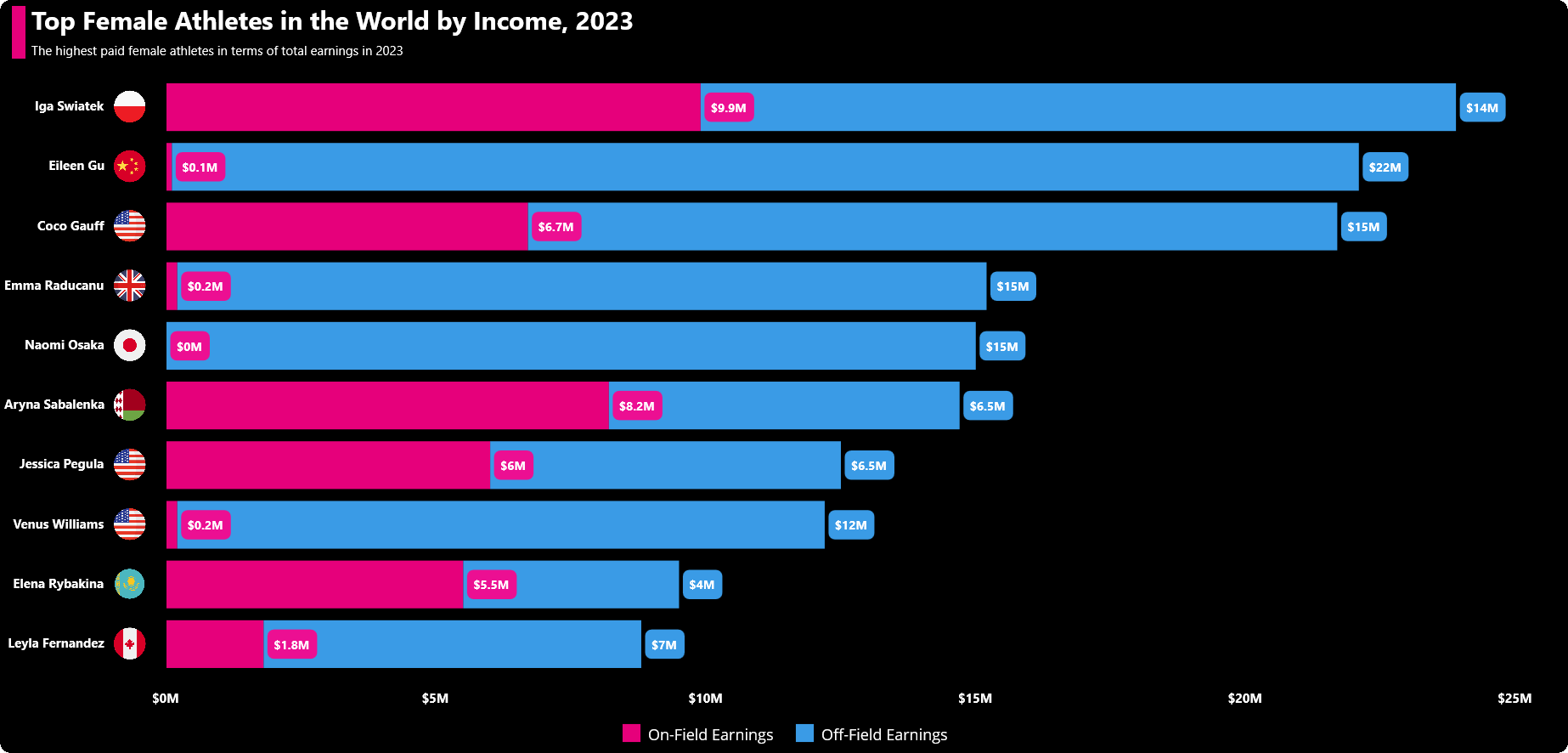
Let’s get started!
Step 1: Gathering the data
First, let’s gather the data for the highest-paid female athletes in 2023.
Step 2: Preparing the data for the chart
Create the FemaleAthletesModel class with AthleteName, OnFieldEarning, OffFieldEarning, and Country properties to store the athletes’ data.
public class FemaleAthletesModel
{
    public string AthleteName { get; set; } = string.Empty;

    public double OnFieldEarning { get; set; }

    public double OffFieldEarning { get; set; }

    public string Country { get; set; } = string. Empty;
}
Next, configure the TopPaidFemaleAthleteInfo class to create a collection of athletes’ data along with their earnings on and off the field and store it in an observable collection using the AthletesData property. Then, create a dictionary to store the streams of each athlete’s country flag image using the Streams property.
public class TopPaidFemaleAthleteInfo
{
    public ObservableCollection<FemaleAthletesModel> AthletesData { get; set; }

    public Dictionary<string, Stream> Streams { get; } = new Dictionary<string, Stream>();

    Stream? stream;
    public TopPaidFemaleAthleteInfo()
    {
        AthletesData = new ObservableCollection<FemaleAthletesModel>()
        {
            new FemaleAthletesModel() {AthleteName = "Leyla Fernandez", OnFieldEarning = 1.8, OffFieldEarning = 7,Country="canada"},
            new FemaleAthletesModel() {AthleteName = "Elena Rybakina", OnFieldEarning = 5.5, OffFieldEarning = 4,Country="kazakhstan"},
            new FemaleAthletesModel() {AthleteName = "Venus Williams", OnFieldEarning = 0.2, OffFieldEarning = 12,Country="united_states"},
            new FemaleAthletesModel() {AthleteName = "Jessica Pegula", OnFieldEarning = 6, OffFieldEarning = 6.5,Country="united_states"},
            new FemaleAthletesModel() {AthleteName = "Aryna Sabalenka", OnFieldEarning = 8.2, OffFieldEarning = 6.5,Country="belarus"},
            new FemaleAthletesModel() {AthleteName = "Naomi Osaka", OnFieldEarning = 0, OffFieldEarning = 15,Country="japan"},
            new FemaleAthletesModel() {AthleteName = "Emma Raducanu", OnFieldEarning = 0.2, OffFieldEarning = 15,Country="united_kingdom"},
            new FemaleAthletesModel() {AthleteName = "Coco Gauff", OnFieldEarning = 6.7,OffFieldEarning = 15,Country="united_states"},
            new FemaleAthletesModel() {AthleteName = "Eileen Gu",OffFieldEarning=22,OnFieldEarning=0.1,Country="china"},
            new FemaleAthletesModel() {AthleteName = "Iga Swiatek",OnFieldEarning=9.9,OffFieldEarning=14,Country="poland"},
        };

        Streams = GetImageSources();
    }

    private Dictionary<string, Stream> GetImageSources()
    {
        Dictionary<string, Stream> keyValues = new Dictionary<string, Stream>();

        Assembly assembly = typeof(MainPage).GetTypeInfo().Assembly;

        for (int i = 0; i < AthletesData.Count; i++)
        {
            string imageName = $"{AthletesData[i].Country}.png";
            stream = assembly.GetManifestResourceStream($"HighestPaidFemaleAthletes.Resources.Images.{imageName}");

            if (stream != null && AthletesData[i].AthleteName != null)
            {
                keyValues.Add(AthletesData[i].AthleteName.ToString(), stream);
            }
        }
        return keyValues;
    }
}
Step 3: Configuring the Syncfusion .NET MAUI Charts control
Let’s configure the Charts control using this documentation.
<chart:SfCartesianChart>
 <chart:SfCartesianChart.Xaxes>
  <chart:CategoryAxis />
 </chart:SfCartesianChart.Xaxes>
 <chart:SfCartesianChart.Yaxes>
  <chart:NumericalAxis/>
 </chart:SfCartesianChart.Yaxes>
</chart:SfCartesianChart>
Step 4: Transposing the chart
In a column chart, the bars are oriented vertically, whereas in a bar chart, they are oriented horizontally. We are going to visualize our data in a horizontal orientation. So, we need to transpose the chart by enabling the IsTransposed property. With this, we can use it as a stacked bar chart.
<chart:SfCartesianChart IsTransposed="True">
 <chart:SfCartesianChart.XAxes>
  <chart:CategoryAxis />
 </chart:SfCartesianChart.XAxes>
 <chart:SfCartesianChart.YAxes>
  <chart:NumericalAxis/>
 </chart:SfCartesianChart.YAxes>
</chart:SfCartesianChart>
Step 5: Bind the data to the chart
Bind the athletes’ income data to our StackedColumnSeries.
<!--On-Field Earning Series-->
 <chart:StackingColumnSeries ItemsSource="{Binding AthletesData}" XBindingPath="AthleteName" YBindingPath="OnFieldEarning">
</chart:StackingColumnSeries>

<!--Off-Field Earning Series-->
 <chart:StackingColumnSeries ItemsSource="{Binding AthletesData}" XBindingPath="AthleteName" YBindingPath="OffFieldEarning">
</chart:StackingColumnSeries>
In the previous example, we used the ItemsSource property to bind the stacked column chart with the AthletesData data collection, which contains the information on the on- and off-field earnings of the top-paid female athletes in 2023. Additionally, we set the XBindingPath with the AthleteName property and YBindingPath with the OnFieldEarning and OffFieldEarning properties in their series.
Step 6: Customizing the axis
We’ll use the category axis to visualize the athletes with their countries. To do so, we need to customize the category axis. Therefore, in the code behind, extend the CategoryAxisExt class by inheriting the CategoryAxis class.
Next, override the DrawAxis() method to achieve the drawing of country flag images with the axis label. Get the images from the resource Stream, then draw the image in the labels position.
public class CategoryAxisExt : CategoryAxis
{
     protected override void DrawAxis(ICanvas canvas, Rect arrangeRect)
     {
         base.DrawAxis(canvas, arrangeRect);

         foreach (ChartAxisLabel label in VisibleLabels)
         {
             string? labelText = label.Content.ToString();

             if (this.BindingContext is TopPaidFemaleAthleteInfo viewModel && labelText != null && viewModel.Streams.ContainsKey(labelText))
             {
                 Stream stream = viewModel.Streams[labelText];
                 var image = PlatformImage.FromStream(stream);
                 var top = ValueToPoint(label.Position); // Assuming positions start from 0
                 canvas.DrawImage(image, (float)arrangeRect.Left + xOffset, top - yOffset, 25, 25);
             }
         }
     }
 }
Add the CategoryAxisExt class instance to the XAxes collection in the SfCartesianChart.
<chart:SfCartesianChart>
 <chart:SfCartesianChart.XAxes>
  <local:CategoryAxisExt />
 </chart:SfCartesianChart.XAxes>
 <chart:SfCartesianChart.YAxes>
  <chart:NumericalAxis/>
 </chart:SfCartesianChart.YAxes>
</chart:SfCartesianChart>
Step 7: Customizing the chart appearance
We can customize the chart’s appearance by changing the chart title, axis elements, series, and more to enhance the readability of the data.
Customizing the chart title
Refer to the following code example for how to add a title and description in the chart for the plotted data.
<chart:SfCartesianChart.Title>
 <Grid>
  <Grid.ColumnDefinitions>
   <ColumnDefinition Width="1*"/>
   <ColumnDefinition Width="{OnPlatform Android=49*,WinUI=59*,MacCatalyst=59*,iOS=49*}"/>
  </Grid.ColumnDefinitions>
  <VerticalStackLayout Background="#E6FF0088 " Margin="10,5,0,15" Grid.Column="0" Grid.RowSpan="2"/>
   <VerticalStackLayout Grid.Column="1" Margin="5">
    <Label Text="Top Female Athletes in the World by Income, 2023" FontSize="Subtitle" FontFamily="centurygothic" Padding="0,0,5,5" HorizontalTextAlignment="Start" FontAttributes="Bold" TextColor="White"/>
    <Label Text="The highest paid female athletes in terms of total earnings in 2023" HorizontalTextAlignment="Start" FontSize="{OnPlatform Android=10,WinUI=10,MacCatalyst=16,iOS=11}" FontFamily="centurygothic" TextColor="White" Padding="0,0,0,10"/>
   </VerticalStackLayout>
 </Grid>
</chart:SfCartesianChart.Title>
Customizing the legend
Then, customize the chart legend using the ItemTemplate property and place it at the bottom using the Placement property.
<chart:SfCartesianChart.Legend>
 <chart:ChartLegend Placement="Bottom">
  <chart:ChartLegend.ItemTemplate>
   <DataTemplate>
    <StackLayout Orientation="Horizontal" Margin="5">
     <Rectangle HeightRequest="15" WidthRequest="15" Margin="3" Background="{Binding IconBrush}"/>
     <Label Text="{Binding Text}" Margin="3" TextColor="White" FontSize="12"/>
    </StackLayout>
   </DataTemplate>
  </chart:ChartLegend.ItemTemplate>
 </chart:ChartLegend>
</chart:SfCartesianChart.Legend>
Customizing the chart axis
Customize the x- and y-axes with the Maximum, Interval, LabelPlacement EdgeLabelsDrawingMode and ShowMajorGridLines properties, as well as the AxisTitle, LabelStyle, LineStyle and TickStyle.
Refer to the following code example.
<chart:SfCartesianChart.XAxes>
 <local:CategoryAxisExt ShowMajorGridLines="False" LabelPlacement="BetweenTicks" EdgeLabelsDrawingMode="{OnPlatform Android=Center,iOS= Center}" AutoScrollingMode="{OnPlatform Android=Start,iOS=Start}" AutoScrollingDelta="{OnPlatform Android=5,iOS=5}">
  <local:CategoryAxisExt.AxisLineStyle>
   <chart:ChartLineStyle Stroke="Black" StrokeWidth="0"/>
  </local:CategoryAxisExt.AxisLineStyle>
  <local:CategoryAxisExt.MajorTickStyle>
   <chart:ChartAxisTickStyle StrokeWidth="0"/>
  </local:CategoryAxisExt.MajorTickStyle>
  <local:CategoryAxisExt.LabelStyle>
   <chart:ChartAxisLabelStyle TextColor="white" FontAttributes="Bold" LabelAlignment="Center" Margin="{OnPlatform WinUI='40,4,4,4',Android='20,4,4,4'}" FontSize="10"/>
  </local:CategoryAxisExt.LabelStyle>
 </local:CategoryAxisExt>
</chart:SfCartesianChart.XAxes>

<chart:SfCartesianChart.YAxes>
 <chart:NumericalAxis Interval="5" Maximum="26" EdgeLabelsDrawingMode="Center"  ShowMajorGridLines="False">
  <chart:NumericalAxis.AxisLineStyle>
   <chart:ChartLineStyle StrokeWidth="0"/>
  </chart:NumericalAxis.AxisLineStyle>
  <chart:NumericalAxis.MajorTickStyle>
   <chart:ChartAxisTickStyle StrokeWidth="0"/>
  </chart:NumericalAxis.MajorTickStyle>
  <chart:NumericalAxis.LabelStyle>
   <chart:ChartAxisLabelStyle LabelFormat="$0M" TextColor="White" FontAttributes="Bold" FontSize="10"/>
  </chart:NumericalAxis.LabelStyle>
 </chart:NumericalAxis>
</chart:SfCartesianChart.YAxes>
Customize the series appearance
Finally, customize the chart series by applying the Fill color and displaying the athlete information using DataLabels.
<!--On-Field Earning Series-->
<chart:StackingColumnSeries ItemsSource="{Binding AthletesData}" XBindingPath="AthleteName" YBindingPath="OnFieldEarning" Fill="#E6FF0088 " Label="On-Field Earnings" ShowDataLabels="True">
 <chart:StackingColumnSeries.DataLabelSettings>
  <chart:CartesianDataLabelSettings LabelPlacement="Outer">
   <chart:CartesianDataLabelSettings.LabelStyle>
    <chart:ChartDataLabelStyle FontAttributes="Bold" LabelFormat="$0.#M"/>
   </chart:CartesianDataLabelSettings.LabelStyle>
  </chart:CartesianDataLabelSettings>
 </chart:StackingColumnSeries.DataLabelSettings>
</chart:StackingColumnSeries>

<!--Off-Filed Earning Series-->
<chart:StackingColumnSeries ItemsSource="{Binding AthletesData}" XBindingPath="AthleteName" YBindingPath="OffFieldEarning" Fill="#E640ACFF " Label="Off-Field Earnings" ShowDataLabels="True" >
 <chart:StackingColumnSeries.DataLabelSettings>
  <chart:CartesianDataLabelSettings LabelPlacement="Outer">
   <chart:CartesianDataLabelSettings.LabelStyle>
    <chart:ChartDataLabelStyle FontAttributes="Bold" LabelFormat="$0.#M"/>
   </chart:CartesianDataLabelSettings.LabelStyle>
  </chart:CartesianDataLabelSettings>
 </chart:StackingColumnSeries.DataLabelSettings>
</chart:StackingColumnSeries>
After executing the previous code examples, we will get output like in the following image.

GitHub reference
For more details, refer to the project on GitHub.
Conclusion
Thanks for reading! In this blog, we’ve seen how to visualize the top-earning female athletes’ data using the Syncfusion MAUI stacked column chart. We encourage you to follow the steps discussed in this blog and share your thoughts in the comments below.
If you require any assistance, you can contact us through our support forums, support portal, or feedback portal. We are always happy to assist you.
See you in our next blog!
Related blogs
- Syncfusion .NET MAUI 2024 Road Map
- Chart of the Week: Creating a .NET MAUI Bar Chart to Visualize Type 1 Diabetes Prevalence
- Chart of the Week: Creating a .NET MAUI Multiple Fast Line Chart to Analyze the Impact of Exported Goods on GDP
- Chart of the Week: Creating a .NET MAUI Stacked Column Chart for Global Smartphone Shipments
 No spam, just valuable updates.