
 Selva Ganapathy Kathiresan
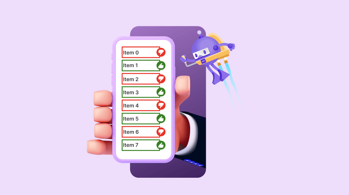
If you’re developing a social networking or an e-commerce app, it’s essential to consider the significance of UI alert notifications. They serve as a vital means of notifying users that the app requires attention.
While these notifications, or badges, are traditionally used to display popular symbols or text in an alert UI, custom symbols relevant to your app can also be incorporated.
The Syncfusion .NET MAUI Badge View (SfBadgeView) is a notification control. It is used to notify users about new or unread messages, status information, and more. It can easily be integrated with controls like ListView, Tab View, and other container controls. You can position the badge text around the badge content, customize the badge background with predefined colors using predefined styles, and add animations to the badge text.
In this blog, we’ll see how to integrate custom symbol badges into your app using the Syncfusion .NET MAUI Badge View control.
.NET MAUI Badge View’s predefined symbols
You can customize the badge icon in the .NET MAUI Badge View using the Icon property, which offers various predefined symbols, including Add, Available, Away, Busy, Delete, Dot, None, Prohibit1, and Prohibit2. If you don’t set the badge text, the badge icon will be displayed by default.
Load custom symbols in the .NET MAUI Badge View
The .NET MAUI Badge View control not only supports predefined symbols but also allows you to load custom symbols from FontIcons. Preparing your desired symbols as FontIcons and setting the FontFamily property of the .NET MAUI Badge View with the font file is the best way to do it.
This feature enables you to load your required symbols in the badge easily. With custom font support in the Badge View, you can choose the font containing the custom icon you want to display, then set the font family to that font. Once you set the font family, you can use the BadgeText property to display the custom icon in the badge.
With this feature, you can make your badges look more professional and tailored to your app’s specific needs.
Follow these steps to load custom symbols in the Syncfusion .NET MAUI Badge View control:
Step 1: Create a new .NET MAUI app using Visual Studio.
Step 2: The Syncfusion .NET MAUI controls are available on the NuGet Gallery. To add SfBadgeView to your project, open the NuGet Package Manager in Visual Studio, and search for Syncfusion.Maui.Core, and then install it.
Step 3: In the MauiProgram.cs file, register the handler for Syncfusion Core.
Using Microsoft.Extensions.Logging;
using Syncfusion.Maui.Core.Hosting;

namespace CustomSymbolBadgeView;

public static class MauiProgram
{
    public static MauiApp CreateMauiApp()
    {
	var builder = MauiApp.CreateBuilder();
	builder
	   .UseMauiApp<App>();
	builder.ConfigureSyncfusionCore();

        #if DEBUG
	builder.Logging.AddDebug();
        #endif

	return builder.Build();
     }
}
Step 4: Add the Syncfusion.Maui.Core namespace in your XAML page.
xmlns:syncfusion=”clr-namespace:Syncfusion.Maui.Core;assembly=Syncfusion.Maui.Core”
Step 5: Initialize the .NET MAUI Badge View control.
<syncfusion:SfBadgeView>
</syncfusion:SfBadgeView>
Step 6: Add the FontIcon file in .ttf format in the Solution Explorer window under the Resource > Fonts folder. Refer to the following image.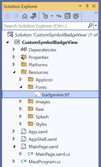
Step 7: Register the font using the ConfigureFonts method in the MauiProgram.cs file.
Using Microsoft.Extensions.Logging;
using Syncfusion.Maui.Core.Hosting;

namespace CustomSymbolBadgeView;

public static class MauiProgram
{
    public static MauiApp CreateMauiApp()
    {
	var builder = MauiApp.CreateBuilder();
	builder
	   .UseMauiApp<App>()
	   .ConfigureFonts(fonts =>
	    {
		fonts.AddFont(“badgeview.ttf”, “badgeview”);
	    });
	builder.ConfigureSyncfusionCore();

        #if DEBUG
	builder.Logging.AddDebug();
        #endif

	return builder.Build();
    }
}
Step 8: We can add text to the badges using the BadgeText property. To do so, we need to apply the Unicode or Glyph value assigned in the FontIcon file to the BadgeText property. Here, I have two icons, Thumbs Up and Thumbs Down, that are assigned to glyph values A and B, respectively.
<syncfusion:SfBadgeView BadgeText=”A”>
 <syncfusion:SfBadgeView.BadgeSettings>
  <syncfusion:BadgeSettings FontFamily=”badgeview”/>
 </syncfusion:SfBadgeView.BadgeSettings>
</syncfusion:SfBadgeView>
Step 9: Apply the required font in the Badge View using the FontFamily property through BadgeSettings.
Step 10: Add the content. An image, button, ContentView, label, or any view can be added to the Badge View using the Content property.
<syncfusion:SfBadgeView BadgeText=”A”>
 <syncfusion:SfBadgeView.BadgeSettings>
  <syncfusion:BadgeSettings FontFamily=”badgeview”/>
 </syncfusion:SfBadgeView.BadgeSettings>
 <ContentView/>
</syncfusion:SfBadgeView>
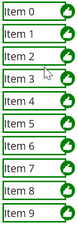
Refer to the following output image.
Changing the custom symbols dynamically
We have seen how to add custom symbols in the .NET MAUI Badge View control. Now let’s see how to create a UI that contains a list of items with dynamic badges that can be either like or dislike symbols. The like and dislike symbols will change to the other badge when its corresponding list item is tapped.
To achieve this UI, follow these steps:
Note: To design the list of items, we have used the Syncfusion .NET MAUI ListView control.
Step 1: Set the ItemsSource property of the ListView to a collection of items from the view model, which will be displayed as a list.
<Grid  WidthRequest="100">
 <ListView ItemsSource="{Binding Items}">
  <ListView.ItemTemplate>
   <DataTemplate>
   </DataTemplate>
  </ListView.ItemTemplate>
 </ListView>
</Grid>
Step 2: Set the ItemTemplate property of the ListView to a DataTemplate, which defines the layout of each item in the list.
<Grid  WidthRequest="100">
 <ListView ItemsSource="{Binding Items}">
  <ListView.ItemTemplate>
   <DataTemplate>
   </DataTemplate>
  </ListView.ItemTemplate>
 </ListView>
</Grid>
Step 3: Add the ViewCell, which is a container for a single item in the list.
<Grid  WidthRequest="100">
 <ListView ItemsSource="{Binding Items}">
  <ListView.ItemTemplate>
   <DataTemplate>
    <ViewCell>
    </ViewCell>
   </DataTemplate>
  </ListView.ItemTemplate>
 </ListView>
</Grid>
Step 4: Let’s add the SfBadgeView control as a child to the ViewCell. This control displays a badge view that contains a badge with the text “A” and a custom green background. The WidthRequest and HeightRequest properties are used to specify the size of the badge view.
<Grid  WidthRequest="100">
 <ListView ItemsSource="{Binding Items}">
  <ListView.ItemTemplate>
   <DataTemplate>
    <ViewCell>
     <syncfusion:SfBadgeView BadgeText="A" WidthRequest="100" HeightRequest="30">
      <syncfusion:SfBadgeView.BadgeSettings>
       <syncfusion:BadgeSettings FontFamily="badgeview" Type="None" Position="Right" Background="Green" />
      </syncfusion:SfBadgeView.BadgeSettings>
     </syncfusion:SfBadgeView>
    </ViewCell>
   </DataTemplate>
  </ListView.ItemTemplate>
 </ListView>
</Grid>
Step 5: Add the TapGestureRecognizer, which allows users to tap on the badge view, to the SfBadgeView control.
<Grid  WidthRequest="100">
 <ListView ItemsSource="{Binding Items}">
  <ListView.ItemTemplate>
   <DataTemplate>
    <ViewCell>
     <syncfusion:SfBadgeView BadgeText="A" WidthRequest="100" HeightRequest="30">
      <syncfusion:SfBadgeView.GestureRecognizers>
       <TapGestureRecognizer Tapped="TapGestureRecognizer_Tapped"/>
      </syncfusion:SfBadgeView.GestureRecognizers>
     </syncfusion:SfBadgeView>
    </ViewCell>
   </DataTemplate>
  </ListView.ItemTemplate>
 </ListView>
</Grid>
Step 6: Set the BadgeSettings property of the SfBadgeView control to the BadgeSettings object, which specifies the font family, badge type, position, and background color of the badge. We’ll set the Type property value as None to allow the custom background color to be set via the Background property.
<Grid  WidthRequest="100">
 <ListView ItemsSource="{Binding Items}">
  <ListView.ItemTemplate>
   <DataTemplate>
    <ViewCell>
     <syncfusion:SfBadgeView BadgeText="A" WidthRequest="100" HeightRequest="30">
      <syncfusion:SfBadgeView.GestureRecognizers>
       <TapGestureRecognizer Tapped="TapGestureRecognizer_Tapped"/>
      </syncfusion:SfBadgeView.GestureRecognizers>
      <syncfusion:SfBadgeView.BadgeSettings>
       <syncfusion:BadgeSettings FontFamily="badgeview" Type="None" Position="Right" Background="Green" />
      </syncfusion:SfBadgeView.BadgeSettings>
     </syncfusion:SfBadgeView>
    </ViewCell>
   </DataTemplate>
  </ListView.ItemTemplate>
 </ListView>
</Grid>
Step 7: Add a Grid as a child of the SfBadgeView control. The Grid contains a ContentView with a green background color and another Grid with a white background color. The Label displays the text of each item in the list.
<Grid WidthRequest="100">
 <ListView ItemsSource="{Binding Items}">
  <ListView.ItemTemplate>
   <DataTemplate>
    <ViewCell>
     <syncfusion:SfBadgeView BadgeText="A" WidthRequest="100" HeightRequest="30">
      <syncfusion:SfBadgeView.GestureRecognizers>
       <TapGestureRecognizer Tapped="TapGestureRecognizer_Tapped"/>
      </syncfusion:SfBadgeView.GestureRecognizers>
      <syncfusion:SfBadgeView.BadgeSettings>
       <syncfusion:BadgeSettings FontFamily="badgeview" Type="None" Position="Right" Background="Green" />
      </syncfusion:SfBadgeView.BadgeSettings>
      <Grid Padding="2">
       <ContentView Background="Green" >
        <Grid BackgroundColor="White" Margin="2">
         <Label Text="{Binding}" VerticalOptions="Center"/>
        </Grid>
       </ContentView>
      </Grid>
     </syncfusion:SfBadgeView>
    </ViewCell>
   </DataTemplate>
  </ListView.ItemTemplate>
 </ListView>
</Grid>
Step 8: In the code, declare an ObservableCollection of strings called items that is initialized with an empty collection. Then, declare a property called Items to return the items collection.
private ObservableCollection<String> items = new ObservableCollection<string>();

public ObservableCollection<String> Items
{
    get { return items; }
    set { items = value; }
}


public MainPage()
{
    InitializeComponent();
}
Step 9: In the MainPage constructor, we’ve used a loop to add 100 items to the items collection, with each item being a string that consists of Item text with the current index converted to a string. The MainPage’s binding context is set to “this,” which is the MainPage itself.
private ObservableCollection<String> items = new ObservableCollection<string>();

public ObservableCollection<String> Items
{
     get { return items; }
     set { items = value; }
}


public MainPage()
{
      for (int i = 0; i < 100; i++)
      {
	 Items.Add("Item " + i.ToString());
      }

      InitializeComponent();
      this.BindingContext = this;
}
Step 10: When the user taps on the SfBadgeView control, the TapGestureRecognizer.Tapped event handler method will be called.
This method checks if the event’s sender is an instance of the SfBadgeView control. If it is, then the method updates the badge by obtaining a reference to the border element within the SfBadgeView control, which contains the badge’s content.
If the BadgeText property of the SfBadgeView control is set to “A,” the method changes it to “B” and sets the background color of both the border and badge to red. Otherwise, if the BadgeText property is set to anything other than “A,” the method changes it back to “A” and sets the background color of both the border and badge to green.
Refer to the following code example.
private ObservableCollection<String> items = new ObservableCollection<string>();

public ObservableCollection<String> Items
{
    get { return items; }
    set { items = value; }
}


public MainPage()
{
     for (int i = 0; i < 100; i++)
     {
	Items.Add("Item " + i.ToString());
     }

     InitializeComponent();
     this.BindingContext = this;
}

private void TapGestureRecognizer_Tapped(object sender, TappedEventArgs e)
{

      if( sender is SfBadgeView badgeView)
      {
	  var border = (badgeView.Content as Grid).Children[0] as ContentView;
	  if (badgeView.BadgeText == "A")
	  {
	      badgeView.BadgeText = "B";
	      border.Background = Colors.Red;
	      badgeView.BadgeSettings.Background = Colors.Red;
	  }
	  else
	  {
	       badgeView.BadgeText = "A";
               border.Background = Colors.Green;
               badgeView.BadgeSettings.Background = Colors.Green;
	  }
      }

}
After executing the previous code examples, our output will look like the following image.
Conclusion
Thanks for reading! In this blog, we’ve seen how to load custom symbol badges into your application using the Syncfusion .NET MAUI Badge View control. Try out the steps provided and leave your feedback in the comments section below!
You can also contact us through our support forum, support portal, or feedback portal. We are always happy to assist you!


 No spam, just valuable updates.